If you're a fan of Loki — and let's just assume that you are, since ya know, you clicked on this — then you're probably super familiar with the iconic looks the God of Mischief has sported over the years.
And now that Loki season 1 has come to an end (who else is READY for season 2, like...now?!), we were curious about the history and development of Loki's ~looks~ leading up to the series. So we chatted with Co-Founder and former Co-Head of Visual Development at Marvel Studios Charlie Wen and Marvel Studios Senior Visual Development Artist Anthony Francisco, who worked on his designs over the years, to find out more!
Here's what we learned...
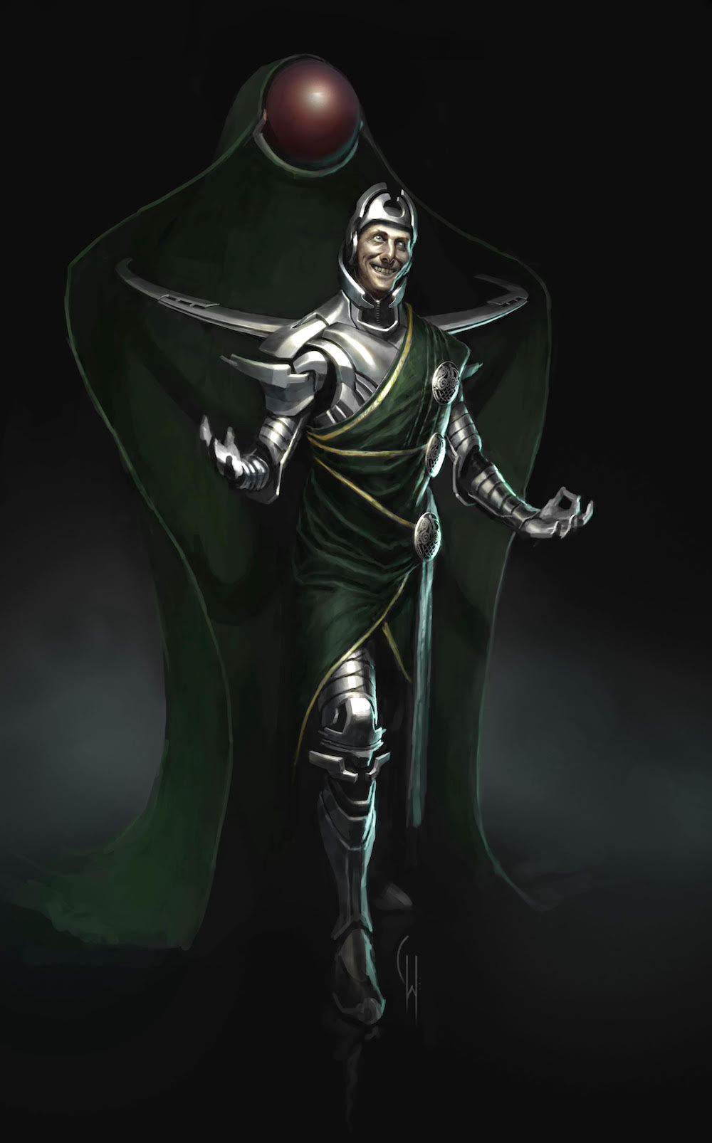
1. Wen was already working on designs for Thor before director Kenneth Branagh was even hired, and this “crazy Loki” design was one of the very first Lokis he created at Marvel.
2. And it was actually Kenneth Branagh who was responsible for bringing Tom Hiddleston on board as Loki, and here's where the design we're more familiar with started to take shape.

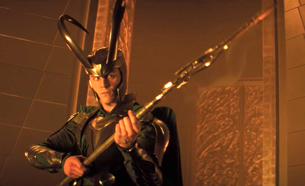
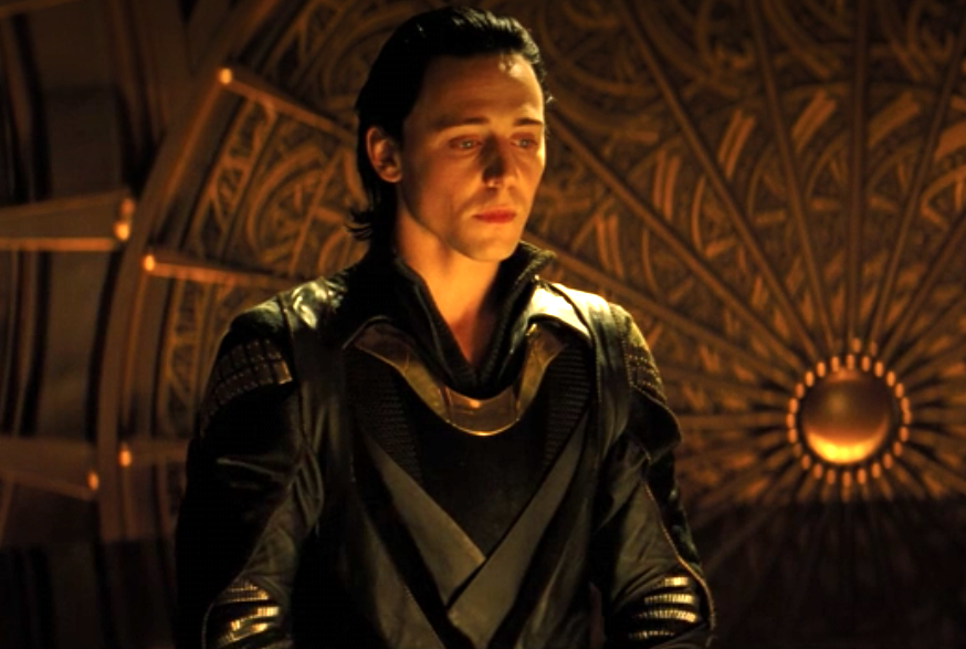
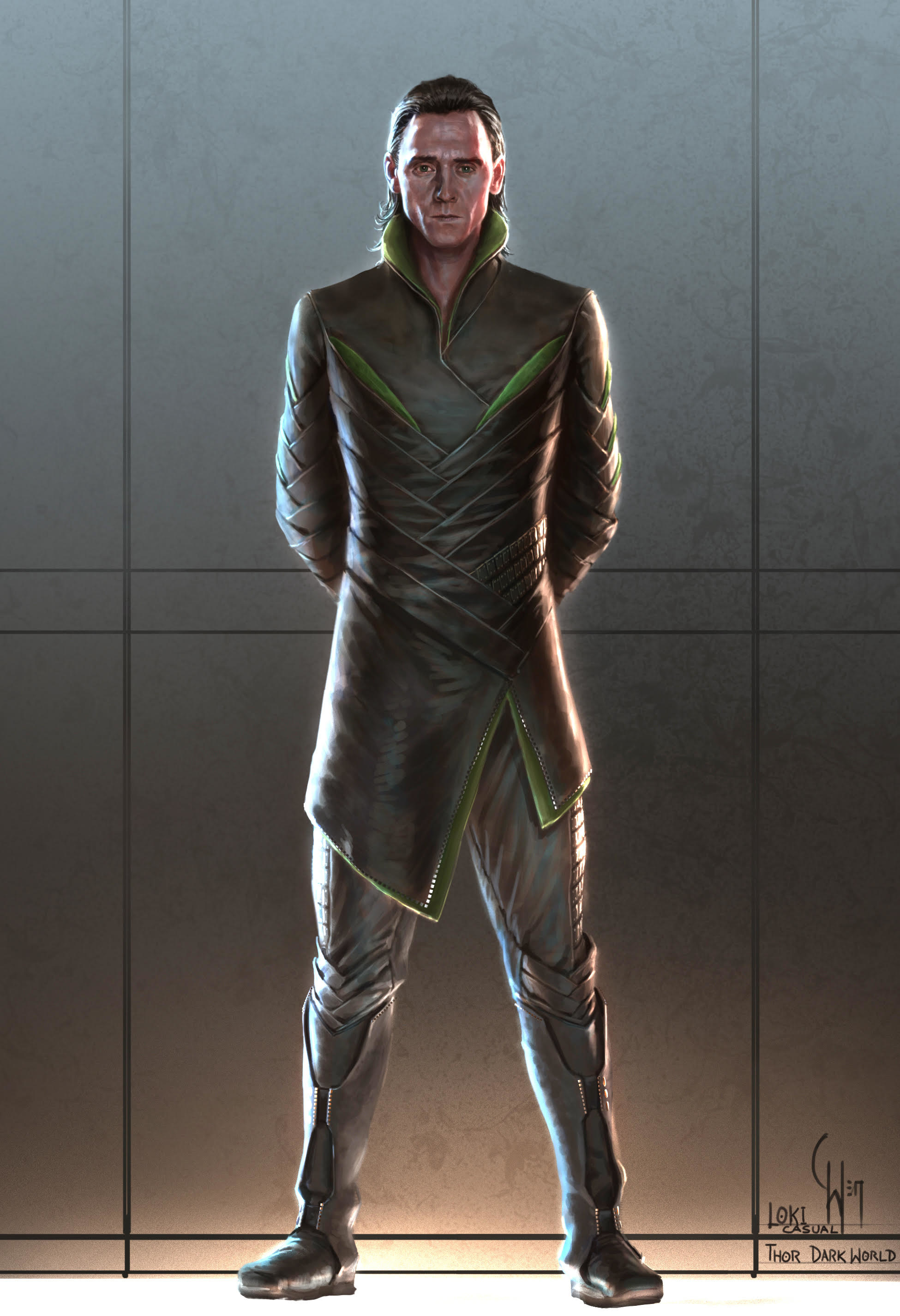
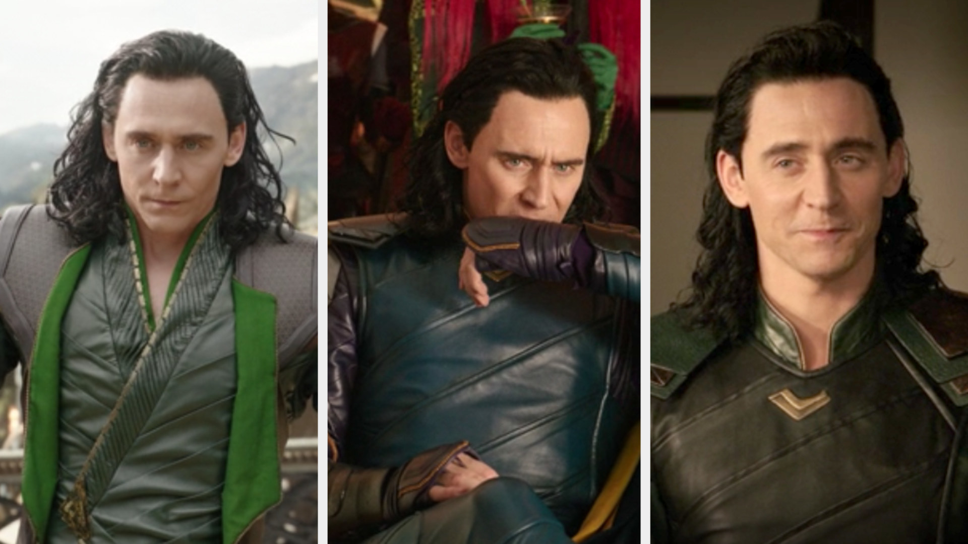
3. And you can see many differences between Loki's armored look vs. his ~casual~ look even in the first film alone.
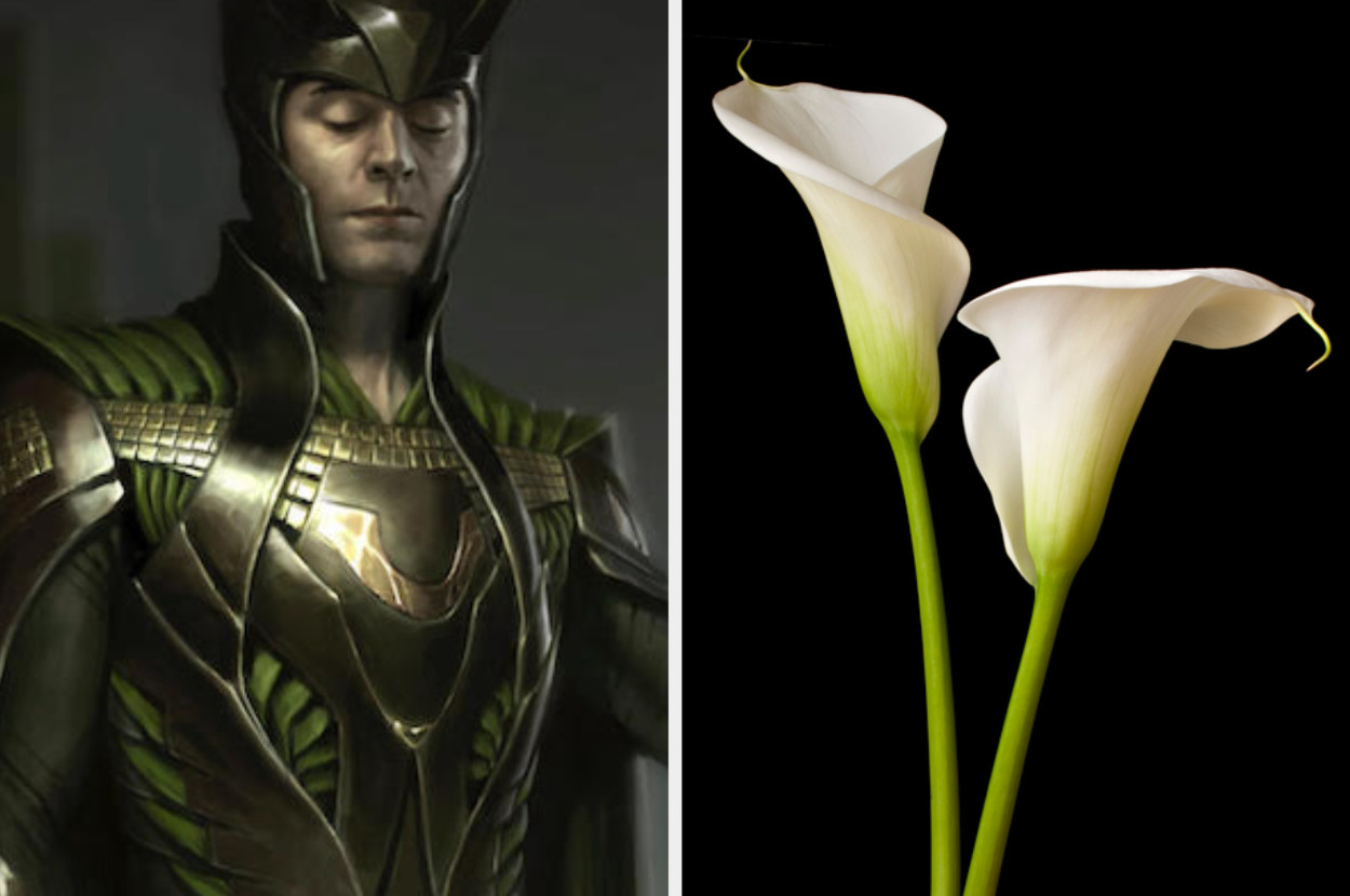
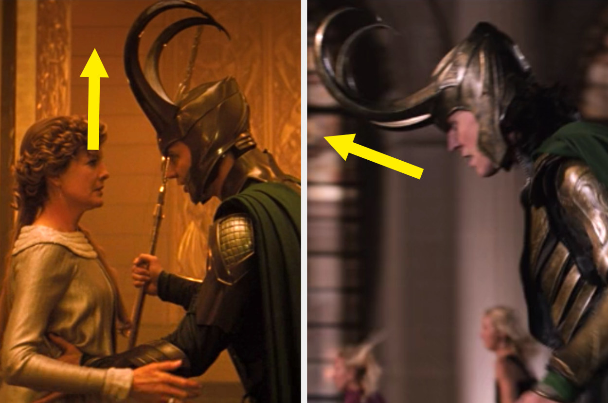
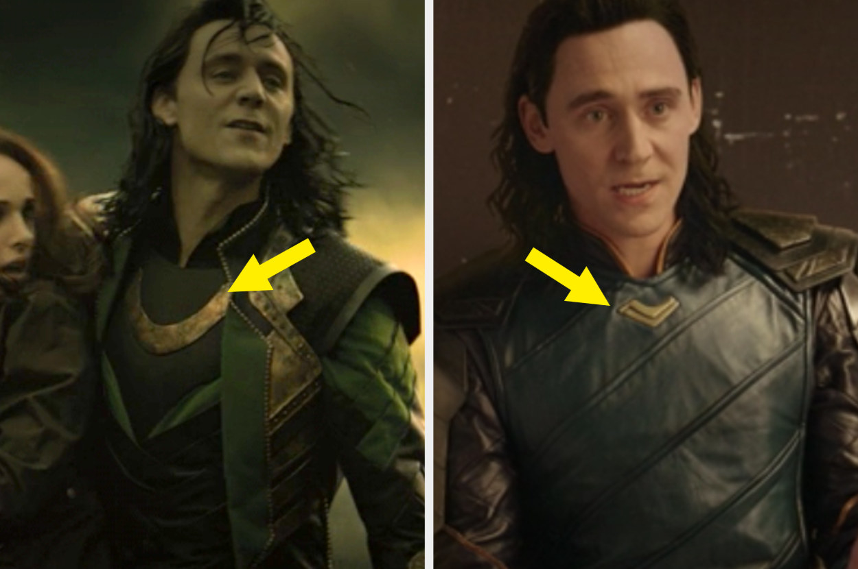
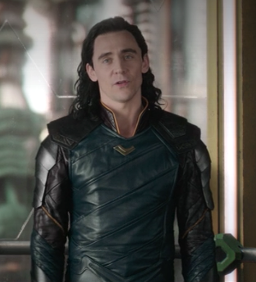
4. Loki's collar was inspired by the flower faux calla lily, and it had a particularly deep meaning.
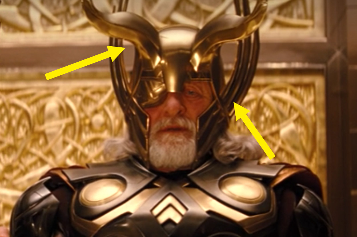
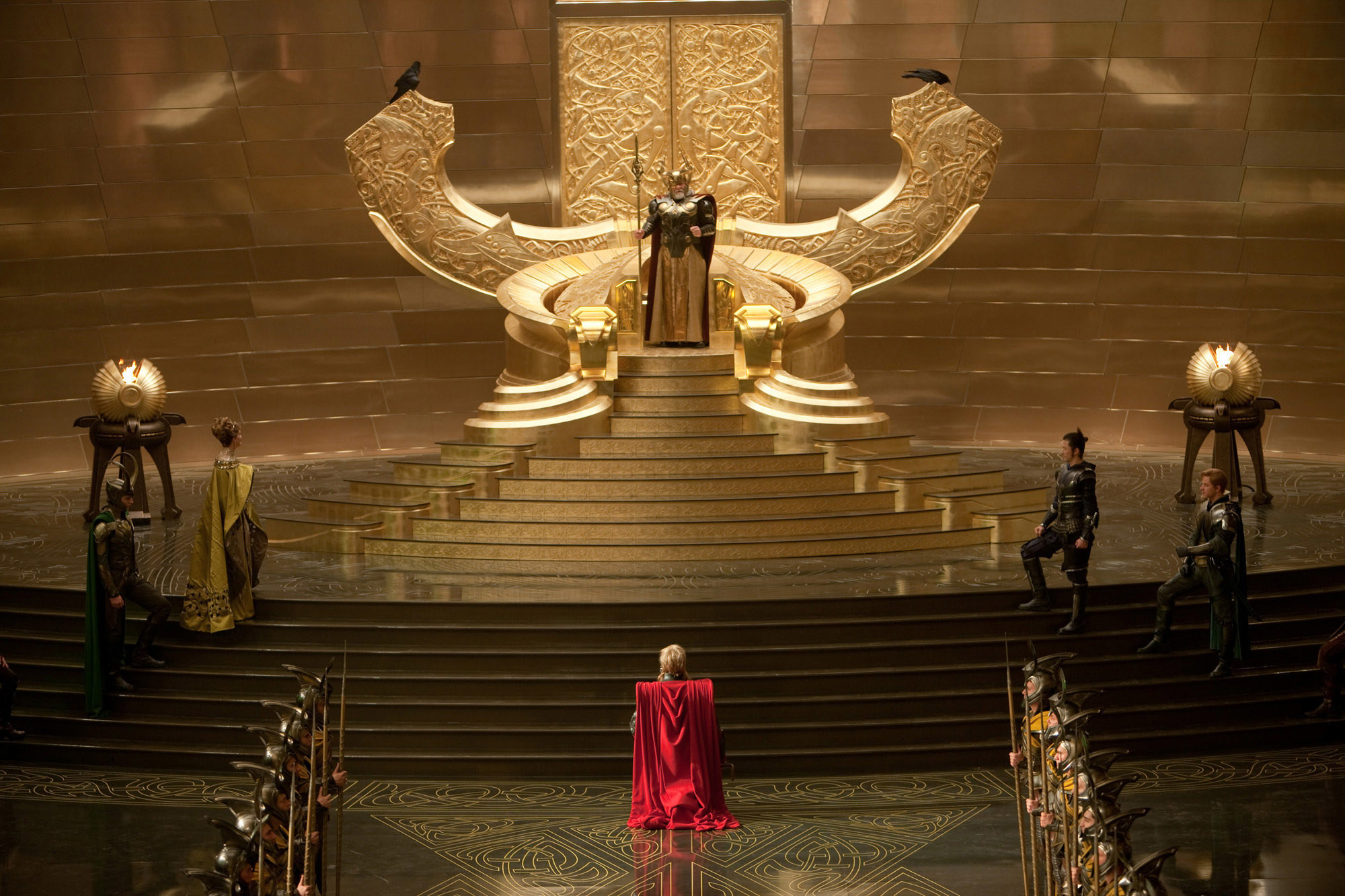
5. And you probably didn't know this, but if you put Loki and Thor's helmets together, you get Odin's helmet.
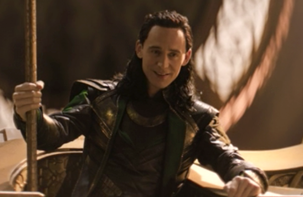
6. Tom Hiddleston actually hated wearing Loki's helmet in the first Thor film.
7. The horns of Loki's helmet in the first film were very vertical, which was intentional to match the upward shapes and design of Asgard.
8. As you go toward the later films, though, Wen started to move toward a more aggressive horn design, one that is thinner and shoots out first.
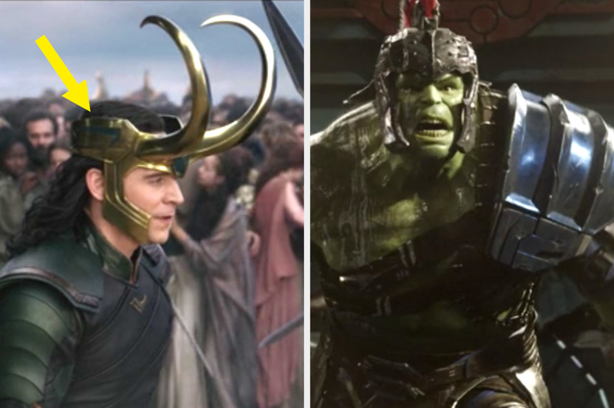
9. For Thor: Ragnarok, Francisco introduced the open-topped helmet for Loki.
10. And the design on the sides of Loki's helmet in Ragnarok links to the designs on Hulk's armor.
11. Wen found inspiration for Loki's design from three major places. First, of course, was Jack Kirby...
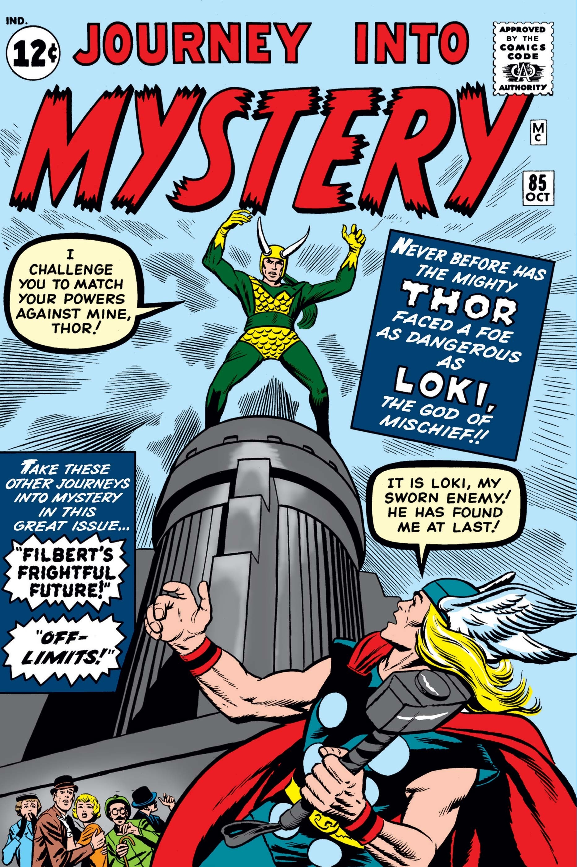
12. ...second was all the variants of Loki through the comics...
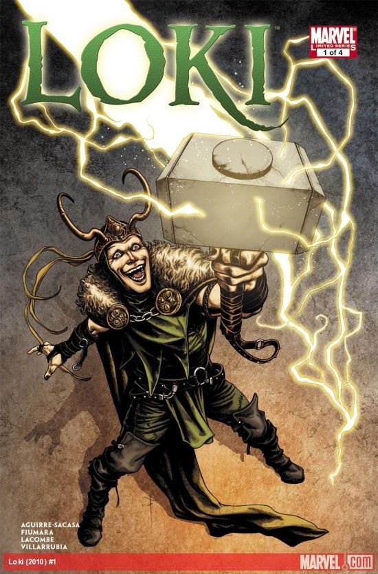
13. ...and finally, mythological Loki.
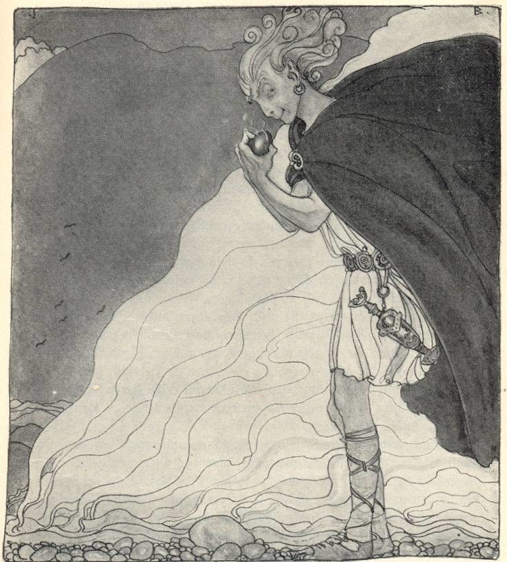
14. According to Wen, the very first screenplay for Thor was actually a lot more about mythology than the comic books.
15. And mythology was something that Wen actually wanted to bring into the Marvel designs anyway.
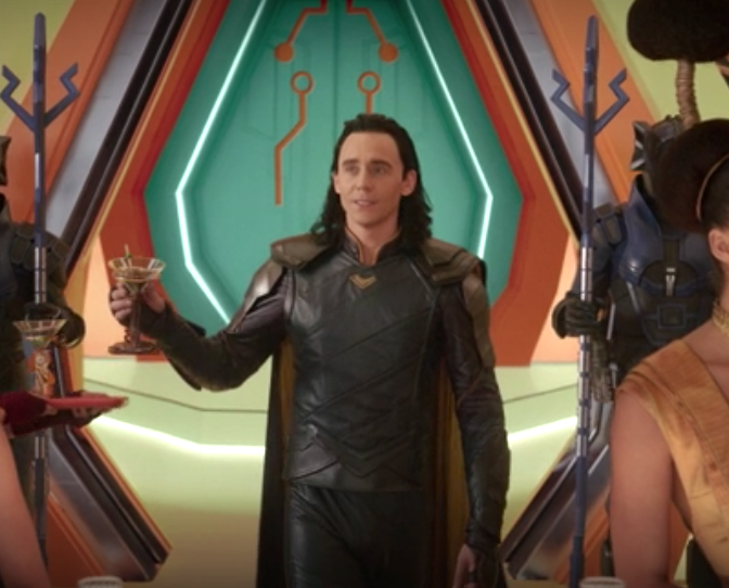
16. In fact, Wen felt a lot of Norse design naturally lended itself to Loki's complex personality.
17. And you'll see even more of that "serpentine-like" design in Dark World.
18. And for Dark World the colors were meant to look more "worn in" and "used."
19. When tackling new looks for Ragnarok, Francisco was excited to hear from Taika Waititi, who told him, "I want a brand-new look. I don't want it to look like Asgard at all."
20. But there are still elements from the "old" Asgardian designs of Dark World like in Loki's shoulder armor...
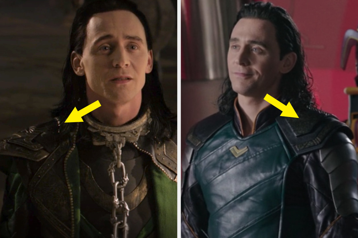
21. ...and also this necklace piece.
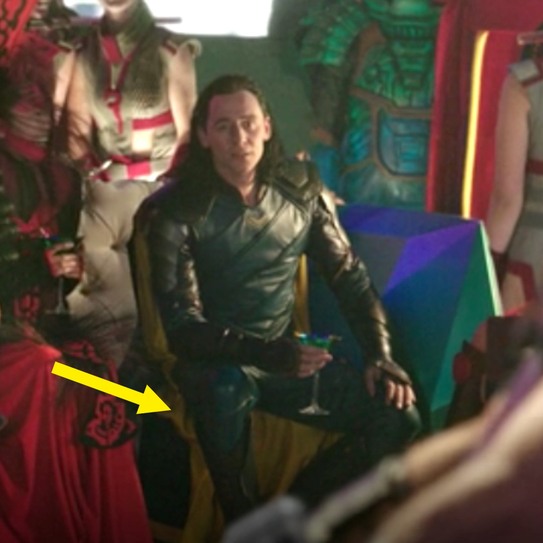
22. For Ragnarok, Francisco wanted to make Loki's design look more imbalanced by using a lot of asymmetrical, diagonal cutlines.
23. And the blue in Loki's Sakaar look is meant to symbolize a more "sad" Loki.
24. The blue is also meant to liken Loki to a peacock who is showing off for the Grandmaster.
25. And the touch of yellow on his cape is meant to symbolize a little silver lining that Loki will be OK later on.
26. And finally, Visual Development artists go through many, many designs for their characters, sometimes ones that are WAY out there; and Francisco did one wild concept where Loki was actually all yellow with green on the inside.