I believe that geography is extremely important to personal narrative. Our location sets a stage for action and interaction, place provides context for characters and feelings, and spatial connection can thread the needle of narrative through unrelated events. A significant part of Vignette has been experimenting with ways of integrating place into narrative, so I was quite excited when a friend showed me Koya Bound. Maps can be difficult to integrate into linear narrative, because they are inherently multi-dimensional, and I thought Koya Bound did an exceptional job of reducing it to a one dimensional path, something that I had explored previously with a different, less compelling, strategy.
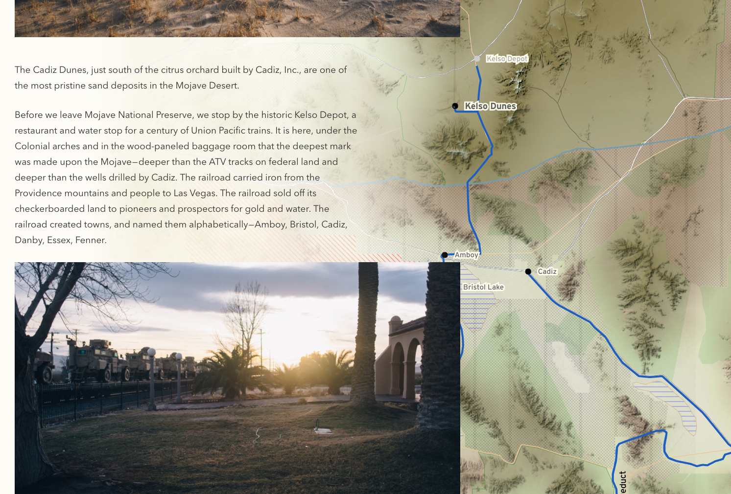
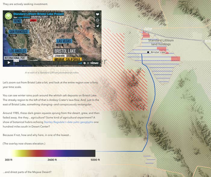
In fact, I was excited enough by that project that I chose to adapt part of a personal sightseeing venture across the Mojave Desert into a similar interactive geographic format. The Mojave trip seemed like the right story because of the diversity of experiences that we had along the way — hiking up huge dunes, traipsing around disheveled sculptures, and investigating salt evaporation ditches — experiences that would be difficult to narratively cohere without the link of geography. However, mid-way through the writing process, I discovered that there more going on under the surface of the desert biocrust than we had known when we were there. My story slowly became one linking our personal exploration, unlikely water politics, Tesla, and 19th-century railroads.
You can read my story online, called "Forty Million Daggers," and if maps or land use politics are interesting to you, I encourage you to do so before reading the rest of this post. I added several features to the interactive map, including animations, overlays, and untraveled jumps. In the rest of this post, I will talk briefly about how I created the map and added those features.
Rendering a custom map
To craft the map that would accompany the story, I used Maperitive to render Open Street Maps data. Maperitive takes a set of raw Open Street Maps data (which you can download from the main OSM browser by clicking “Export”) and renders it according to a custom stylesheet. It can also use elevation data to create beautiful topographic shading and relief. And, most importantly, it can output a vector SVG file, which can be zoomed without loss of quality and further edited and refined in Adobe Illustrator or Inkscape.
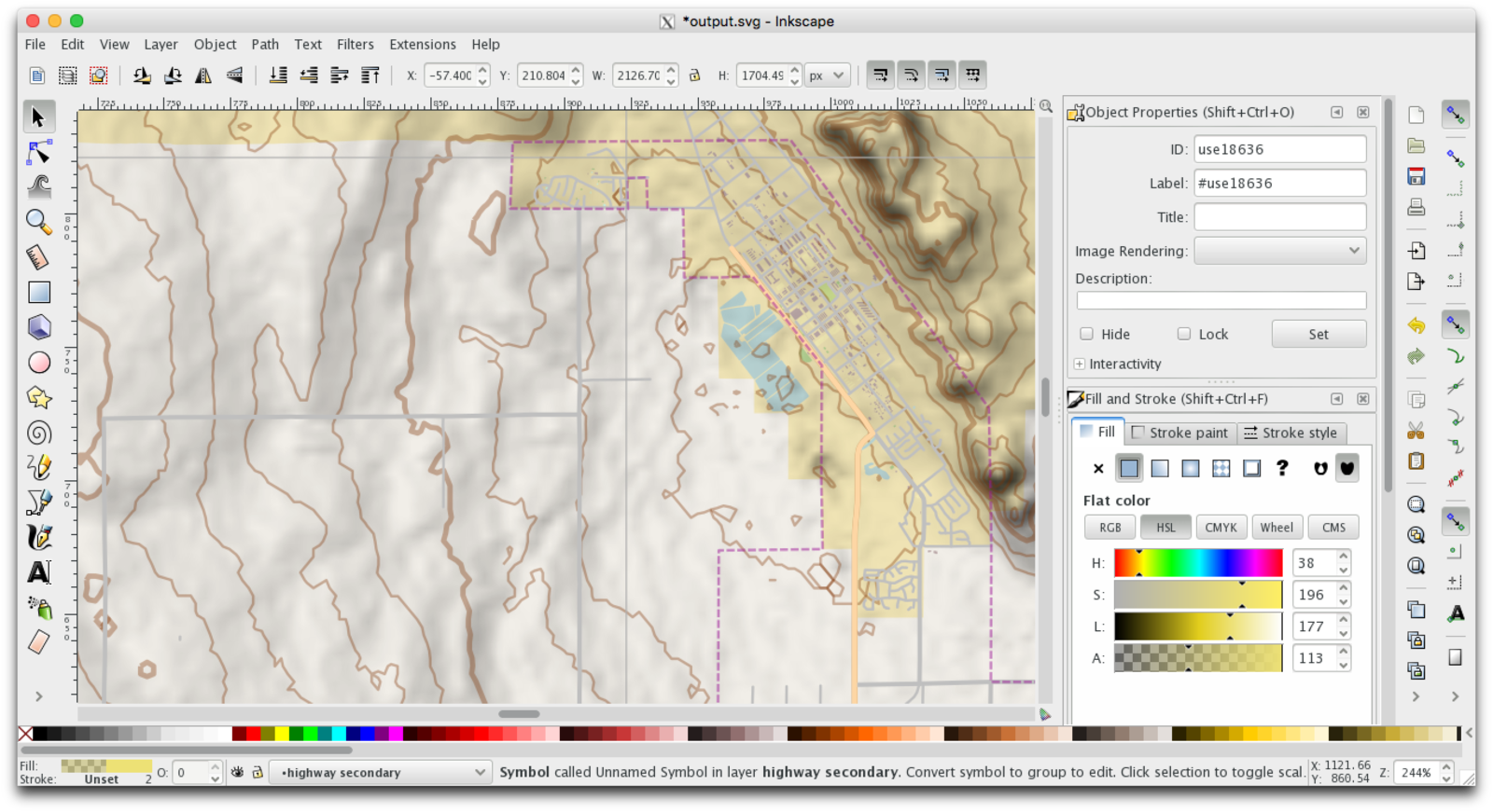
The map I created for this story prioritized certain features, especially dry lakes and canals. To help the reader interpret the landscape, it also showed roads, land use boundaries, and topography. The stylesheet that I wrote to generate these maps is here.
The web application that powers Koya Bound and Forty Million Daggers was written by Lucas Bebber, and he generously released it without any restrictive licensing here. The JavaScript loads an SVG file and looks in it for three special layers: the route to highlight, the route the camera follows, and points along the way that delineate sections of narrative. These special layers can be added with any vector image editing software — check out the original tutorial for more details.
My planned map was of a huge region, including the entirety of Metro Los Angeles, which has very dense geometry. Rendering every street in LA from an SVG would take a very long time, so the final map SVG for my story uses pre-rendered bitmap images in several locations. It also has selectively higher resolution topographic images in areas where the story zooms the map closer. This technique worked okay, but it does raise the question — why bother with SVG at all if significant parts are pre rendered bitmaps? I think that if I were to do this again, I would make the whole map a high-resolution bitmap image. Though it would take longer to download, it would be faster to render and make support for older browsers easier.
Adding overlays
In order to illustrate land use issues I wanted to be able to plot additional data, like land ownership, on top of the SVG map at certain points in the story. The additions I have made to the original code are somewhat hacky, but I’m including them anyway in case they are helpful to people trying to make similar things.
The core of the app is in the canvas-map.js file. Let’s say we want to add an image overlay to trigger on a specific section of the narrative. Here’s how we can do that. In the init() function, add some code to load the image and store it:
Now, in the renderMap() function, where the meat of the rendering happens, we add code to draw this overlay at the appropriate point. In this case, it will begin when we scroll to the section in the story with an id of “overlay_section”.
This uses the function calculateOpacity, which simply fades the image in at the beginning of a section and fades it out near the end.
Finally, drawOverlay is where the image is actually drawn onto the map canvas. The coordinates provided are in the coordinate space of the map SVG, so those must first be converted to the canvas space. Then an opacity is set, the map is drawn, and the canvas opacity is reset back to normal.
Animated overlays
To draw animated overlays, like the timelapse aerial imagery in my narrative, I used a slightly different method. First, the animation is converted into a film strip image, with each frame side by side.

We will load the whole image when we load the page, just like the static overlays, but we only draw one part of the image (a single frame) onto the canvas at a time. We also draw a label on the overlay. In the case of the two GIFs in "Forty Million Daggers," the labels are the year the image was captured.
Breaks in the path
The last significant change I made to the original project’s code was to hide certain parts of the path. For example, since I never traveled from Amboy to Cadiz, I didn’t want to draw that line on the map, but I did want to draw a line later from Cadiz to Rancho Santa Margarita in order to illustrate the proposed water pipeline path. I achieved this by modifying the drawSubdividedPath function so that sections of the narrative with the “no-path” class would not result in anything drawn ont the map.
This project clearly has a long ways to go before it is broadly accessible. Currently, creating interactive webpage narratives like this require enough technical skill to be able to render SVGs, write HTML, edit JavaScript, and run Node. Open source tools for making interactive geographic narrative creation more approachable will be important to individuals, journalists, and media organizations alike. (I think they will be especially valuable to smaller local newspapers.) I hope that those that continue to work on similar projects use open licenses and consider their work from an infrastructural and accessible perspective.