
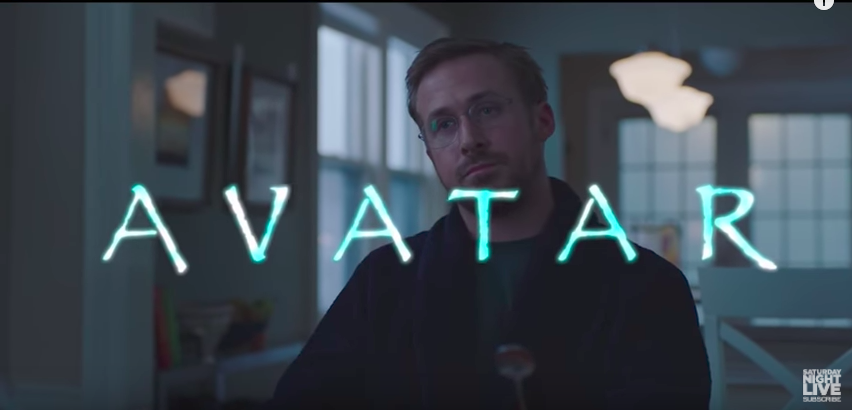
During the 43rd season premiere of Saturday Night Live, host Ryan Gosling starred in a hilarious sketch about Papyrus.


View this video on YouTube
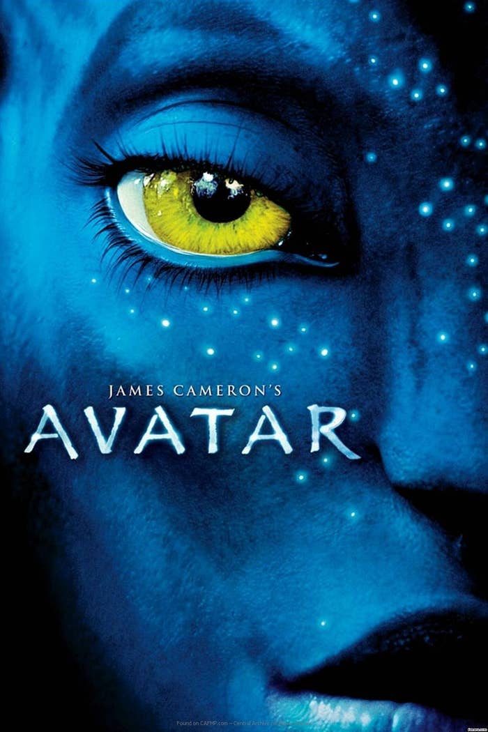
No, not the beloved stationery store, but the font. Particularly, its use in the film Avatar.
People — graphic designers, in particular — LOVED the sketch and found it insanely relatable because they, too, hate the overused font.

Every marketing professional or graphic designer just died tonight 😂😂😂 #Papyrus #SNL (I felt like I got Rick rolled with that #ComicSans...)
😂😂😂.

I've never related more to an #SNL sketch than I do to this AVATAR Papyrus one. I once refused to go into a restaurant cause of its font.
Just look at the pure rage on his face.

I have never identified with anything as much as this #SNL sketch where Ryan Gosling has a meltdown over Avatar’s u… https://t.co/tYXV7fHMWF
Well, in a recent interview with CBS News, the creator of Papyrus, Chris Costello, talked about the history of the font and shared his thoughts on the hilarious sketch.
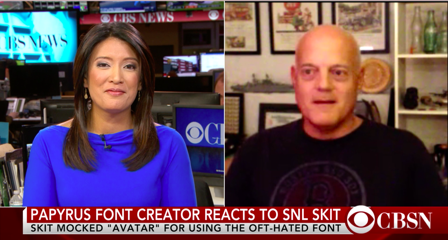
"I really think — and, again, if I could take this time to apologize to my brother and sister graphic designers — I'm a graphic designer as well, I'm an illustrator ... I believe it's a well-designed font, it's well thought-out."
I designed the font when I was 23 years old. I was right out of college ... I was just kind of just struggling with some things, different life issues. I was studying the Bible, I was looking for God, and this font came to mind — this idea of thinking about the biblical times and Egypt and the Middle East. I just started scribbling this alphabet while I was at work, and it kind of looked pretty cool.
But Chris — who, years ago, sold the font for a mere $750 — admitted, "It was not my intent to have it used for everything...it's way overused."
Welp, there you have it!
