
Warning: Despite the designer's best intentions, some of these are a little NSFW. Proceed with caution.
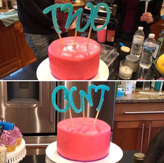
1. This birthday cake reveals an entirely different message when looked at from behind.
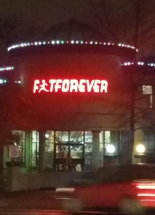
2. The designer of this gym sign probably should have made the man in the logo look more like an "i".
3. Life lesson: It's really hard to make people look like letters of the alphabet.

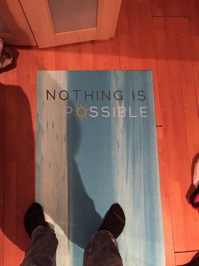
4. This is why it's important that all of your fonts are clearly visible.
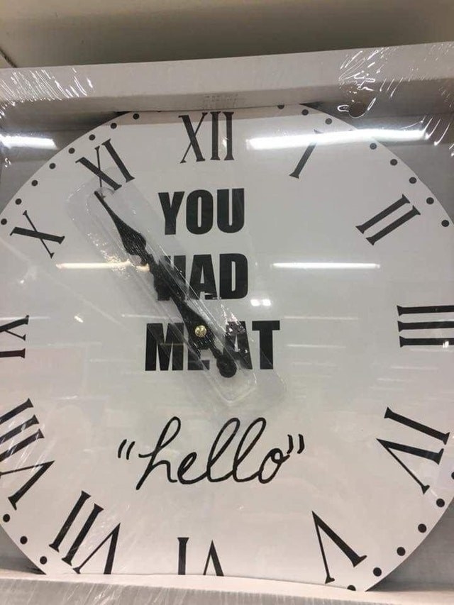
5. "You had meat hello".
6. If this is intentional, I have nothing but respect for the honesty in this team name.

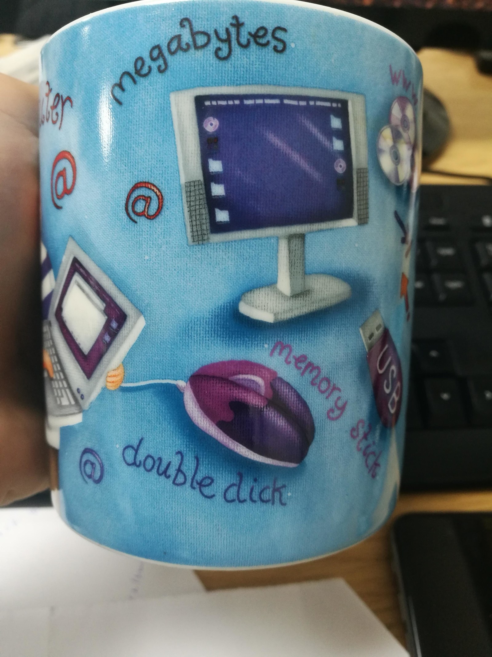
7. Wait, double what???
8. Fridays in this office seem a little unpleasant.

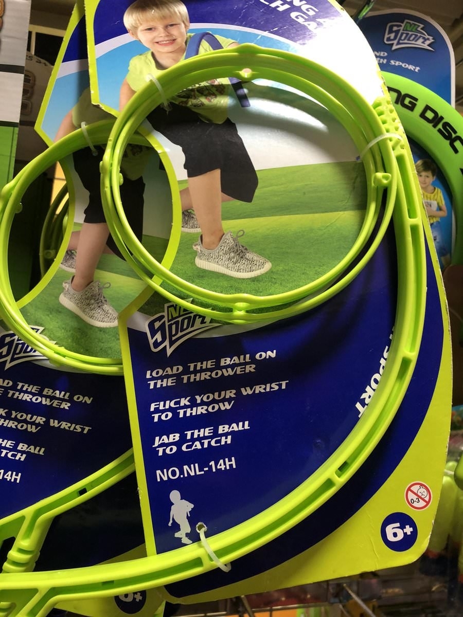
9. Apparently this is supposed to read "trapping a fairy". Yeah…

10. This toy is anything but child friendly.

11. And whoever chose the title font on this homework clearly hates children.

12. Curt. His name is Curt.

13. Some logos should never be written in cursive, otherwise you can end up with something like this.
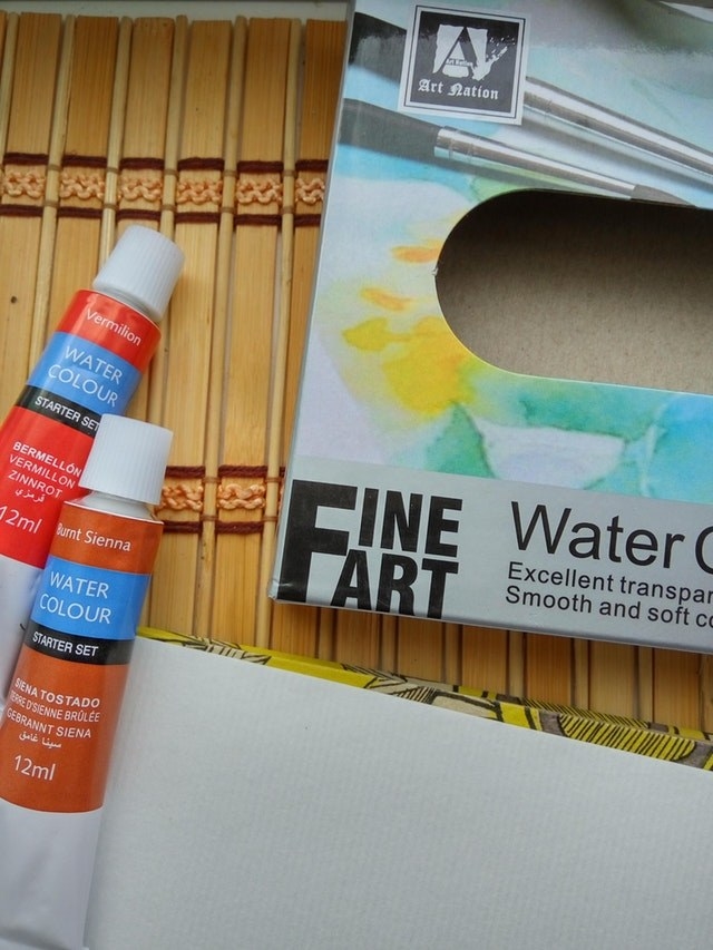
14. Anyone fancy doing some fine fart?
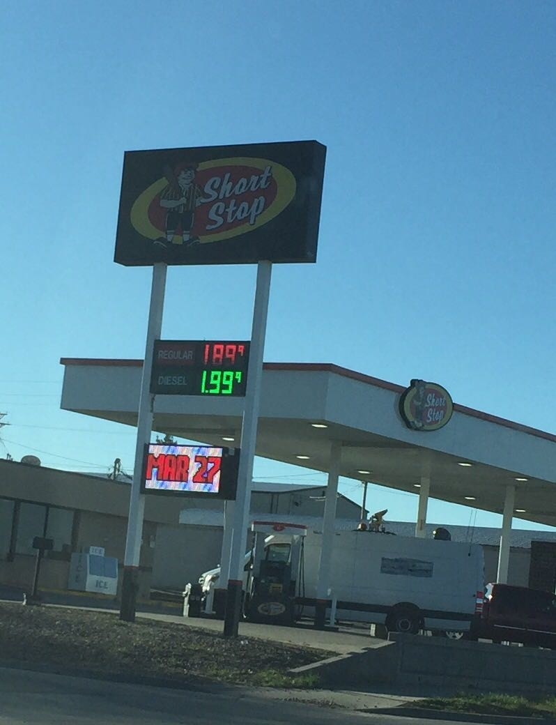
15. You can keep your $5.

16. And finally…
