
The poster for the Magic Mike sequel dropped last night, bringing mass hysteria and delighted choruses of "yaaaaaassssssss!" across the internet. The IMDb synopsis of the movie is a little bland ("The continuing story of male stripper, Magic Mike") so we broke the poster down to its key elements. Drink your fill.

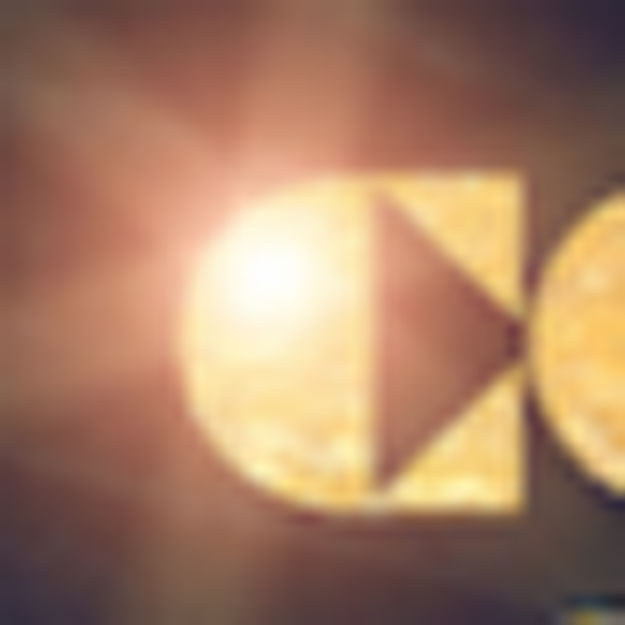
1. "MMXXL"
Technically, it stands for Magic Mike XXL, but by abbreviating this rather unwieldy title, "Chanimal" does two things: 1) he makes it fit (heh), and 2) he makes it take on the implied classiness of Roman numerals (there is no such number as MMXXL, by the way). Add to that the fact that it's written in gold blocky caps, and the message is clear: This is world-class stripping, and you might learn something while he's rotating his crotch in your face.
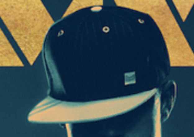
2. The baseball cap
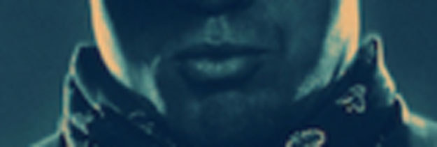
3. The lips
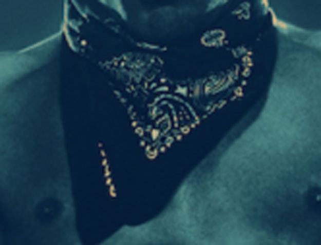
4. The bandana
5. The biceps
No one ever thinks they're into muscles, until confronted by nicely shaped ones. Shoutout to nice muscles. Full points awarded.
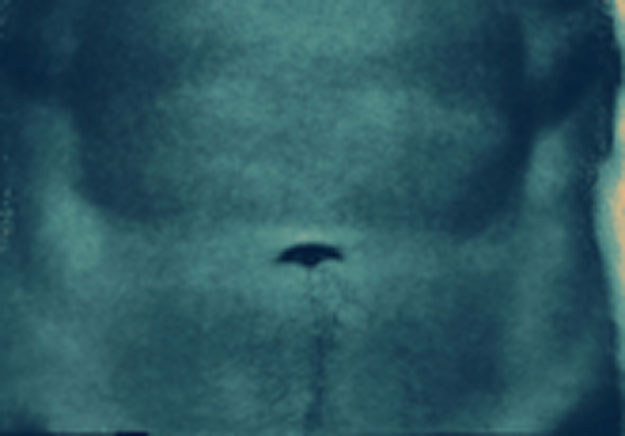
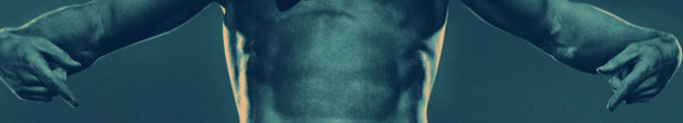
6. The abs
7. The pointing
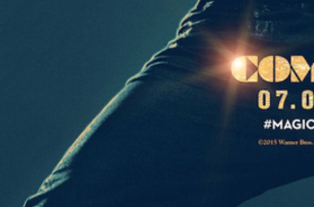
8. The jeans
Mike is not a fancy man. He doesn't play games. He just wants to strip, and make you happy – and no one needs a tux for that. Remember: Real Men Wear Jeans, Especially When They're Stripping.
9. The thighs inside the jeans...
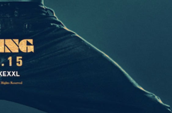
...are perfect. Next question.
10. "Coming"
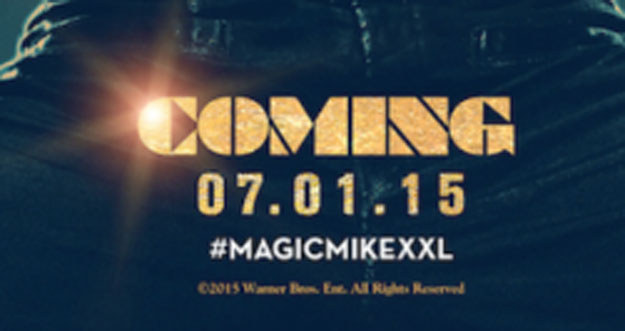
11. The gleam on the C of "Coming"
12. The stance
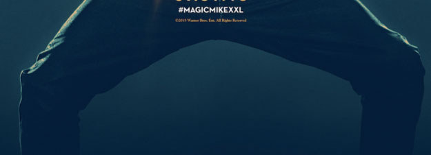
13. The fabric bunching
The bunching of his jeans about his knees suggests this dude cares about style. Bet he creates a moodboard for each of his choreographed routines, just to make sure he stays true to his vision. He's an artist, and the importance of fabric drape is never to be underestimated.
14. The legs...
15. The colour scheme
Dark green of varying opacities? With accents of gold? I call this filter "Liberace Lite". This is important, eloquent, moody shit. ART.