

20. Watford
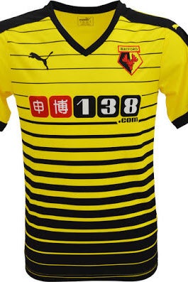
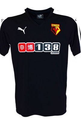
Yellow kits are normally great, which makes it even sadder what Puma have done to Watford's this season. It looks like it started running out of ink when it got to the bottom. The away kit is fine, but dull.
Rating: 21/100
19. Sunderland
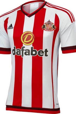
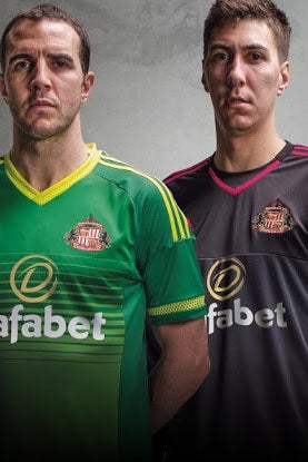
A solid home kit, but the worst of a good set of red and white striped numbers this season. The away shirt looks like a training top, and the gold on the sponsor looks tacky.
Rating: 39/100
18. Bournemouth


The home shirt is kind of ruined by having the JD Sports logo slapped all over it, while the away strip still looks a little "Football League". You don't see red and black stripes often in the Premier League though, so at least it's something a little different.
Rating: 41/100

17. Norwich City
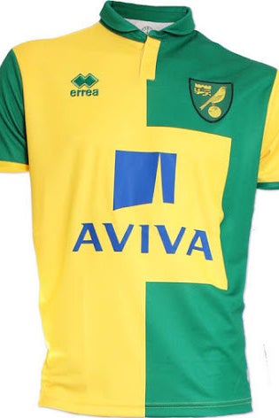
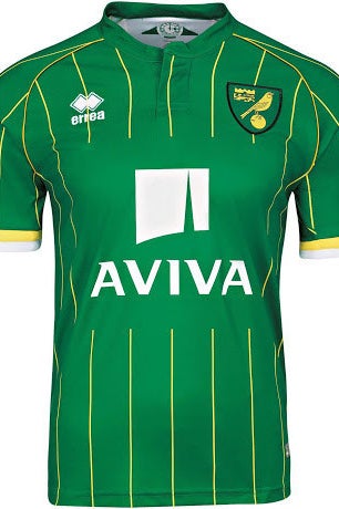
It's hard to avoid the fact that the massive Aviva sponsor basically takes up the entire front of the shirt. This effectively ruins what would otherwise be a nice half and half home shirt and messes up the pinstripes on the away kit too.
Rating: 50/100
16. Manchester United


This is another nice strip completely ruined by an awful, awful sponsor. It might be one of the ugliest of the Premier League era. The white on the sleeves is a nice touch on the home shirt, but what's doing with the double hems? Still not used to seeing Adidas on a United shirt either.
Rating: 54/100
15. Swansea
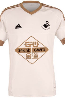
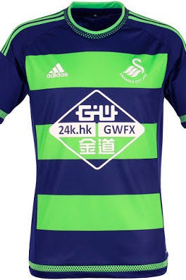
Gold often looks a bit cheap on football kits, but it's not too bad on this Swansea home kit. The garish away shirt kind of works too. It might even be great, we haven't decided yet. What the fuck is that sponsor though?
Rating: 56/100
14. Tottenham Hotspur
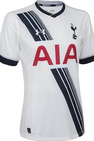

Sashes are good, but Tottenham's home kit looks a little too much like it's been run over by a bus. It's still quite nice though, and while the away strip's colours are good, it looks more like something your fitness-obsessed uncle would go running in.
Rating: 59/100
13. Liverpool
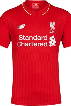
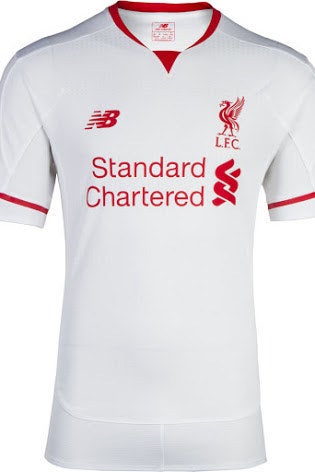
These are both really good kits – simple an effective, which is a nice change from some of the fucking atrocious efforts Warrior produced. The away kit especially is very smart, but points are lost from there not really being anything stand-out on either design.
Rating: 65/100
12. Everton

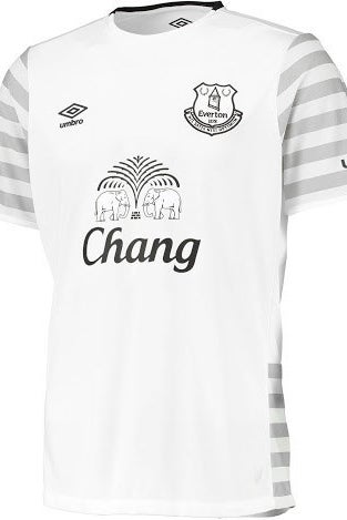
The simple home shirt is spiced up a bit with the white collar, while the subtle grey hoops on the away kit make it interesting without falling into the common trap of becoming garish or over the top. The only downside is that on the long sleeved away shirt, the arms look a bit like an elephant's trunk.
Rating: 67/100
11. Aston Villa
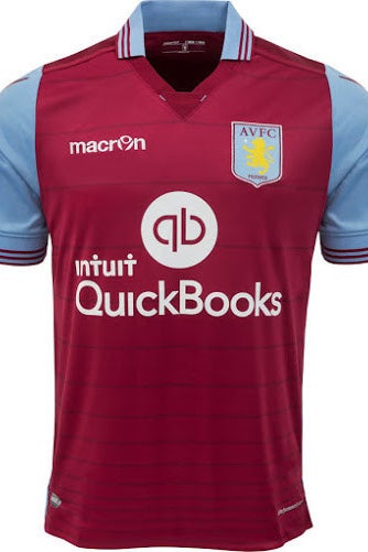
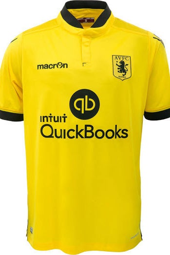
These might be the best Villa kits in ages. After Watford's effort, it's nice that we have a good yellow shirt in the league, while the home kit has a good collar and the faint hoops set it off perfectly.
Rating: 69/100
10. Southampton

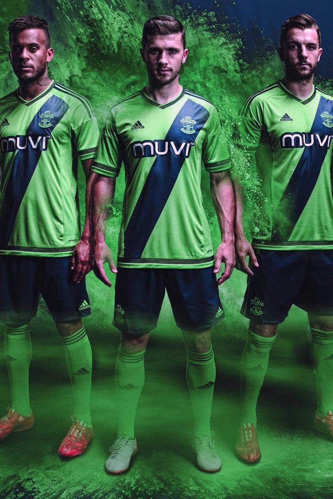
This is one of the best home shirts in the league – hopefully Southampton never go back to the pinstriped travesty of a couple of seasons ago. The away effort is good too, with a nice sash, but Stoke's superior versions of the same colour schemes knock Saints down a tad.
Rating: 71/100
9. Newcastle United
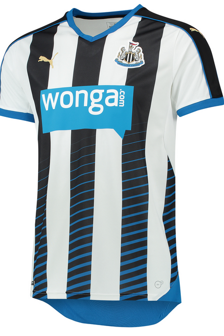

The weird blue slashes on the home shirt are actually a pretty nice addition, and don't ruin the traditional black and white stripes. The away kit is a little goalkeeper-esque, but it's not bad at all.
Rating: 72/100
8. Arsenal


The gold trim and button-down collar really works on this home shirt, it just looks so slick and professional. The away kit isn't quite as good though, even if it does bring back memories of a classic from the JVC era.
Rating: 73/100
7. Leicester City


Leicester are showing some real maturity in their second season back in the Premier League (in terms of their kits, anyway). The away shirt uses the same pattern as Arsenal's, but it works far better in black, while the simple home shirt is a great shade of blue. Also: best looking sponsor in the league?
Rating: 75/100
6. Crystal Palace
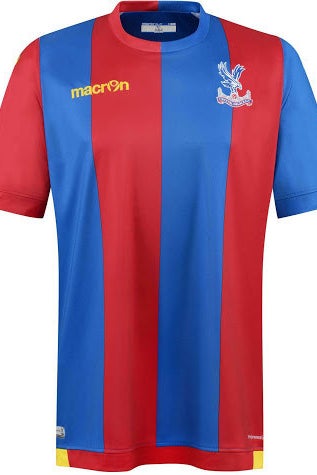

Unfortunately the Mansion sponsor has now been slapped on these shirts, so they're not quite as glorious as they look here, but even so, that away top is pretty much perfect, and the subtle yellow trim on the home shirt is A+ too.
Rating: 77/100
5. Stoke City

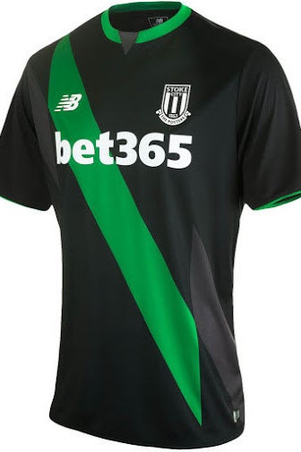
New Balance have produced some really solid kits this season, but Stoke's is the best of the lot. The home kit is traditional while still looking sleek and modern, while the away shirt is a complete triumph.
Rating: 79/100

4. Chelsea
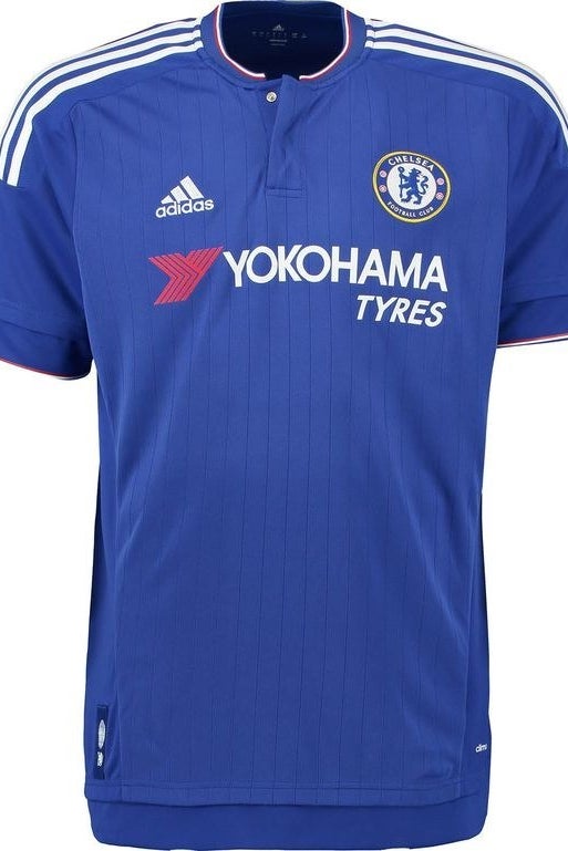
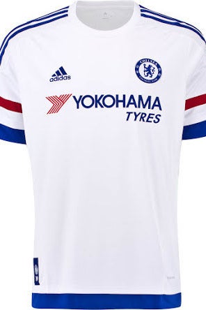
The slightest drop of red really sets off this pinstriped Chelsea home shirt, but it's made great by the button down collar. The away shirt on the other hand is probably the best in the division – you'd wear that anywhere.
Rating: 82/100
3. Manchester City
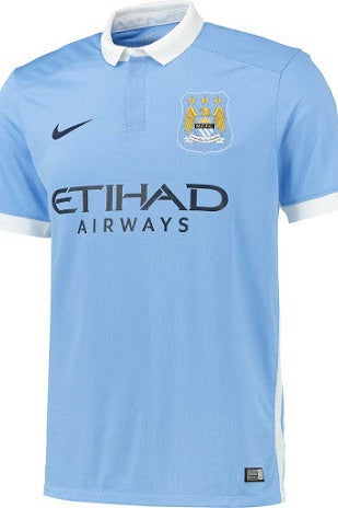

Man City's sky blue home kits are often a bit dull, but this one looks really classy – the collar and sleeves really make it. The away shirt has an actual blue moon on the sleeves too, which fans will love, and gives it a stand-out feature without looking tacky.
Rating: 84/100
2. West Ham
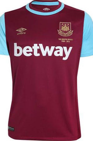
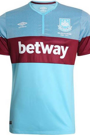
This is such a great pair of West Ham kits – perfect to mark their final season at Upton Park (which is commemorated below the crest). The home shirt's collar is excellent, while the away shirt is original while still sticking to the traditional claret and blue.
Rating: 85/100
1. West Bromwich Albion


And the winners of the 2015/16 Premier League are... West Bromwich Albion! It's the colours that really make these kits – the shades of blue and red are both lovely, and the calligraphy-style logo on the away shirt makes it extremely wearable. However, if they finish this high in the league itself, we will gladly eat both kits.
Rating: 90/100