
British elections are steeped in tradition. And one tradition is the publication of election leaflets stuffed with really, really dodgy graphs.
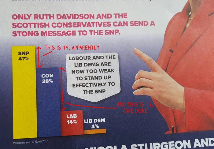
1. In which the Scottish Tories suggest that 14 is bigger than 19.
Here's what it SHOULD look like!

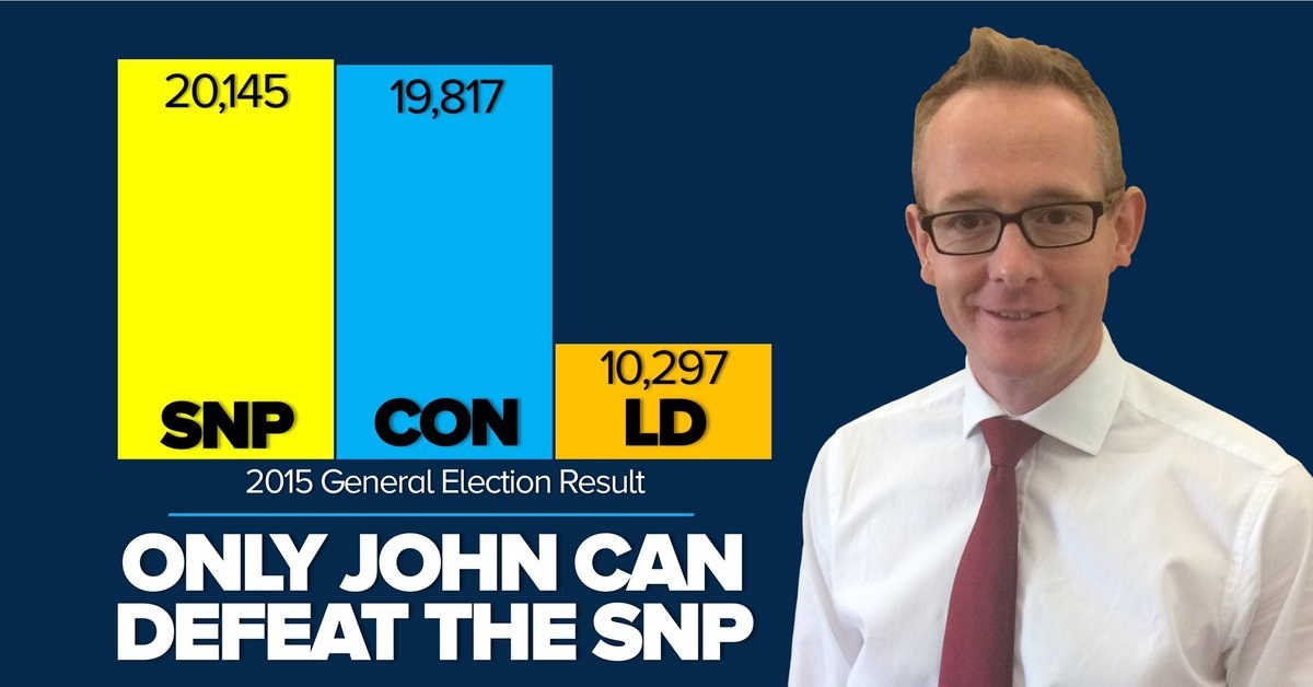
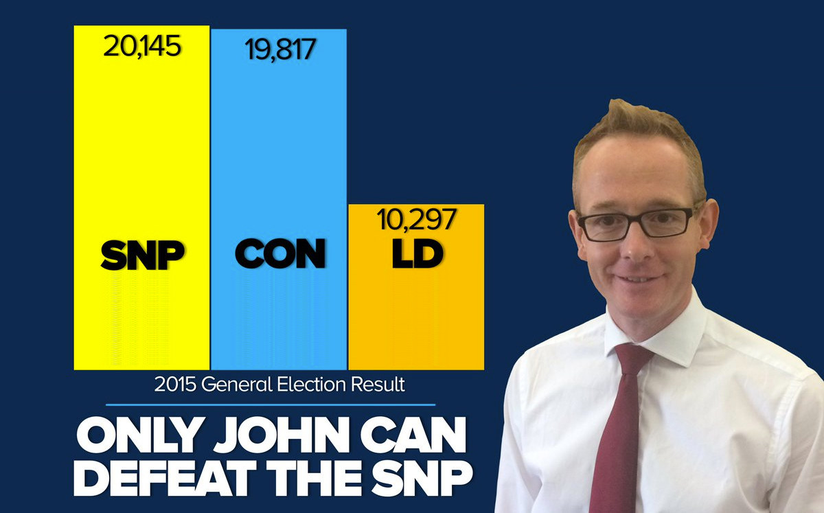
2. Another, in which they suggest that 10,000 is a third of 19,000.
Fixed that for ya, John.
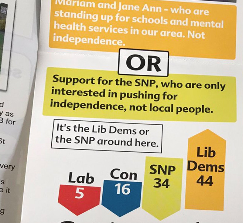
3. According to the Lib Dems, 2.8 is about three times the size of 12.5!
Fixed this one too:
4. And, apparently, 23 is about seven times bigger than 7.
Here's what it should look like.
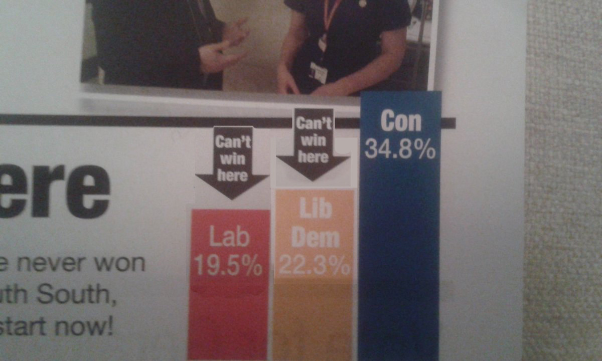
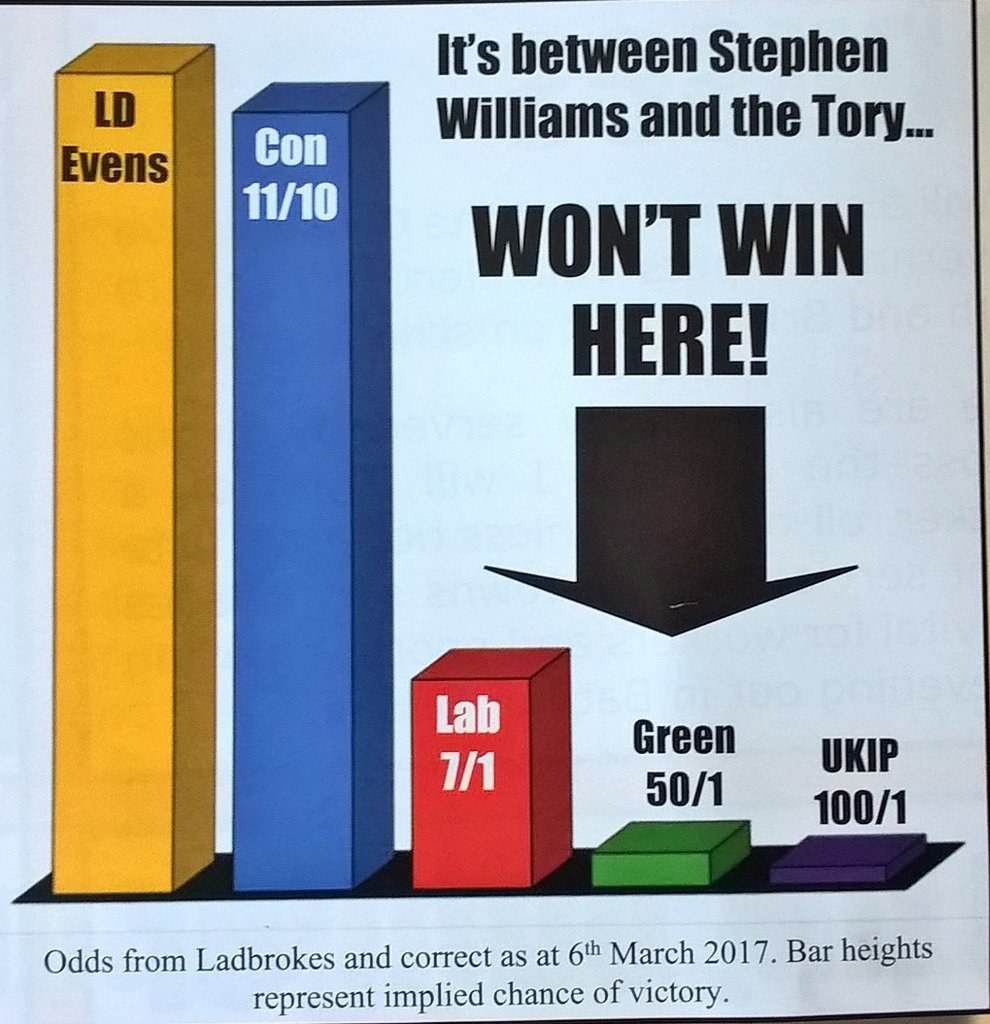
5. Here are some Lib Dem numbers that tell you nothing at all.
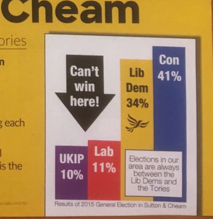
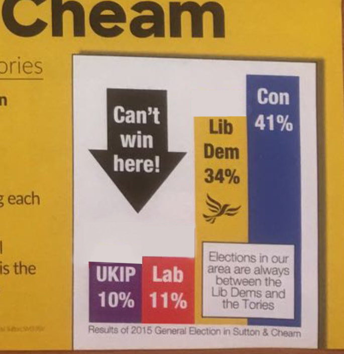
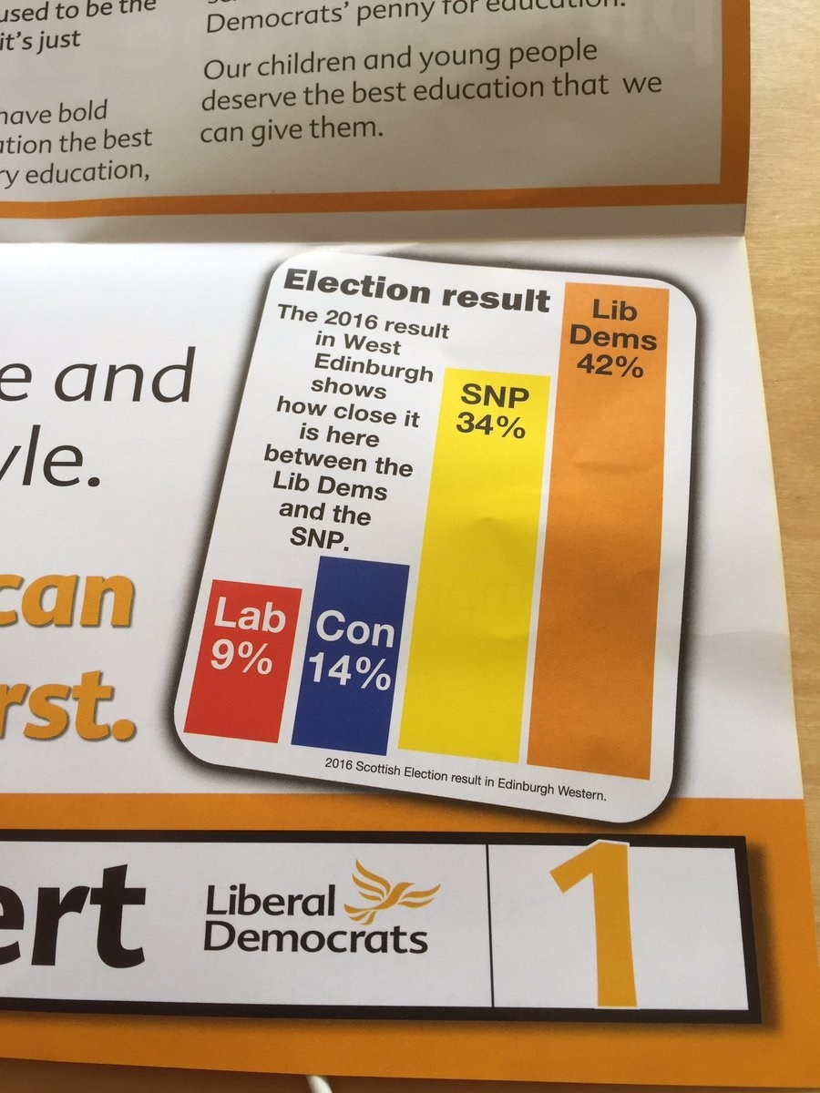
6. In which the Lib Dems seem to think 5 is about a third of 8.
7. Honestly no idea what this chart means.
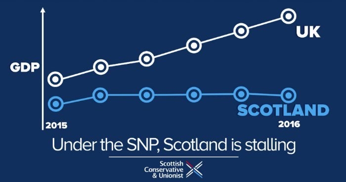
Here's a more comprehensible version.
Showing quarterly GDP growth for Scotland and the entire UK, from January 2013 to December 2016. (100 = 2013 average quarterly GDP.)
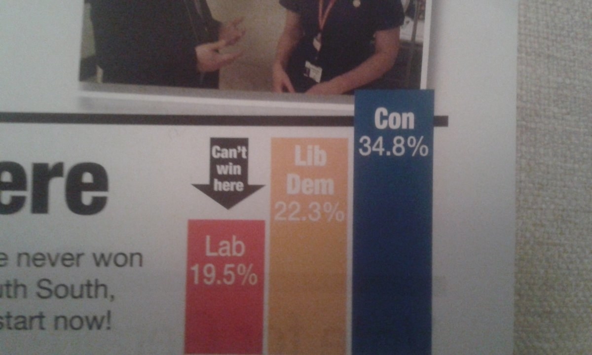
8. When the polls don't say what you want, why not ignore them?
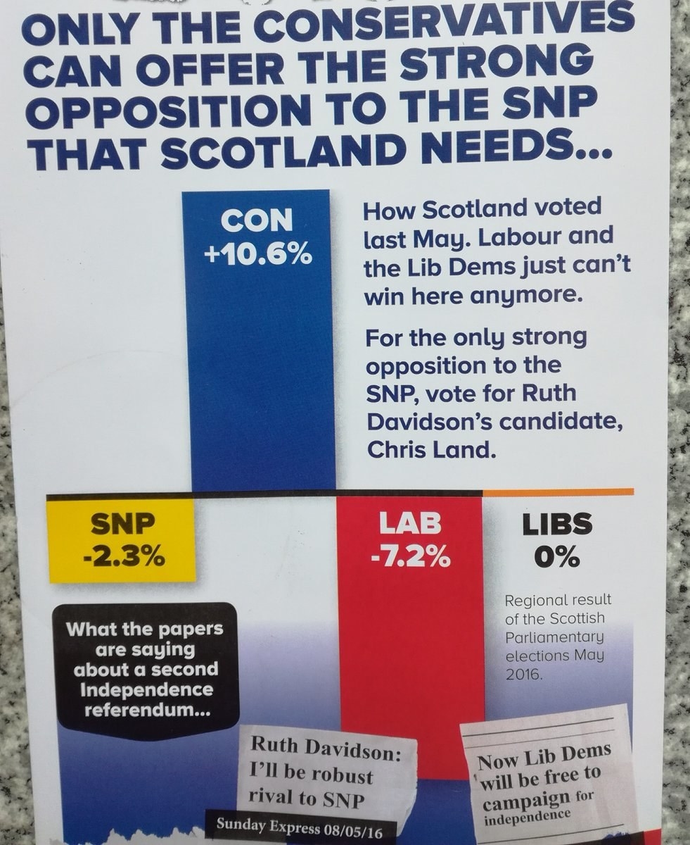
9. And, finally, the Scottish Tories printing an entirely meaningless chart that still manages to be wrong.
CORRECTION
Our version of Chart Number 7 now goes back to 2013 and has a Y-axis at 90. An earlier version of this piece had a chart which was only fractionally less misleading than Dean Lockhart's original.