

Every year, Pantone's Color Institute chooses a "Color of the Year" as a way of trend forecasting and capturing the global zeitgeist.
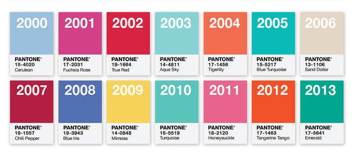
Since 2000, Pantone's chosen a single color. Last year's selection was earthy, moody Marsala.
Today, for the first time ever, Pantone announced not one, but two colors for 2016: Rose Quartz and Serenity.
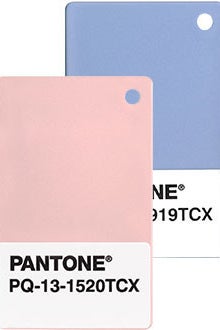
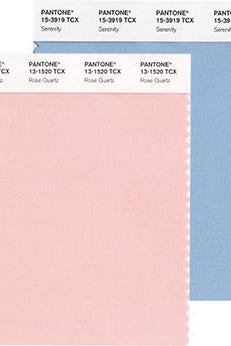
AKA Pantone 13-1520 & Pantone 15-3919, respectively. Say hi, Pantone 13-1520 & Pantone 15-3919!
Pantone said in the official release that Rose Quartz is "a persuasive yet gentle tone that conveys compassion and a sense of composure." Meanwhile, "Serenity is weightless and airy, like the expanse of the blue sky above us, bringing feelings of respite and relaxation even in turbulent times."
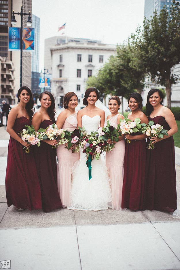
You may be thinking, "Hey, those look like baby colors," and you're not totally wrong. One of the reasons Pantone picked two colors is to challenge traditional associations between color and gender.
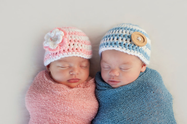
One could argue that choosing just Rose Quartz would better achieve that goal because it would send a message that pink is for everyone, not just girls, but... hey, what do we know?

We know at least one person who is definitely into this:
