This post has not been vetted or endorsed by BuzzFeed's editorial staff. BuzzFeed Community is a place where anyone can create a post or quiz. Try making your own!

If you're like most people, your PowerPoint presentations still look something like this...

Don't worry though. We're here to change that. Today, we're going to teach you...

Before you begin making your presentation, you'll want to select your Color Palette.

So... many... colors...
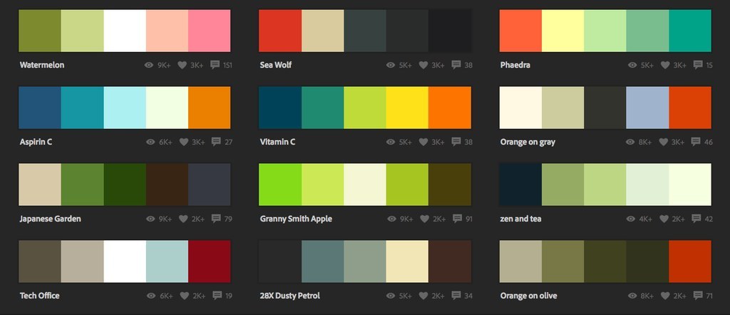
Once you open it, you'll find a little box called "HEX." Take note of this number!

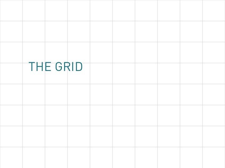
Now that you've selected your colors, it's time to pick your backgrounds!

The Pale Gray!

The Pale Gray-dient

The Popping Solid

The Grid
The Pattern

Now that we're done with the background, let's go to...

This is the key:

You can combine a regular weight and a bold weight to come up with a cool effect, like this!

So, now that we have the text, where do we put it?

Consider having the title a bit left of center instead. It makes for a nice touch!

You can try having your text start on the top left corner...

...or have it end on the bottom right one.

You can have all your text on the left side (no pictures on the right, please!)

You can also use a brightly colored bar to highlight certain texts!

Using numbers? Try to get them to cover 70% of the screen.

So, you're probably wondering how to use images... Well, here are a few suggestions.

Try combining shapes and images.

You can also put a black rectangle over an image and lessen the transparency.

If you have a lot of text, try putting an entire rectangle from top to bottom.

It's a bit difficult to show animations, but here's one that you can use...

Okay, strictly speaking, this isn't an "animation," but it kind of looks like one.

Lastly, we'll talk about branding.

A small, simple logo on the lower left always adds a good touch!

You can also lower the transparency for a nice-looking watermark.

Try a dark bar too. You can add text there too!

And that's it!

Share This Article