Melbourne and Sydney are in the grip of a property boom not seen since the 1880s.
The bubble is here. The bubble is real.
In the below graph, looking at 1999 onwards, you can see Melbourne and Sydney are in the grips of a long, sustained property boom.
This is the result of good economic conditions. But it is also due to incentives in our system for housing investment. There is a reason the current boom took-off when former Prime Minister John Howard introduced generous tax concessions for money earned selling property in 1999.
The only similar period in history was the property boom of the 1880s. The crash that followed was the worst in Australian history. It upended our political system and was one of the key events that led to federation.
Sydney and Melbourne Real Median House Prices

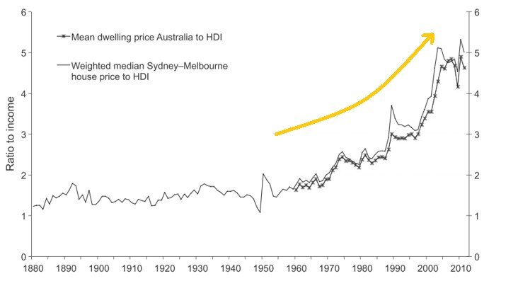
We're spending more of our income on houses than ever before.
The price-to-income ratio shows how much a median house costs compared to average household income. It's been going up, for forever.
Duh. They didn't have credit cards in the 1880s and not much access to mortgages.
Still, the recent increases indicate how much wealth is tied into housing and how reliant Australians are on the ongoing health of the property market.
Ratios of housing prices to household income
This economist gave us the preconditions to a bubble. All are currently being met
Don't believe the data? Well, howabout this guy?


Share This Article