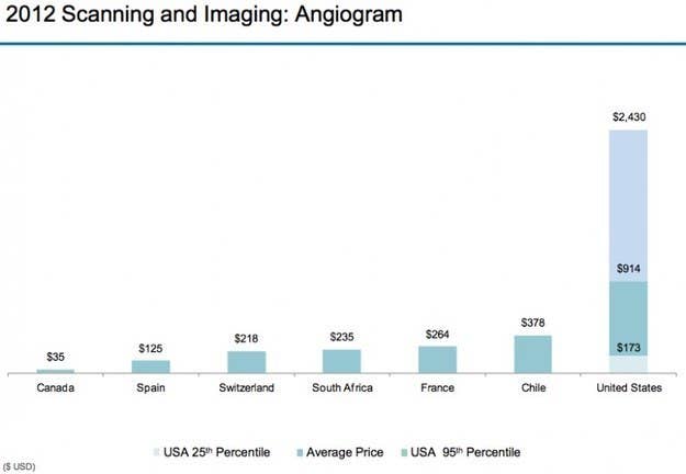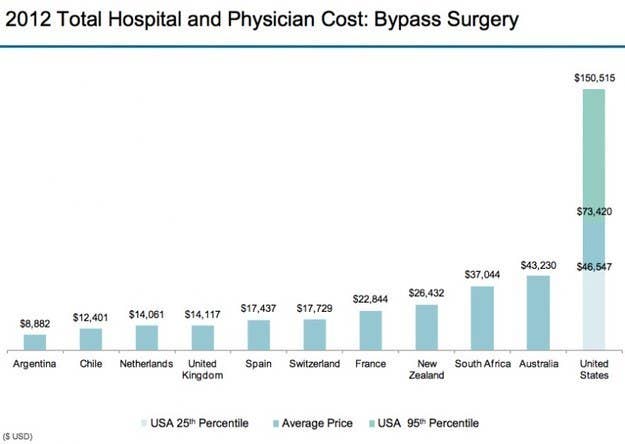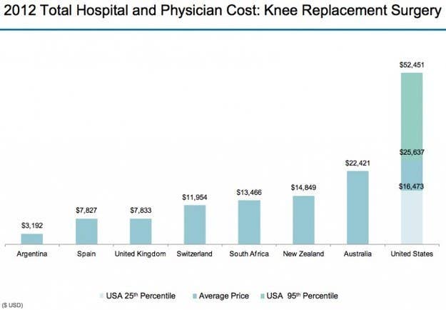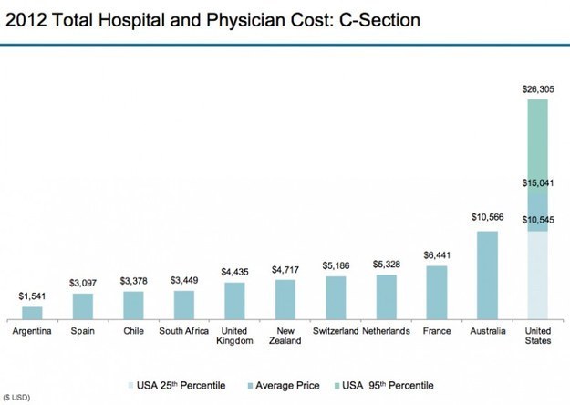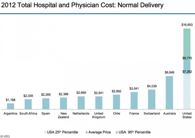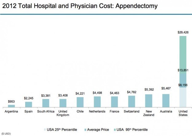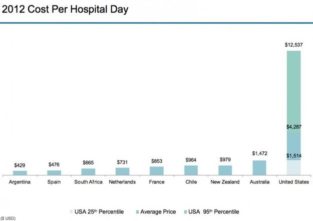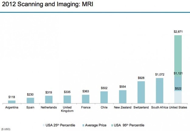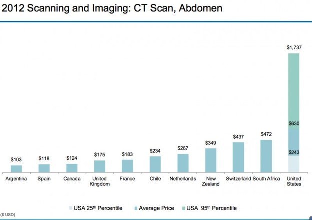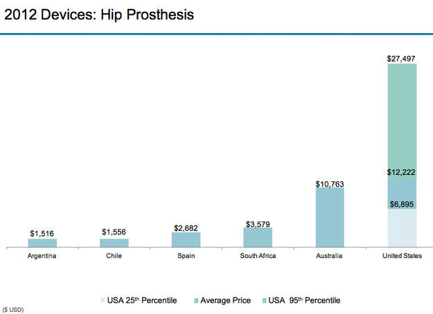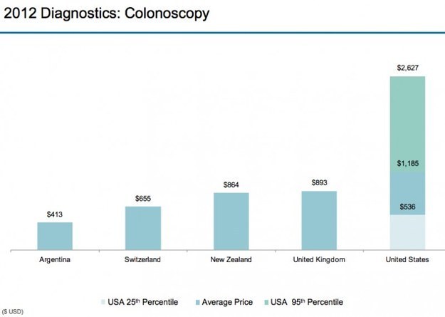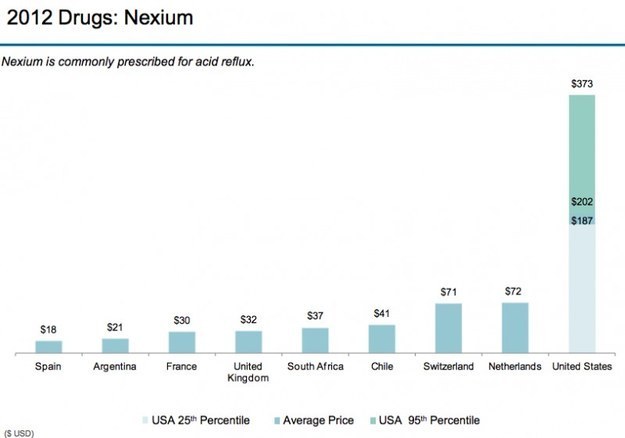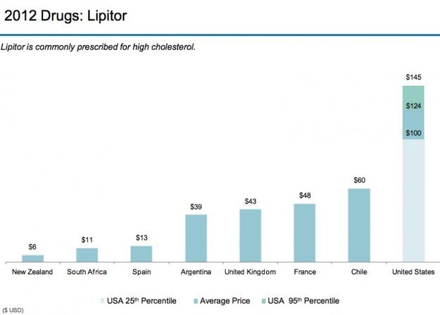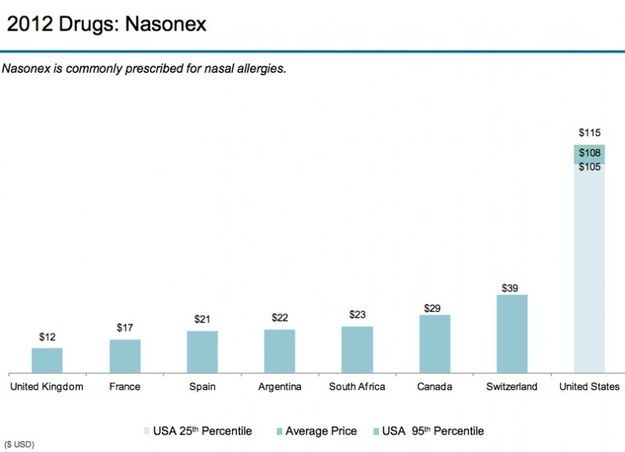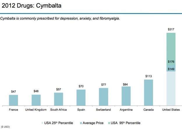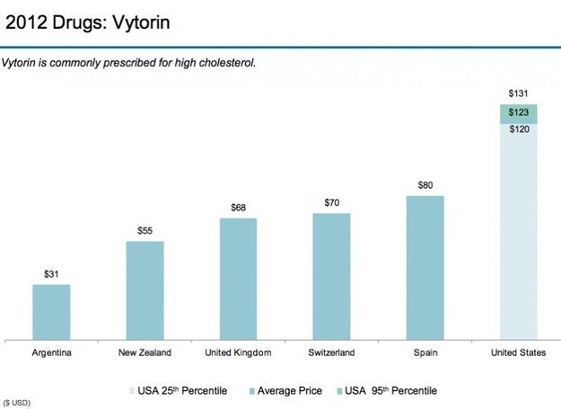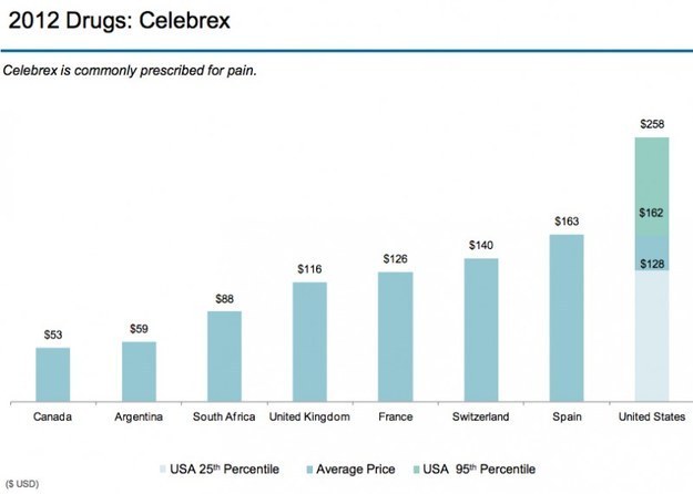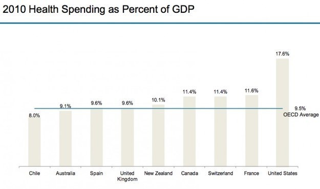


By Ezra Klein March 26, 2013 Every year, the International Federation of Health Plans — a global insurance trade association that includes more than 100 insurers in 25 countries — releases survey data showing the prices that insurers are actually paying for different drugs, devices, and medical services in different countries. And every year, the data is shocking. The IFHP just released the data for 2012. And yes, once again, the numbers are shocking. This is the fundamental fact of American health care: We pay much, much more than other countries do for the exact same things. For a detailed explanation of why, see this article. But this post isn't about the why. It's about the prices, and the graphs. One note: Prices in the United States are expressed as a range. There's a reason for that. In other countries, prices are set centrally and most everyone, no matter their region or insurance arrangement, pays pretty close to the same amount. In the United States, each insurer negotiates its own prices, and different insurers end up paying wildly different amounts. That's what Steven Brill's explosive article was about, and it's why you see U.S. prices expressed as a range rather than a single number. http://www.washingtonpost.com/blogs/wonkblog/wp/2013/03/26/21-graphs-that-show-americas-health-care-prices-are-ludicrous/
