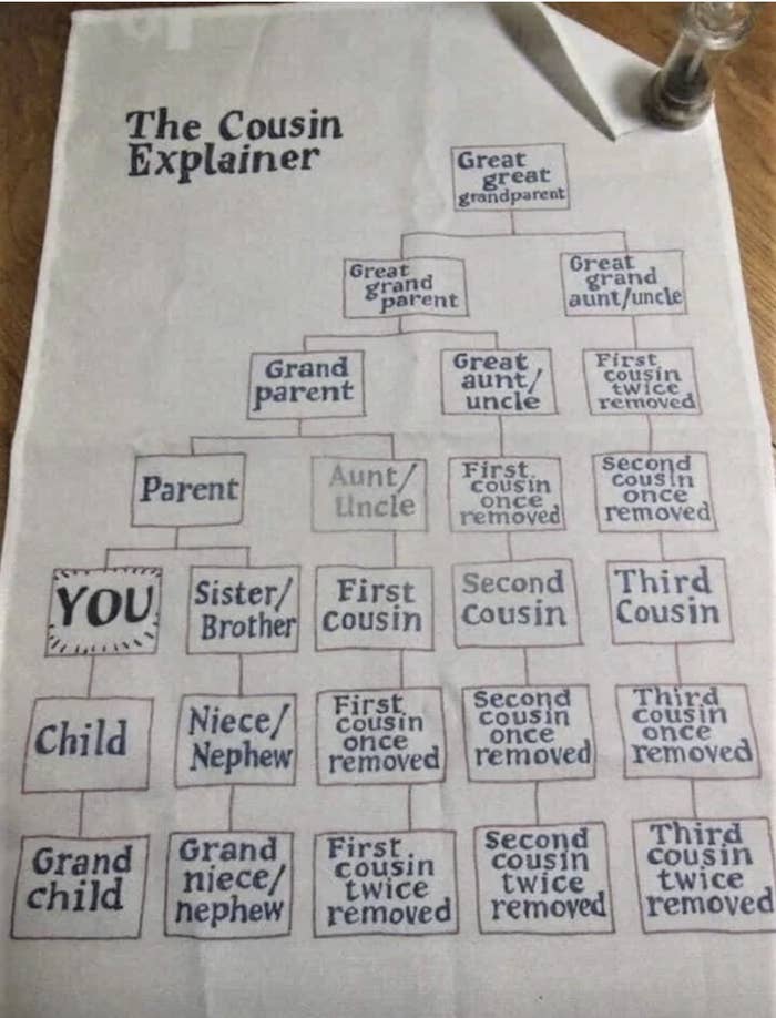
1.If you're being honest, you're probably a little foggy on the difference between a second cousin and a first cousin once removed. This napkin explains it all!
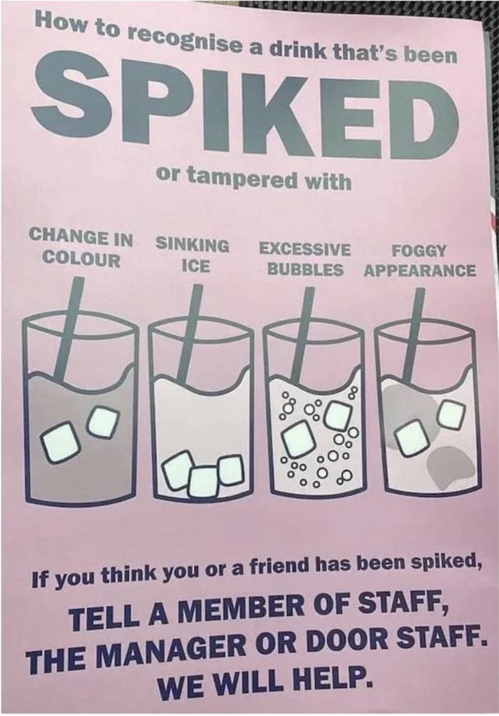
2.This important chart tells you how you can know when someone has spiked (or otherwise tampered with) your drink.
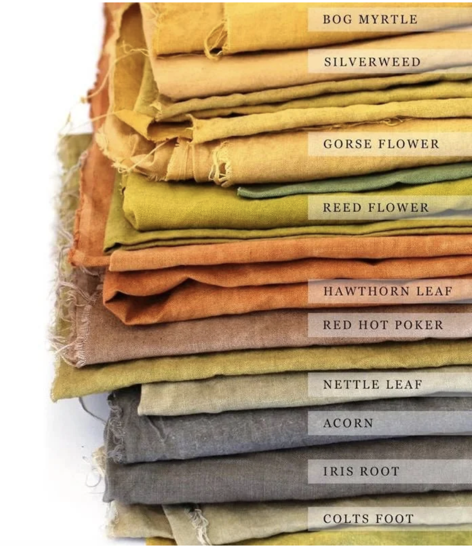
3.And this fascinating chart shows you the typical colors of clothes during the Middle Ages...and the natural dyes people used to create them!
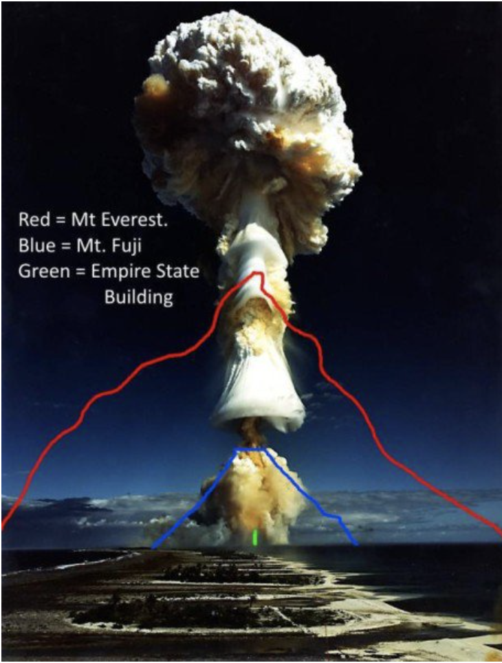
4.Nuclear mushroom clouds can be so much more staggeringly large than you likely realized.
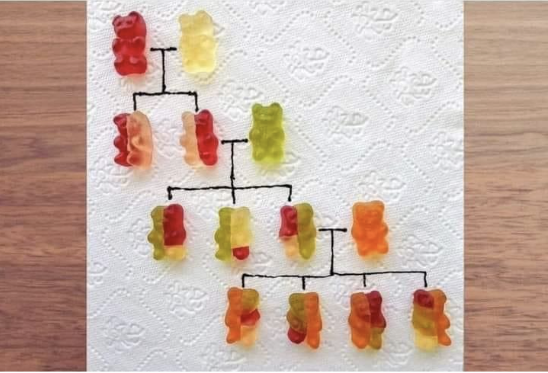
5.This ingenious image does a great job of explaining how genetics work...and making you crave gummy bears.
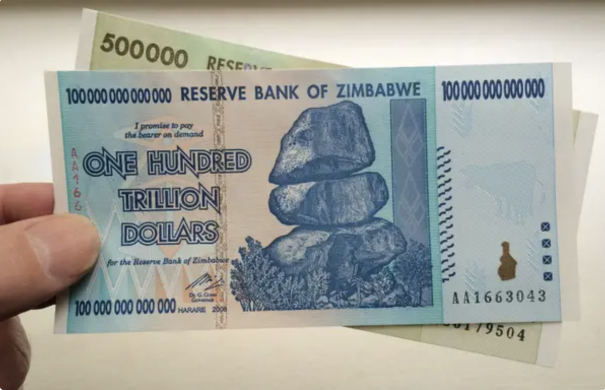
6.And this chart shows you just how unfathomably large a trillion dollars is.
Speaking of a trillion...this fact is wild. Hyperinflation hit Zimbabwe so heavily in 2009 (inflation literally reached 230,000,000% that year!!!) that the country introduced a 100 TRILLION dollar bill...which was worth about 40 US cents.
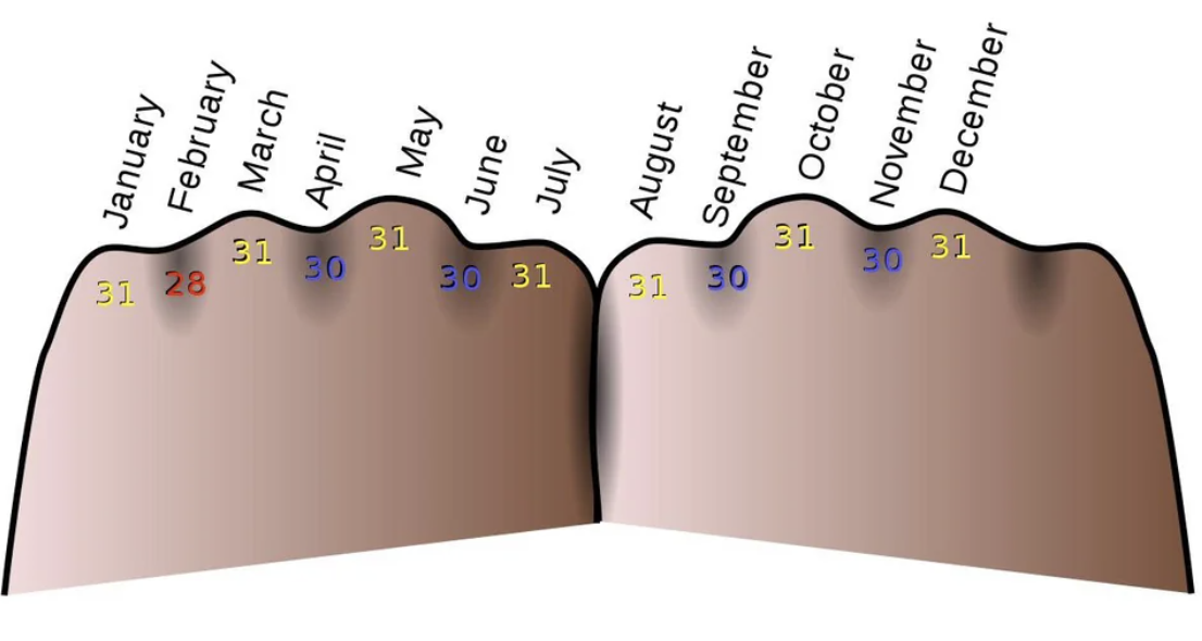
8.This chart shows a trick for remembering how many days are in each month (the "knuckles" months are the ones with 31 days).
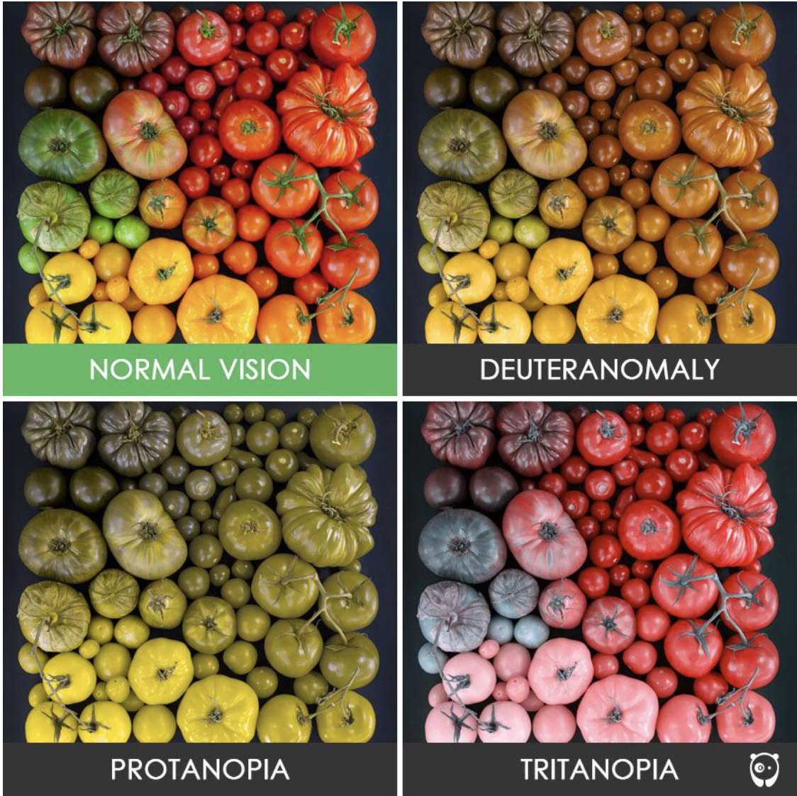
9.And being colorblind doesn't mean you see the world in black and white — it's that you have a narrower perception of color.
10.Speaking of eye sight, babies don't just pop out with fully developed vision. ... It's a gradual process.
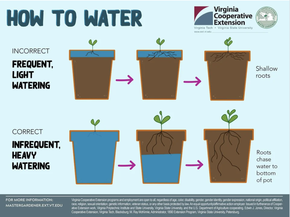
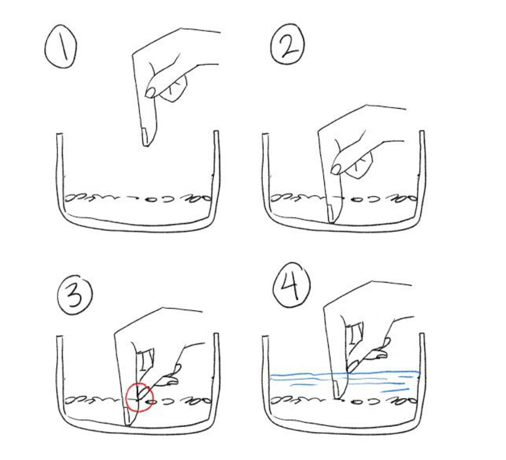
11.This chart explains how we've all been watering our plants the wrong way.
12.This incredible image shows just how much a cervix can dilate during childbirth.
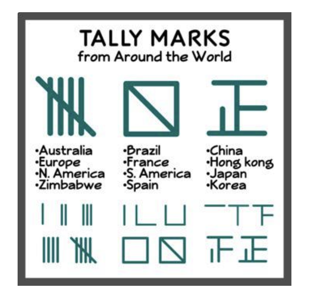
13.And this chart shows people draw tally marks differently depending on where they are in the world. Huh.
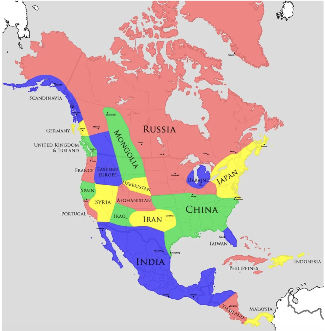
14.This US map chart explains that the American Southwest's climate is like the Middle East's, and Washington's is like England's!
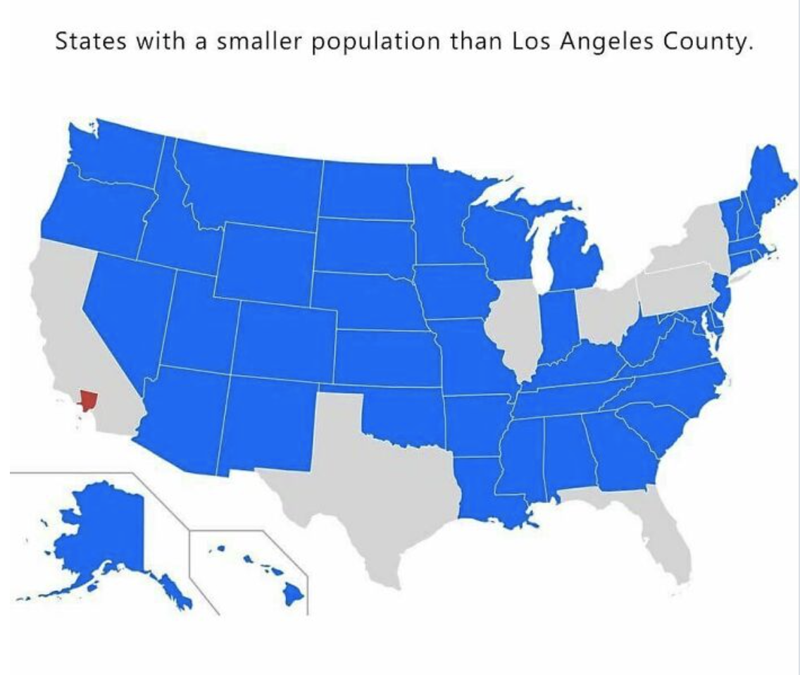
15.And Los Angeles County has a greater population than 40 actual states!
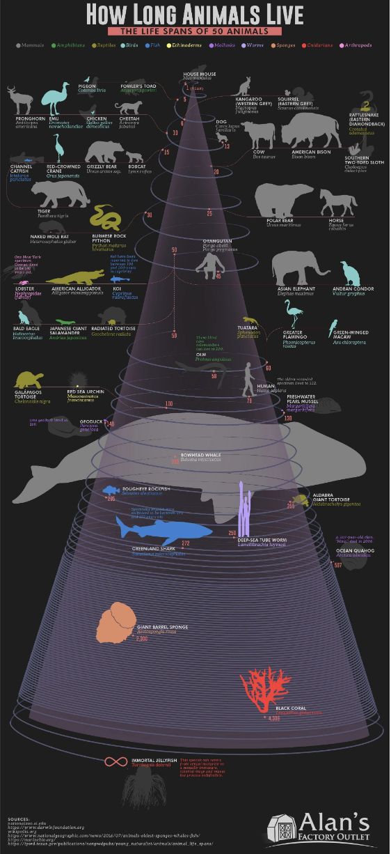
16.There's a type of jellyfish that's — wait for it — immortal. Known as the Immortal Jellyfish, the species (as the chart says) "can revert from sexual maturity to a sexually immature, colonial stage and repeat the process indefinitely."
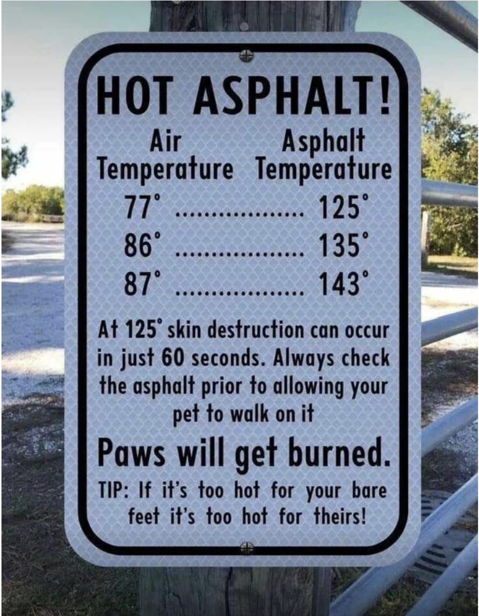
18.And, speaking of dogs, the asphalt your pup walks on is probably way hotter than you realized.
19.This chart shows how you can figure out what bug did you dirty just by looking at your bite.
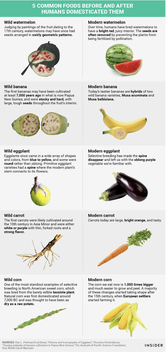
20.This chart explains fruit hasn't always been the same — modern watermelon, bananas, and carrots, for example, have been radically improved through domestication!
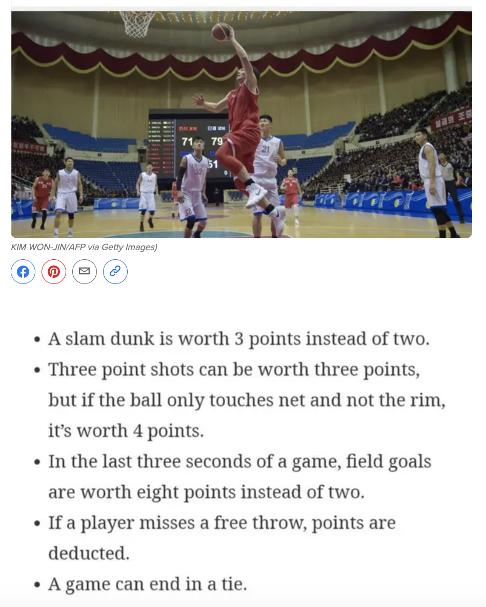
21.And, while things are pretty secretive in North Korea, it appears this wild fact is (or at least was) true — their professional basketball league has their own rules, including dunks being worth three points!
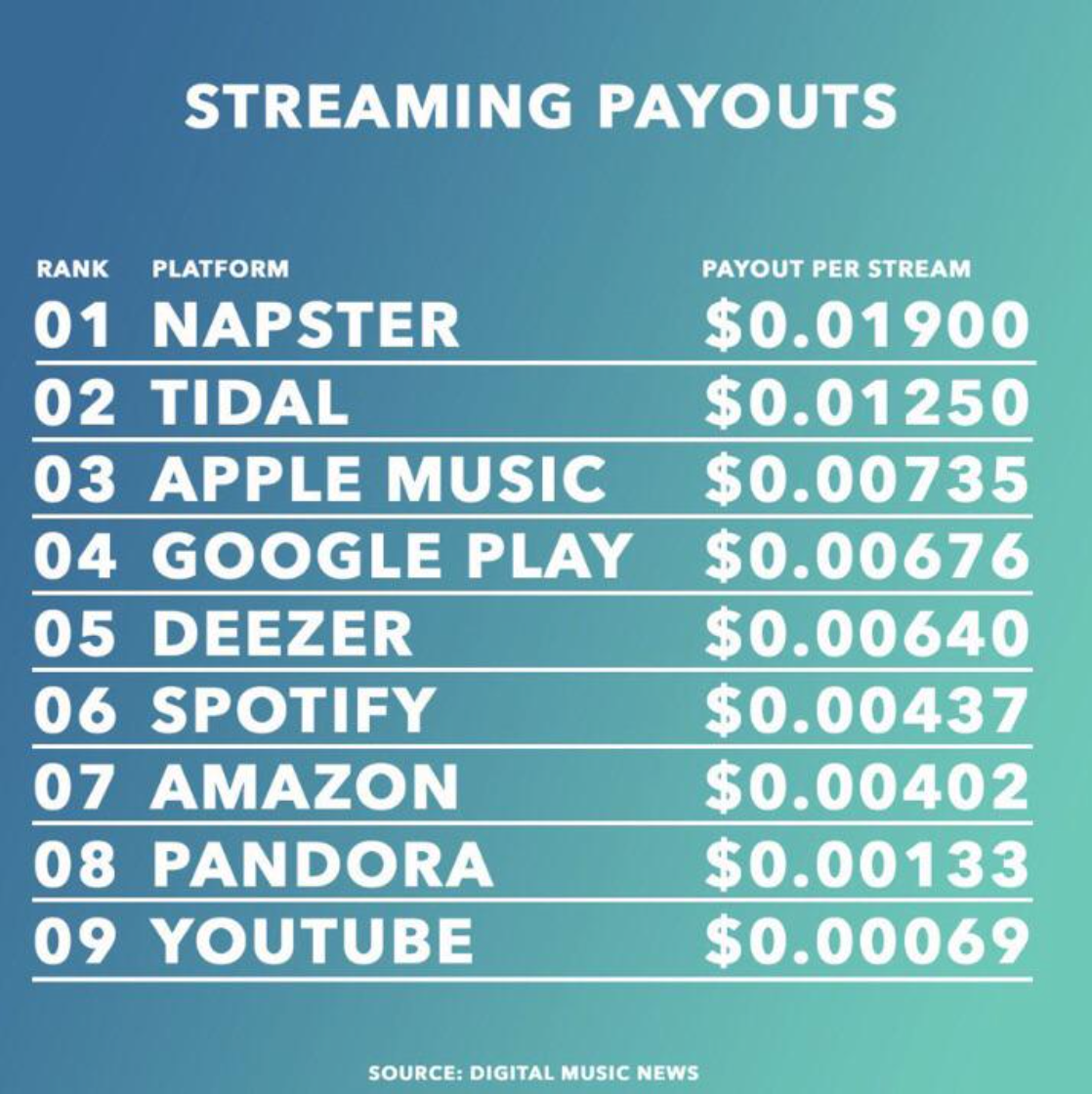
22.You've probably heard streaming makes it really hard for a musician to make a living, but this chart shows just how dire a situation it is!
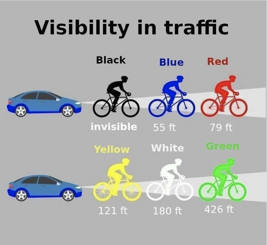
23.What you wear running or riding a bike at night makes a shockingly HUGE difference in how visible you are.
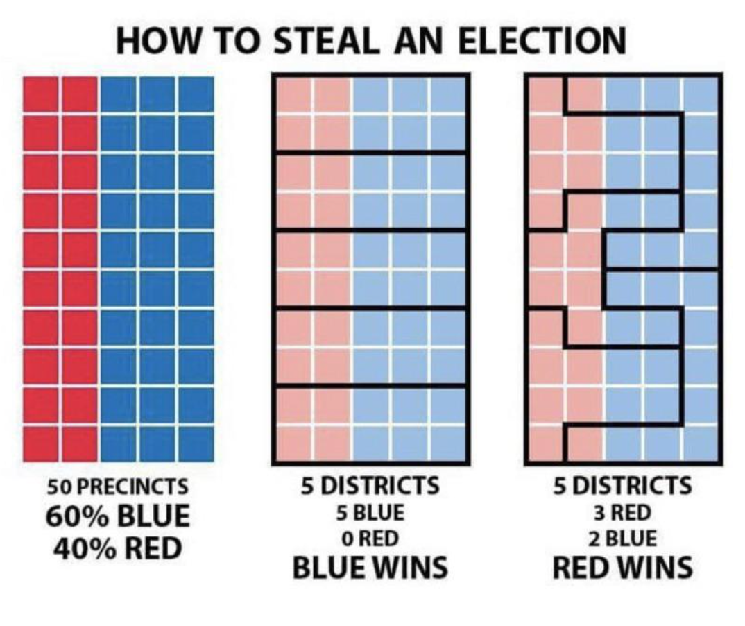
24.And this graphic explains how gerrymandering works in simple terms...so we can all understand how infuriating it is!
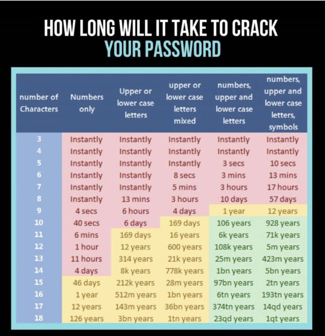
25.Hackers can crack a so-so password instantly, but a really strong one can take millions (yes, millions) of years to crack.
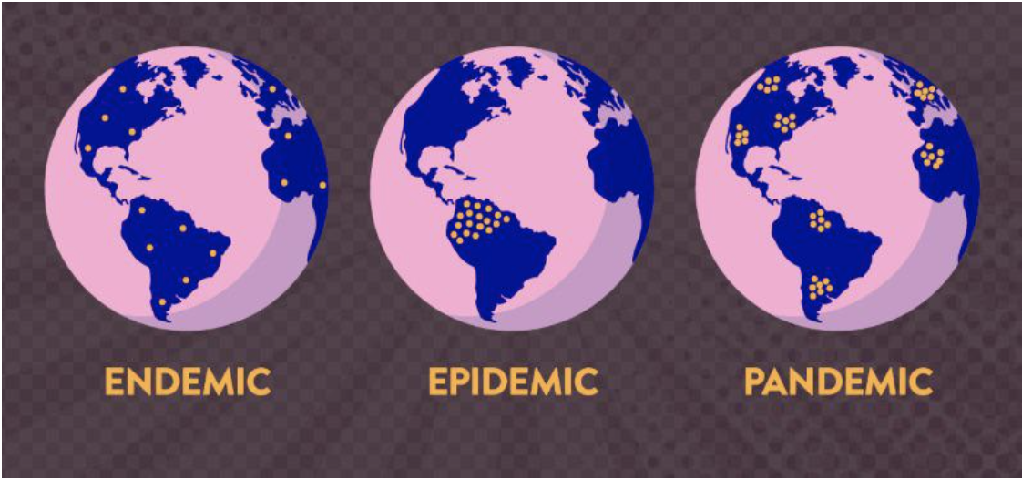
26.This is the differences between endemic, epidemic, and pandemic...explained in the simplest way possible.
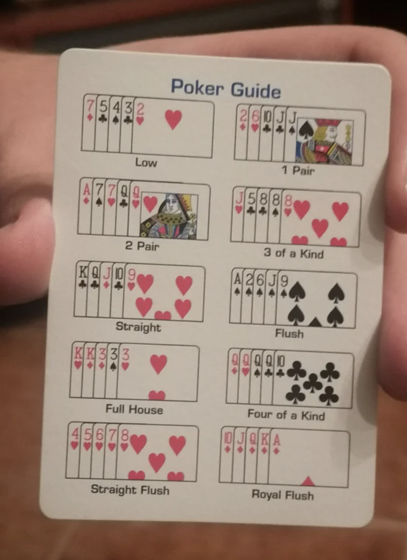
27.And this card (found in a deck of cards) explains all the hands you can have in poker.
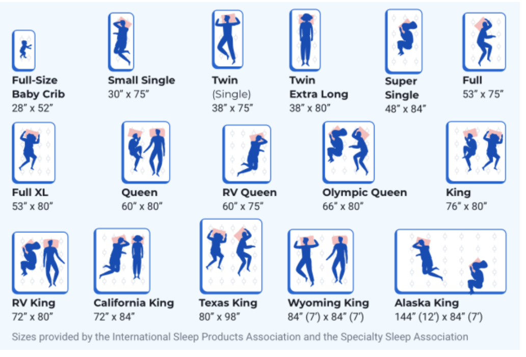
30.This cool chart shows you 16 — yes, 16! — different sizes of mattresses.
And if you're wondering what the heck an Alaskan King looks like in person...well, here's one.
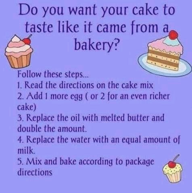
31.This chart dishes on how you can make box cake taste like it was baked by the fanciest bakery in town.
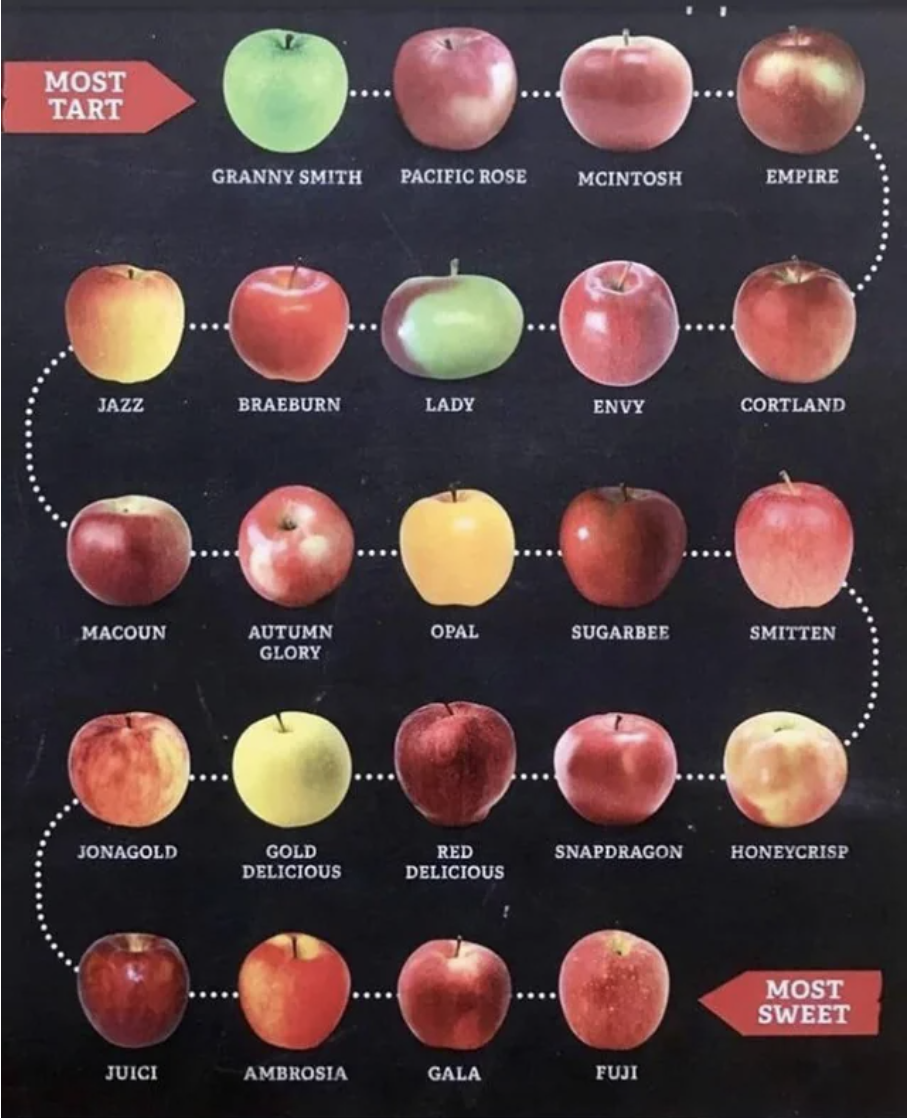
32.This chart shows apples on a scale from most tart to most sweet.
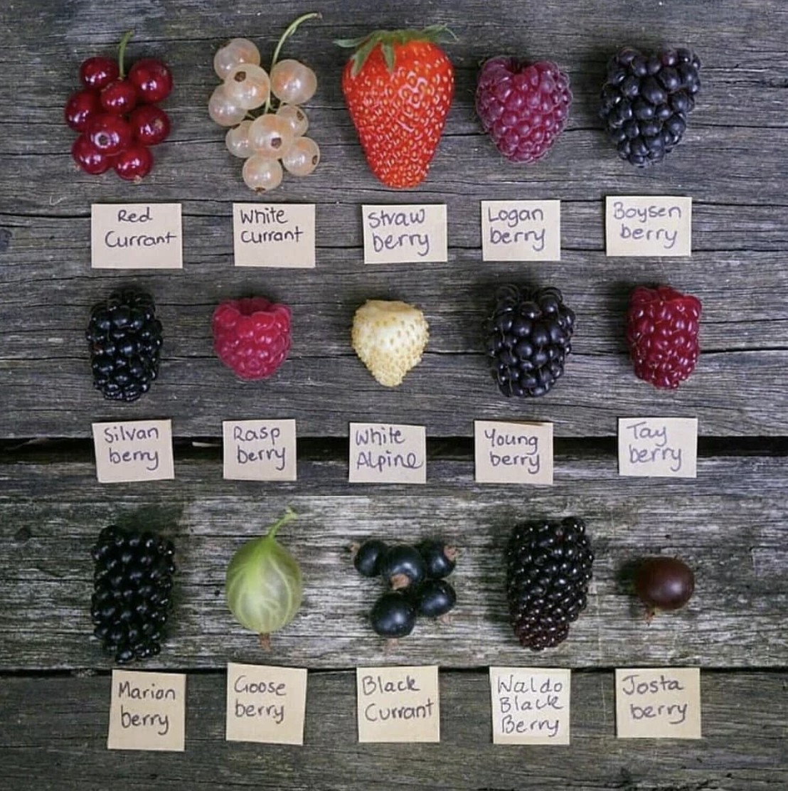
33.And this chart will teach you how to recognize on sight a bunch of different berries.
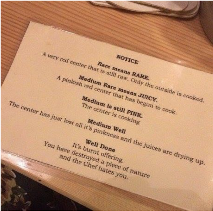
34.Ever wonder what the exact differences are between the ways you can cook a steak? This chart's for you.
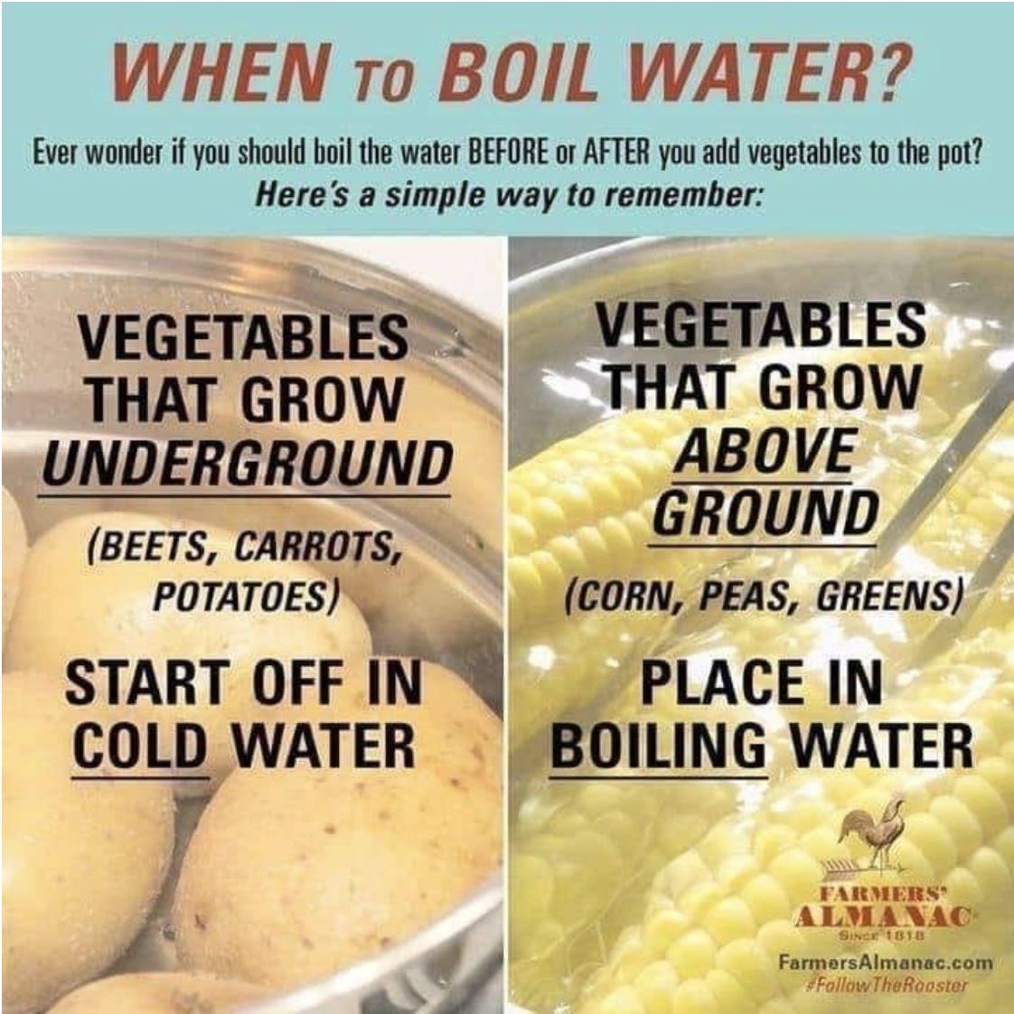
35.And if you've ever wondered, "Wait...do I put the veggies in the water before or after I boil it?" Well, this chart's for you, too.
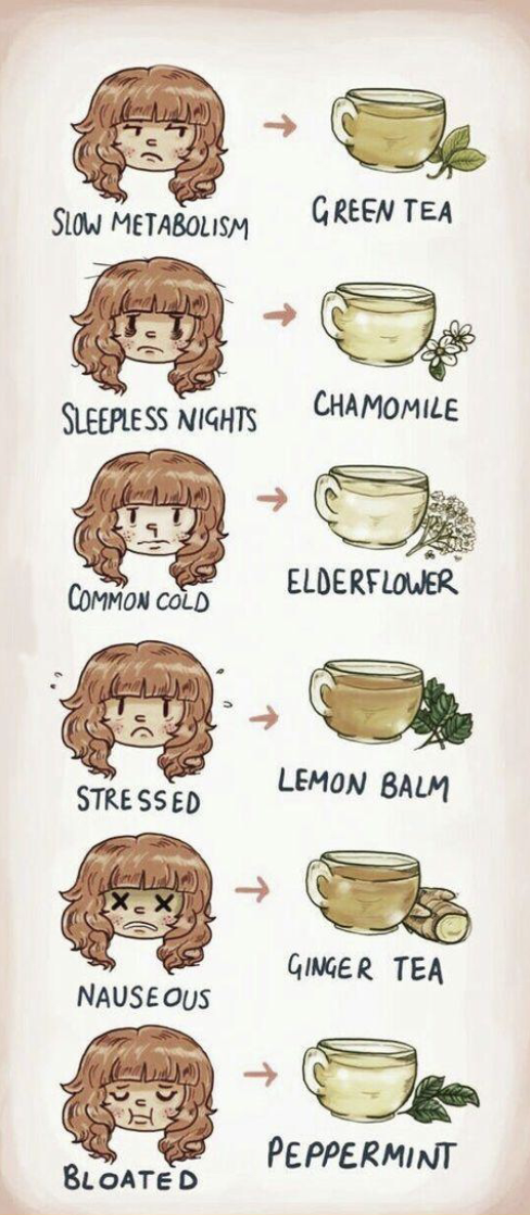
36.This chart tells you which tea to drink in every situation.
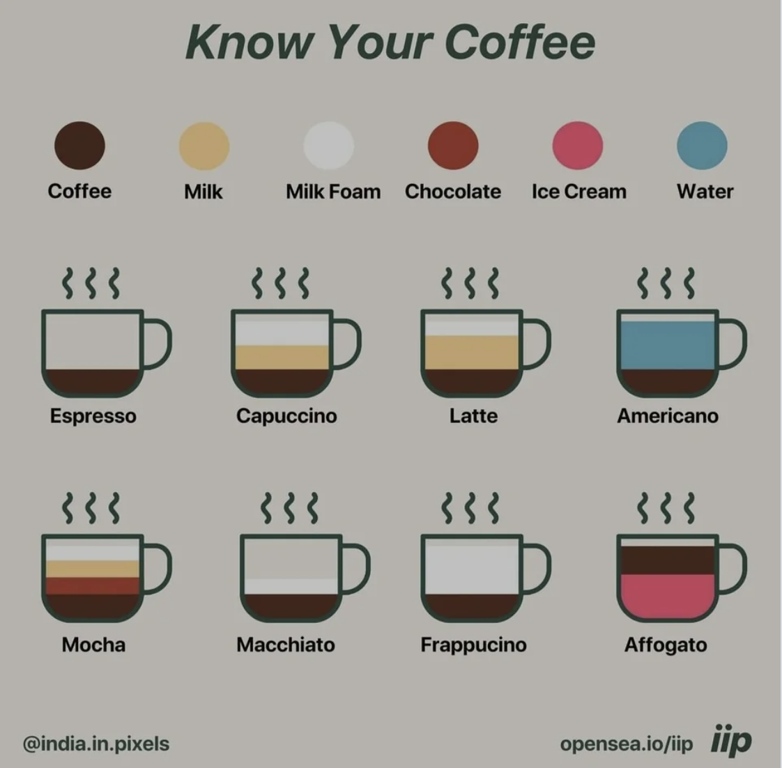
37.This chart takes the mystery out of coffee.
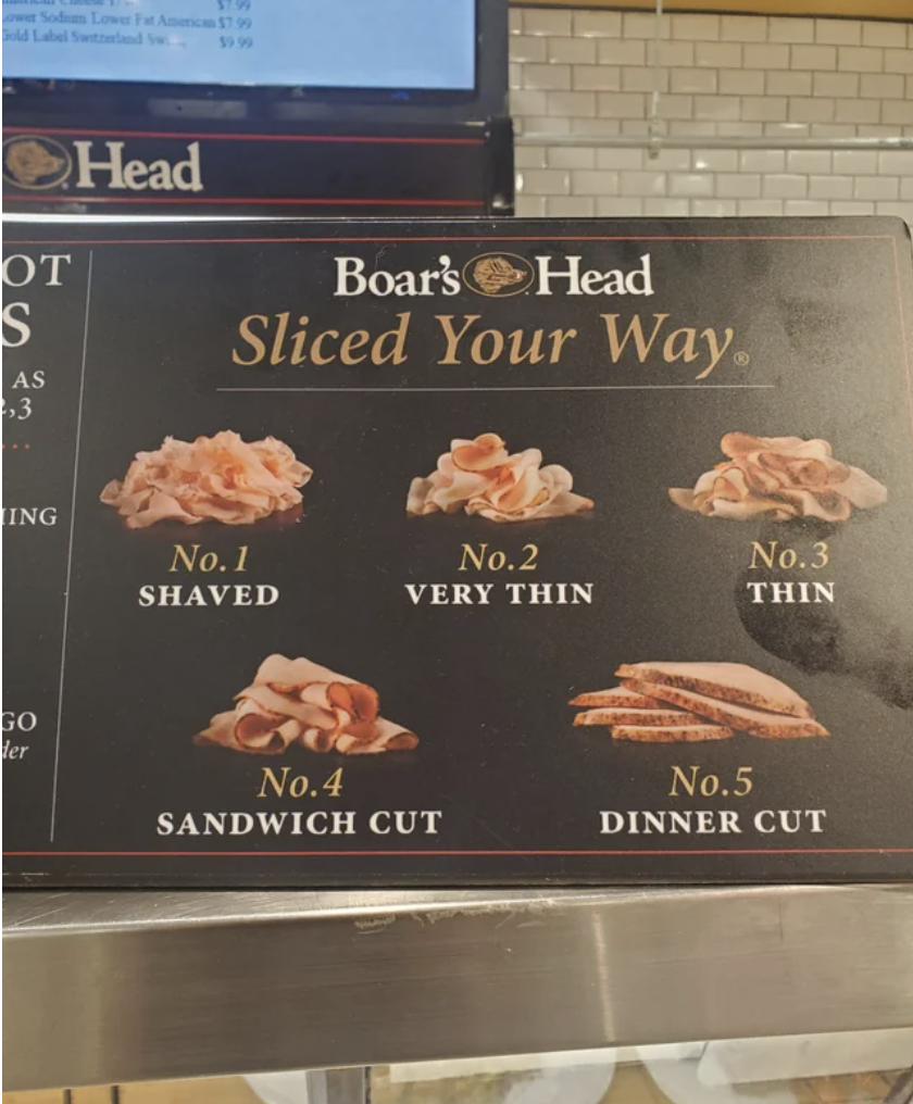
38.And this chart makes buying sliced meat a cinch.
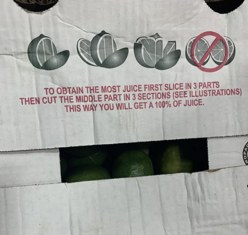
39.This chart explains how to slice limes to get the most juice out if it (spoiler...most of us are doing it wrong).
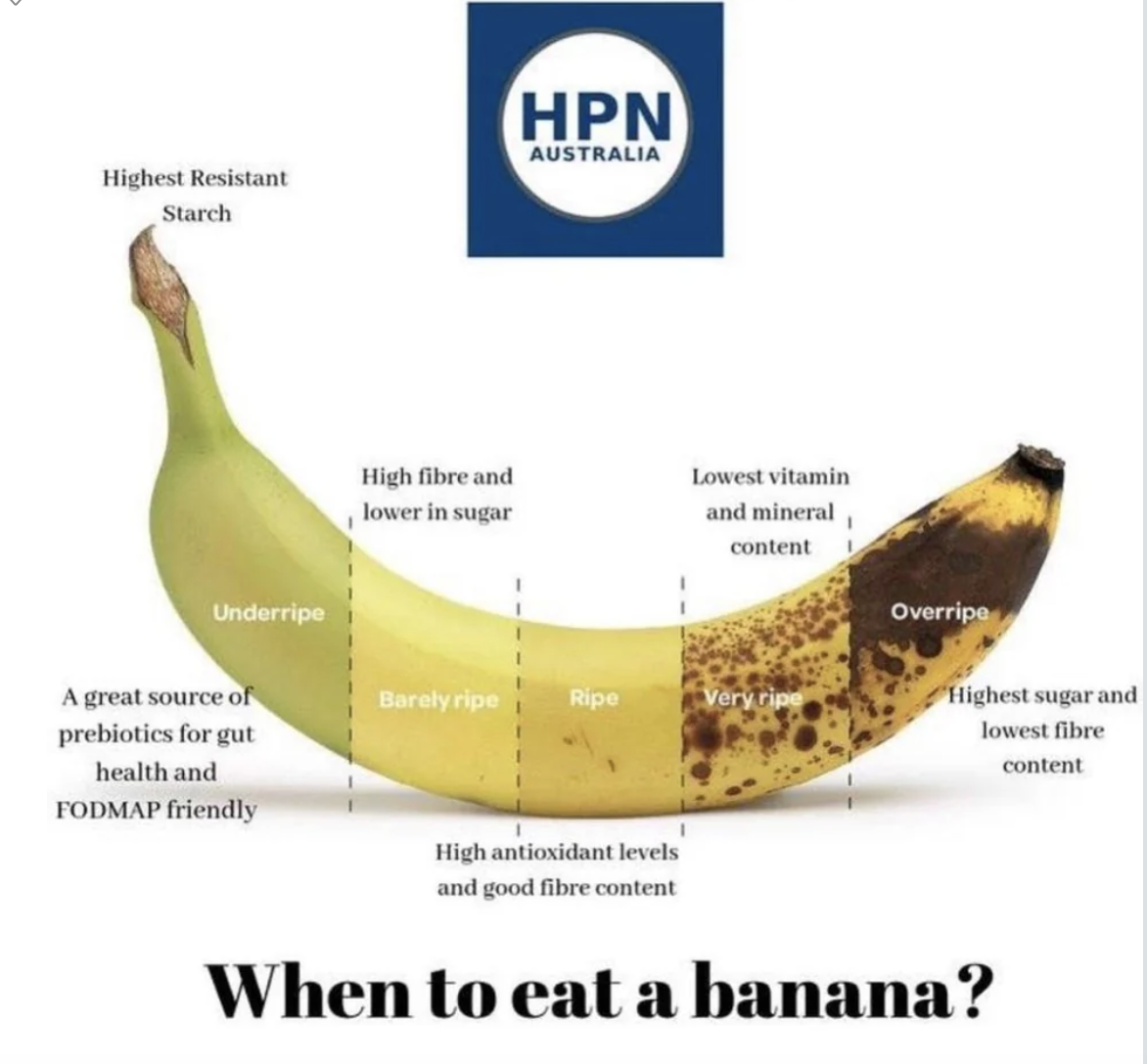
40.This chart explains when you should eat a banana (and has me rethinking my whole life...or at least when I eat bananas).
41.And this trick for measuring out rice and water is a game-changer.
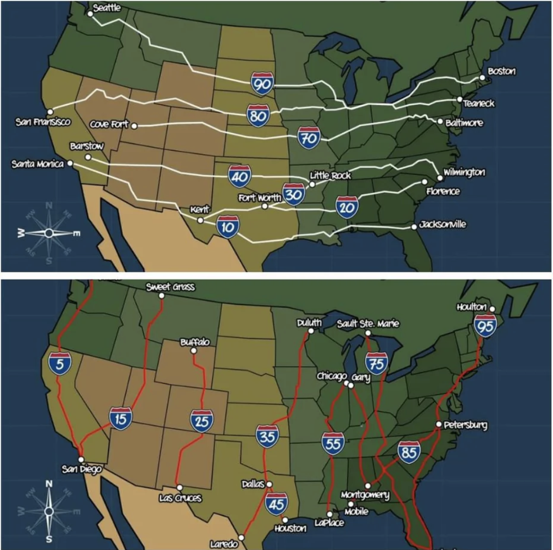
42.Get this — the numbers used for our Interstate Highway System aren't random...they all mean something specific.
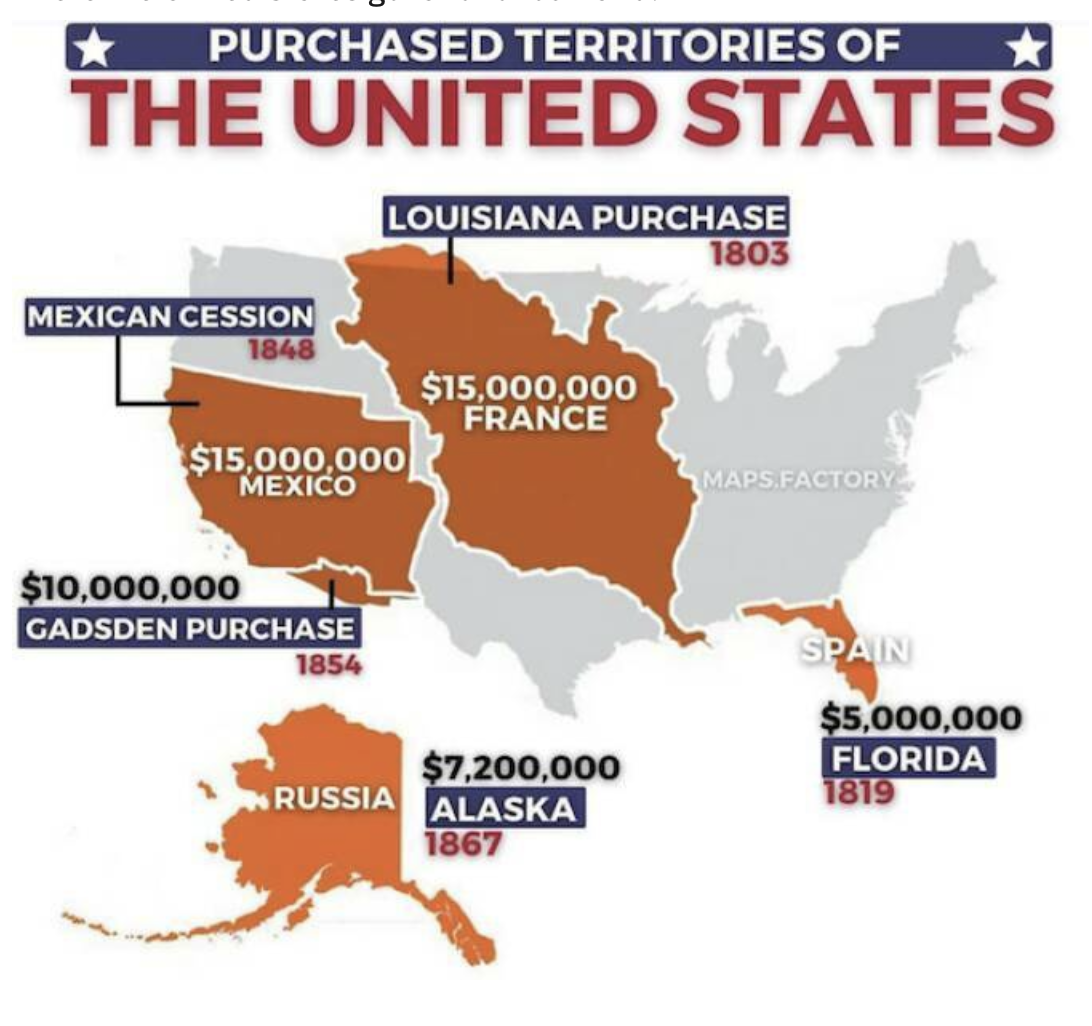
43.Also fascinating? This map that has the deets behind the territories the United States purchased.
44.This map shows life expectancy in the different counties throughout the USA — looks like the Upper Midwest is a good place to go if you want to live a while!
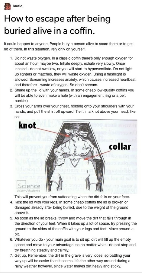
45.And this infographic shows you how to survive (checks notes) being buried alive.
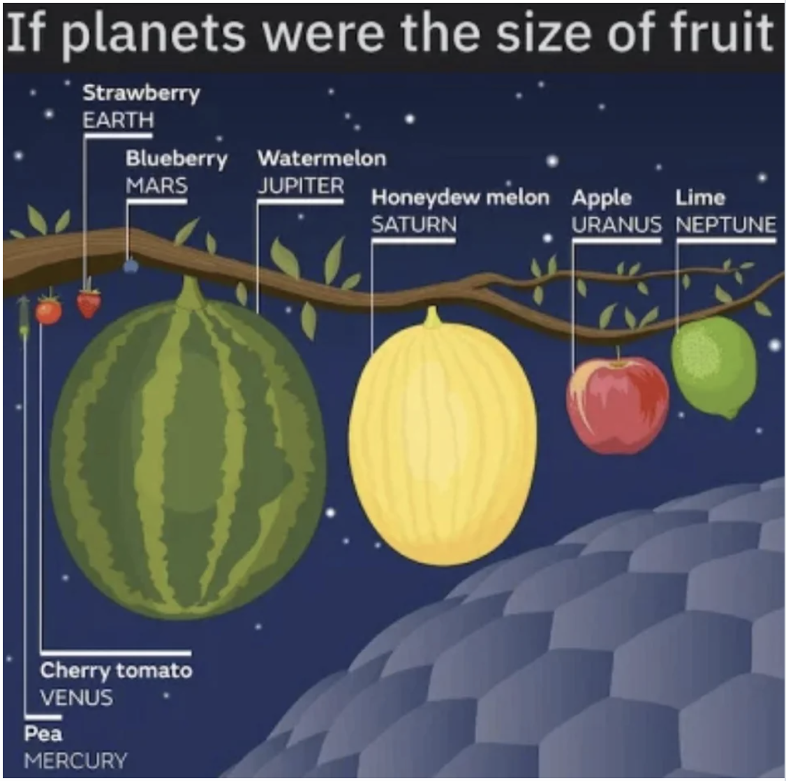
46.This super-cool chart spells out just how vastly different the planets are in our solar system...using fruit.
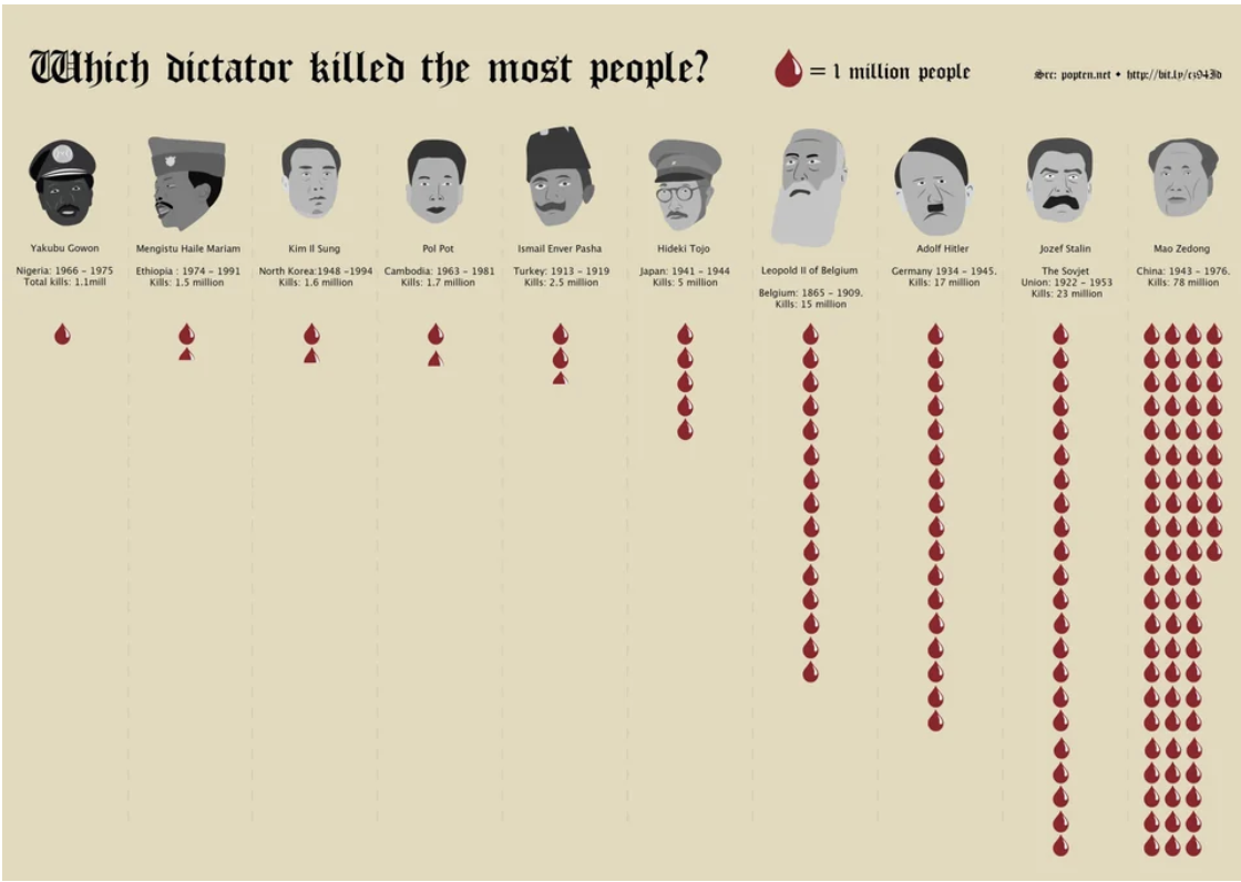
47.This sobering chart shows just how despicable these absolute monsters were.
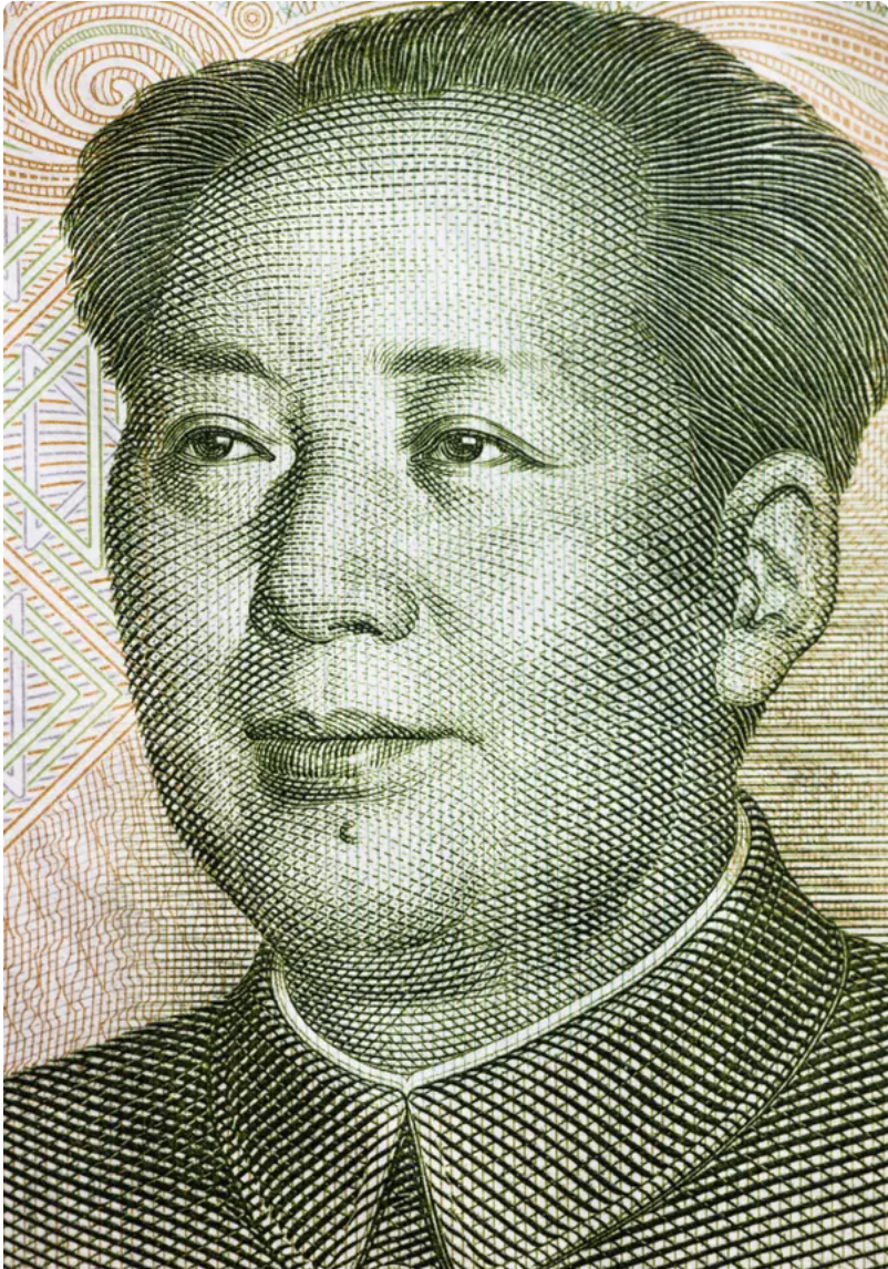
So, how did Mao Zedong — the chairman of the Chinese Communist Party from 1943–1976 — kill so many people? A big part of it was due to his Great Leap Forward program, which aimed to turn China from an agrarian nation into an industrialized one...fast. Way too fast. As a result, as many as 45 million starved, fueled by Mao's refusal to acknowledge what was happening or to accept international aid.
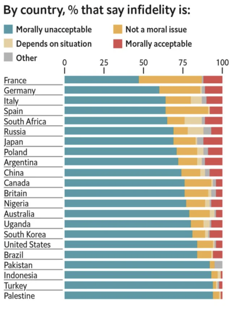
48.This chart shows a ranking of countries based on how accepting they are of infidelity.
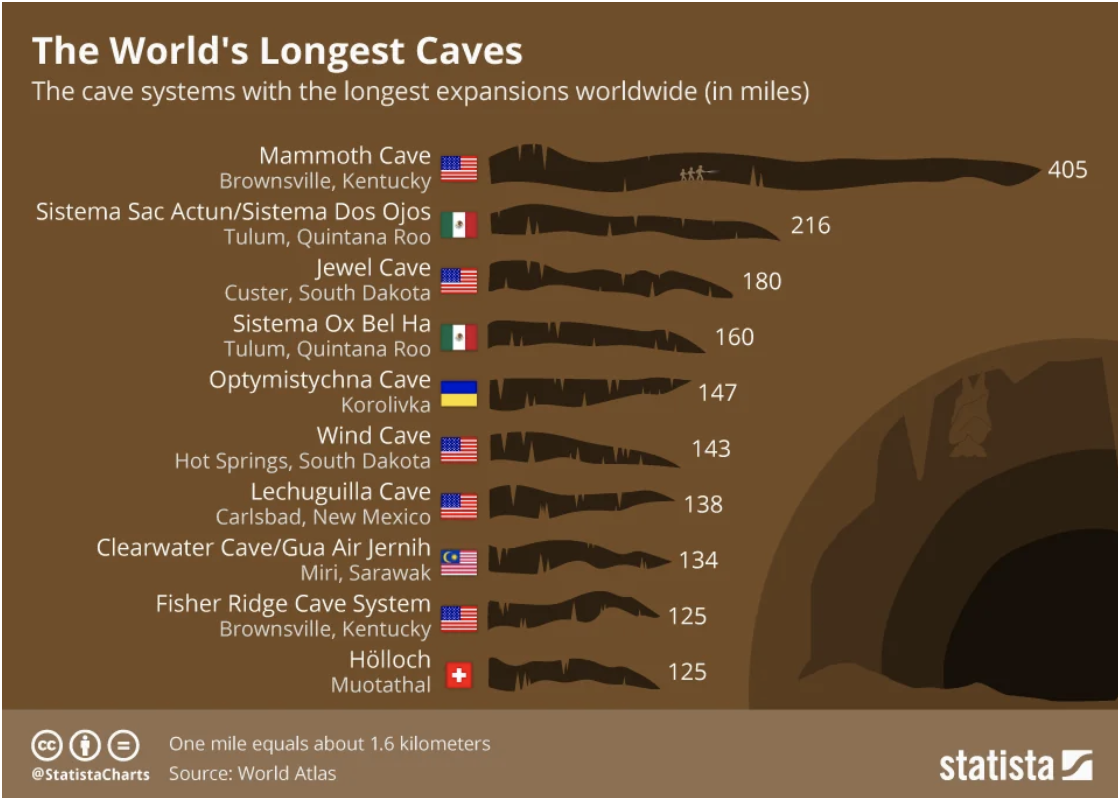
49.This chart explains what the world's largest caves are (Kentucky's Mammoth Cave is indeed MAMMOTH).
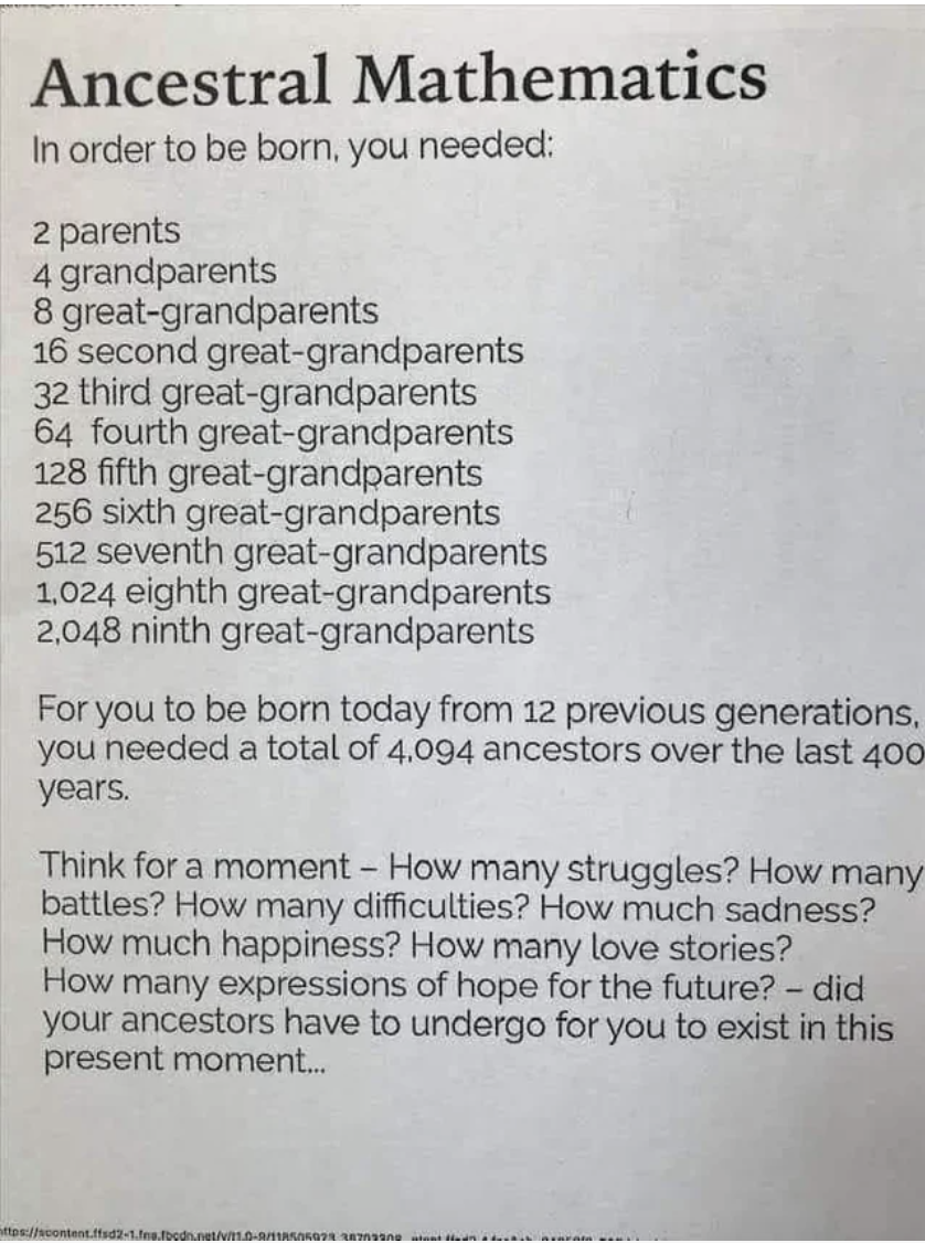
50.And lastly, this deep thought should inspire you to stop and reflect on your place in it all, and maybe feel a little gratitude.

