
The maker of V energy drinks has lost a six year legal battle to trademark the shade of green used on its cans, after someone accidentally attached a swatch of the wrong shade of green to the original application.
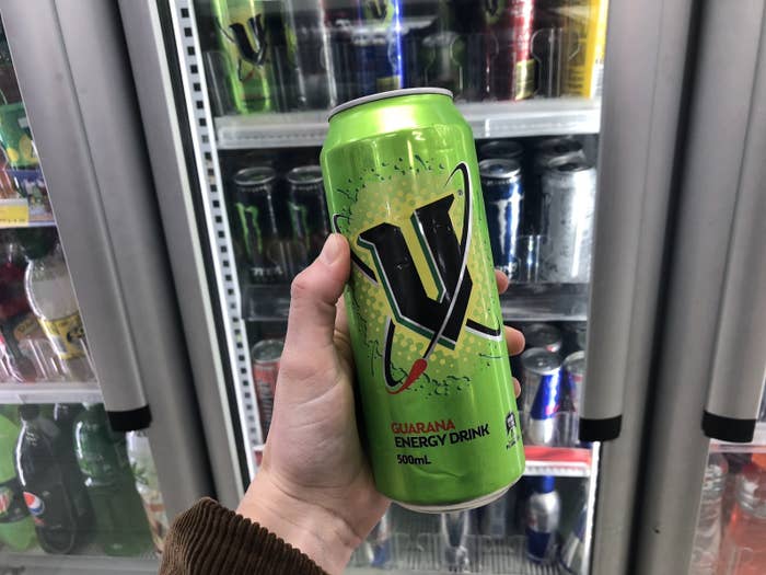
Frucor Beverages Limited wanted to trademark the bright green used on cans and branding of V, an energy drink containing guarana that has been sold in Australia since 1999.
The Japanese-owned company applied to trademark the shade of green, which it calls "V Green" in 2012, but had the application rejected four years later. The trademark was opposed by The Coca-Cola Company, which owns the rival energy drink Mother.
Frucor then launched an appeal in the Federal Court, but in a decision handed down on Monday afternoon, Justice David Yates dismissed the appeal bid.
Let us pause here to take a brief walk down the path of colour matching.
The Pantone Matching System (PMS) is a popular way of standardising colours by assigning physical colour swatches to corresponding numbers.
The shade of green Frucor wanted to trademark is called Pantone 376C. The colour alone is Pantone 376, but under the PMS system, letters are added to indicate the surface the colour is printed on.
Pantone 376C refers to the shade of green when applied to solid coated paper, which has a glossy finish. Pantone 376U is the colour on solid uncoated paper, and Pantone 376M the colour on matte or dull paper.
Of course, V cans are made of metal – which is not a surface assessed under the PMS. But as it turns out, the glossy finish of solid uncoated paper is a fairly good stand-in, meaning Pantone 376C is the next best option for identifying the colour of V cans.
OK, back to court. In 2012, when the application was first filed, a Frucor solicitor attached a colour swatch of what we now know was not Pantone 376C, but an entirely different shade of green.
Coca-Cola argued that Frucor had in fact submitted a swatch of Pantone 7727C by mistake. Here are the two colours side by side:
The swatch sent in "clearly appears to the naked eye to be a significantly darker shade of green" as described by Michael Kirov, the trademark registrar delegate who rejected the application in 2016. You can probably also see this.
Frucor argued in the Federal Court appeal that the written description "Pantone 376C" should be taken as the colour they wanted to trademark, not the swatch of a clearly different green. But it didn't stand up in court.
Yates offered a rather philosophical summation of the significant problem this mix-up had created, using the example of a person inspecting the trademark register and seeing the colour swatch.
"He or she is told that this colour is 'Pantone 376C'. He or she may accept that as a fact, not knowing that the colour is not Pantone 376C. However, if he or she were to inquire further, he or she might come to know that the colour, as depicted in the representation, is not Pantone 376C. At this point, it becomes manifest that the representation and the description are in conflict. They cannot both be correct. Where does the error lie? Is it in the description of the colour depicted in the representation as 'Pantone 376C' or in the graphic representation of the colour itself? Each alternative is equally possible on an objective assessment. A person presented with this conundrum would not know how to resolve it and thus come to an understanding of what mark has been applied for. This is why the delegate accepted that the application was fatally flawed."
Because the features of the sought-after trademark – in this case, Pantone 376C – are uncertain and can't be objectively determined, Frucor hadn't met the legal test it needed to in order to register it as a trademark, Yates found.
He also found that even if you did accept that Frucor was trying to trademark Pantone 376C, the use of the colour was "substantial, consistent and conspicuous" in V branding, but didn't function as a trademark.
Yates agreed with Coca-Cola that it was the prominent V logo that acts as the "brand of origin" for the energy drink, not the shade of green.
He also found that while Pantone 376C was "reminiscent" of the core product of V energy drinks, that it hadn't functioned as a trademark.
Frucor had previously released cans with different colours to denote different flavoured drinks, all of which had the V logo on them.
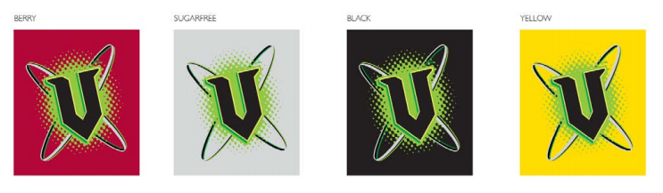
"Frucor’s own use of colour before the filing date shows that, in relation to its own V energy drink range, colour was used to denote varietal differences, and to distinguish products in the range from each other and from its core product – the hero in the range," Yates said.
"Although Frucor’s use of V Green was pervasive and no doubt fundamental to its whole marketing strategy, it was, nonetheless, reminiscent of its core product. In this way, Frucor’s use of V Green was essentially descriptive, not distinctive in the trade mark sense."
He also found that Frucor had been aware it had sent in the wrong swatch since at least 2014 but inexplicably did not try to amend the application until 2017.
For this and other reasons, he ruled the company could not file a further appeal to try and amend the application and trademark the colour.