McDonald's Golden Arches are literally one of the most famous logos in the entire world.

Seriously, whether I'm walking through Times Square or cruising down the interstate, the second I see that giant yellow M, I immediately want a Big Mac and large fries.
But what if I told you that the the Golden Arches — that curvy yellow M — stood for more than McDonald's name?

What if I told you that the M was supposed to symbolize YOUR MOTHER'S BREASTS?

That's right, folks: The Golden Arches actually represent BOOBS.

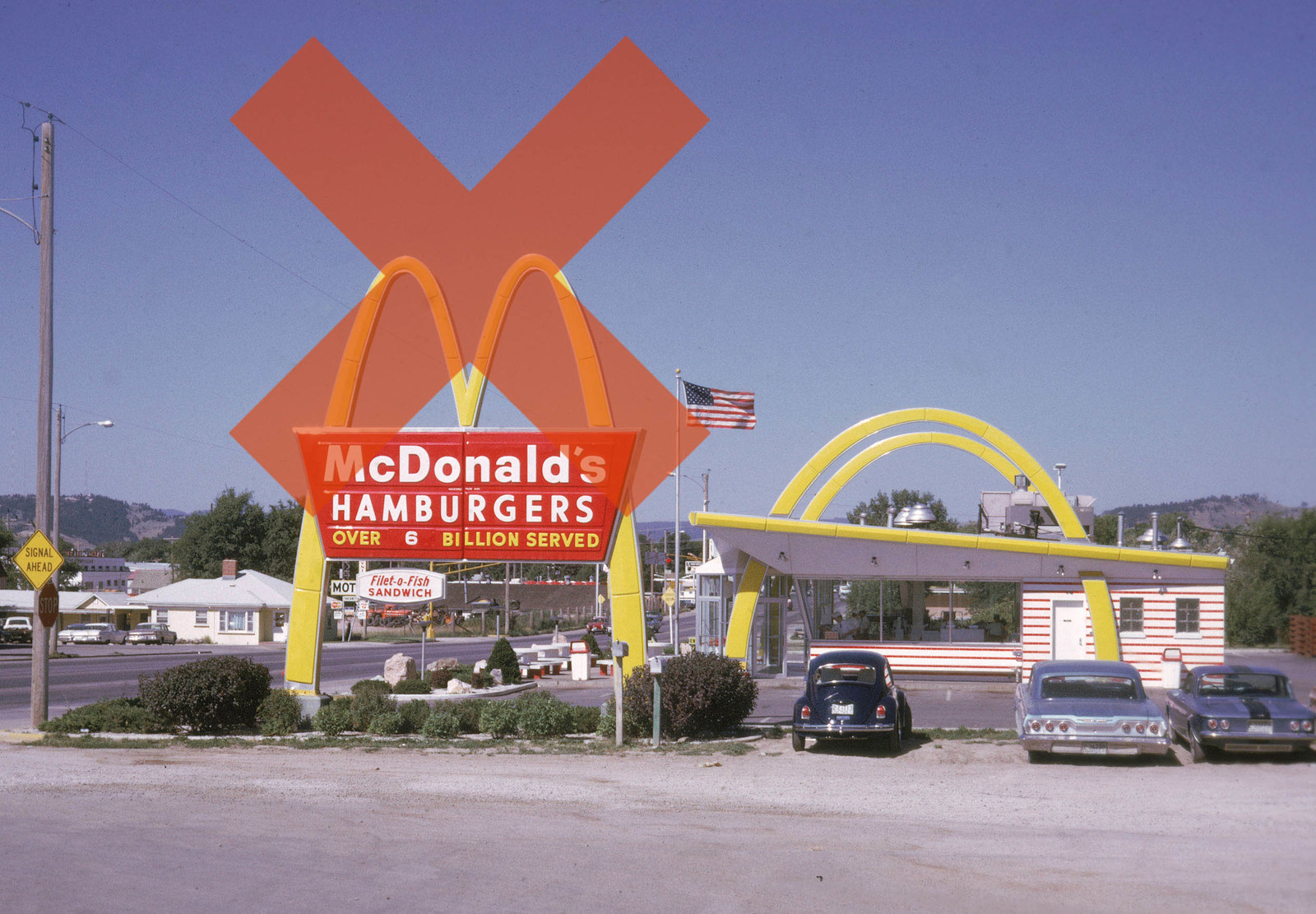
Here's how it happened: Back in the '60s, McDonald's was considering ditching the Golden Arches as part of a national redesign.
However, a psychologist, design consultant, and Freudian named Louis Cheskin persuaded execs to keep the logo because the M looked like breasts — and not just any breasts, but one's mother's, as in the ~original~ source of nourishment.
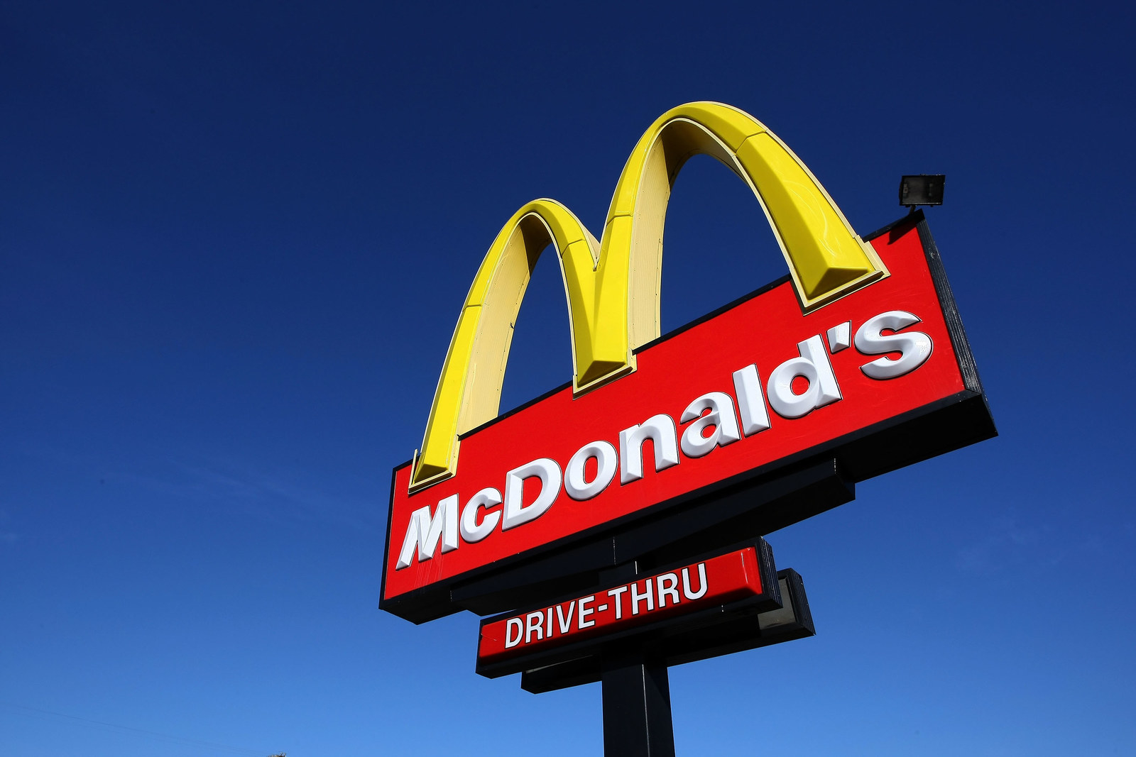
Thus the Golden Arches are still with us today.

Oh, and one of McDonald's old slogans was "Give Mom a Night Off."

In conclusion: 👀😳😱.