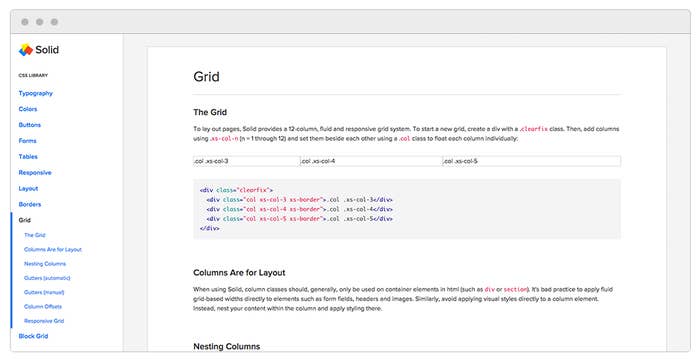
After eight months of hard work, we’re so excited to announce that we’ve recently launched Solid, BuzzFeed’s CSS and component library. It’s been an amazing journey of collaborating, negotiating, experimenting, and “roadshow-ing” with what has become the fundamental design patterns for BuzzFeed products across the web. This is a super exciting time for us, and we hope you’ll enjoy taking a peek!

Discovering the Challenge
When I first came to BuzzFeed as a Product Designer, I didn’t really know what to expect. I had a semi-extensive knowledge of the post experience design on BuzzFeed; that is, the listicles I would frequently enjoy reading via Facebook, Twitter, or a friend’s Google Chat message. But what I learned shortly after joining, was that there was so much more underneath the surface.
It was the first time I’d become part of a design team that was more than four people, and I was super excited to dive in. Every week when we sat in critique to look at one another’s work, it always struck me how vast the range of projects were. One week, a designer would show a new flow for an internal tool that our Sales team uses, while another designer would be struggling with a UX problem inside the CMS. And sometimes the design challenge was outside of the BuzzFeed product, and lived on an entirely different platform (à la Facebook Instant Articles).
It was fascinating to see the breadth of work, and even more interesting to be able to critique something you weren’t nearly as close to as the team or designer working on it. But as we looked at more and more work, it became apparent that there were a few too many style inconsistencies. As we grew and matured as a design team, our newer designs clashed with older parts of the experience that hadn’t been touched for quite some time. This mix of older designs interspersed with fresher looking UI felt unbalanced.
Additionally, our new designs weren’t being considered holistically. Each designer who needed an overlay would either start from scratch or take an existing overlay and tweak it to look even more different than before. As a new designer at BuzzFeed, it was incredibly difficult to get your footing, since there were very few agreed-upon design patterns to draw from.
Also, over the last few years, our CSS started to catch up with itself and had become bloated. At times it could be difficult to understand or troubleshoot styles, making evolving a feature or fixing a bug pretty difficult. And though we continued to reduce and refactor old legacy CSS, we didn’t want that to slow us down from improving our products and experiences at the same time.
Enter Solid
A small group of us — a few designers and a couple front-end developers — began working closely together to determine what we needed, how we would break it down and how we would choose to implement it in the codebase. This was huge for us, since previously engineers and designers often worked siloed from each other, communicating only through detailed design specs or conversations in Jira. We were eager to experiment with a process that brought engineers and designers closer together, and closer to the product. We wanted designers in the code, and engineers able to influence design decisions.
Taking inspiration from frameworks like BassCSS, we set out to design an atomic CSS framework that would give us a great balance of flexibility and consistency. We wrote single-purposed, tightly scoped styling classes that, much like BassCSS, mimic basic CSS functionality. The classes are also immutable, meaning that they shouldn’t be overridden (in fact, we’re building linting to prevent this from happening in the BuzzFeed codebase). Because of Solid’s atomic nature we were able to allow for a scalable and iterative design process without adding tons of CSS to our codebase (Solid is just 12kb gzipped).
What’s Next
We’ve been implementing Solid into our new internal projects at BuzzFeed for the past few months and have started to implement it in places like our CMS and News frontpage. We’ve been enjoying working with it so much that we decided to make it public and available for anyone to use. We’ll be writing more about the development process and future updates as we go along, but we’d love to hear your feedback on the initial release. So take a look, grab the code and let us know what you think!
