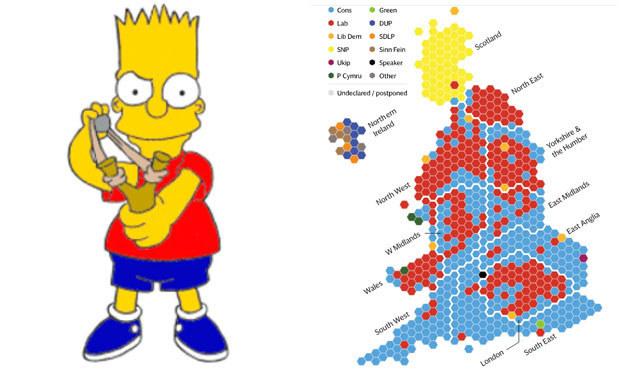
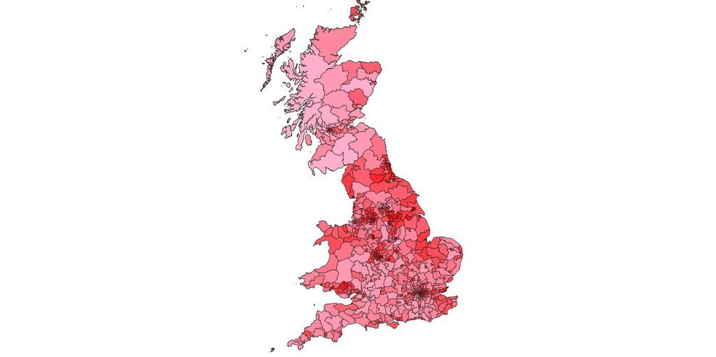
Let's start with the standard results map
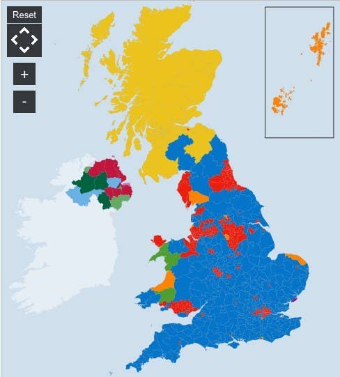
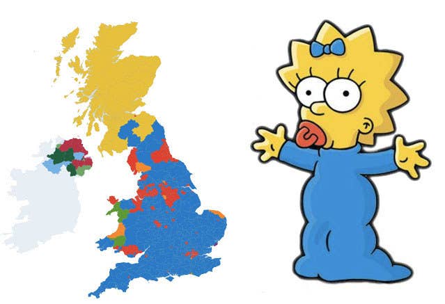
Which, as you all spotted, looks (a bit) like Maggie Simpson.
Though some were sceptical of mapfandom...

The only way the UK map looks like Maggie Simpson is if she was shot a few times then run over by a steamroller.
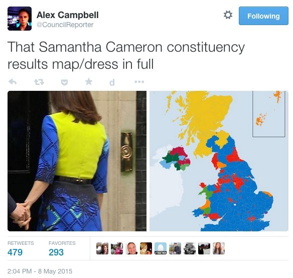
... there was so much love for maps they began to be seen everywhere
This person was so excited by maps he stitched the results LIVE

Not my best stitching, but my fastest... Now to take it outside and BURN IT!#UK2015GeneralElectionResultsLiveStitch
(And yes I thought it was a woman doing the stitching when I first wrote this which is obviously sexist AND STUPID because his name is just there!)
And these people aimed to get a tweet from every constituency and stick it on a exciting giant map

Here lies the rubble of #electionnightchallenge. With 350-odd constituencies, I think we've done better than Labour.
I don't know why they did it but who cares, it's fabulous #electionnightchallenge
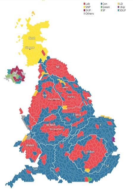
The other exciting election map is the one where each constituency is the same size
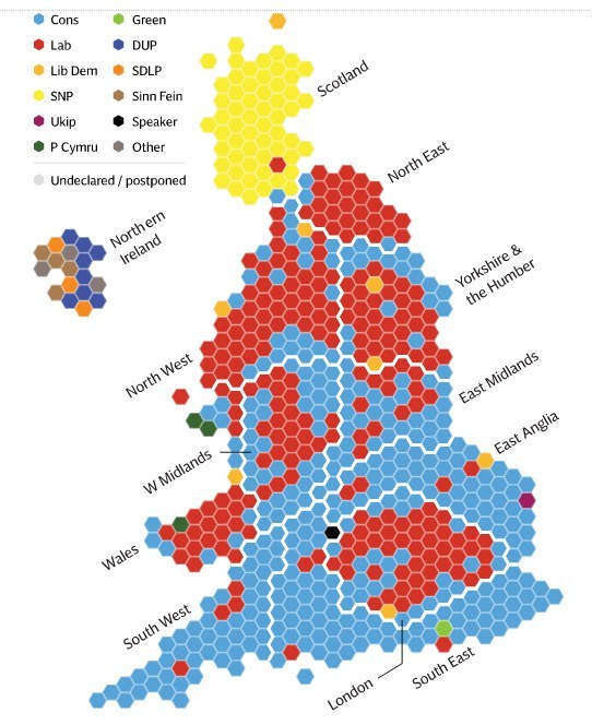
It is also a bit Simpson like.
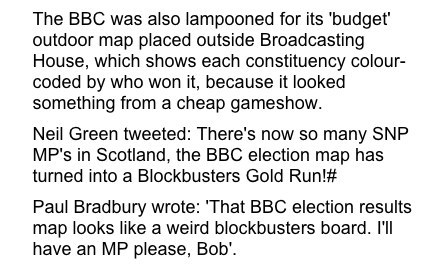
The BBC used this style of map outside their London headquarters

BBC election map has now changed into Spider-Man getting a custard pie in the face #GE2015
Although the BBC's choice of map was controversial and criticised by the Daily Mail
The Guardian made a similar kind of map but slightly different
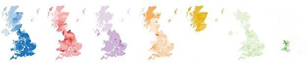
There are LOTS of maps on the BBC website
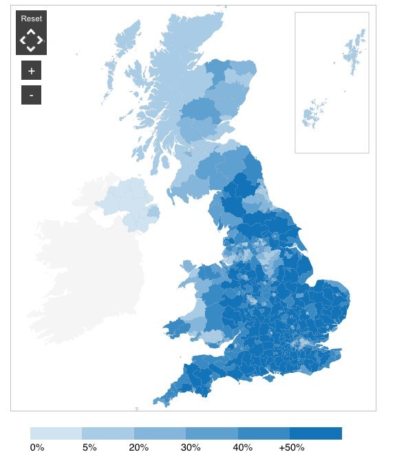
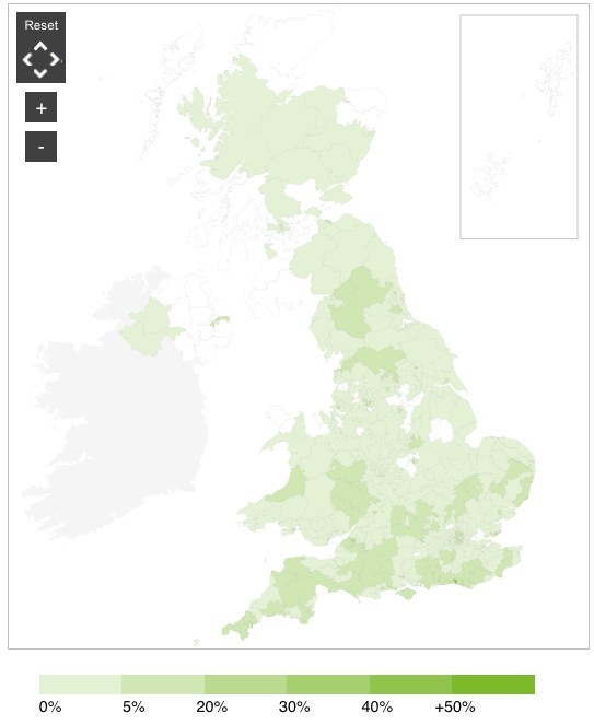
This map shows where where Conservative support is highest...
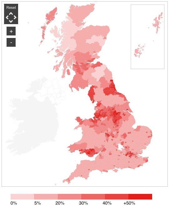
And the same for Labour...
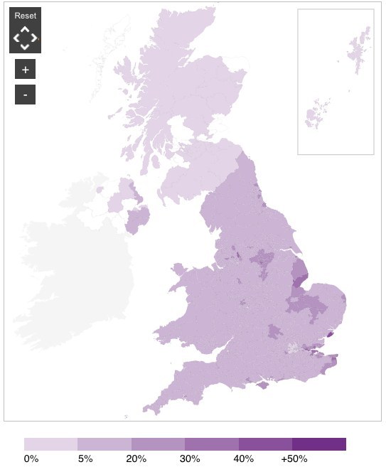
UKIP...
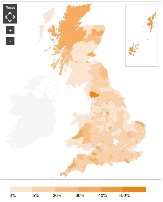
Liberal Democrats...
Greens...
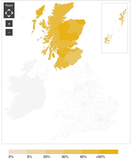
The SNP (basically a map of Scotland)
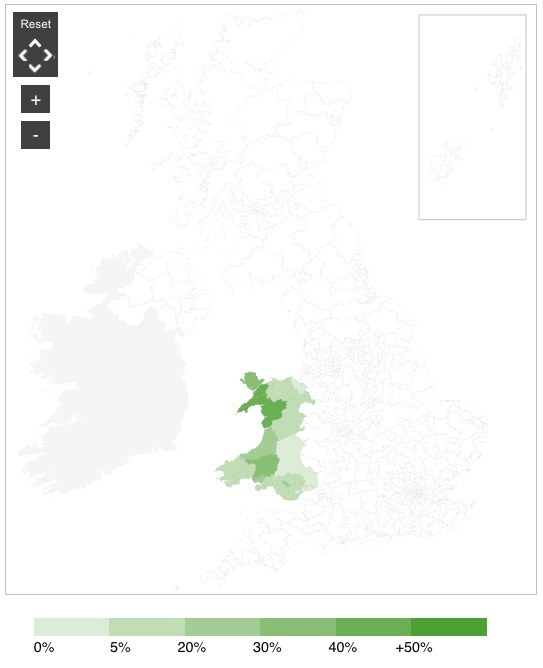
And Plaid Cymru...
The BBC love maps so much they've even done one for turnout but they used a horrible green colour
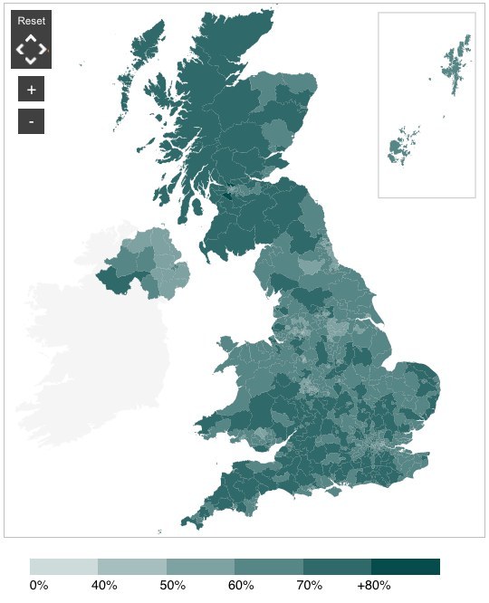
This is an alternative turnout map
Interestingly there seems a correlation between low turnout and areas that vote Labour

The Guardian have also made what look like weather maps but are actually very clever
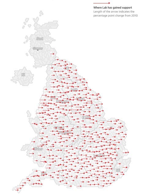
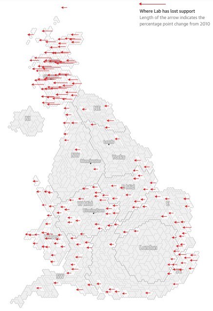
And this map shows where Labour lost support.
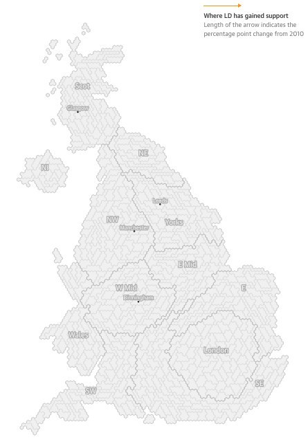
This is where the Liberal Democrats gained support
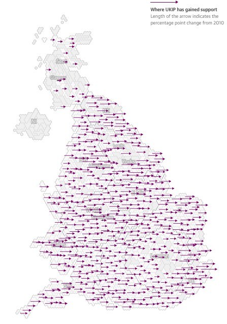
UKIP gained support (if not seats) all over England.
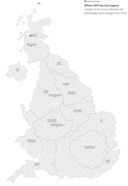
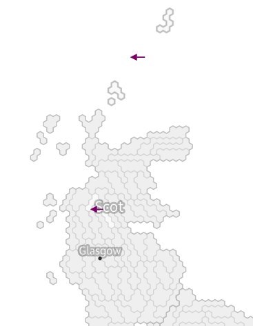
And this is where they lost support...
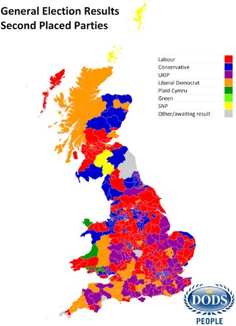
This is a map of who came second in each constituency:
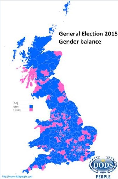
Someone made a map showing the gender breakdown of the new MPs using the colours pink and blue
Someone drew a map to show how Labour support coincides with the areas where there used to be coal mining

Do I get a prize for this? Distribution of Labour seats compared to England and Wales coalfields.
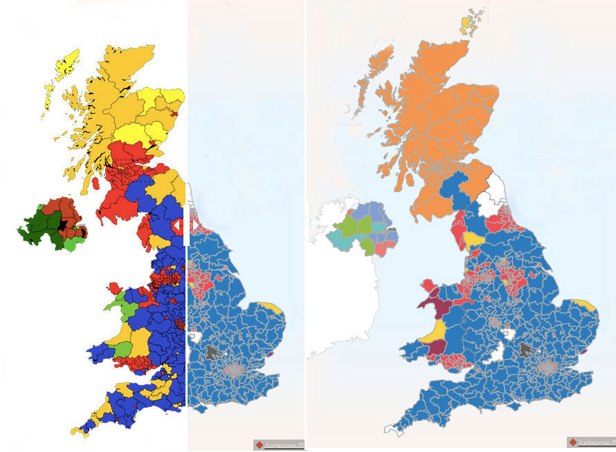
Ooo! A slidey map!
I love maps so much I got the Free Speech team involved for election night and it was a wild, wild success

The election colouring-in map is here! #GE2015
People retweeted this piece of social media genius 18 times!
First result for the @BBCFreeSpeech live election graphics system. 349 to go.
Favourite constituency names we've come across whilst map colouring: 1. Brigg & Goole 2. South Holland & The Deepings 3. Gordon #TheVote
Latest election situation on the Free Speech interactive graphic display
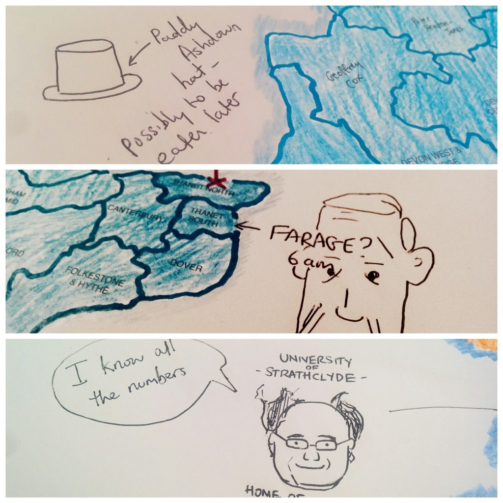
Key parts of electoral history were recorded

Should've bought a pot of blue paint and a roller. #GE2015
Though eventually we ran out of awakeness and gave up
At some point around 5am in a sleep deprived haze we fell behind on this project
If you spot any other politics maps please do let me know because they are very exciting
Tweet me at @brenkjm
Share This Article