The State Of The Money Race In 7 Charts
Obama campaign out-raised by Romney in May, but spends far more. Obama still has a giant pile of cash, though.
1. Romney is raising more and spending less
2. But his campaign is slowing ramping up
3. Obama is getting more money from smaller donors
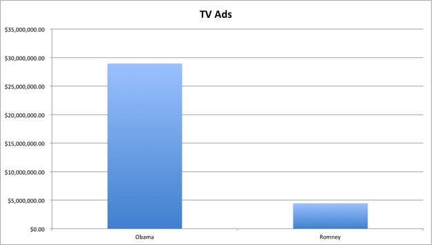
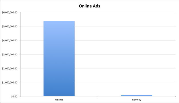
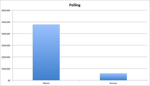
(Donations directly to the campaign — not to joint victory committees (<$5000).
4. Here’s how the campaigns are spending their money
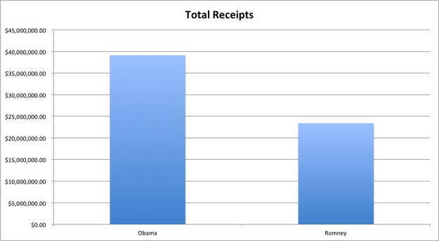
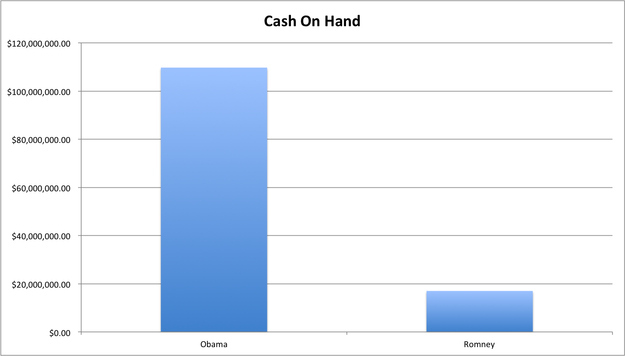
7. But Obama is still sitting on a big pile of cash
(with Rebecca Elliott)
Via: Zeke Miller
HOT ON
Facebook Conversations
3 Responses So Far
- ninahartp thinks The State Of The Money Race In 7 Charts is Cute
- joemygod.blogspot.com readers just made The State Of The Money Race In 7 Charts hotter
- foxnews.com readers just made The State Of The Money Race In 7 Charts hotter
-
WhatTheHolyHeck 11 months agoCampaign finance reform. Now. Please. Public financing only. 6 month campaign cycle. Vet them, mandatory minimum number of legitimate debates, then vote. Done and done.
-
- The State Of The Money Race In 7 Charts is starting to get hot on Twitter Tweet It
-
- johntk2 thinks The State Of The Money Race In 7 Charts is Win
-
oOo 11 months agoIt would be helpful if the charts themselves said “in May” in the titles because the main title of this post makes you think the charts depict the whole race, not just May. May is in the subtitle but is easy to skim over and miss and think you’re talking about the campaign as a whole, and then you start wondering how Romney could raise more, spend less, but still wind up with so much less on hand and have the math be so off besides. Another way to help distinguish May from the campaign would be to include one more chart that showed money raised and spent for each guy for the whole campaign to date. Also since the first chart intro says Romney is spending less and the second one says he’s spending more, that’s initially confusing until you realize the second one isn’t a comparison against Obama but rather his own prior month. If you change the second chart intro line to say, “Romney’s spending is increasing” or something, it would be less confusing after the first one.
-
- The State Of The Money Race In 7 Charts was rebuzzed by Rebecca Elliott


Special Reactions
Your Reaction?
React with an animated GIF!
READY. SET. REACT!
GET STARTED