This post has not been vetted or endorsed by BuzzFeed's editorial staff. BuzzFeed Community is a place where anyone can create a post or quiz. Try making your own!
Where All the Money Went
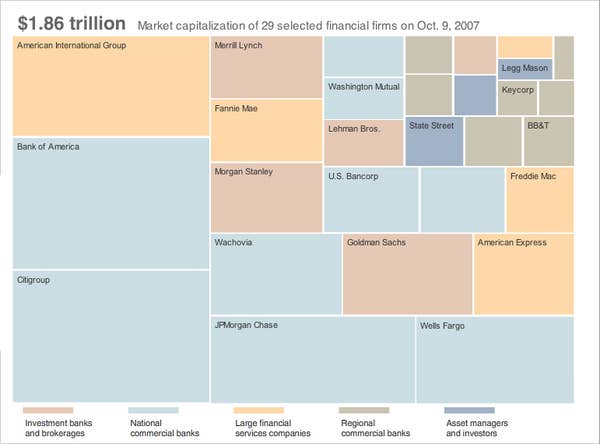
The nytimes has a great interactive feature showing where all that pesky capital that was bogging down our markets has run off to.
