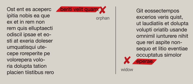
1. Bad kerning (spacing between characters)


2. This typesetting
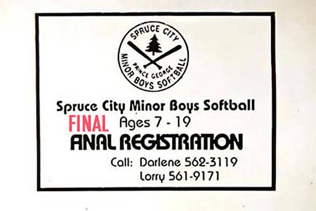
3. These typesetting mistakes:

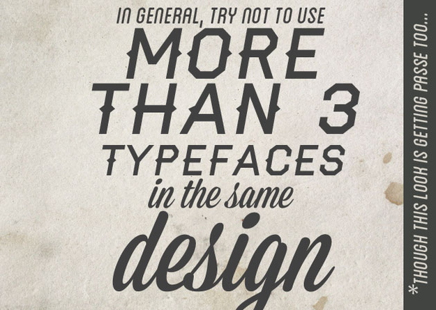
4. Medley of "attitude" fonts

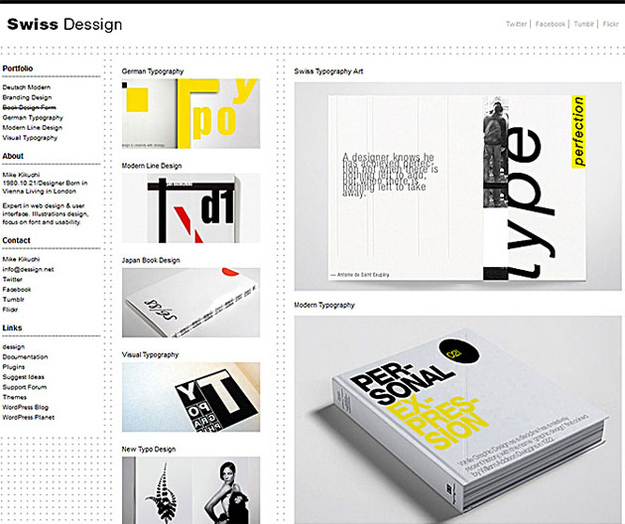
5. Violating the Swiss Grid
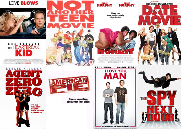
6. Big Red Text on movie posters
7. The "I just learned Adobe Illustrator" look
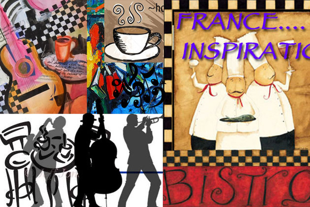
8. The "funkiest bistro in Connecticut" look
9. Soothing corporate gradients

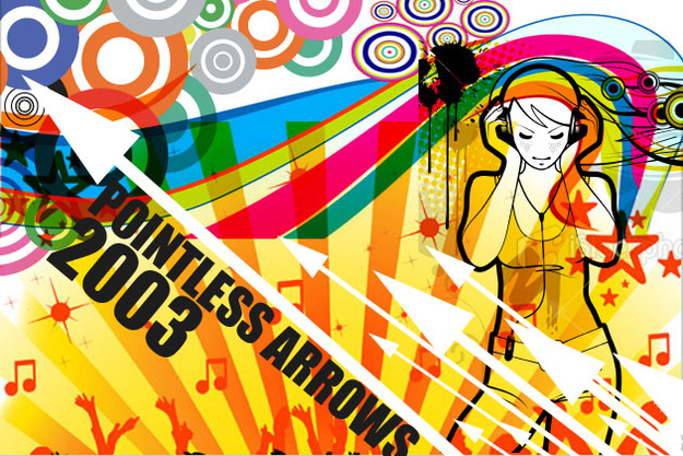
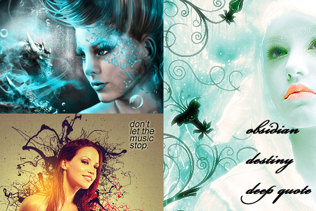
10. Deviant Art cybergoth circa 2002

11. Photo-manipulated selfies
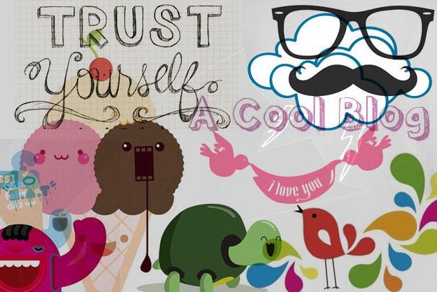
12. Way too twee
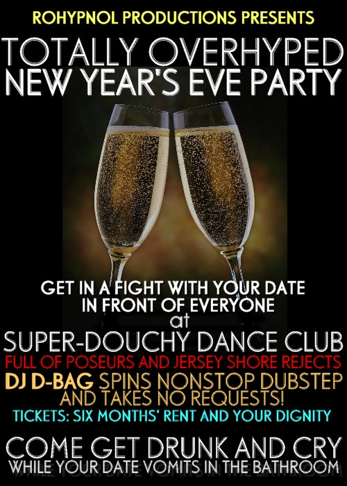
13. Generic Nightlife Flyers
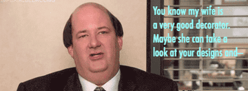
14. When clients suggest this

15. And other dumb client instructions...

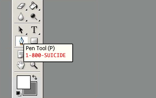
16. The Pen Tool in Photoshop
17. This