
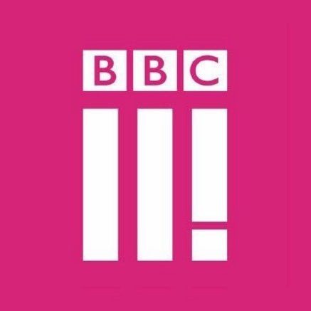
BBC Three unveiled a new logo today.

No it's not BBCII!, or BBC Two with an exclamation mark after it.
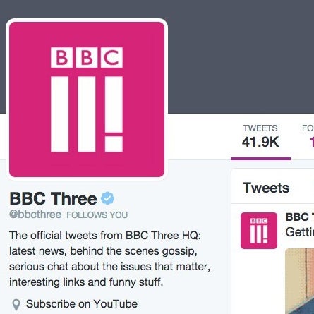
BBC Three added the logo to its Twitter account on Monday. We double-checked that this actually is a new logo and the BBC confirmed to us that it really is. You can see it in a new trailer here.
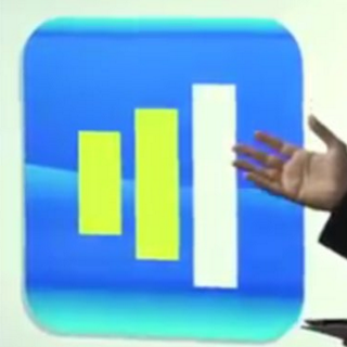
It gets weirder. W1A, a comedy mockumentary set at the BBC, which has been praised for accurately portraying life inside the broadcaster, managed to predict this logo nearly two years ago.


View this video on YouTube
It was when branding consultant Siobhan Sharpe's and her agency, Perfect Curve, was asked to come in to suggest a new look for the famous BBC logo, "to make it look more like an app."
Siobhan's team removed the famous BBC letters from the BBC logo and replaced it with lines so it looked like this.

It's pretty uncanny really.
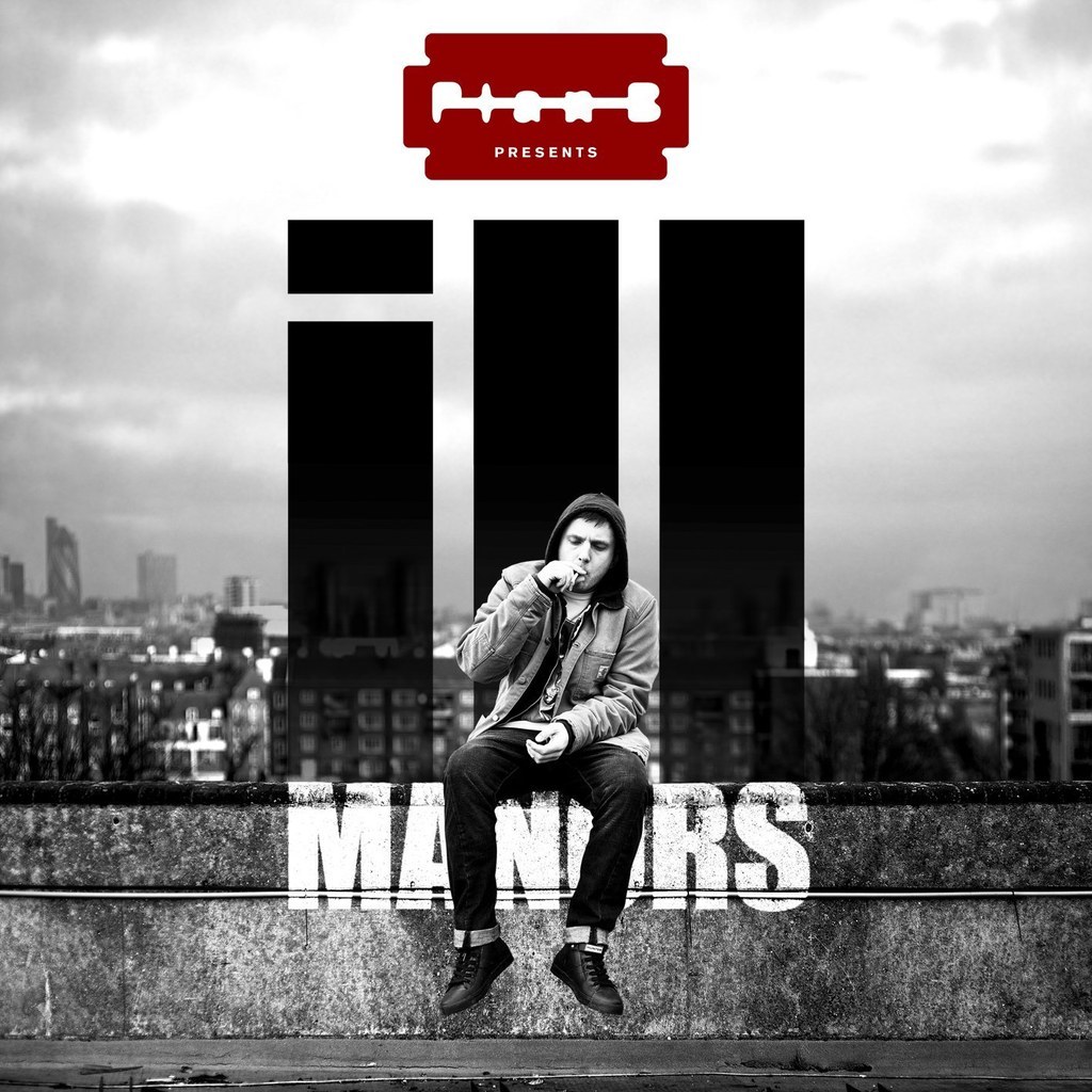
It also looks like Plan B's "Ill Manors" upside down.
So... in the immortal words of Siobhan Sharpe.

UPDATE
The BBC says that it is aware of the similarities in a new blog post on their website.