So the Bay Area Deathfest 2 event in Oakland in July had a great line-up, including Cattle Decapitation, Psycroptic, No Zodiac, and Party Cannon.
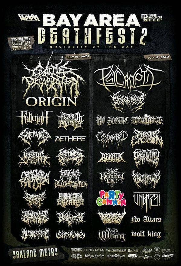
Woah, hang on, PARTY CANNON? Did you guys not get the memo?
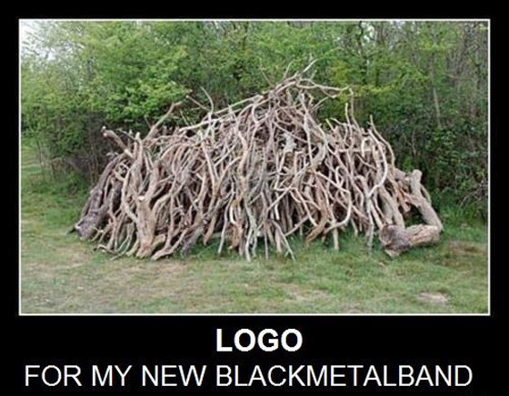
This is what a death metal logo is supposed to look like.
Not this.
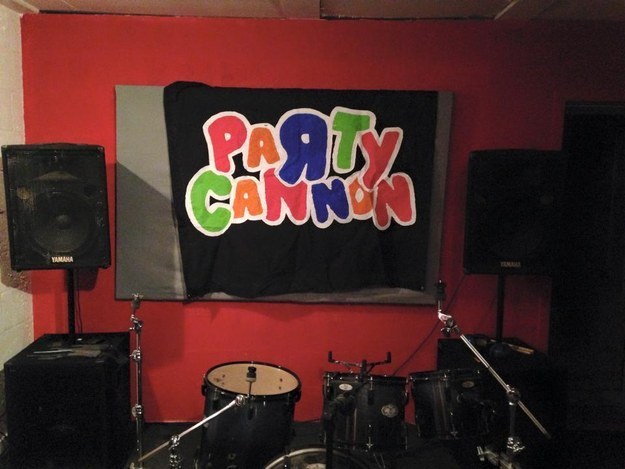
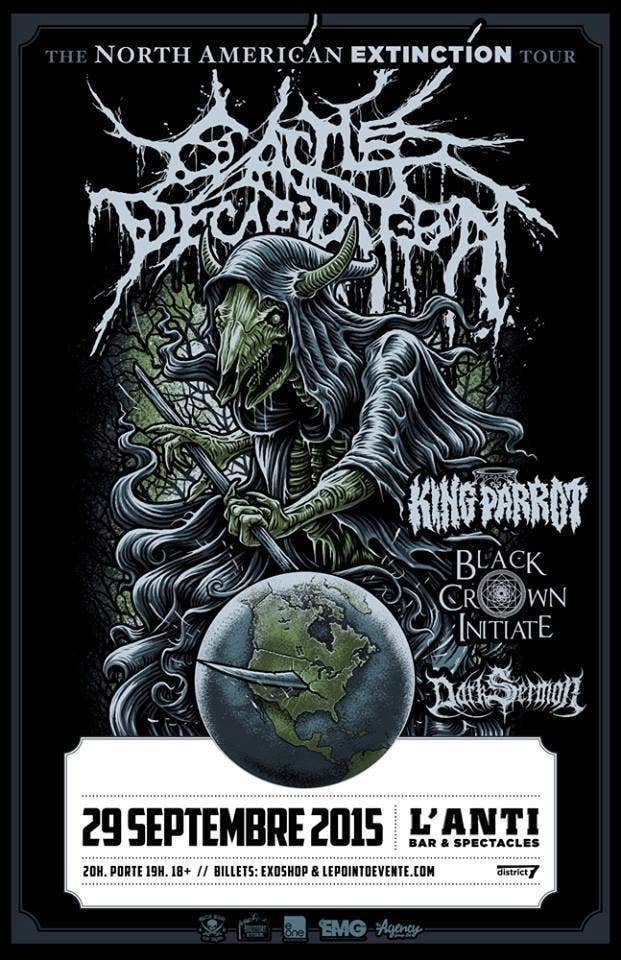
But Party Cannon – who are from Dunfermline in Scotland – are in fact a well-respected and punishingly heavy band on the death metal circuit, having recently finished an American tour.

Nevertheless, the Deathfest poster was being shared like wildfire on social media on Thursday.

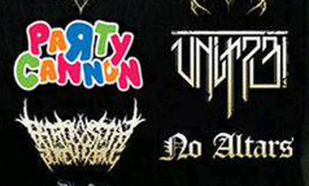
Jesus Christ, Party Cannon. We've been through this!

@steviebuckley Party Cannon looks like the logo for the local soft-play centre \m/
Chris from Party Cannon told BuzzFeed News that the poster has gone viral before – at least five times – and the band is used to it by now.
"We are aware that the flyer is currently being shared a lot, though this is not the first time the logo has gone viral – probably closer to the fifth," he said.
"It's crazy to see how far it has spread and it's always fun to see the spectrum of reactions it brings.
"I'm pretty sure 90% of the people that follow those pages have never even heard of Devourment but now they've heard of us, which I can't really complain about.
"Every time it goes viral we definitely gain legitimate fans that listen to the music, attend shows, buy merch, and properly get what we're about which is awesome.
"Obviously there are a few people that like the page just because 'the logo is funny', but thankfully people like that tend to fuck off as soon as a new cat picture is uploaded."
All this goes to show is that black/death metal band logos are normally very hard to read.