
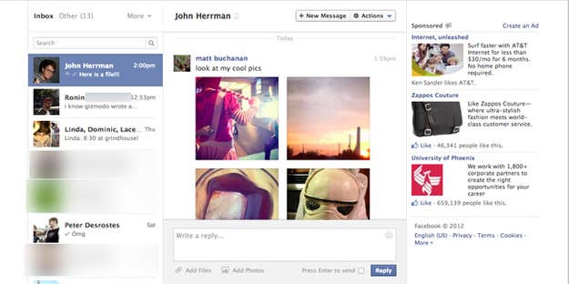
If your Facebook messages don't look like this now, they will very soon. The redesign was announced back in August when it first talked about the mercury project, its ambitious re-architecture of chat and messages, but appears to have become more widely available for users over the last day (though not everybody seems to have it yet).
The big changes include a side-by-side two-panel view, with a conversation list on the left and whatever message is in focus on the right, an interface style that's become de rigueur for tablet chat apps; a richer message style that's more photo centric; and more profoundly, a new threading and search system that makes it horrifically easy to reach back into the annals of your own Facebook messages, uncovering conversations you haven't seen in years and no longer make any sense. Like, here's my first ever Facebook conversation:

Facebook's been iterating hard and fast on messages and chat over the last few months, with the new messages design announced just two months after Facebook changed users' default email address to @Facebook.com — a move intended to funnel email into users' Facebook messaging inbox. Facebook also launched a totally rebuilt Messaging app for iOS and Android about a month ago, and made a small change to chat in the last month or so that started telling users if the recipient(s) have seen their message.
The reason Facebook's hitting this hard is that there's very much a vacuum to be filled here: There's no longer just one chat service that everybody uses, like AIM back in the late 90s. And if any sevice could credibly claim to make that happen, it's probably Facebook. After all, everybody's already on it. Except the weirdos.