
Twitter's been doing things in the last weeks and months, things like changing the rules for developers and effectively smothering third-party clients like Echofon, killing connections between it and competing services, and removing third-party image services from its app. All to build toward this promise of a Shiny New Twitter. A Shiny New Twitter that we haven't seen a pixel of. Until now.
Twitter's announcements today are relatively minor, in a way — you now have a cover image in your profile, just like Facebook (and, uh, Path)! and a new iPad app that looks like the current iPhone app, but bigger. The most noteworthy news, at a glance, might be that Twitter announced an update to an iPad app on the Today Show. But these are the first bits of the Shiny New Twitter, the Twitter that's more like Facebook than, well, Twitter.
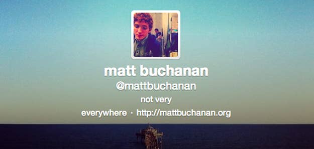
This Twitter update, in a sense, is all about images (which makes sense for a text-based service becoming a Media Company). The most visible change is that user profiles have been redesigned around a splashy cover image. The reason, like the design, is pretty Facebook-y: to make your Twitter profile a more canonical landing page for you as a person. In other other words, Twitter wants you to send people to your Twitter page, not your Facebook page (or About.Me or whatever page). To that end, it's also why it's made photos and images that you've tweeted far more prominent. (The killer real estate for images is why Twitter's officially removed third-party image sharing services like TwitPic [and personal favorite MLKSHK] from the official Twitter app, dooming them to an altogether different kind of existence.)
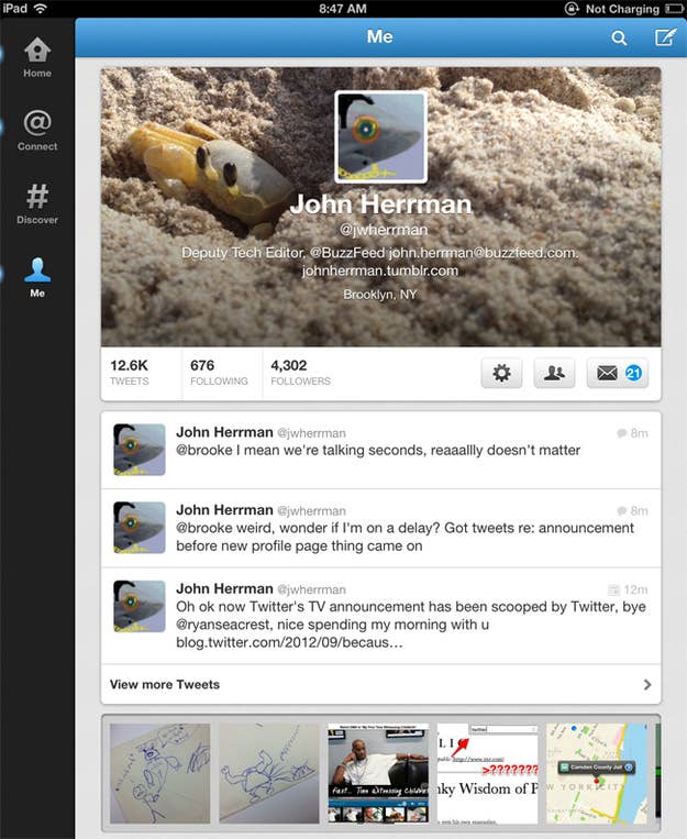
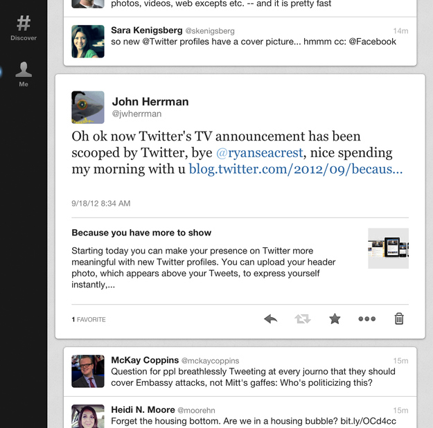
A couple months ago, the director of Twitter's design team told me that none of its current apps really match the vision for where they're going with Twitter. The first app to start to do that, apparently, is the new iPad app. Which, yes, looks a lot like the current iPhone app. But then if you look at the media experience, you can start to see what that means, hints of a richer, more viscous Twitter stream — like this. Images in general are more immersive in the iPad app than the iPhone version (just compare a profile page on the iPhone vs. iPad) and if you look at the way tweeted articles appear on the iPad, the thumbnails are massive, relatively speaking, and feel more Flipboard-y than old-school Twitter. And a lot of it is underpinned by Cards, which is where Twitter wants developers to build stuff, creating little modules, not unlike the way Facebook has developers build into Facebook. (Right now, every time you tweet an Instagram picture and it looks real nice? That's a Card.)
We're also seeing, for the first time ever, a Twitter that's actually consistent across the four platforms it considers important — iPhone, Android, iPad and the web — a fact laden with no small amount of irony, since "consistency!" has been Twitter's battle cry since it started tightening the noose on third-party clients like Tweetbot well over a year ago. (Until relatively recently, Twitter had wildly differing experiences on its official apps for iPhone, Android, and the iPad versus the web.)
Today, Twitter gets to talk about how "consistent" your new cover image is across all four platforms. Which is good from a product point of view — it should be easy to use Twitter no matter what device you're using — but it's also very good from an advertising point of view: It's a lot harder to sell ads to folks if you don't know what the ads are going to look like when they land on somebody's phone. And Twitter, the media company, has a lot of ads to sell. It's also, I suspect, much easier to sell ads in a rich stream of images than it is in a spartan stream of text.