
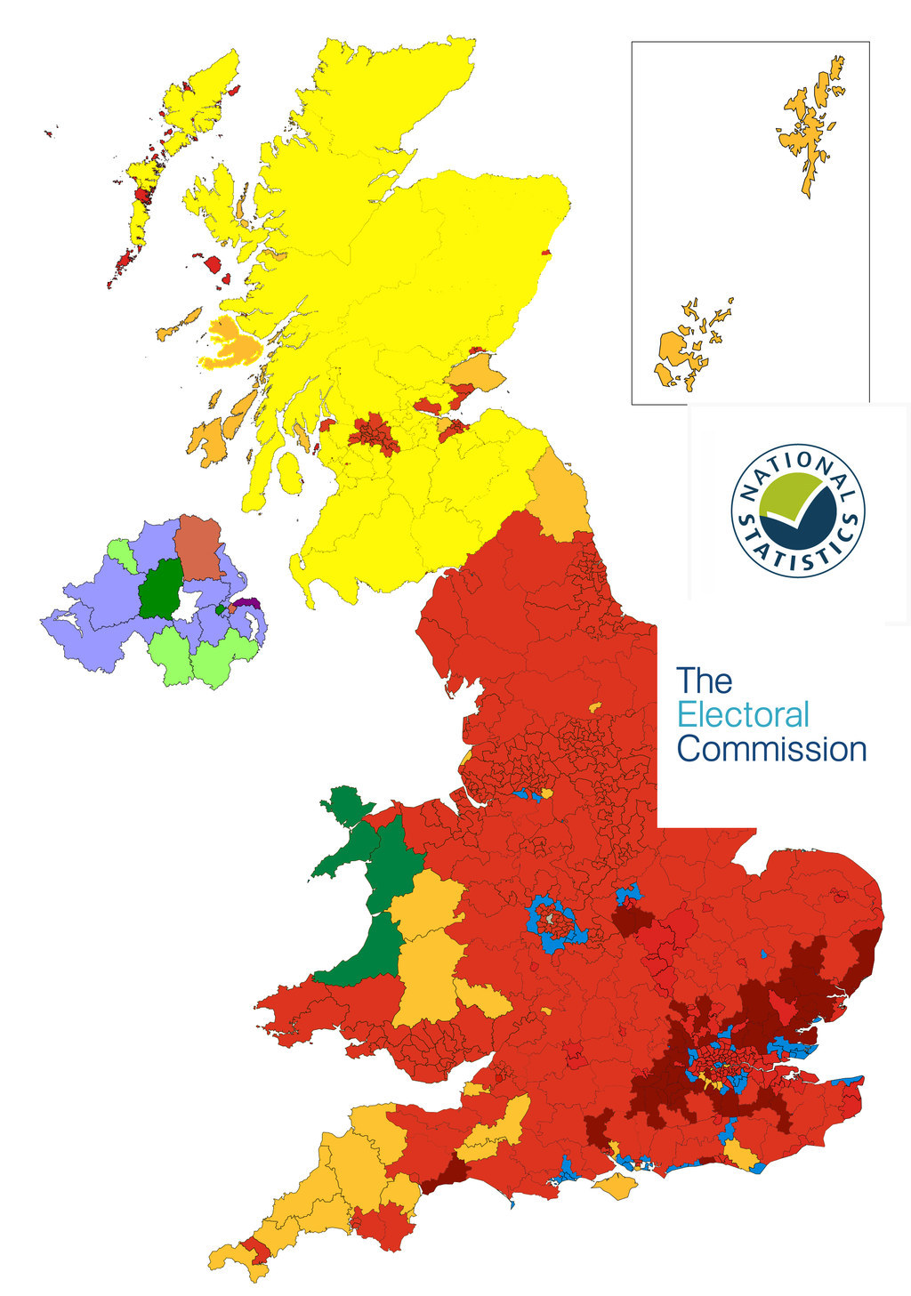
A fake map purporting to show the real results of last week's elections has gone viral.

Oi! #bbcnews. Why do you keep talking down #Labour? Here's the post local election map...
The map, which purports to show Labour's success in last week's local elections, went viral over the weekend as people defended the party's performance.
While there had been widespread predictions that the party would lose hundreds of council seats across England and Wales, Jeremy Corbyn's party instead beat expectations and only lost 18 wards. In the process, Labour held on to most of the councils it already controlled.
After weeks of the party's chances being talked down, some Labour supporters were understandably keen to celebrate the relative victory and started sharing this map.
The problem is this map is completely wrong and doesn't resemble any real election results.
For a start, there were no local elections in swathes of England and Wales, meaning a realistic map would have large gaps in the results where no council elections were held.
Moreover, it ignores areas in Scotland and Wales where the Conservatives made substantial gains – one of the big stories of the real election night. And it gives the impression that Labour has taken control of vast chunks of rural middle England.
It also features a spurious "Gov.UK" logo placed on the graphic for no particularly good reason.
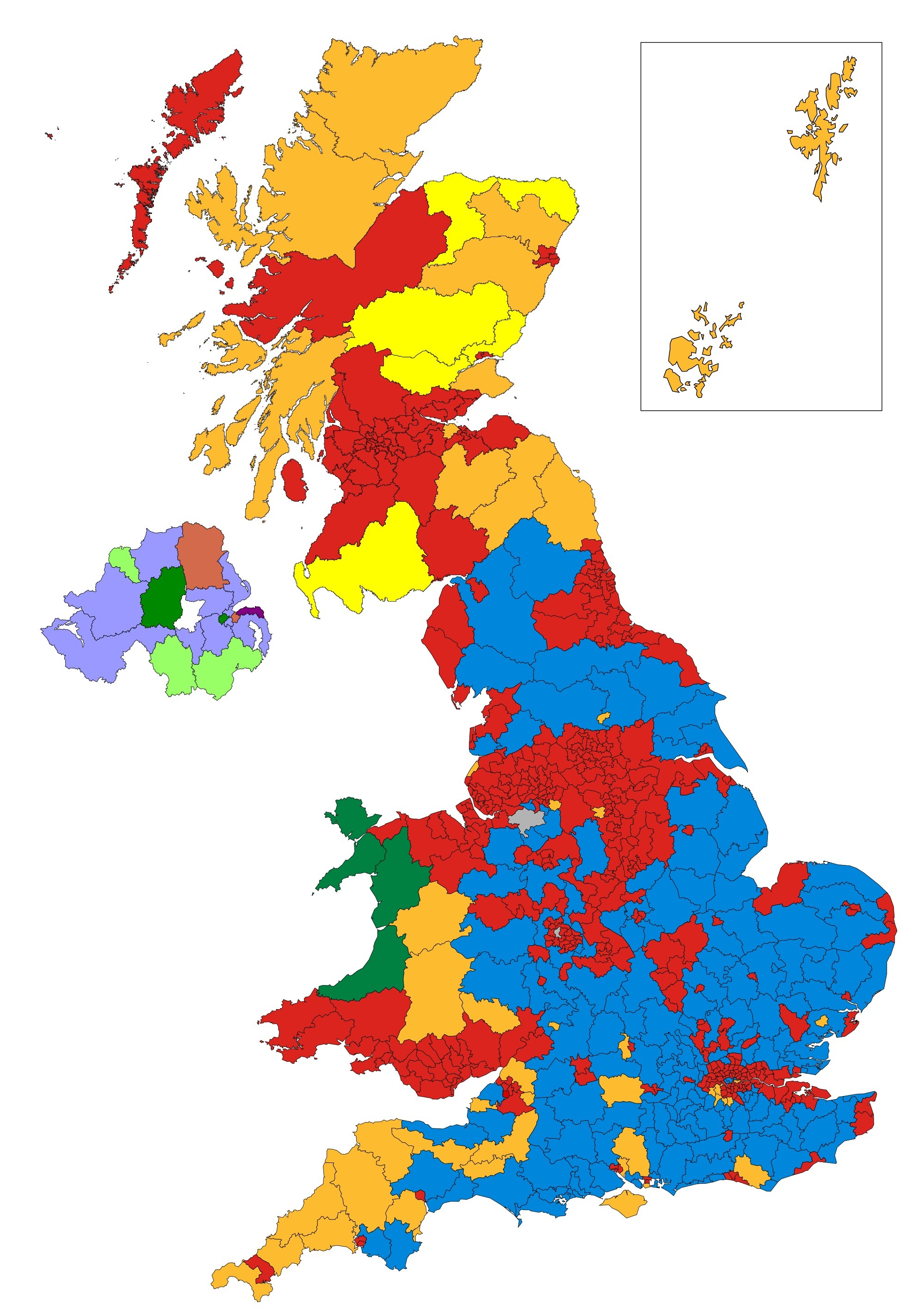
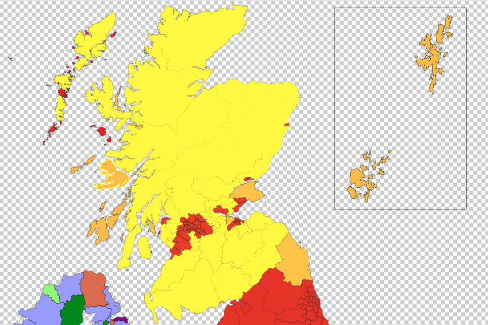
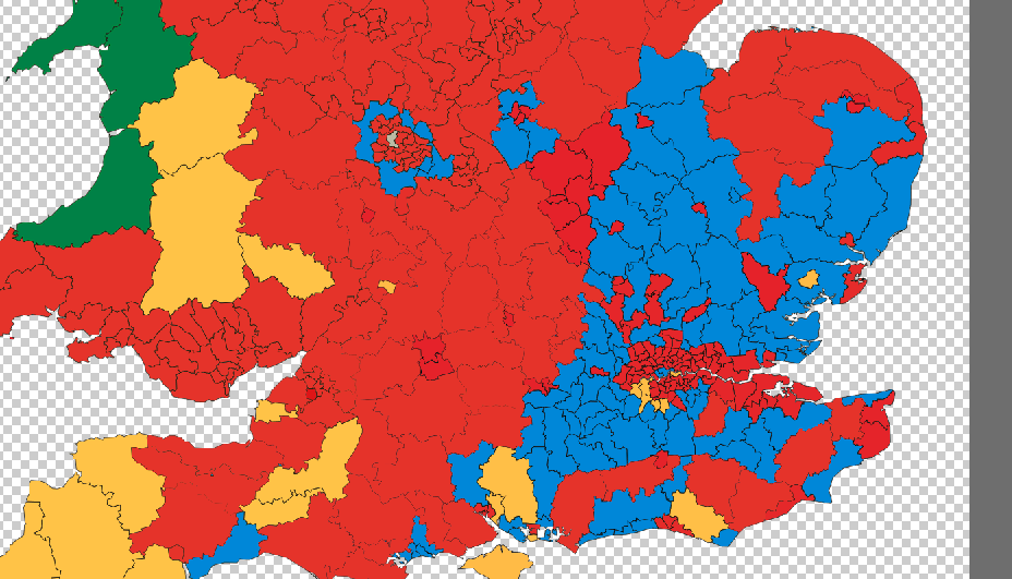
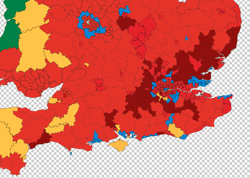
This is what the map of Thursday's election results really looks like.
So why are people sharing the fake version?
This map began appearing on social media on the day after the poll. It was given a boost by a tweet from fake TV journalist Jonathan Pie, played by actor Tom Walker. He said he didn't make the map and does not know where it originally came from.
However, Walker said it plays into a wider distrust of the media and political reporting, especially when it comes to Jeremy Corbyn and Labour.
"People know when they're being spun a line and the run-up to the local election was about how Labour are going to do really badly," he said. "Normally in the run-up to a local election it's about how are the incumbents doing and there was nothing about this. People were being spun a line, they knew they were being spun a line, they were thirsty for the actual facts, so they'll go with anything."
Or, as he put it more succinctly: "If there's a void of facts then people will fill it with any old shit."
In order to demystify the process, here's your own guide to creating a fake viral political map.
1. It appears the creator of the viral local elections results map started with a Wikipedia graphic of the 1997 general election. So we did the same.
2. Wielding the paint bucket tool on photoshop, we coloured in most of Scotland in something roughly approaching an SNP landslide.
3. Then we headed to England and just coloured in a lot of the south of the country in red, because why not?
4. At some point we accidentally switched shades of red but we'll just claim that was on purpose to show the spread of deeply held political values.
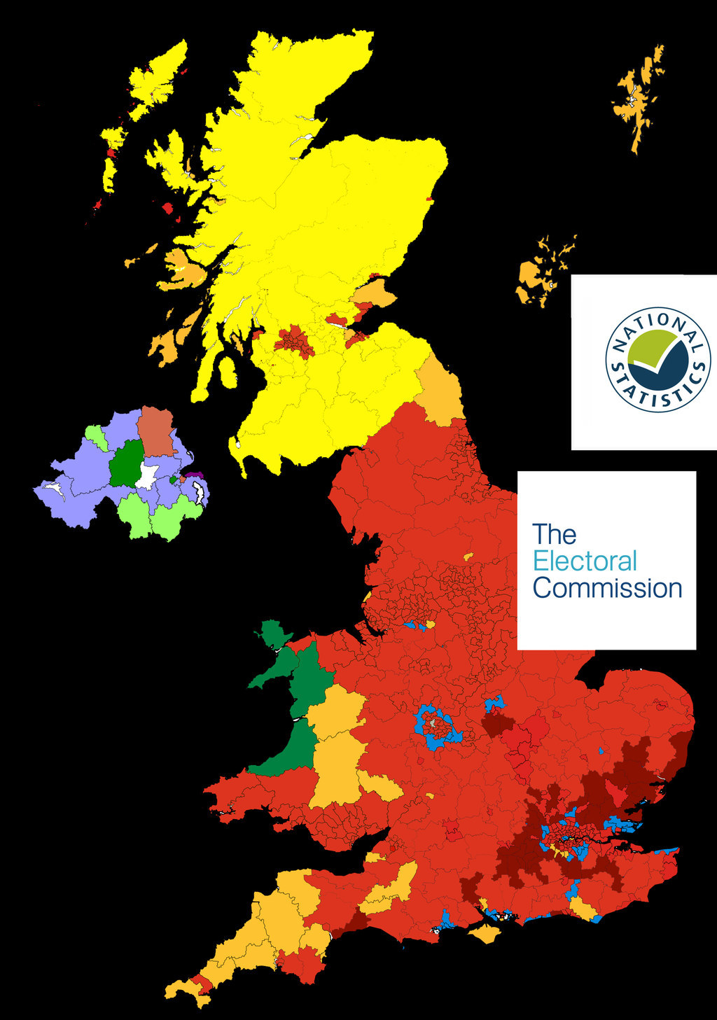
5. Ta-da! Job done. Now we added some spurious official-looking logos to give the graphic an element of authenticity.
6. Then a black background to make it seem a bit more serious.
7. Then there's the opportunity to insert a real political message, so we took the big decision to play on fears of a media conspiracy and deploy "BBC Lies" in inverted commas.
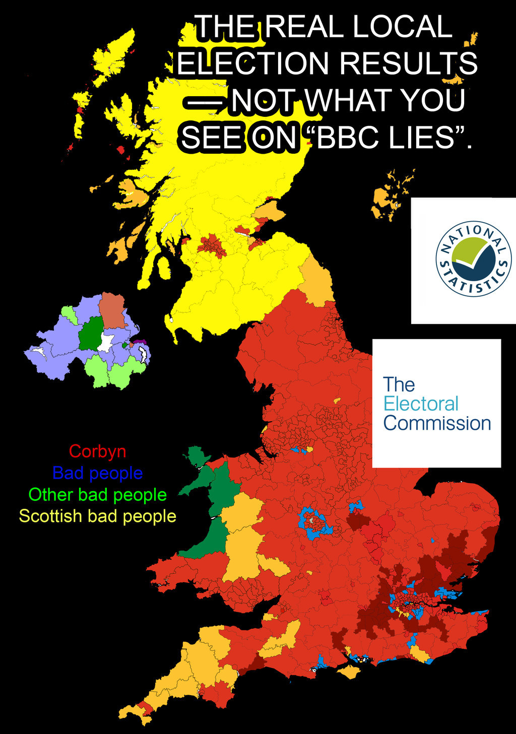
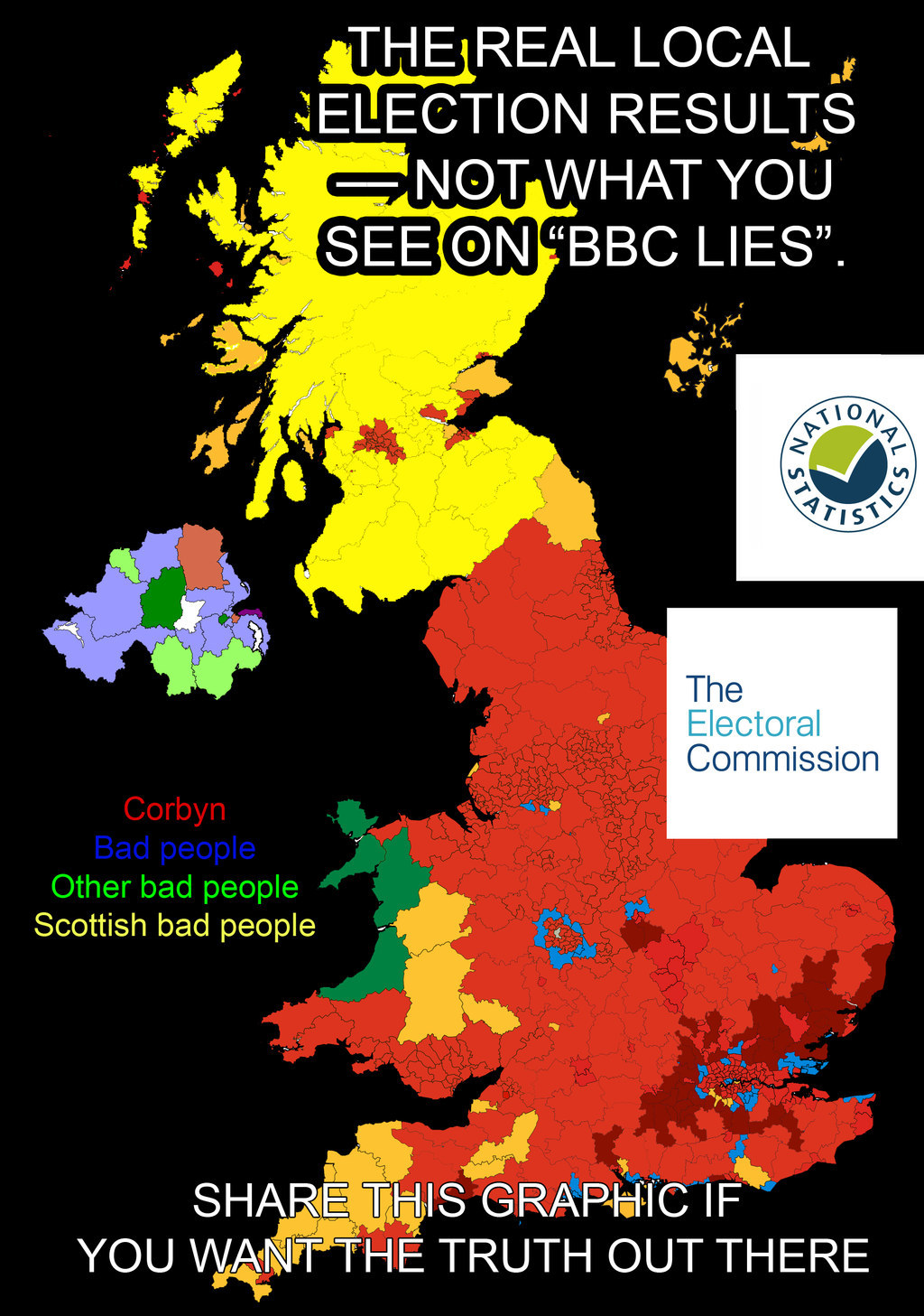
8. And just to finish our fake election map off and make it more viral, we added a a line of text at the bottom pleading with people to share it.
And that's how you do it.
If you want to read how Labour really did in last week's elections, read this.