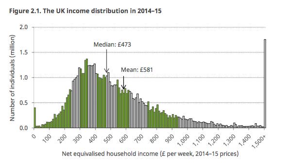
1.
This is what the UK's income distribution looks like today.
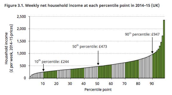
2.
The average take-home income is either £473 a week, or £581 a week, depending on how you look at it.
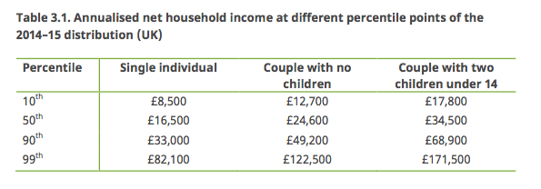
3.
Here's what all that means in figures.
4.
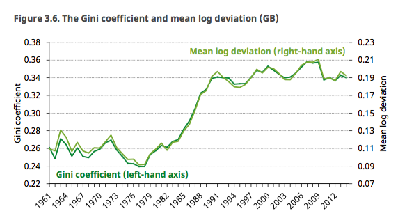
Inequality has fallen since the financial crisis – but not by very much.
5.
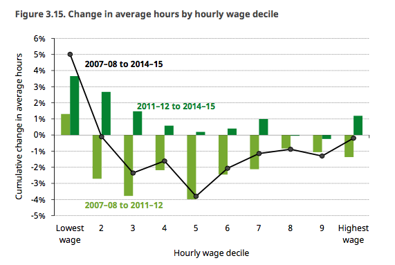
The reason inequality is falling isn't particularly rising wages, but that poor people are working longer hours.
6.
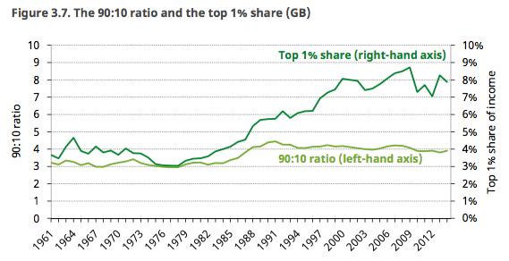
The ways of measuring more extreme inequality show less improvement than the official measures.
7.
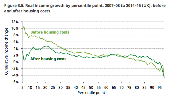
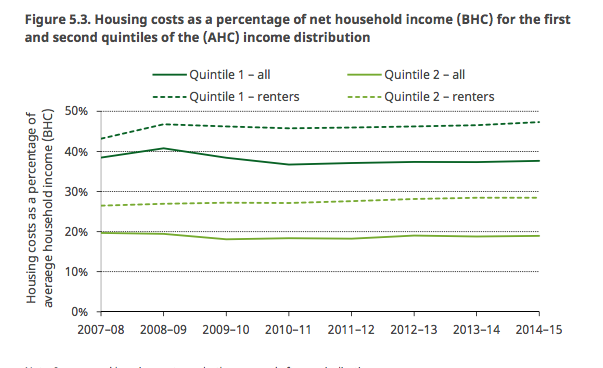
Housing costs wipe out most of the gains made by the lowest earners.
8.
Poorer renters spend a higher share of their income on housing.
9.
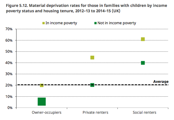
Among families with children, those who rent but aren't in poverty are more likely to face deprivation than non-renters who are in poverty.
10.
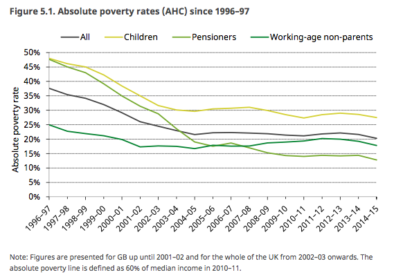
Families with children have the highest poverty rates. Pensioners have the lowest.
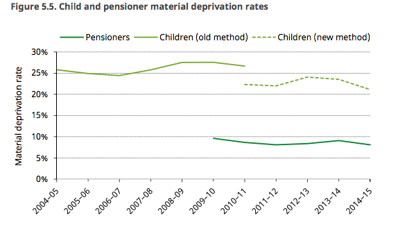
11.
This pattern stays true for deprivation, as well as poverty.
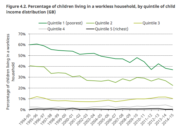
12.
Most children in the poorest households have parents who work.
