1.This bookmark was given to a kid at SCHOOL. Imagine it poking out of a kid's book and just seeing "drugs proud!"
2.This is in a pediatric dentist's office.
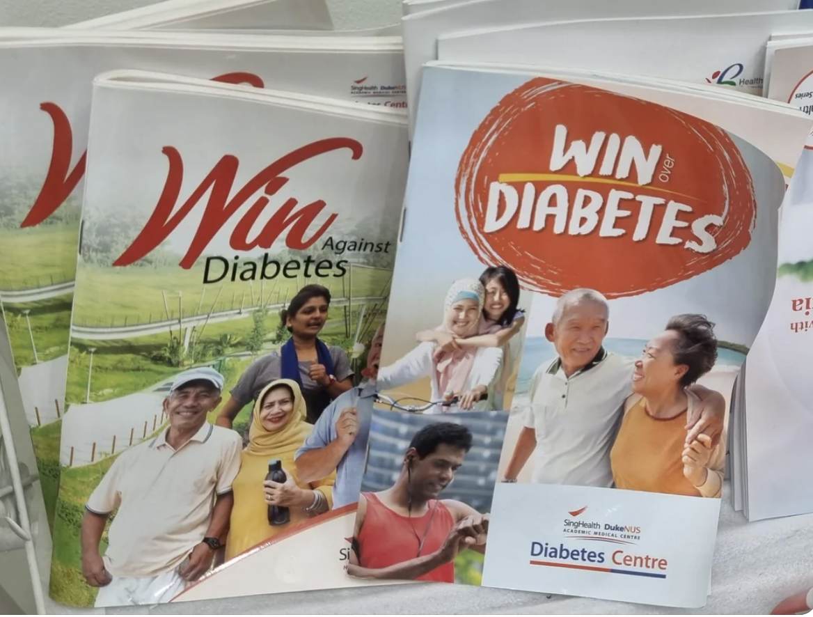
3.I've always wanted to win diabetes!
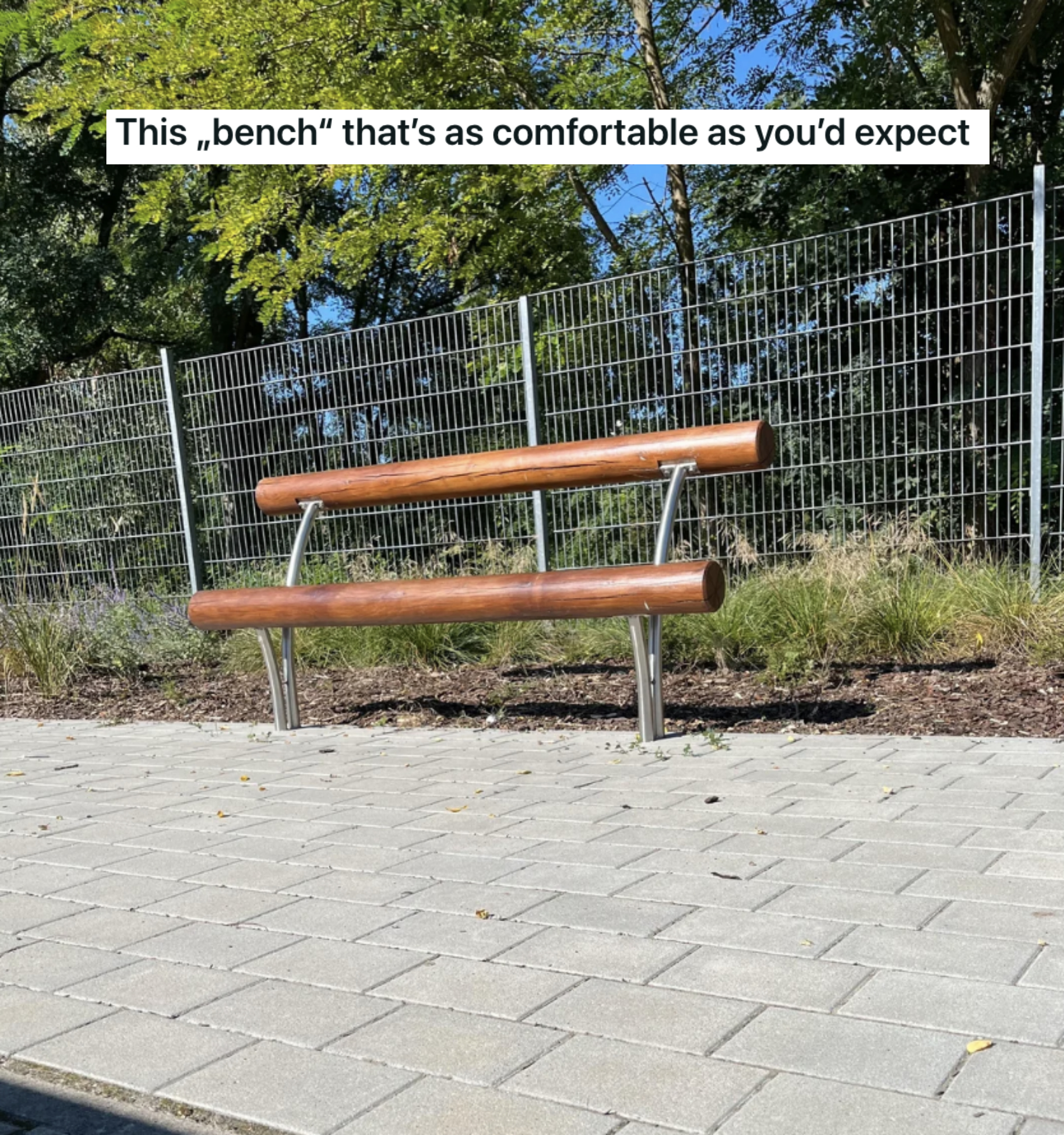
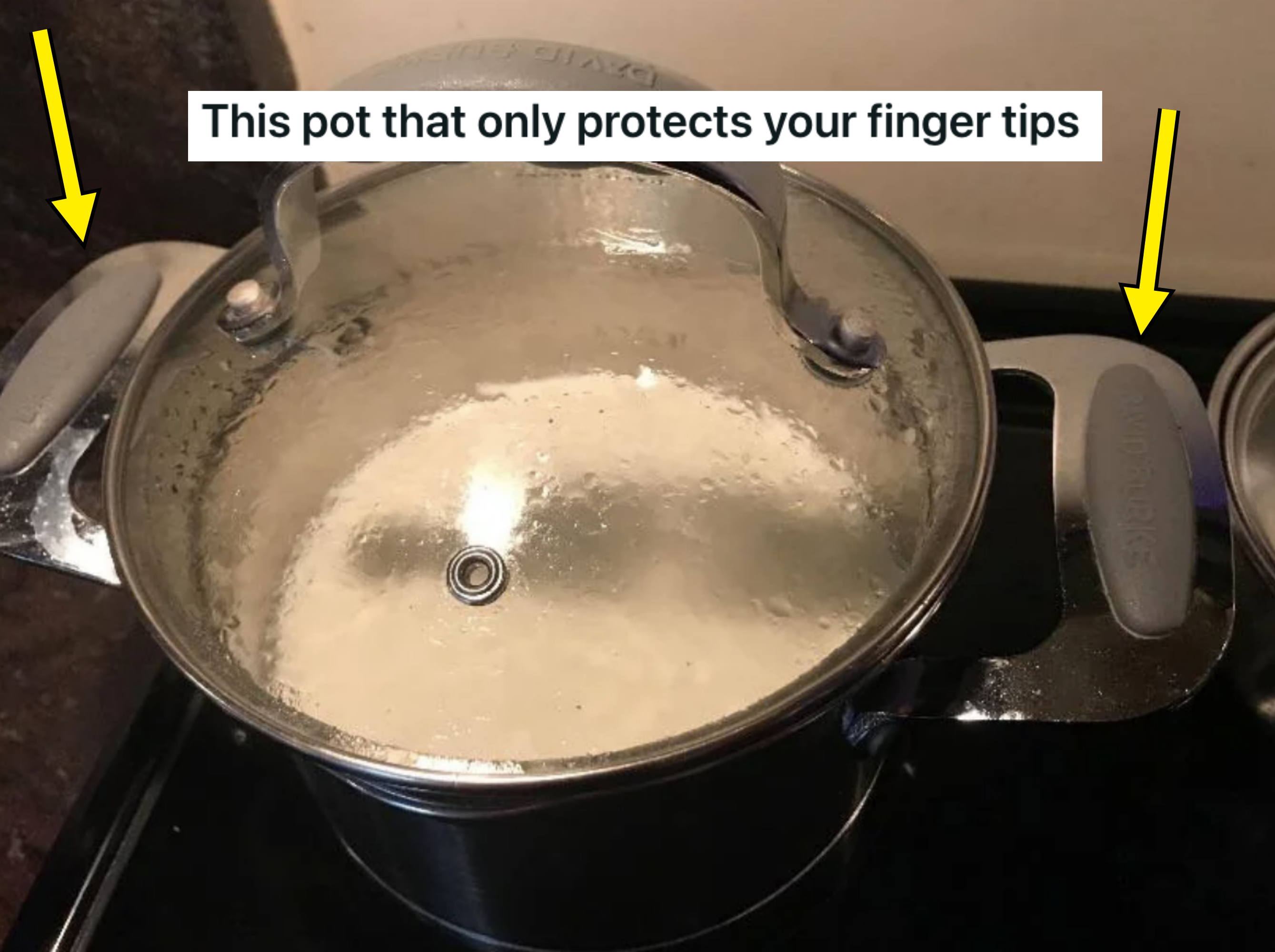
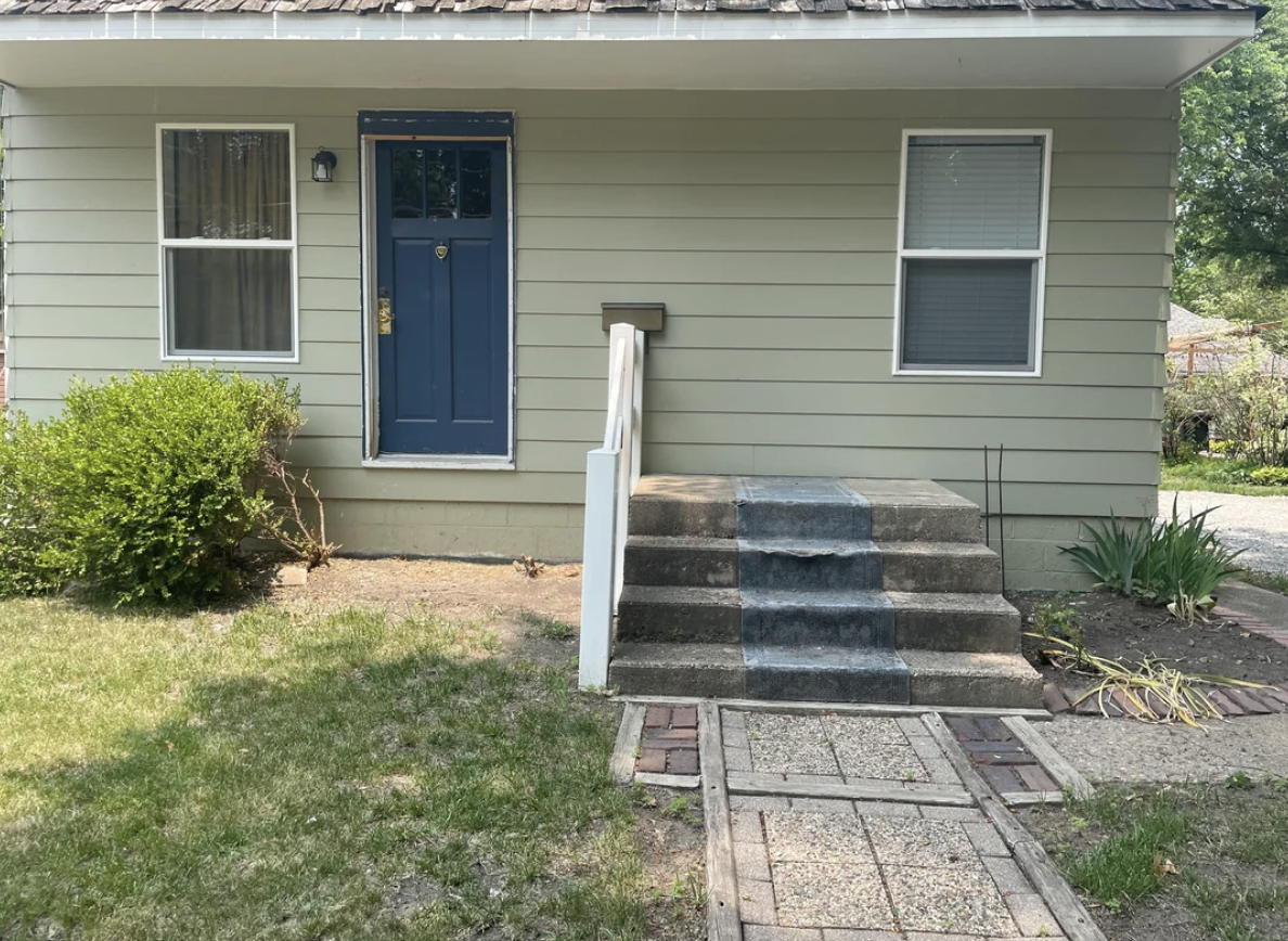
4.There are things that are A) aesthetically pleasing but not functional, B) functional but not aesthetically pleasing, and C) neither. Guess which this is.
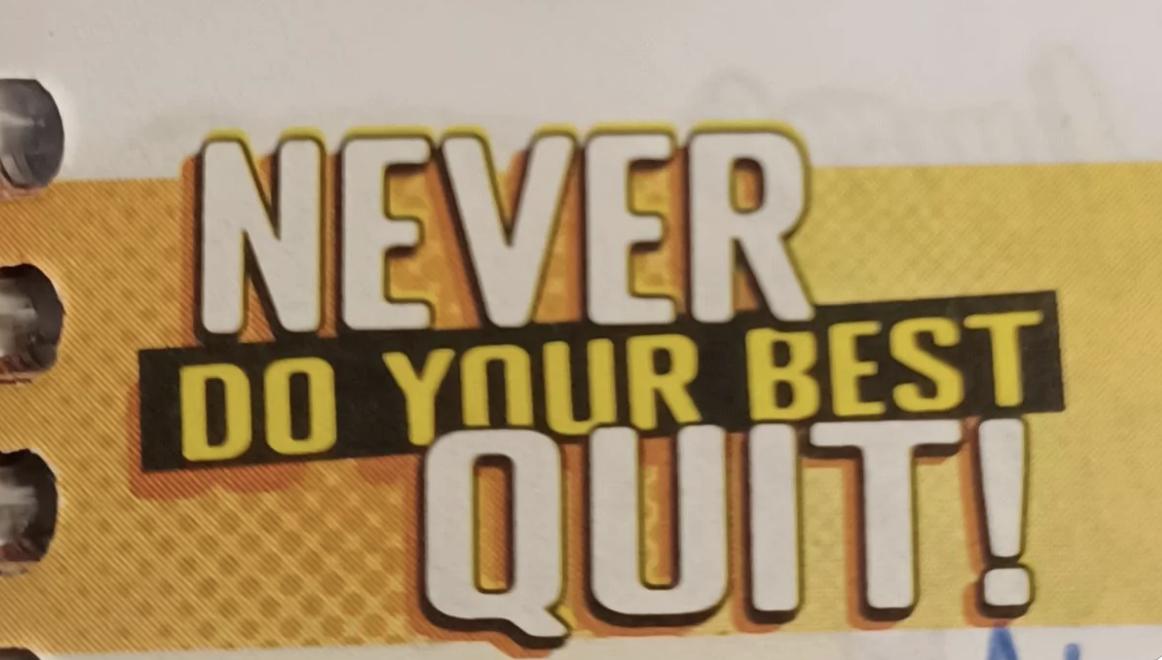
5.So motivating!
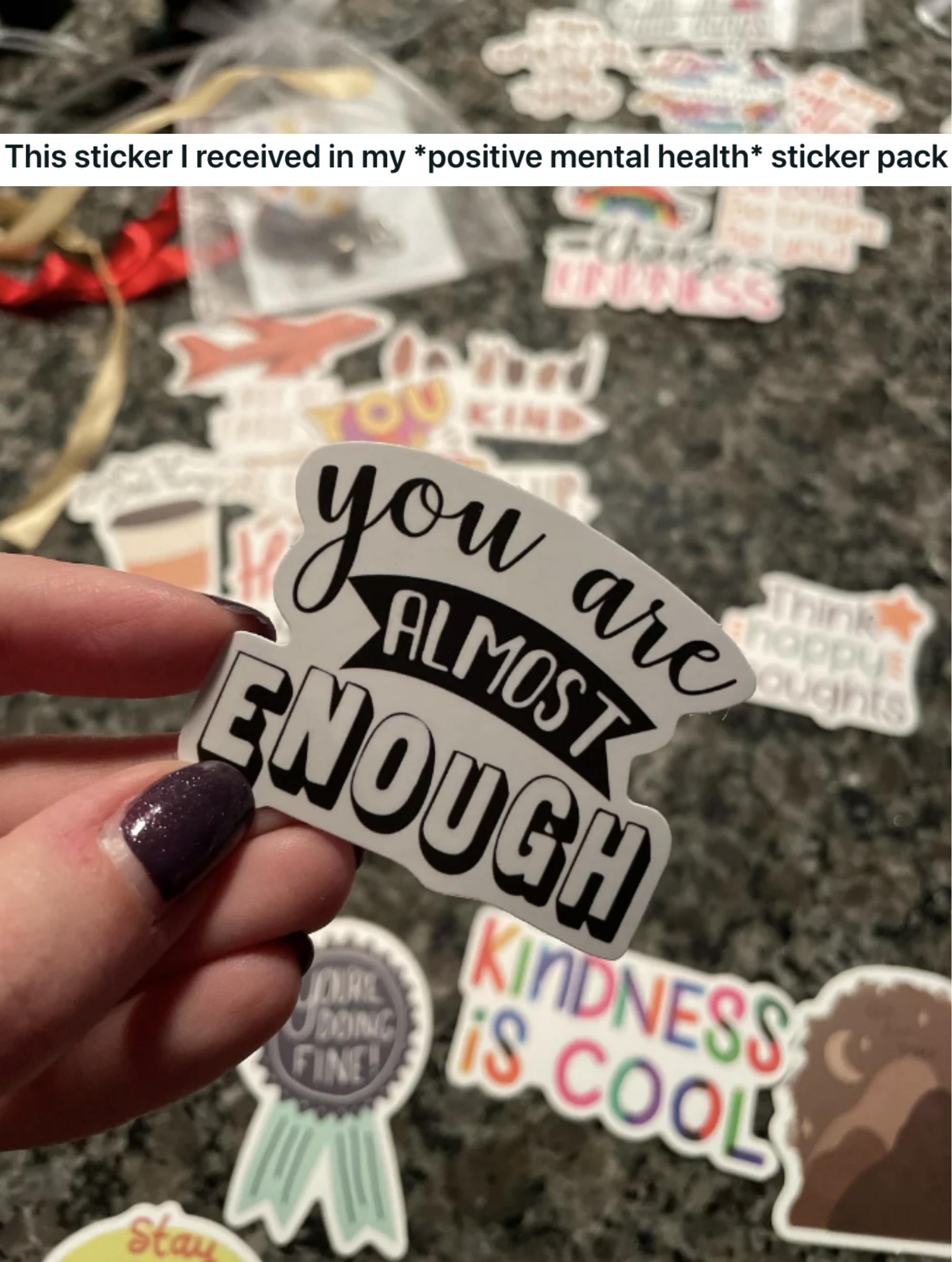
6.This, too!
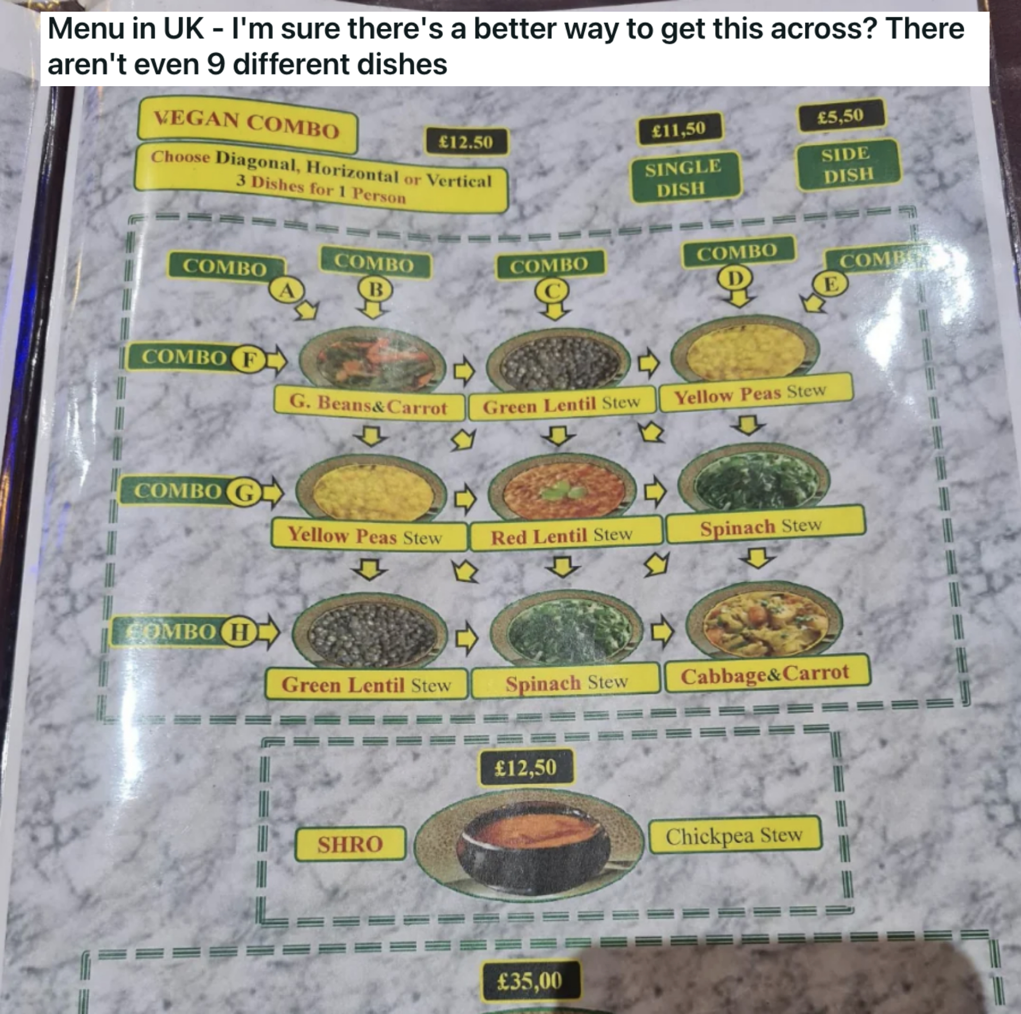
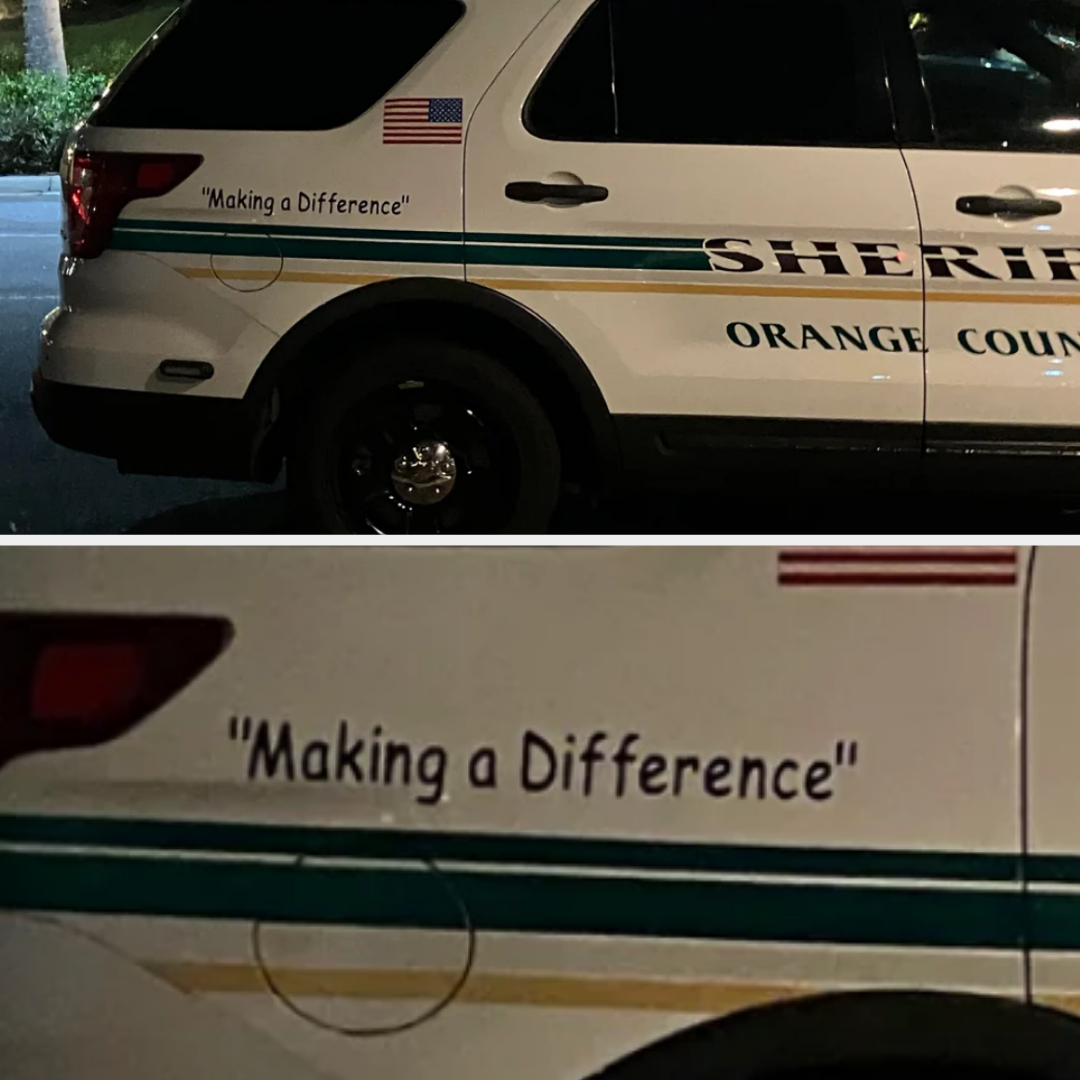
7.According to OP, this is a consistent error, and I really feel like the company should've noticed by now.
8.What is this even supposed to say?
9.And this?
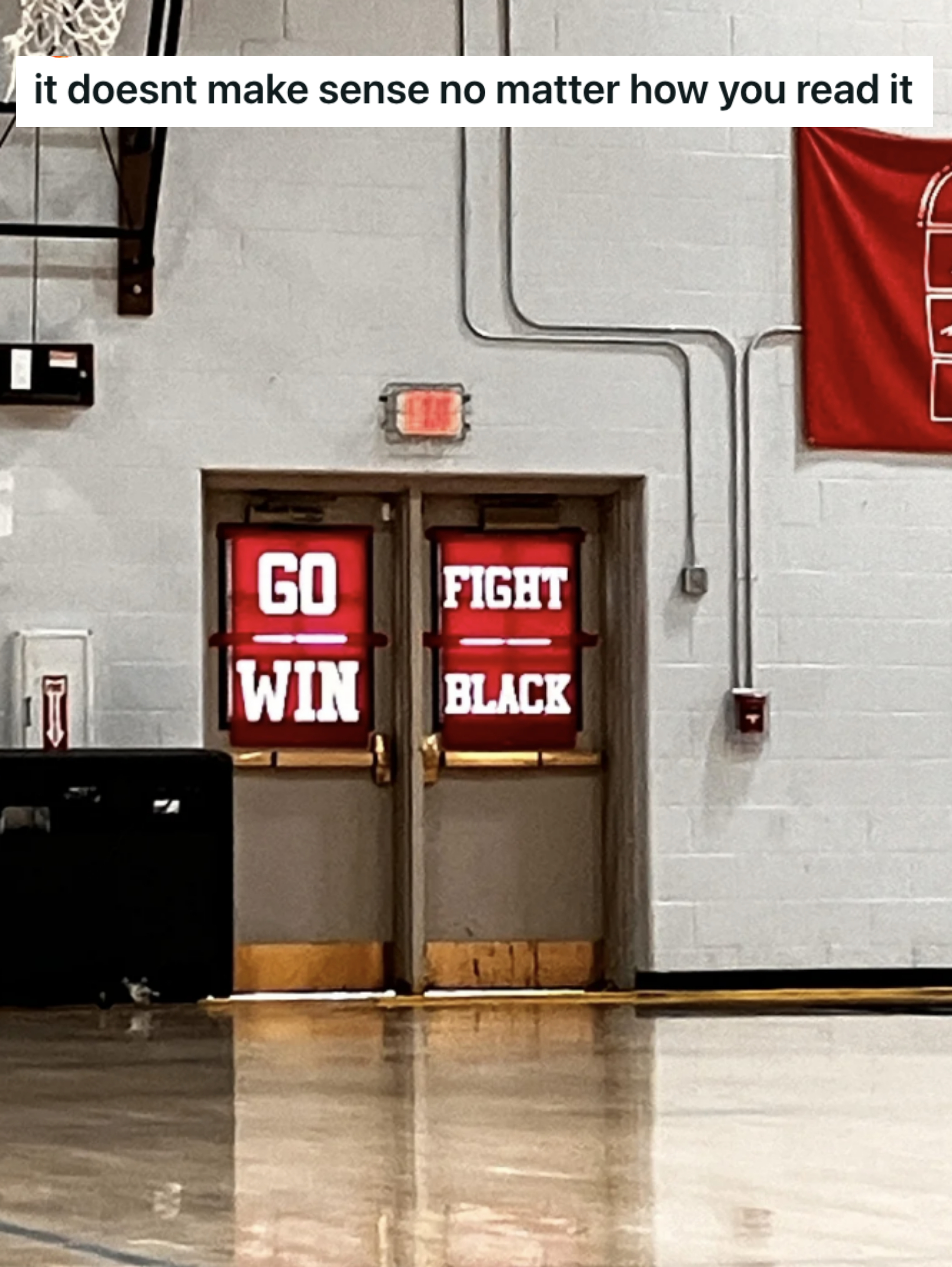
10.This design just makes zero sense.
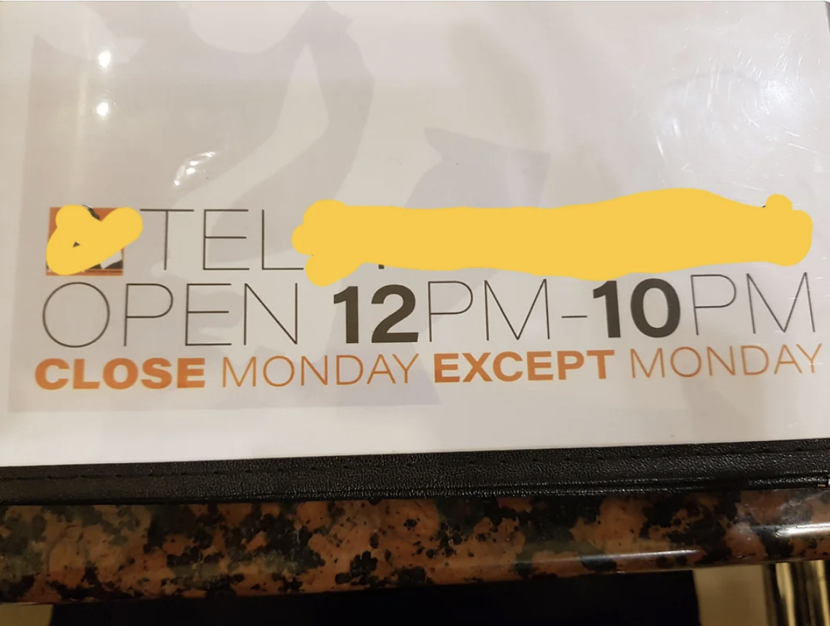
11.Uh...closed when?
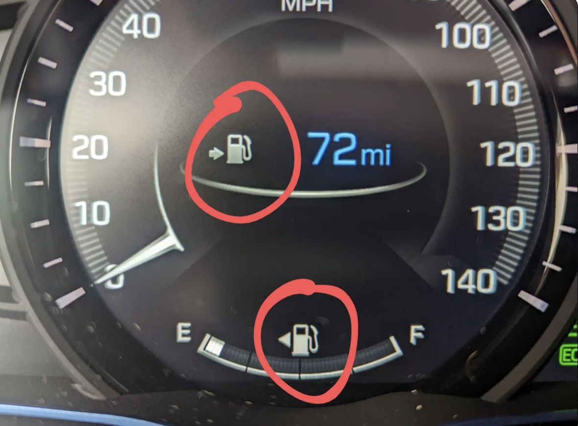
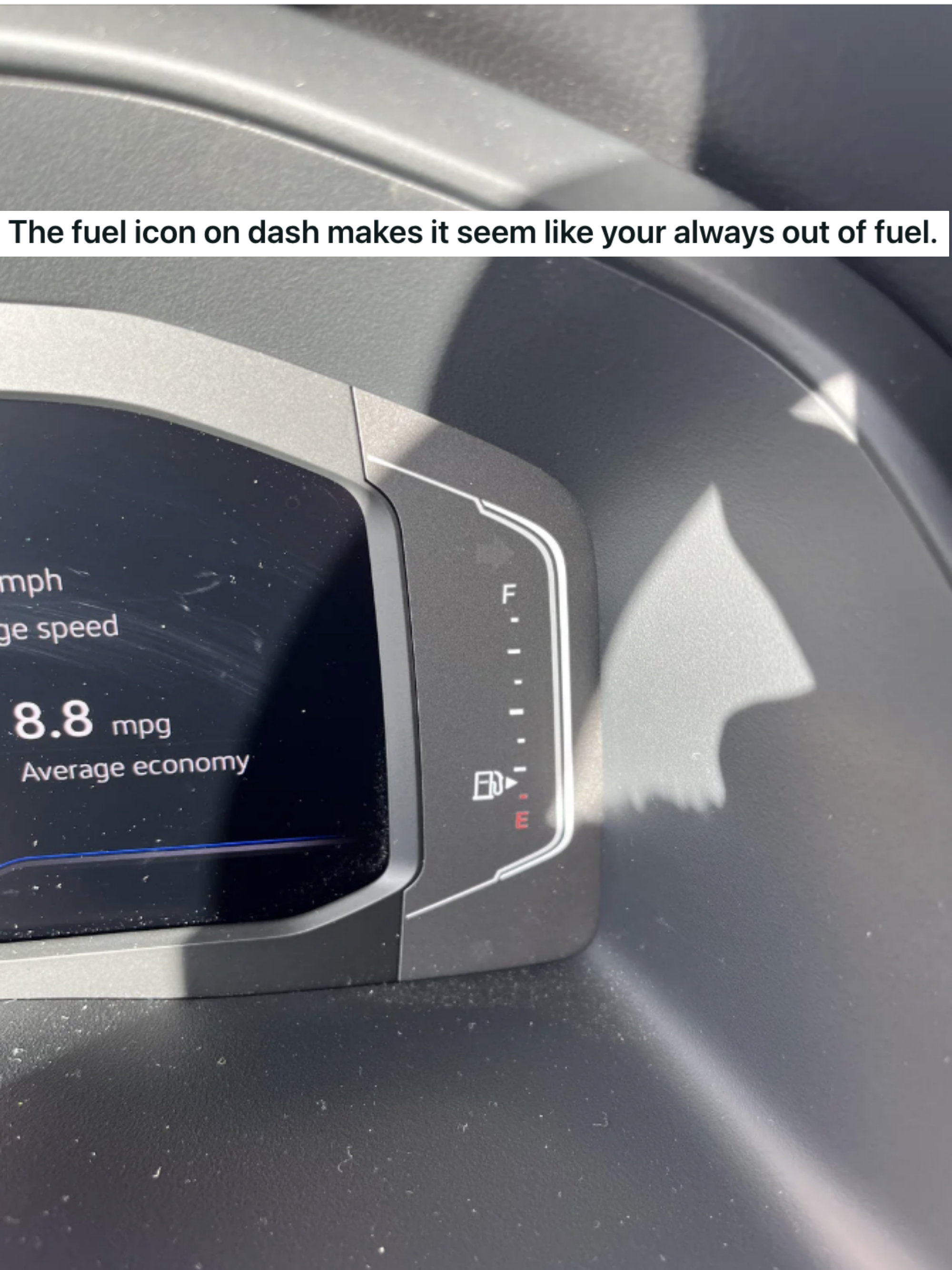
12.Which way is the gas valve???
13.Why would someone create this monstrosity, if not to torture us mortals?
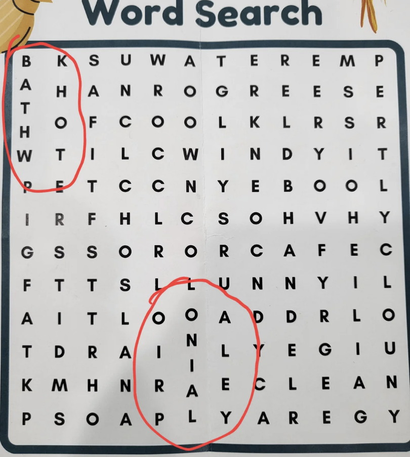
14.This word search has two columns with extra letters, and it's genuinely infuriating.
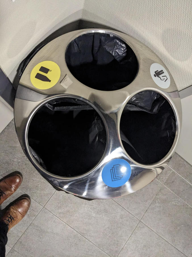
15.This garbage can could reallyyyyyy use some arrows.
16.The person who made this sign clearly did not understand the assignment.
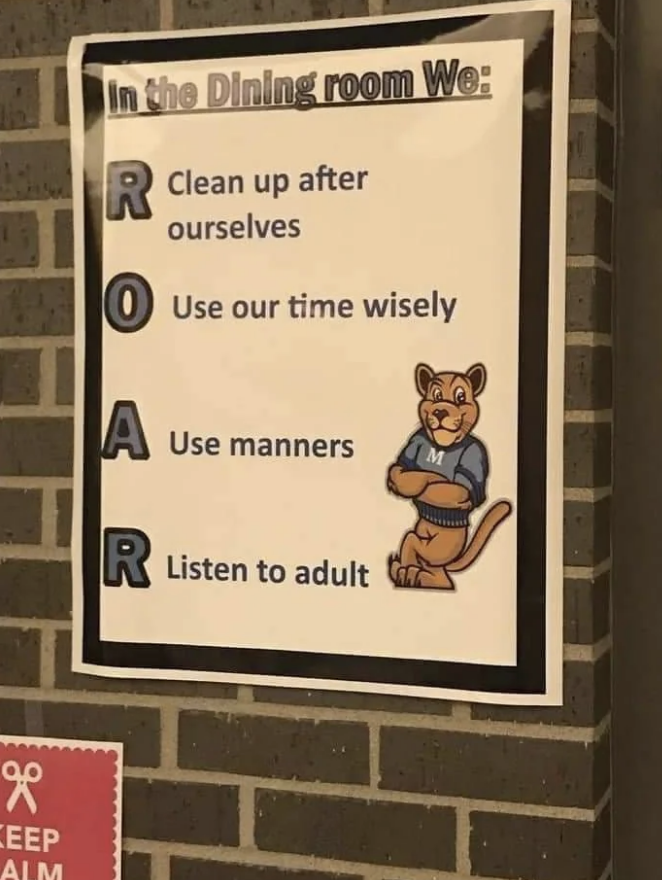
17.And this person did not understand acronyms.
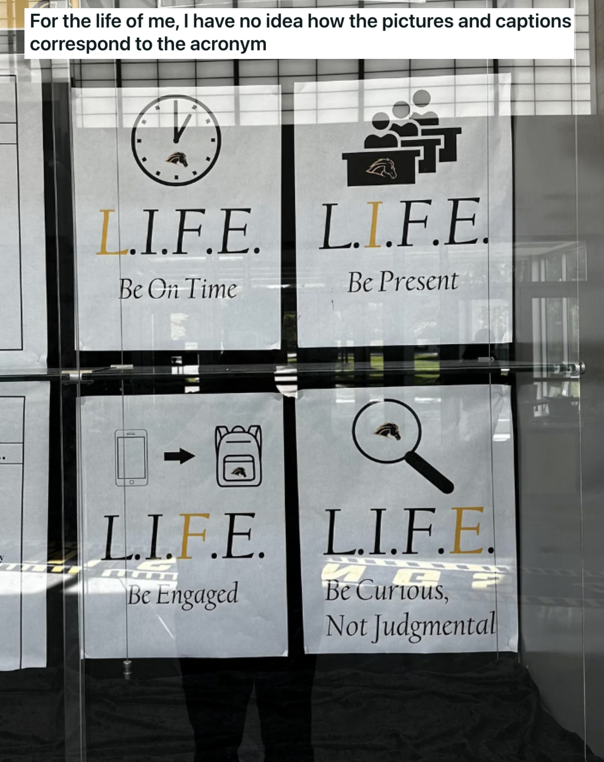
18.Yet another unrealistic standard for women!
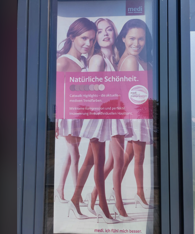
19.This political ad just hurts my eyes.
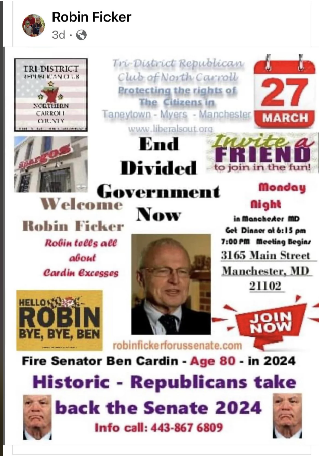
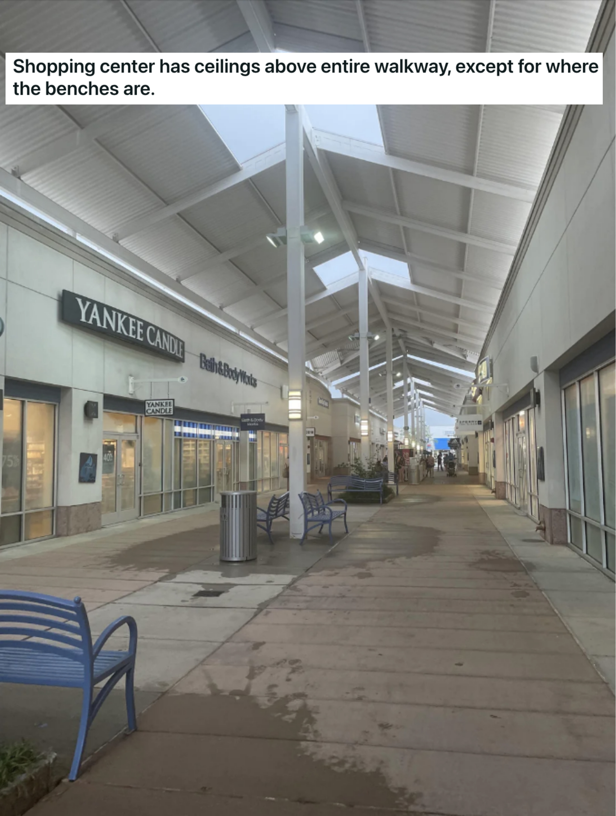
20.This shopping mall is actually specifically engineered to make people angry.
21.Am I having a stroke, or is this impossible to read?
22.I can't unsee this now.
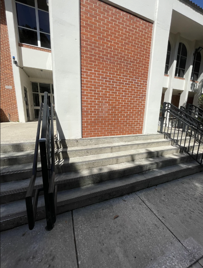
23.This has got to be a safety hazard.
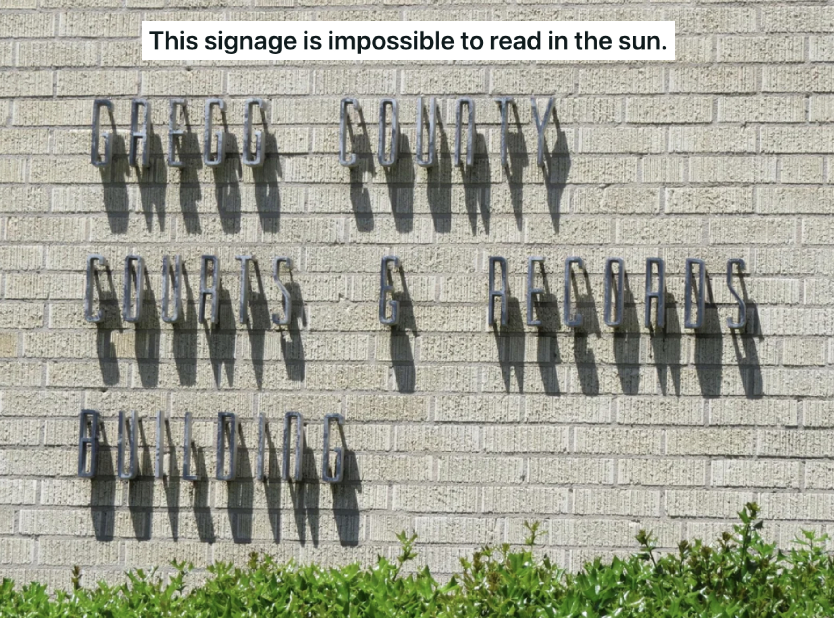
24.Why would you make an outdoor sign that's impossible to read when it's sunny?
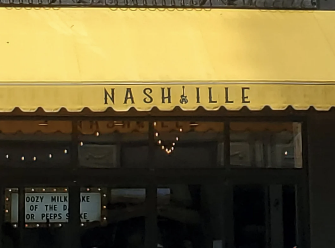
25.They could have made the "i" a guitar...
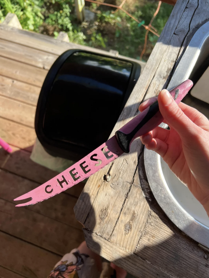
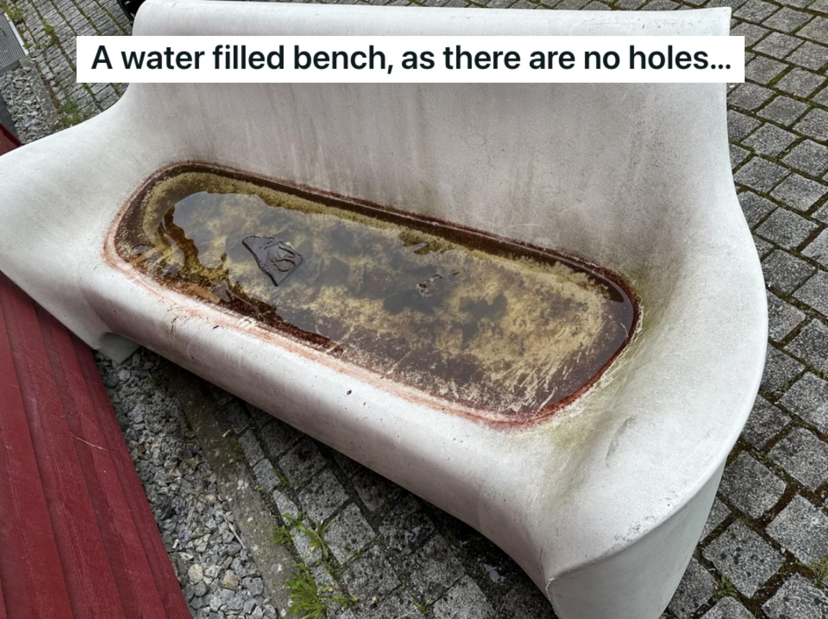
26.This would be nearly impossible to clean.
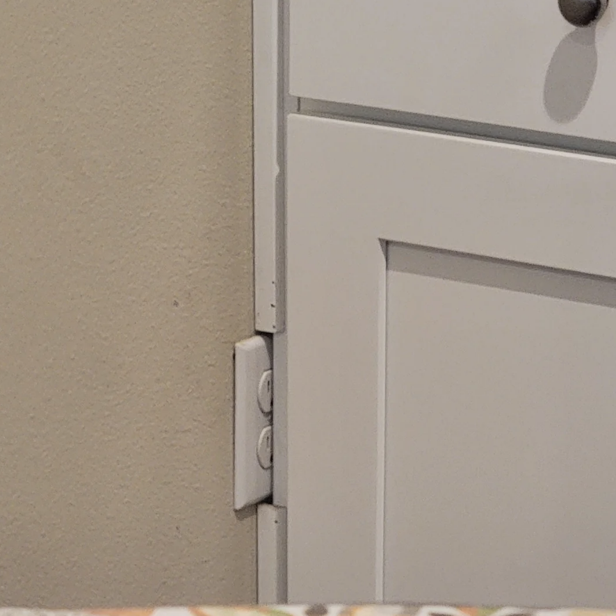
27.Great plug placement!
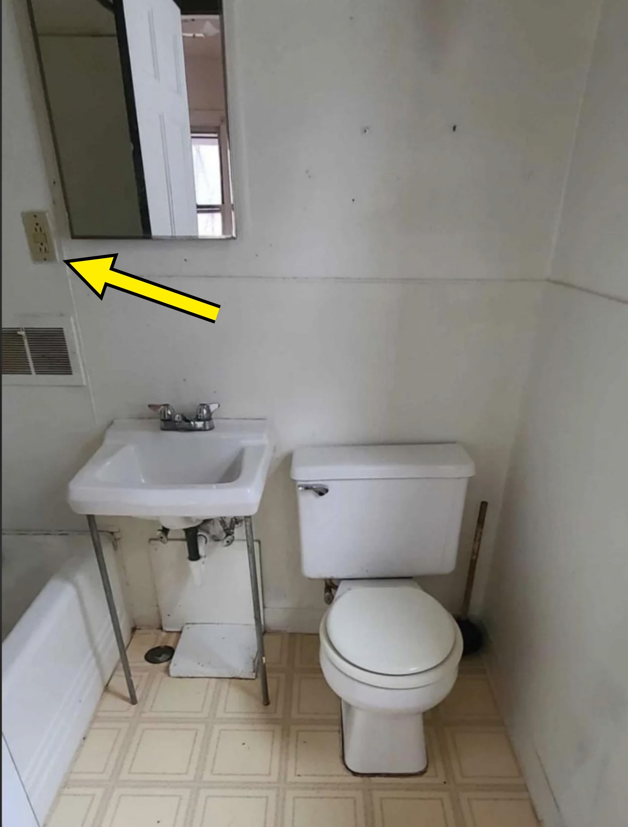
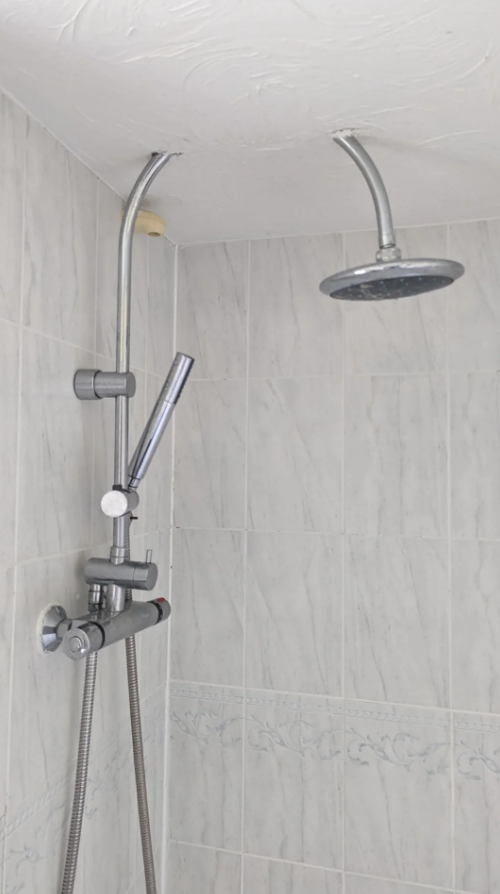
28.This one — in a SHOWER — is even better!
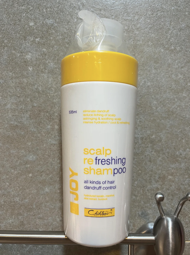
29.This just makes me angry.
30.And this is just stupid.
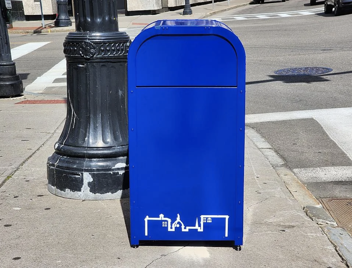
31.These bright blue trash cans DEFINITELY don't look exactly like mailboxes.
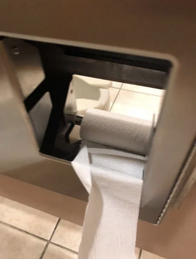
32.This would stress me the heck out.
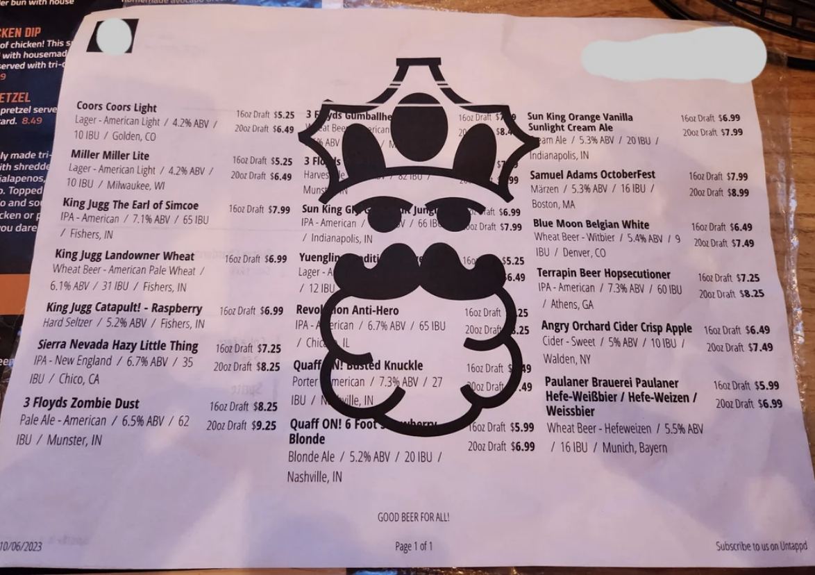
33.I feel like I need a degree in rocket science just to understand this.
34.And this.
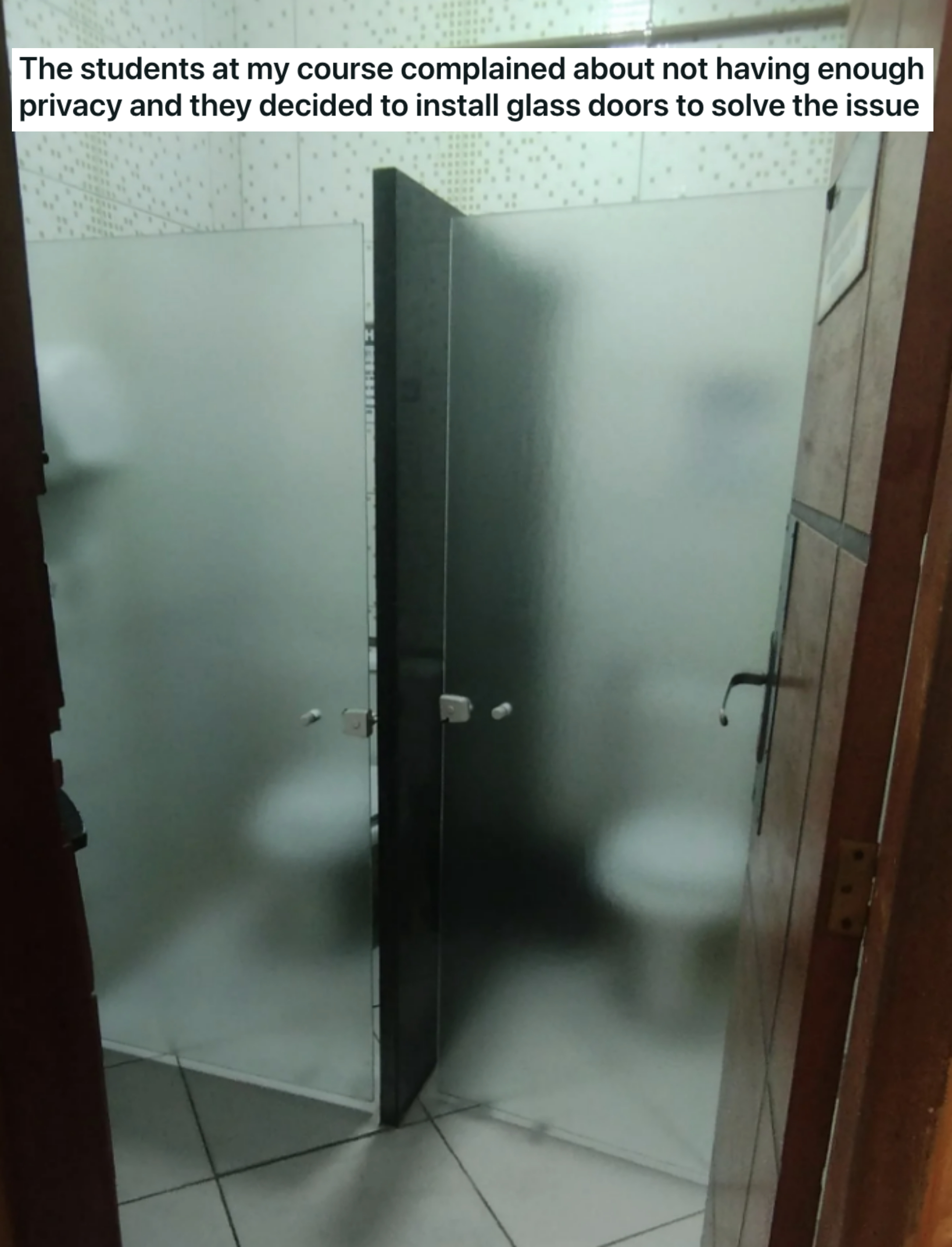
35.I don't even want to know why there's a hole between these stalls...
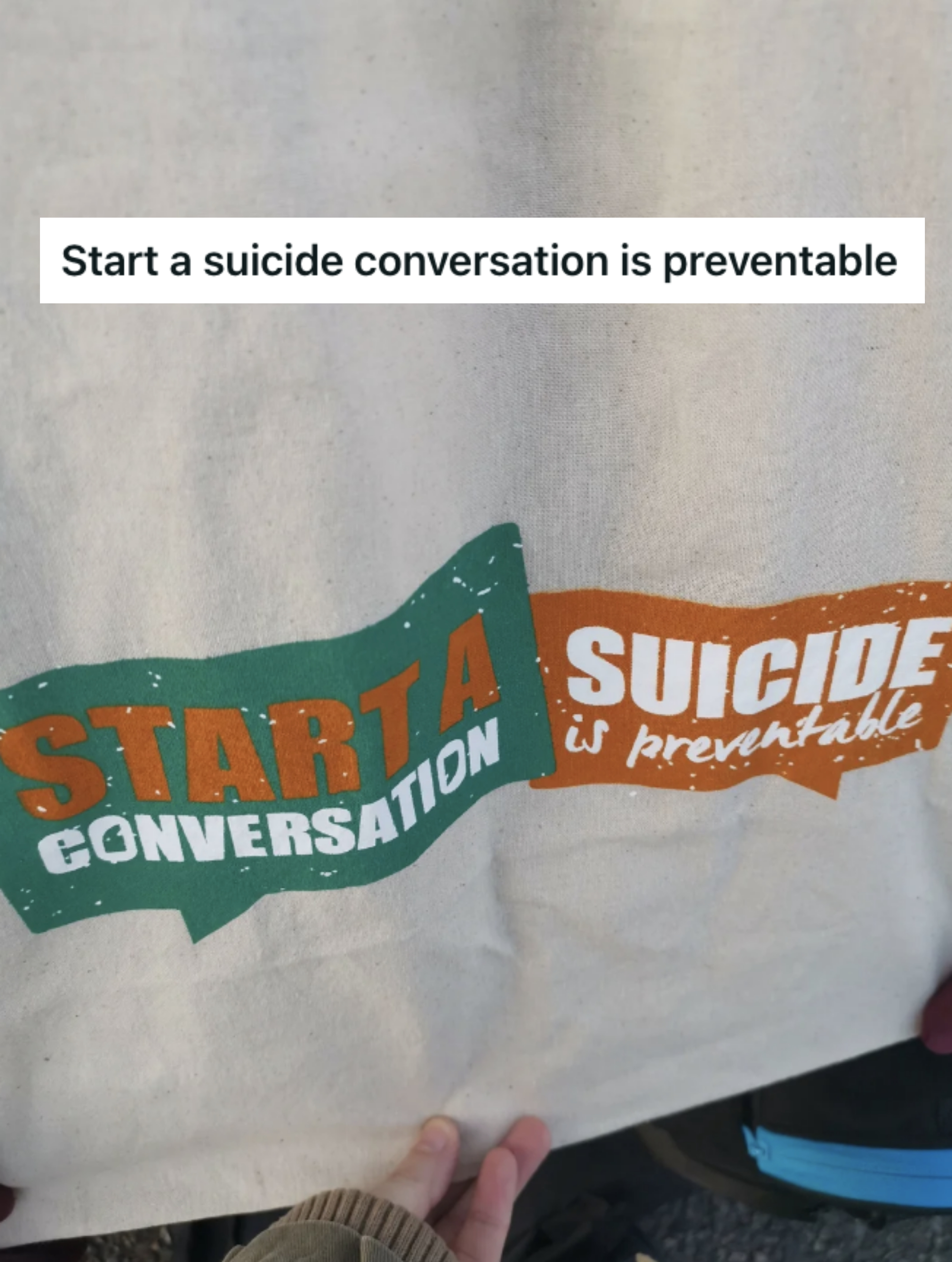
36.Whoever made this shirt probably should've given it a second look.
37.Just...why?
38.And again, I say more emphatically, WHY?
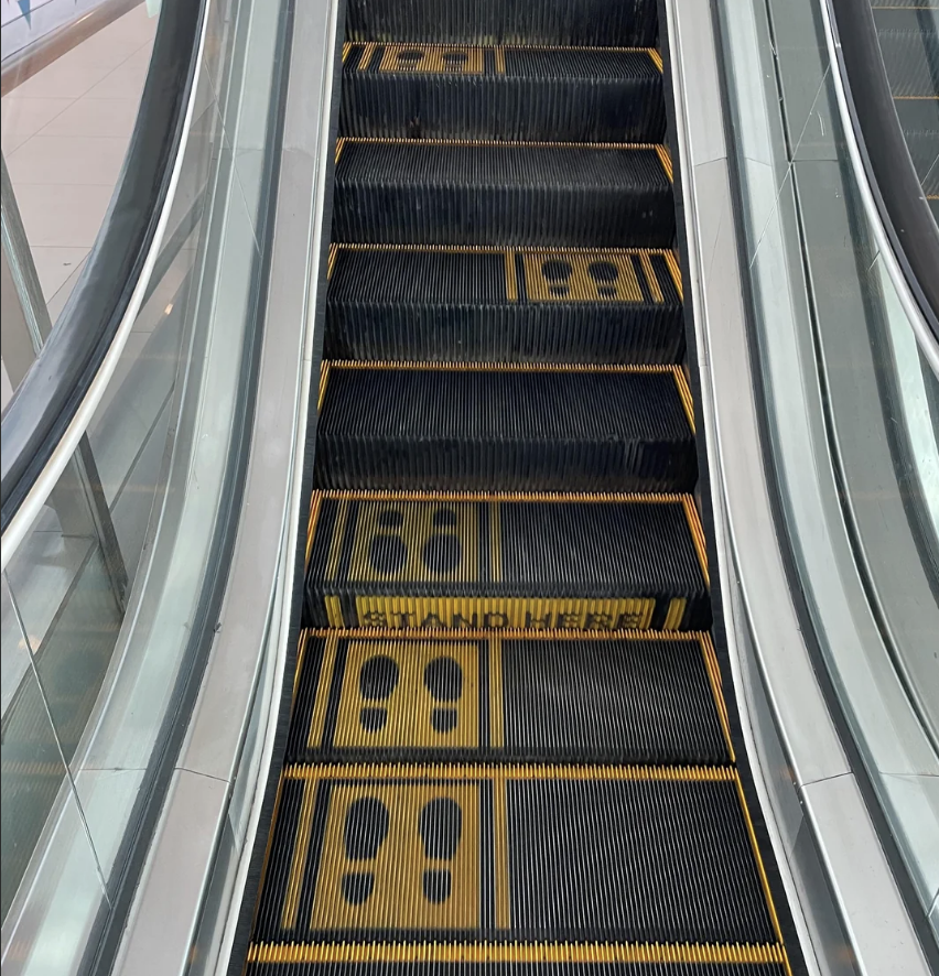
39.Are you supposed to jump from side to side to get up this escalator?
40.What monster created this eyesore?
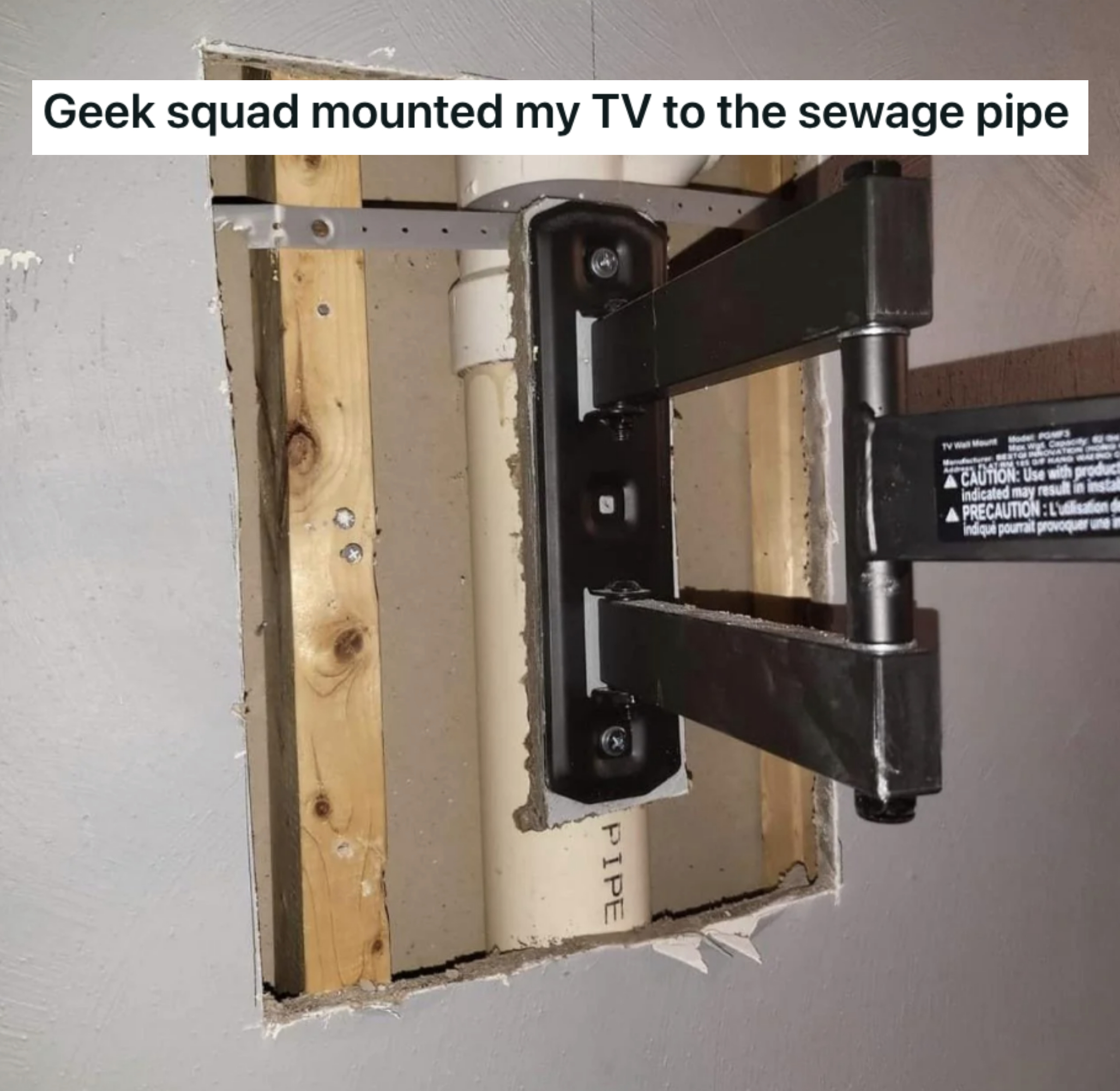
41.Why would you do this???
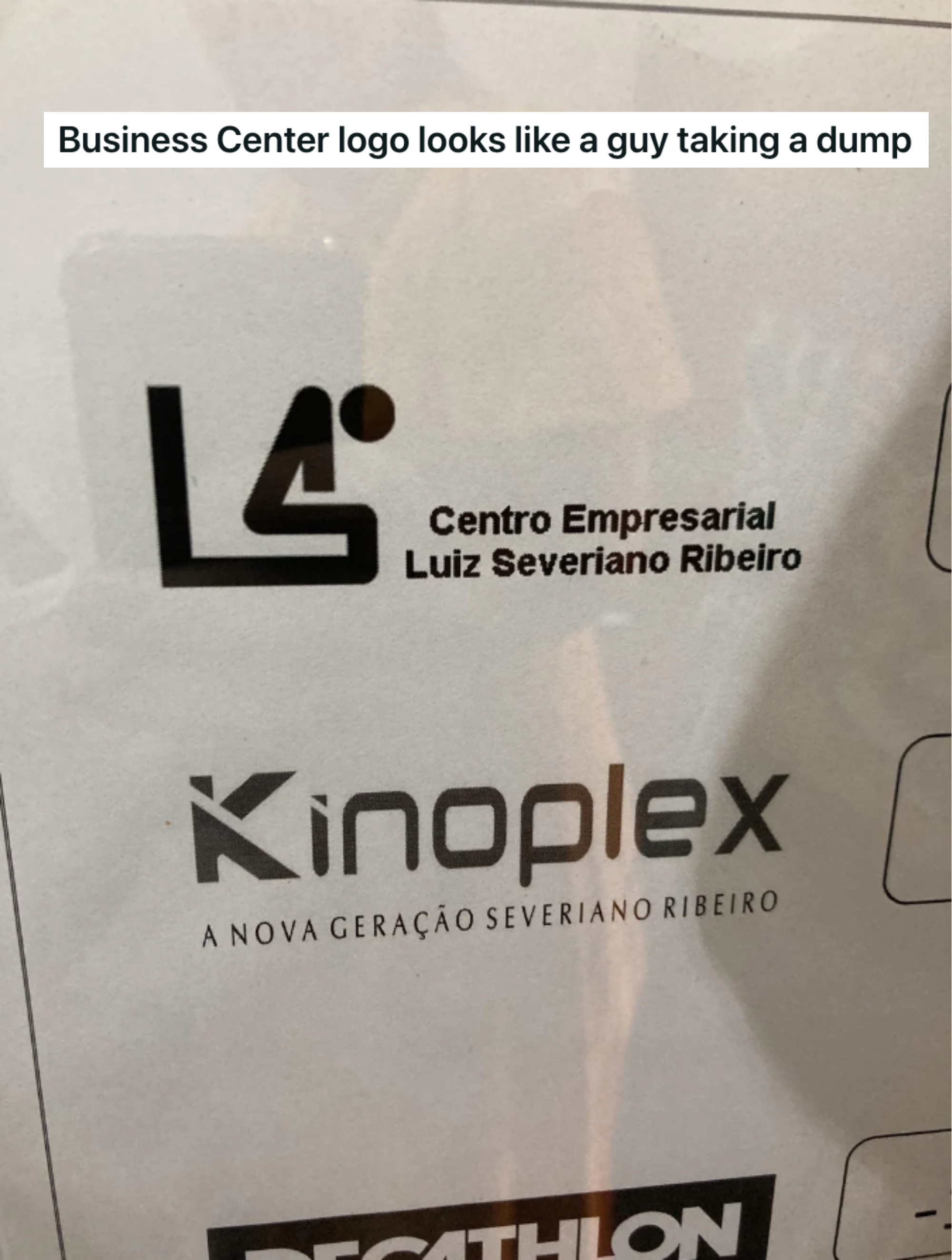
42.Is it just me, or does it look like this guy is pointing a gun at his head?
43.I love to think of fresh poos when I'm cleaning.
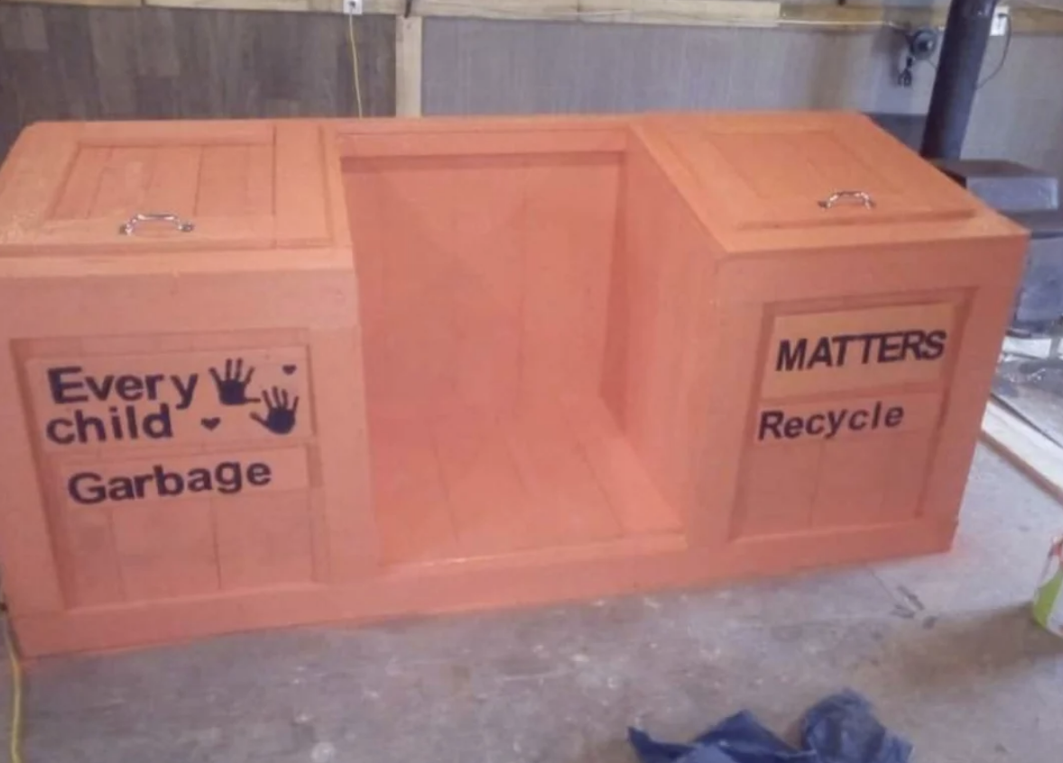
44."Every child garbage!"
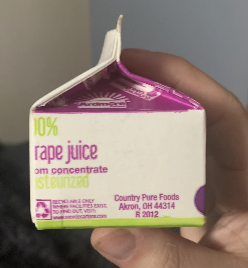
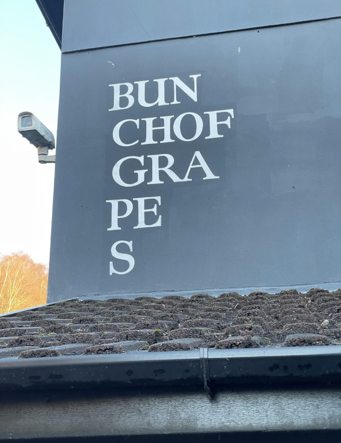
45.The name of this place is apparently "Bunch of Grapes," and I cannot for the life of me figure out why they would do it like this.
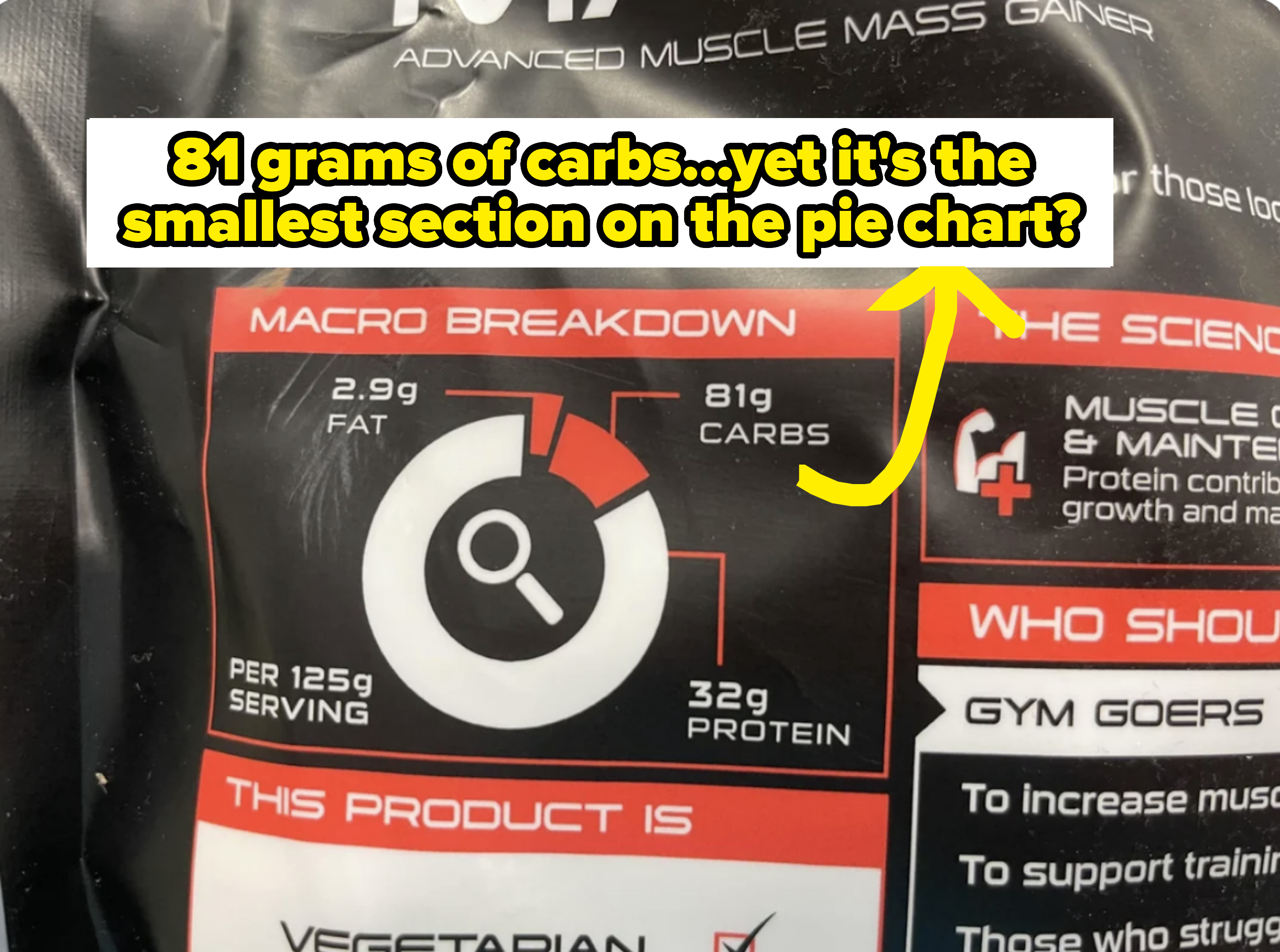
46.This is super misleading advertising.
47.Problem solved!
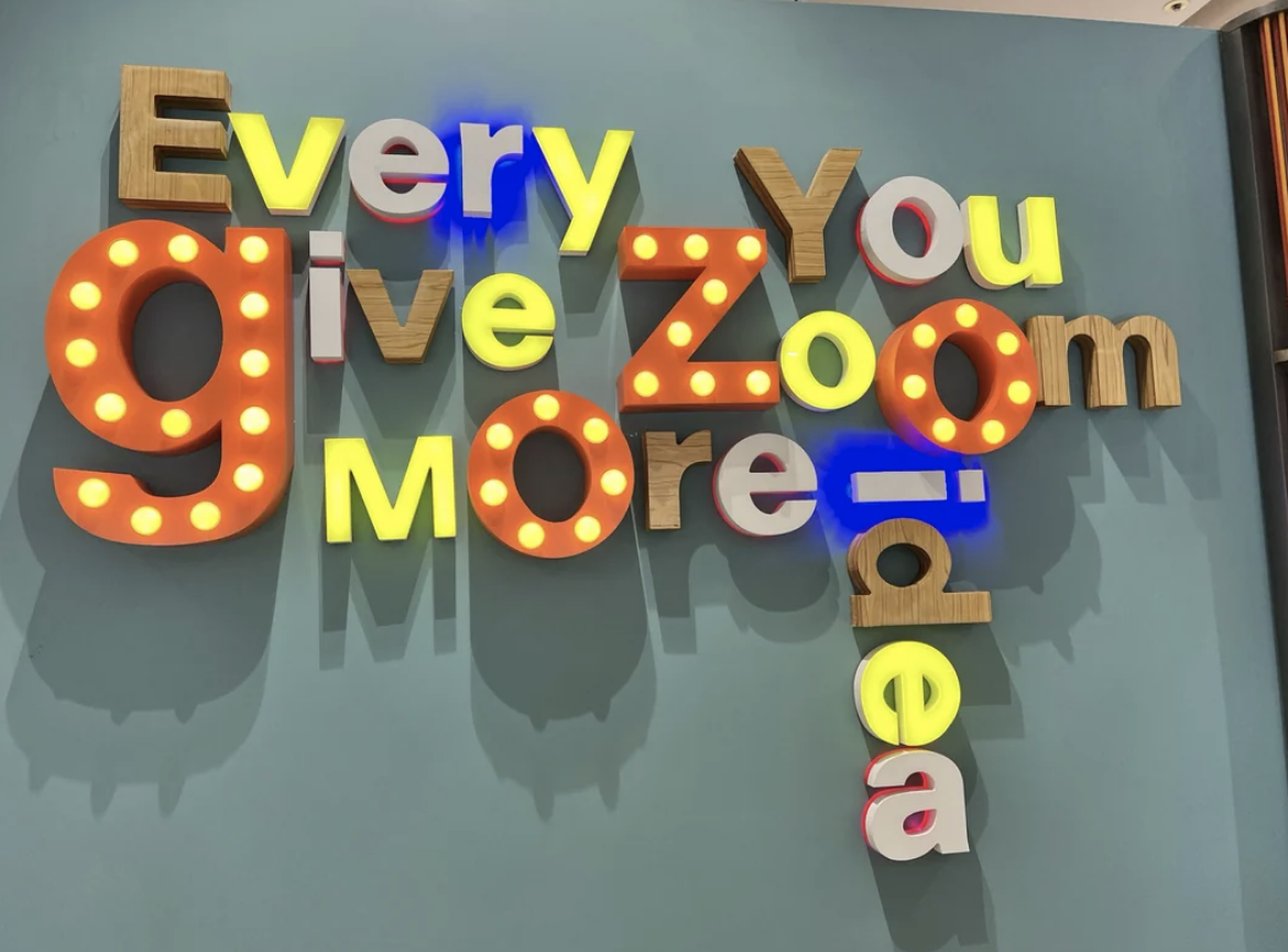
48.There are a million different fonts out there that aren't Comic Sans. And are those quotation marks really necessary?
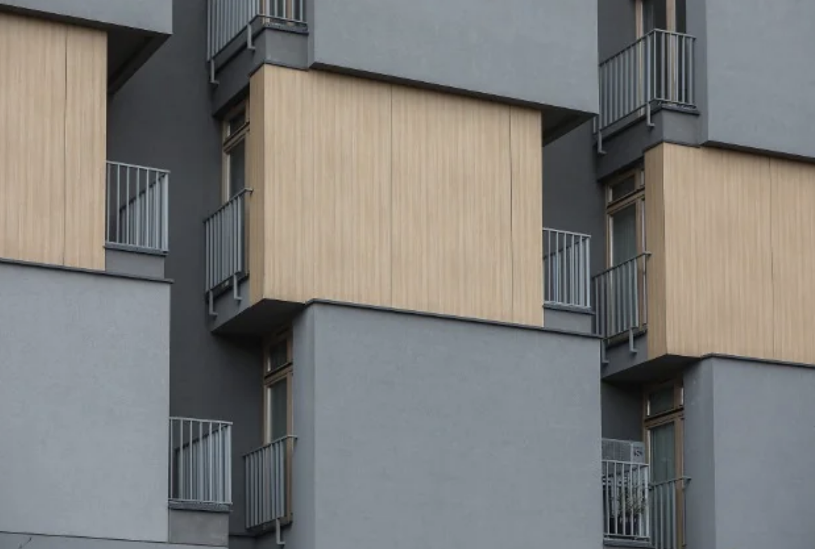
49.These sideways balconies are just an awful idea all around.
50.This is at a school for the blind.
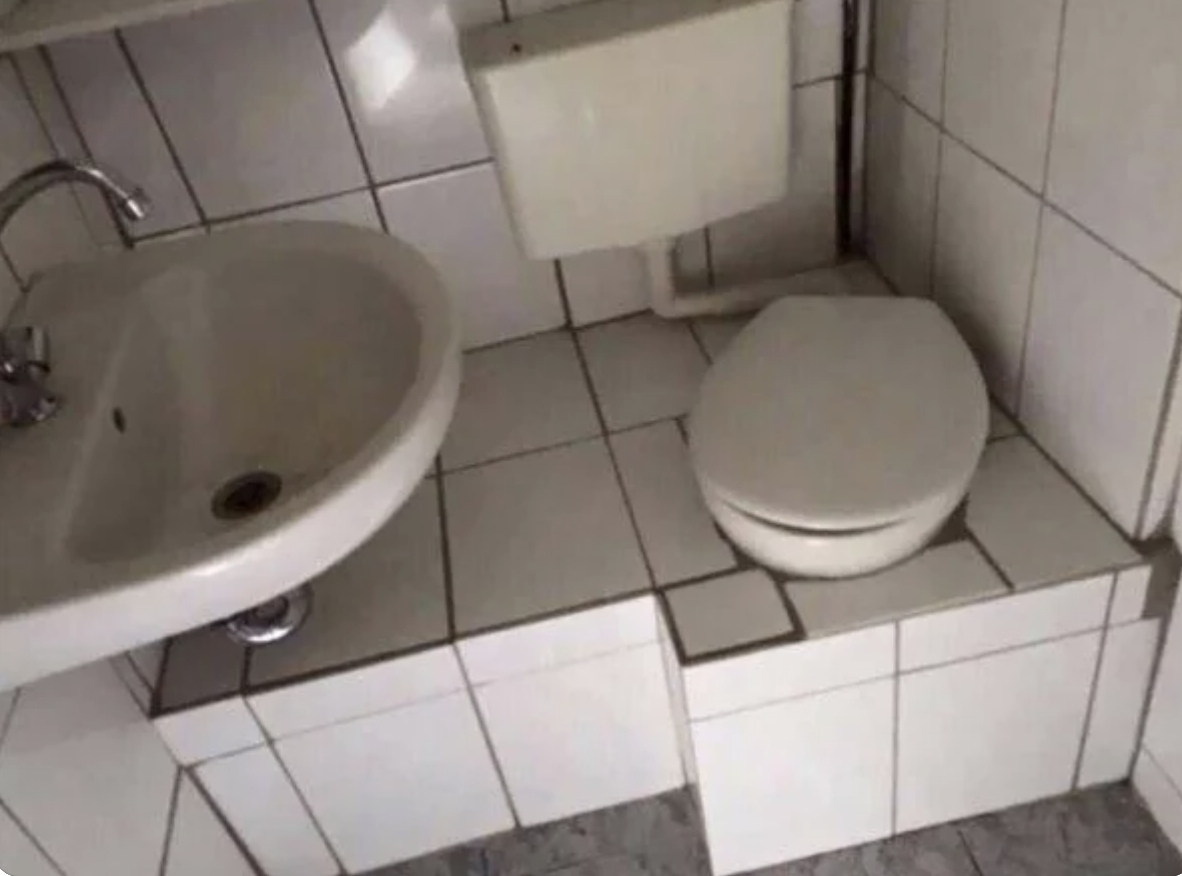
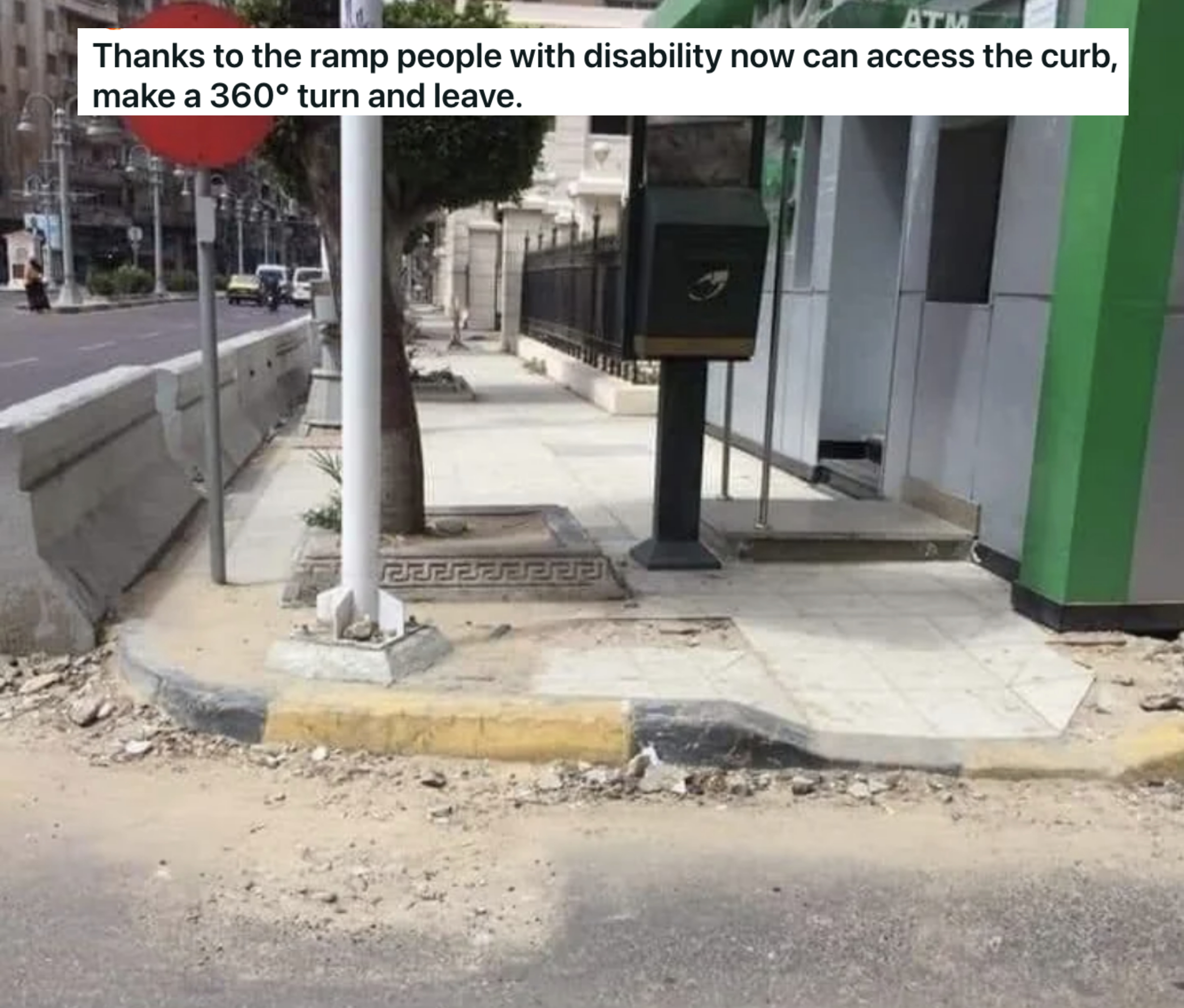
51.This is also wildly accessible!
52.As is this!
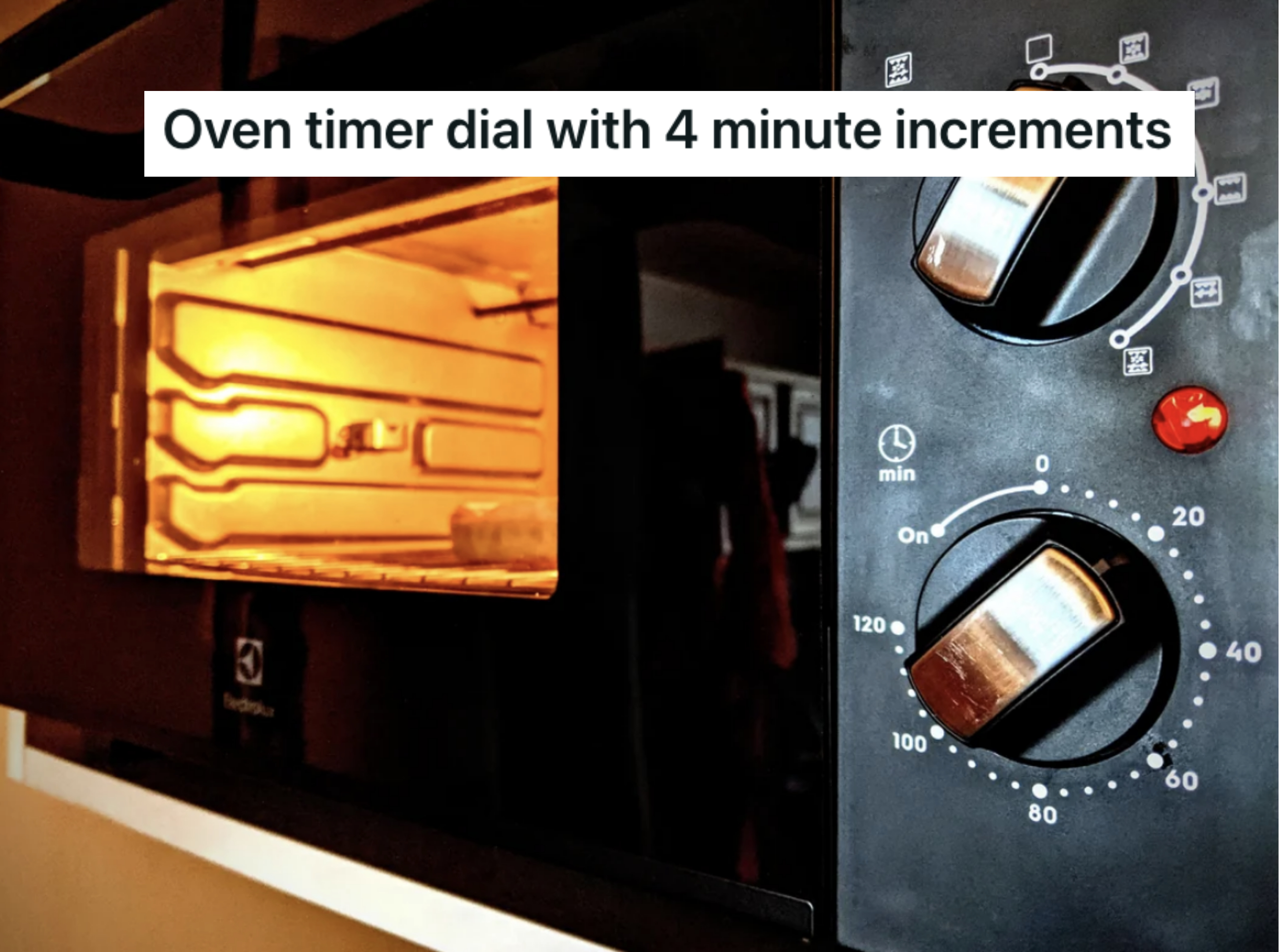
53.This just makes no sense. Why four minutes???
54.And finally, this is *definitely* what this is supposed to look like.
