There's nothing I love more than my usual late-night r/CrappyDesign scroll, even if designers' choices do give me a whopping headache. So please join me in rubbing your temples in disbelief over these horrendously designed objects.
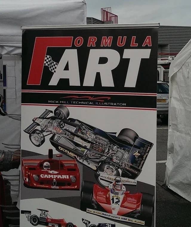
1.Nothing goes faster than a "Formula Fart."
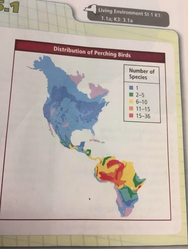
2.South America is looking a little different these days.
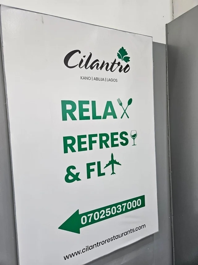
3.Remember to "Rela, Refres, & Fl."
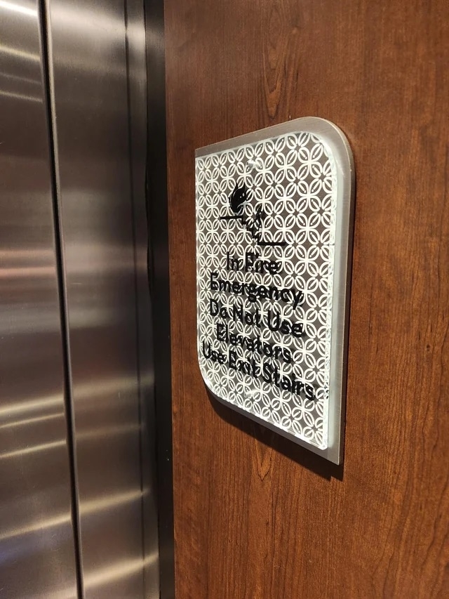
4.In case of emergency, take an extra 10 minutes to try and read this.
5.I hear Risp is lovely this time of year.
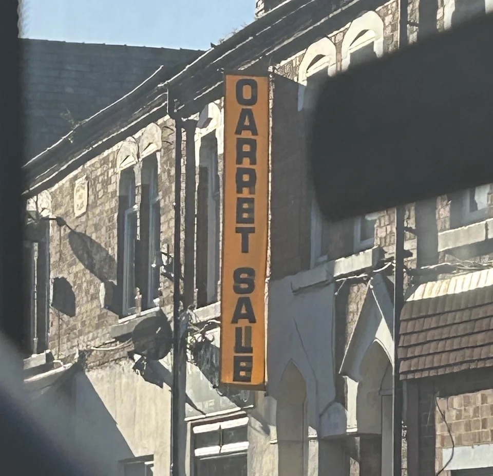
6.I love a good OARR8T SAU8.
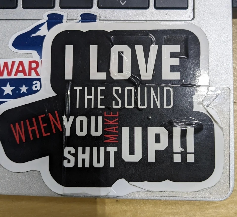
7.I, too, love the sound when you make shut up.
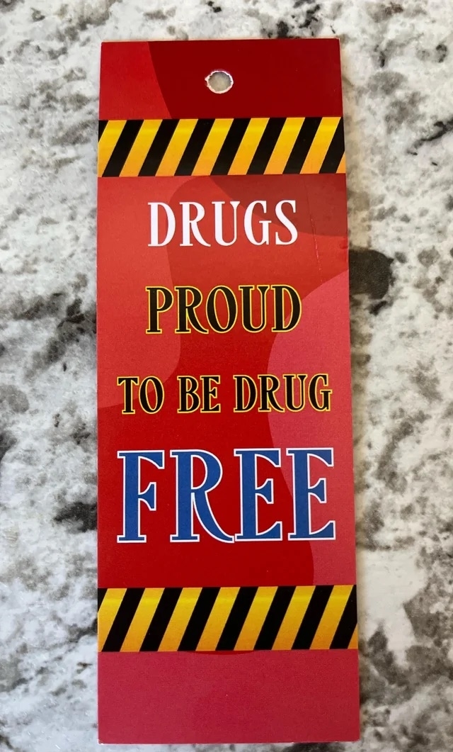
8.I'm so proud of drugs for being drug free.
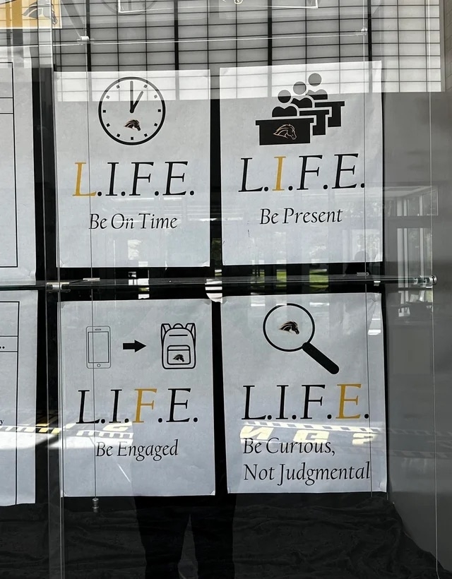
9.No logical order here, just vibes.
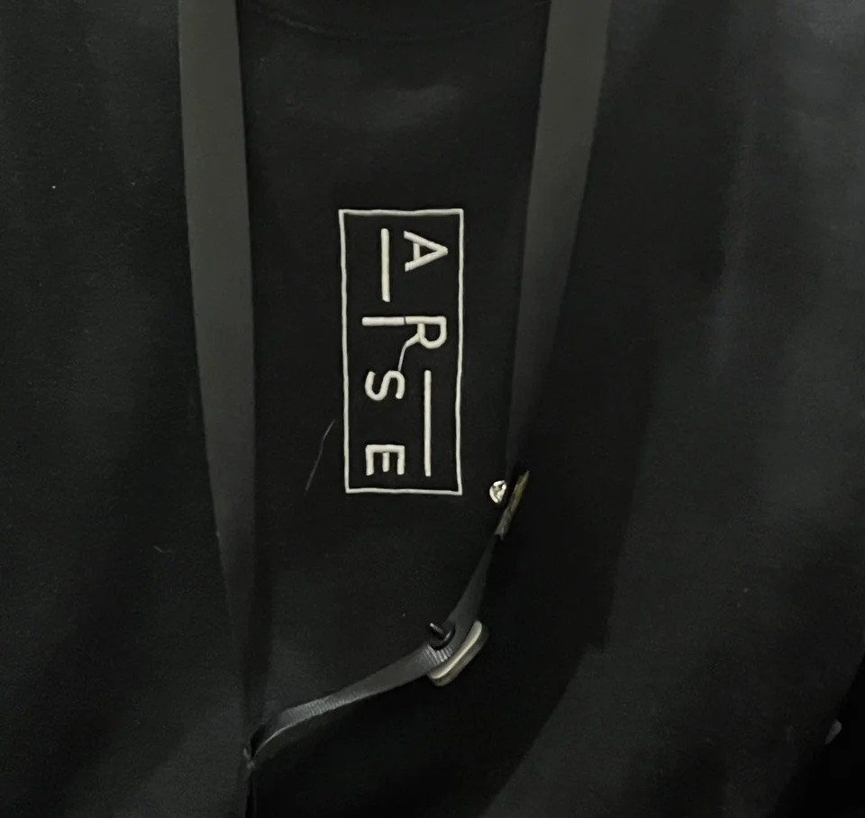
10.If there's no arse on the label, I don't want it.
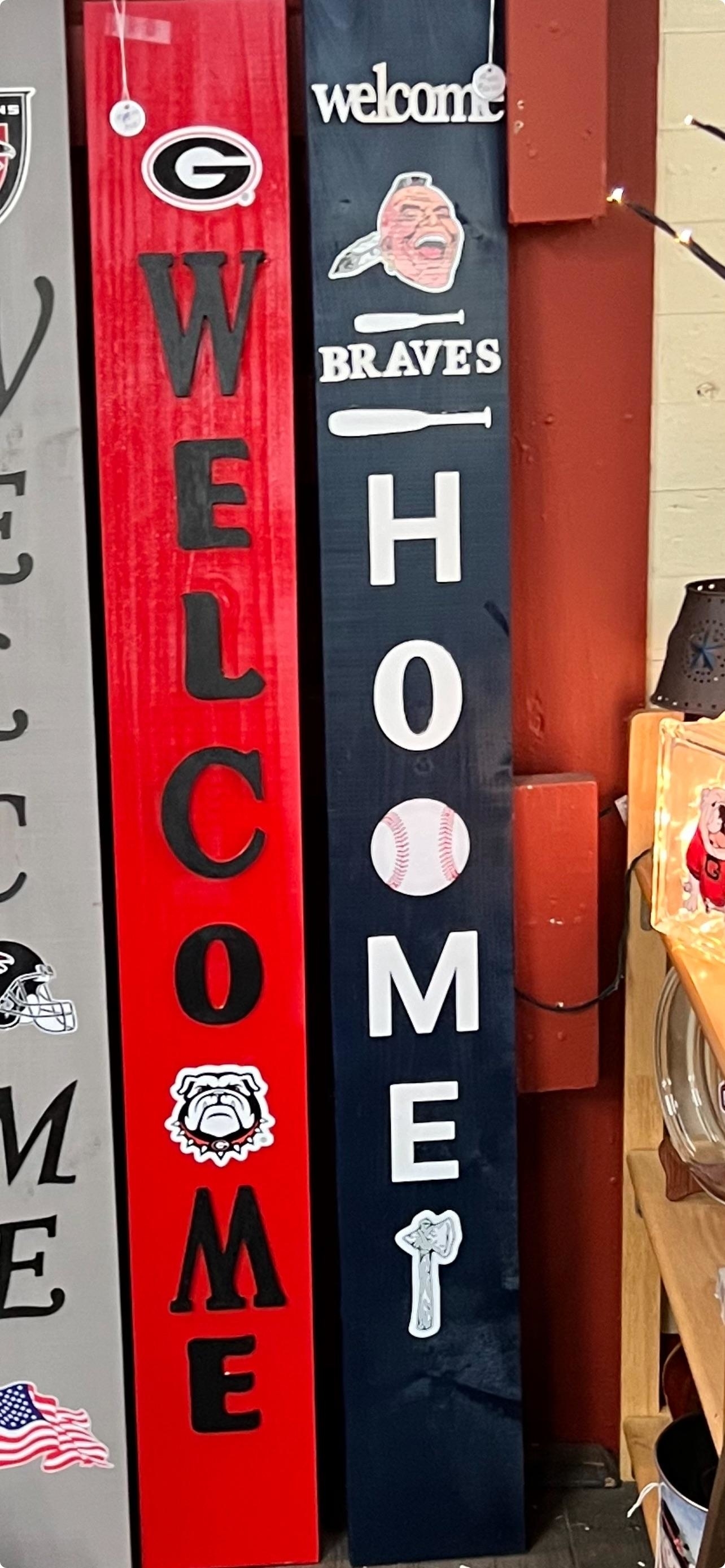
11.What a lovely Welcoome Hoome.
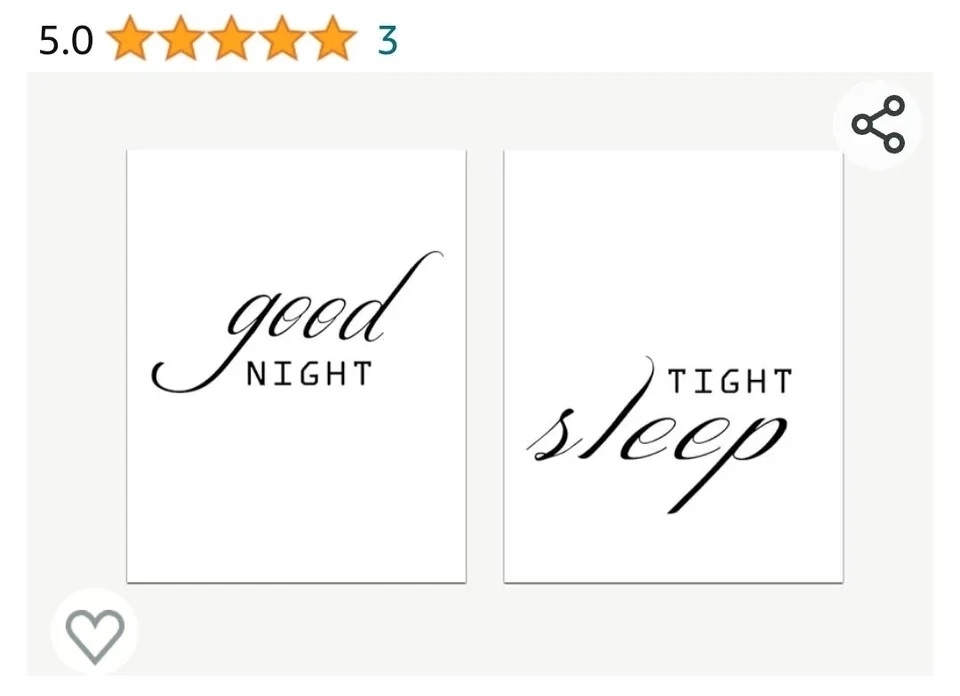
12.Hope you all have a really tight sleep.
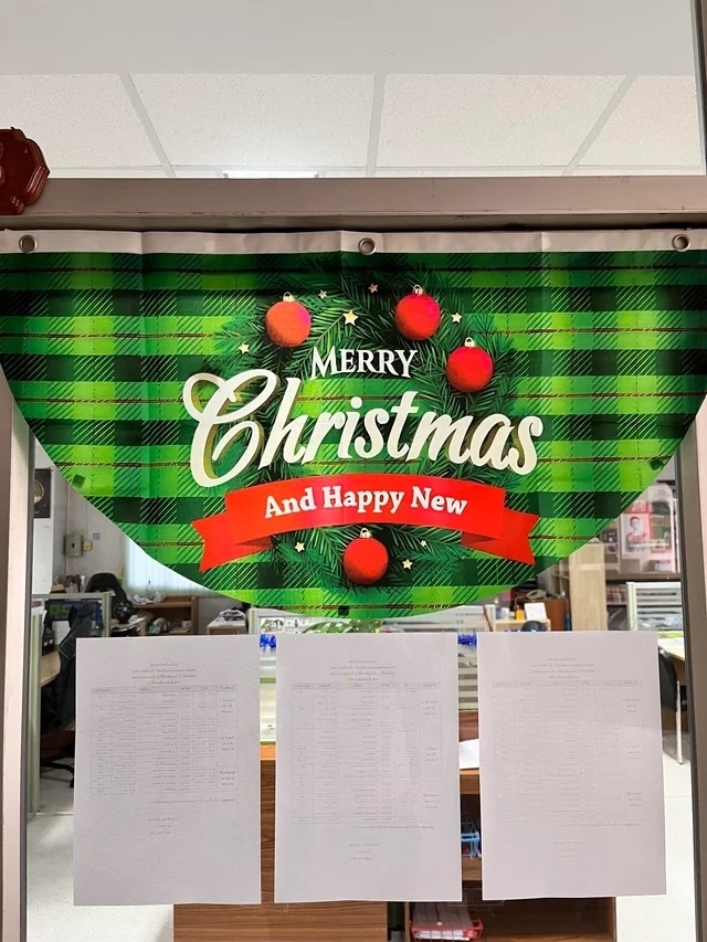
13.And a Happy New, of course.
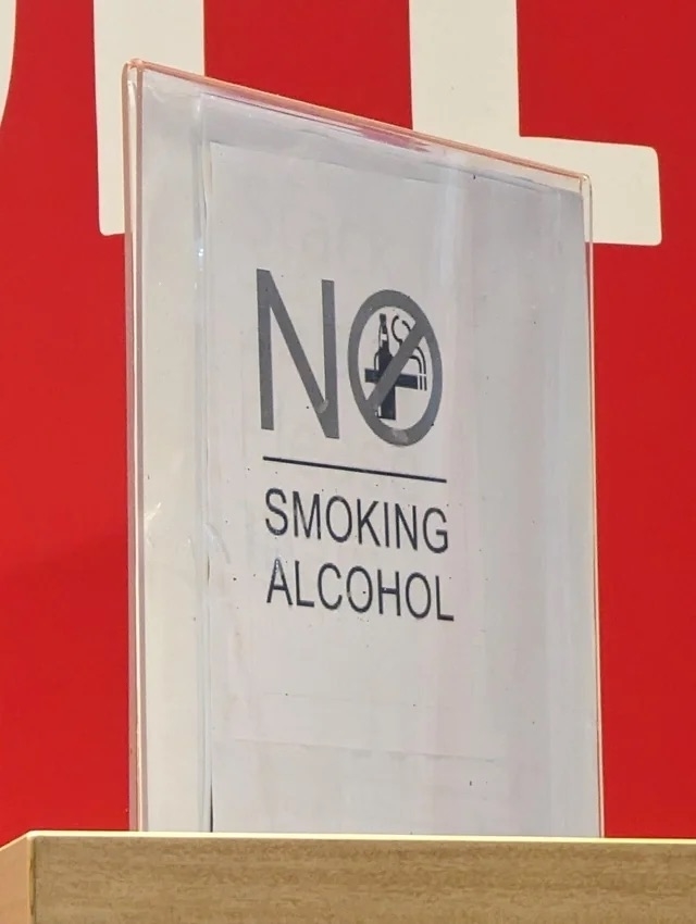
14.Just say "no" to smoking alcohol.
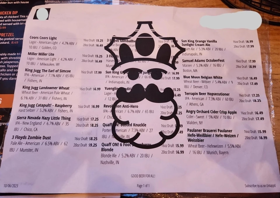
15.The clip art bearded king is essential to the menu.
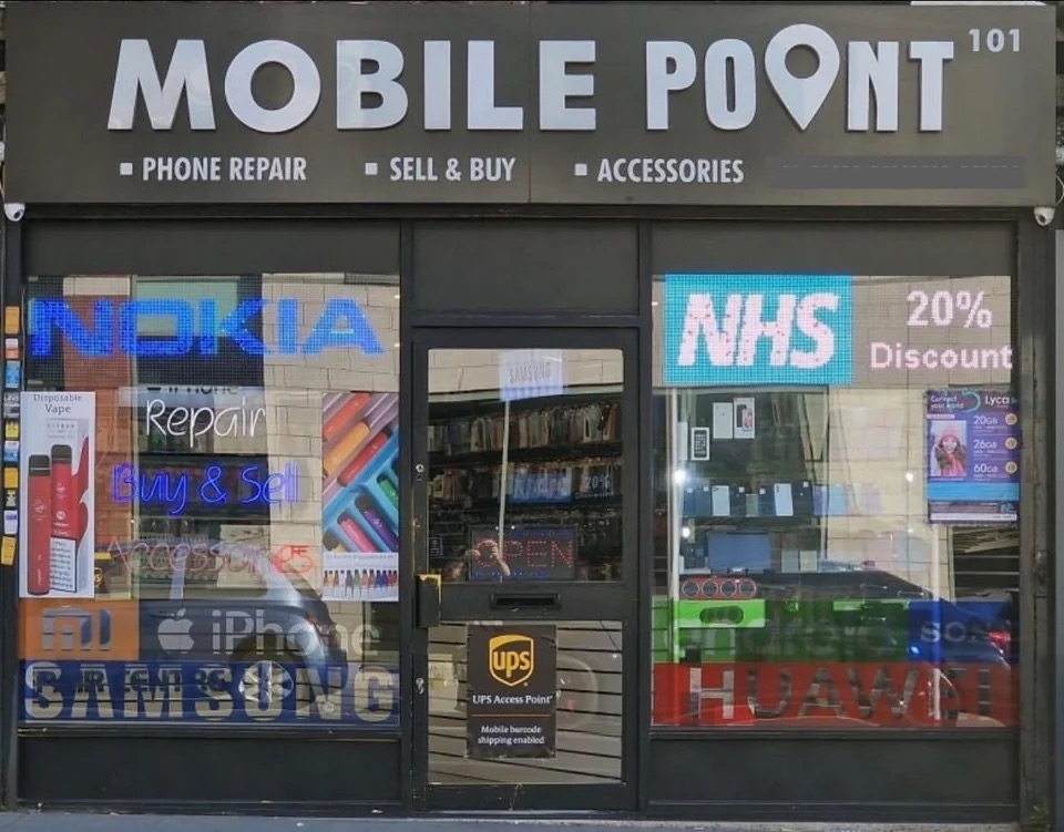
16.I hear they have great deals down at Mobile Poont.
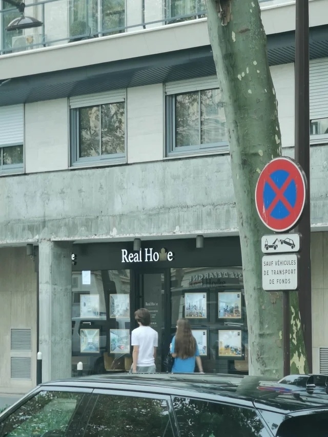
17.Or maybe stop by Real Hoe.
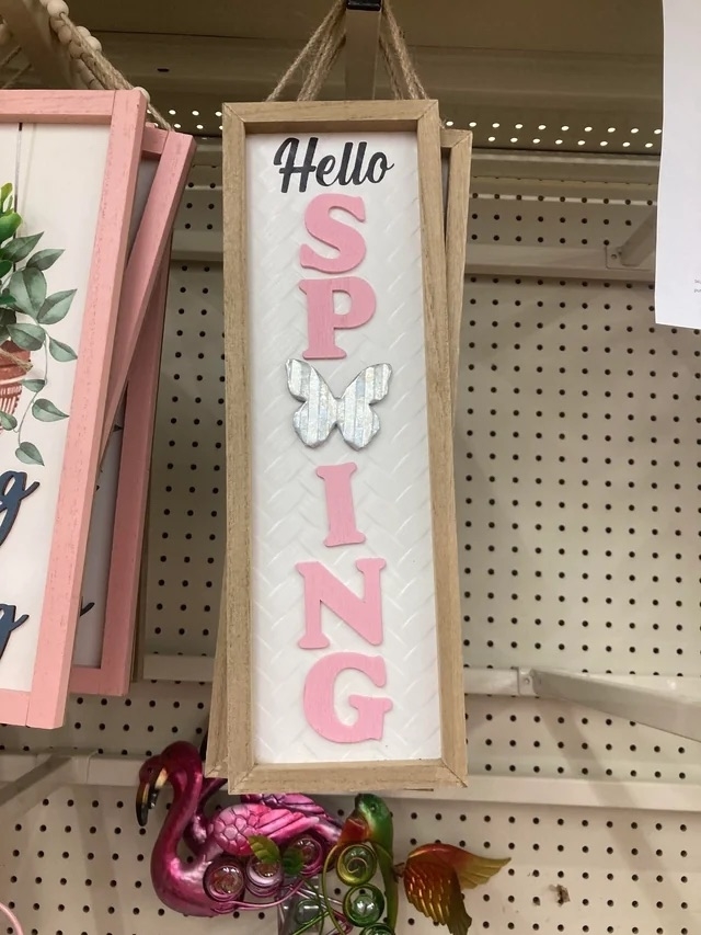
18.Ah yes, Sp[butterfly]ing, my favorite season.
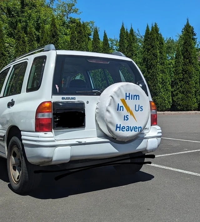
19.There's a lot to unpack here.
20.I'm no Serena Williams, but somethin' is looking a little off.
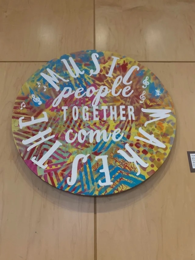
21."Music people together come makes the." Beautiful.
22.Oh my.
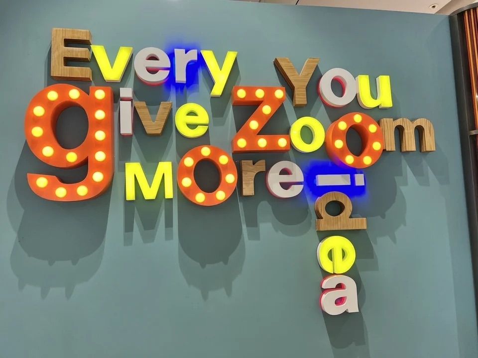
23."Every You give ZoOm MOre idea." Got it.
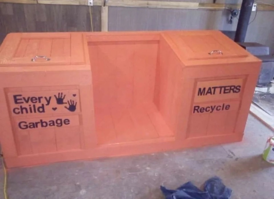
24.Every child <3 Garbage.
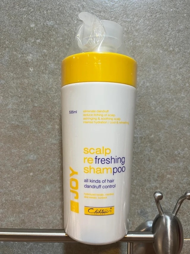
25.And last but not least, may I interest you in some scalp re sham freshing poo?
