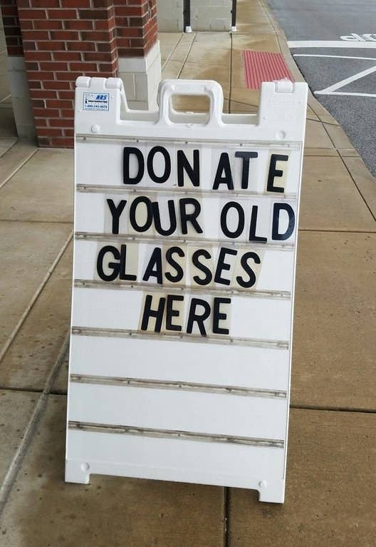
1.
This sign that makes it sound like someone named Don ate eyewear.
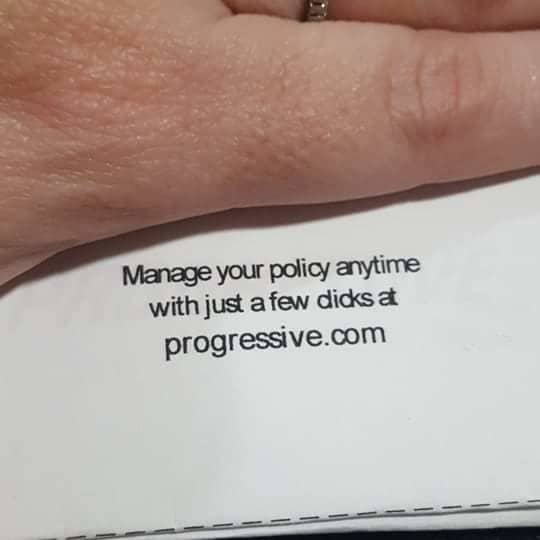
2.
This insurance bill that says you can manage your policy with "just a few dicks."
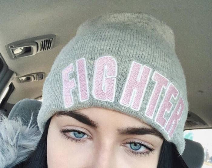
3.
This beanie that wants to say "fighter," but looks more like "fig hater."
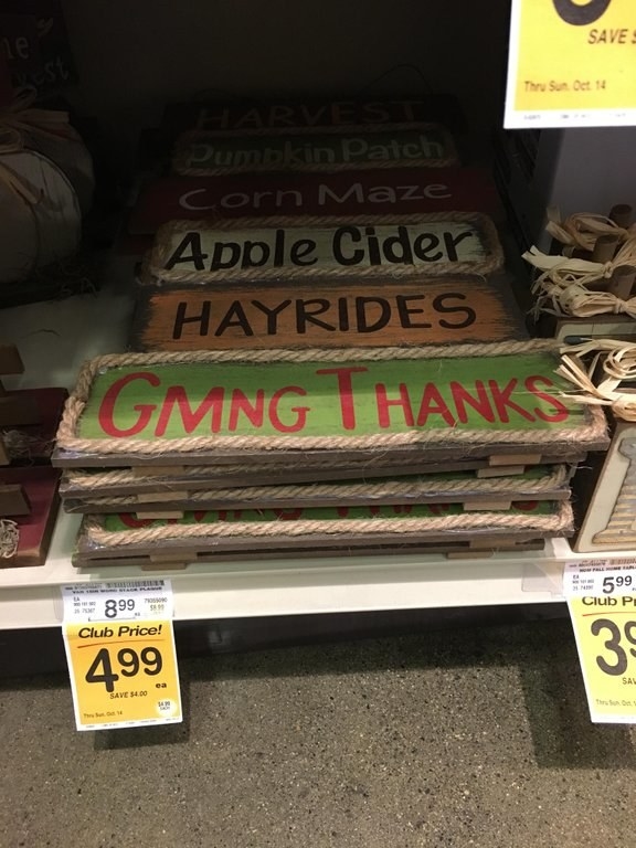
4.
This decoration that's struggling to say, "giving thanks."
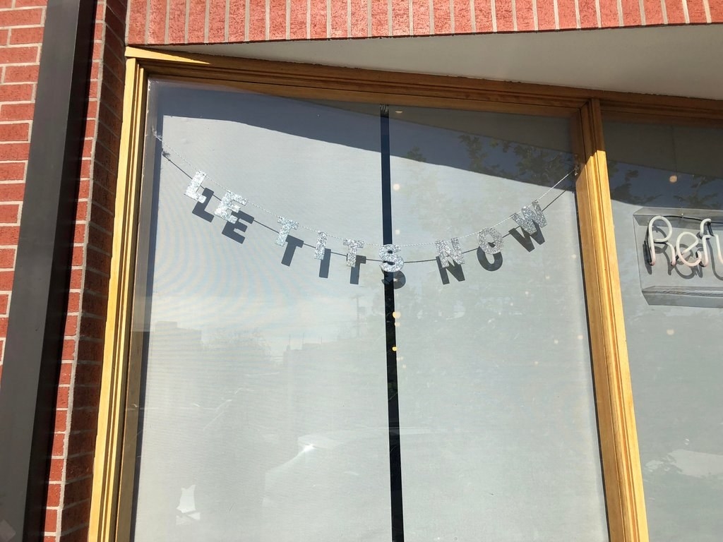
5.
Then there's this "let tits now" sign.
6.
And the design in this coffee that says "ciclickis."
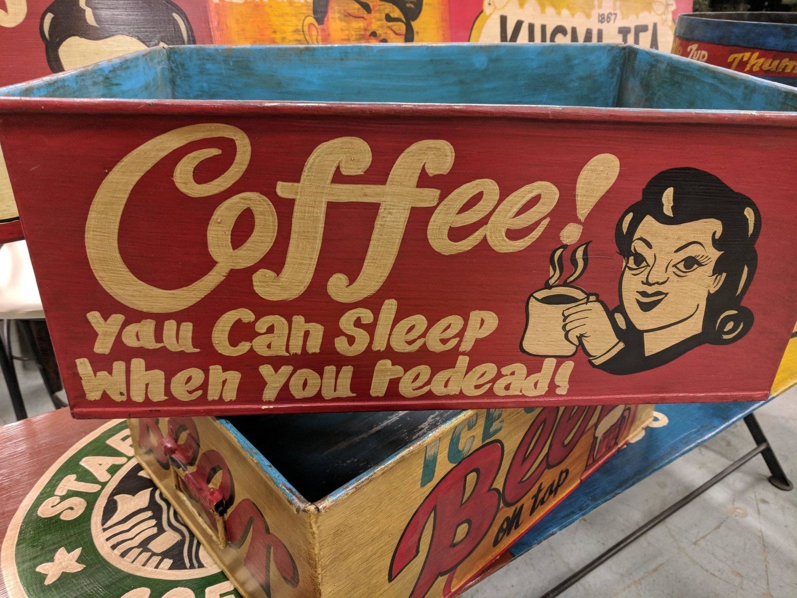
7.
This reminder that you can sleep when you redead!
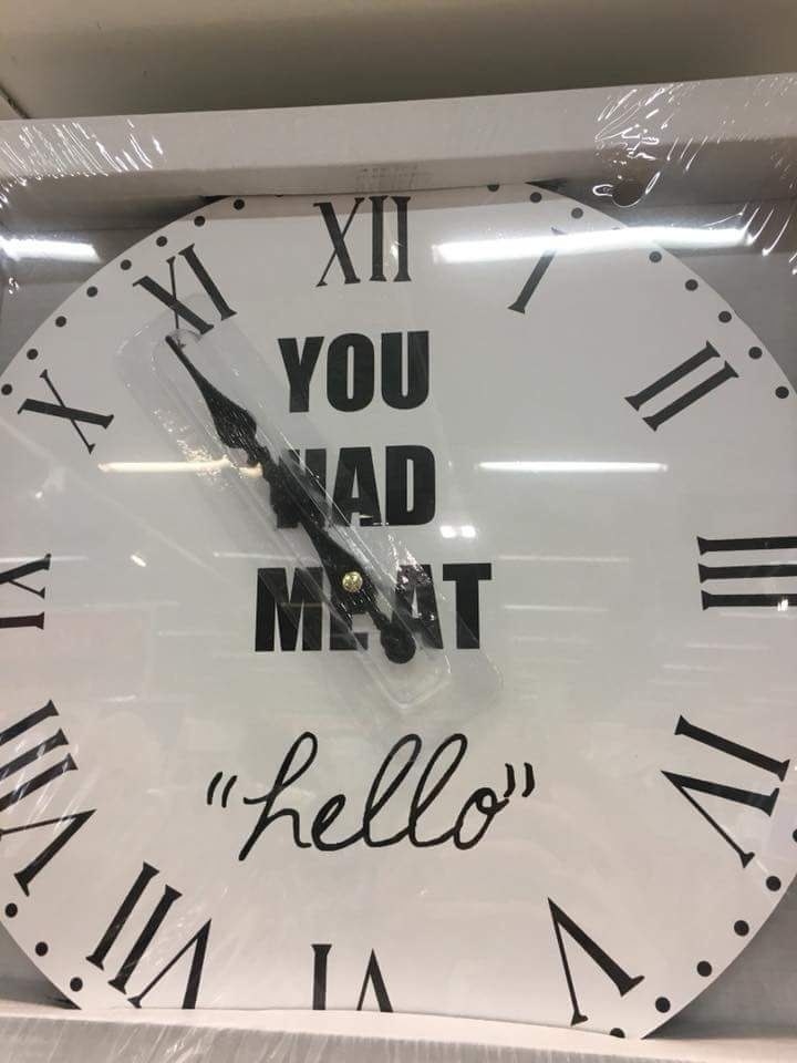
8.
This "you had meat hello" clock.
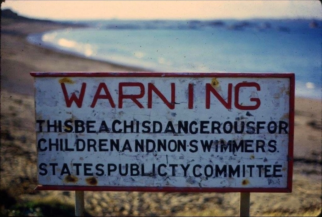
9.
THISBEACHISDANGEROUSFORCHILDRENANDNONSWIMMERS.
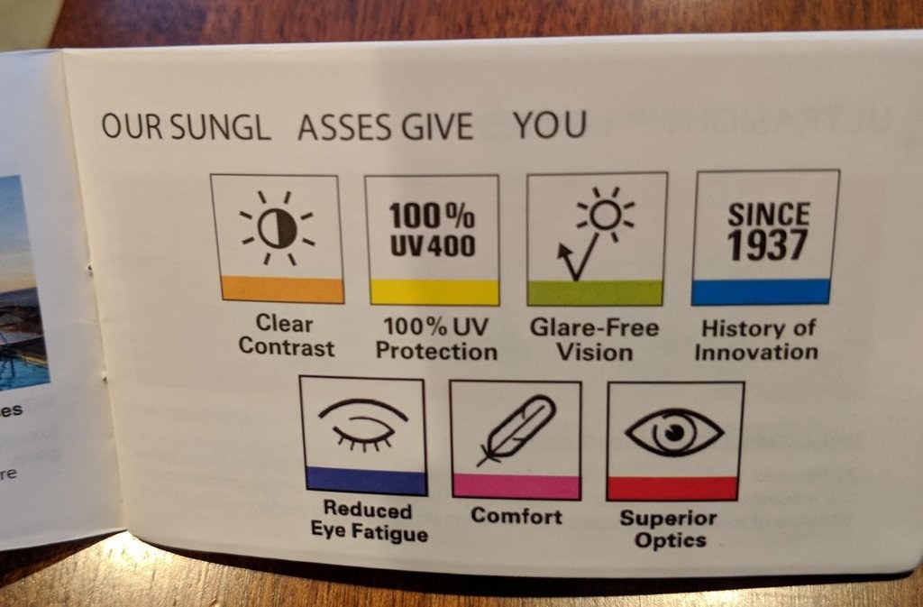
11.
These sungl asses that have a lot to offer.
12.
This mess of a mural.
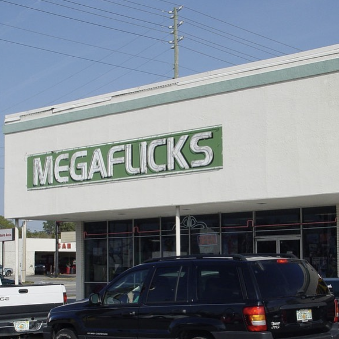
13.
This business called Megaflicks that probably should've gone with a different font.
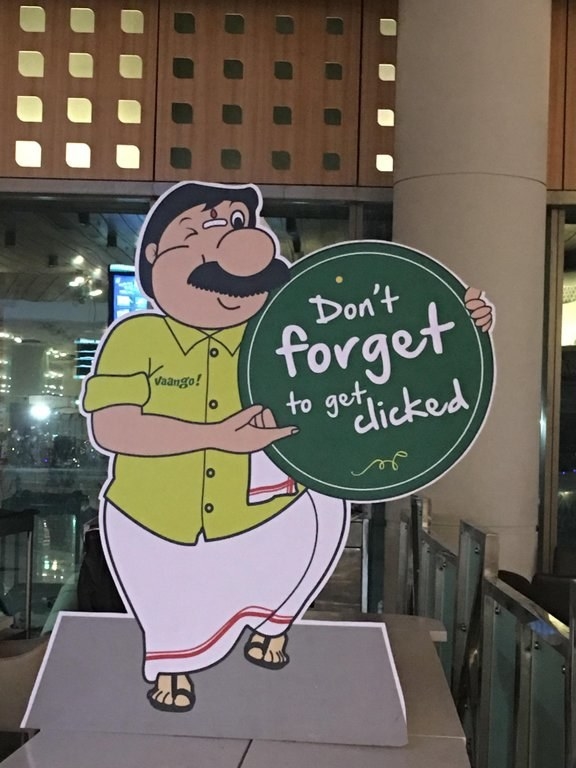
14.
This sign that tried to remind people to "get clicked" — as in, take a photo, but instead looks like it's telling folks to "get dicked."
15.
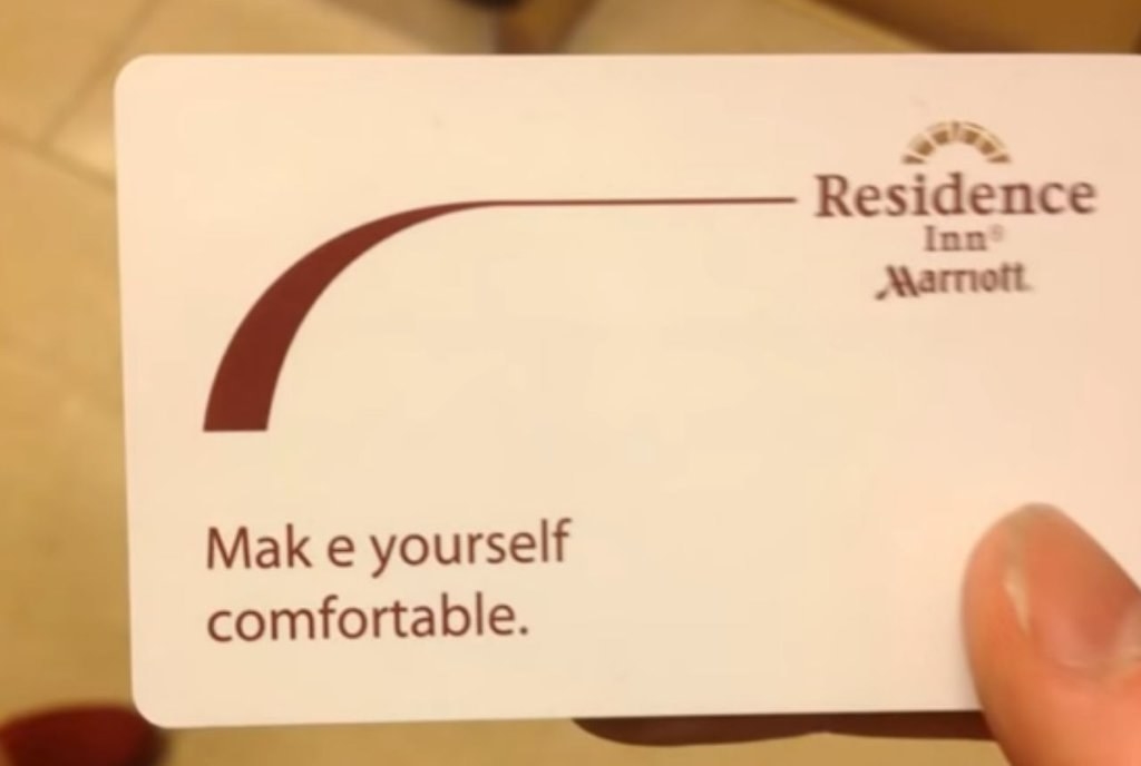
This uncomfortably printed text.
16.
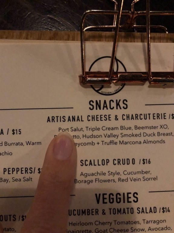
This menu's listing of artis anal cheese.
17.
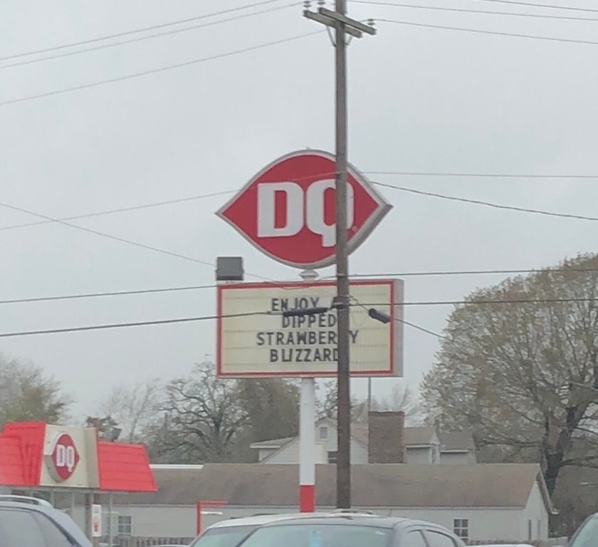
This sign advertising strawberry buzzards!
18.
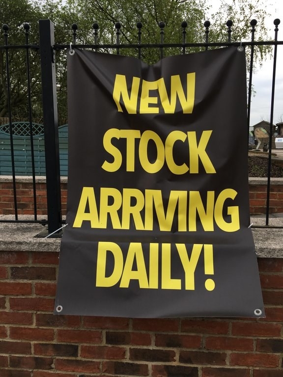
This poster boasting about the NEW STOCK ARRMNG DAILY.
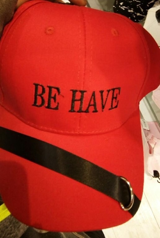
19.
And finally, this sad little be have hat.

