This post has not been vetted or endorsed by BuzzFeed's editorial staff. BuzzFeed Community is a place where anyone can create a post or quiz. Try making your own!

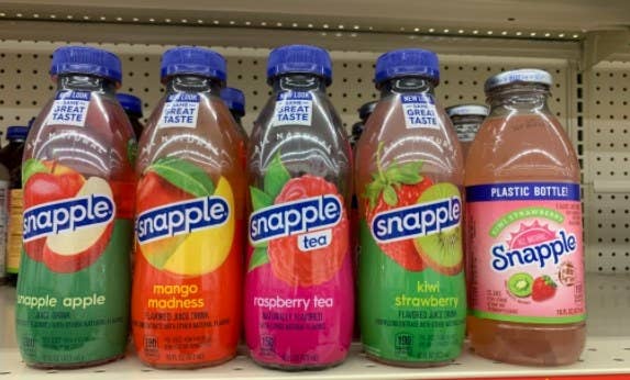
Snapple
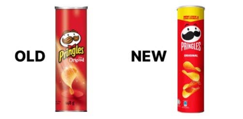
Pringles
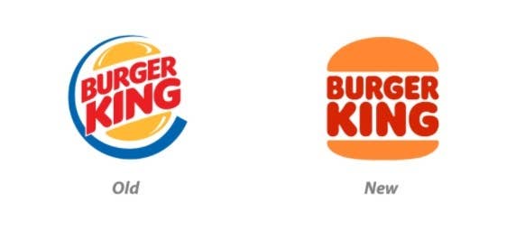
Burger King
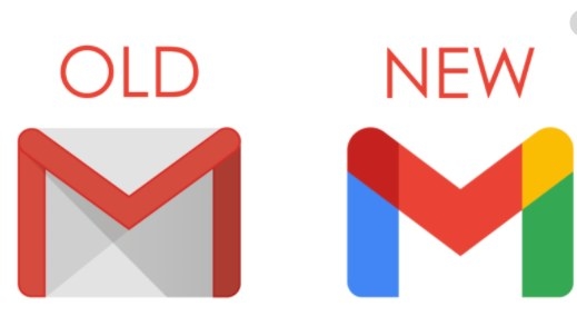
Gmail
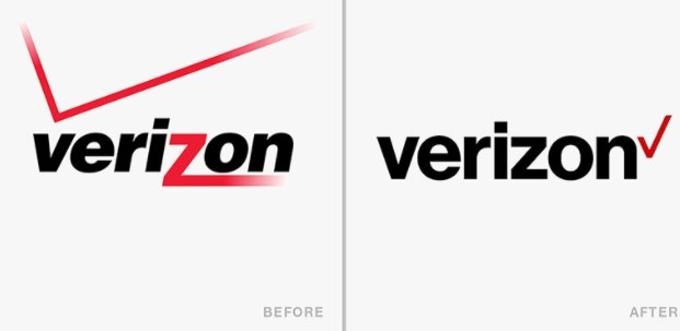
Verison
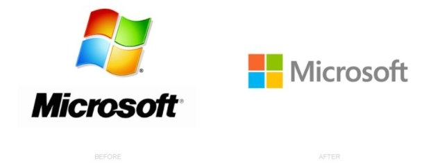
Microsoft
Thank you for reading my post! If you know of any other disappointing brand logo changes, feel free to leave them in the comment section. Also, please keep in mind that these are just my opinions and I hope that I didn't force them on you. :)
Share This Article