The Jobs Report Is Wrong

What headlines say about the monthly jobs numbers is actually no more accurate than chance. A BuzzFeed original analysis.

I know, right? Now tell your friends!
The Jobs Report Is Wrong
Willie Herrmann

Months in red are months where initial headlines said the jobs numbers fell short of economists’ expectations, but then the revised numbers actually exceeded expectations (or vice versa). Numbers represent the difference between expected job creation and government reported numbers.

Economists’ expectations were drawn from a Bloomberg survey of economists, and jobs figures were gathered from BLS.gov. Final benchmark revisions for the previous March are released by the Bureau of Labor Statistics in February of the following year.

“Stunning.” “Pleasant surprise.” “Easily beat economists’ predictions.” These are some of the phrases being used to describe February’s employment report, which showed 236,000 new jobs created last month. But a few months or a year from now, there’s a decent chance we’ll have an entirely different perception of today’s news.

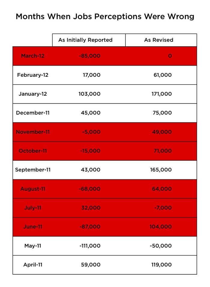
The Bureau of Labor Statistics, which releases monthly estimates of job growth based on firm surveys, continually revises these figures as more information streams in. And while the monthly announcements receive the most attention, the revised figures often vary widely from initially reported numbers.

Most jobs-report headlines focus on how the economy performed relative to economists’ expectations. So BuzzFeed looked at initially reported figures, economists’ forecasts, and final benchmark revisions released annually to find out how often the narrative of performance relative to expectations turned out to be wrong.

A full 50% of the time, the initial perception of the jobs numbers would have been incorrect: Reported jobs growth fell short of economists’ expectations, but then the revised numbers actually exceeded them, or vice versa. In other words, if you want to know what today’s jobs report means for the economy, reading the headlines is no more useful than flipping a coin.

Check out more articles on BuzzFeed.com!

Facebook Conversations


    5 Responses So Far

    • daven7 2 months ago

      Piss off buzz feed! This is in coherent ranting. Obama won and the economy is kicking ass.

    • daven7 thinks The Jobs Report Is Wrong is Fail  about 2 months ago
    • The Jobs Report Is Wrong is starting to get hot on Facebook Share It  about 2 months ago
    • m.fark.com readers just made The Jobs Report Is Wrong hotter  about 2 months ago
    • fark.com readers just made The Jobs Report Is Wrong hotter  about 2 months ago
    • The Jobs Report Is Wrong is starting to get hot on Twitter Tweet It  about 2 months ago
    • salon.com readers just made The Jobs Report Is Wrong hotter  about 2 months ago
    • memeorandum.com readers just made The Jobs Report Is Wrong hotter  about 2 months ago
    • jennifert19   The Jobs Report Is Wrong  about 2 months ago
    • Leron V thinks The Jobs Report Is Wrong is WTF  about 2 months ago
    • Dayman 2 months ago

      Suck up to your audience Buzzfeed! There’s no room for this nonsense.

    • eccentricgerard   The Jobs Report Is Wrong and thinks it’s Win, Fail & LOL  about 2 months ago
    • christinel19 thinks The Jobs Report Is Wrong is Powerful  about 2 months ago
    • robertl13 thinks The Jobs Report Is Wrong is Fail  about 2 months ago
    • alexduvall18 thinks The Jobs Report Is Wrong is Trashy  about 2 months ago
    • aximill 2 months ago

      Even when they are revised, the new numbers shouldn’t be that far off these initial estimates.

    • MEP thinks The Jobs Report Is Wrong is Trashy  about 2 months ago
    • doozer 2 months ago

      Data scientist? The real pattern here is that in almost all cases (July 2011 the exception) there was improvement over the initially stated number. The revision is better. So, while 236K beat estimations, by the patterns here, the revised figure should be even further above that, right? Data scientist? So your 50-50 marker is rather laughable. Your point is twisted and spun. And you failed to find the larger trend…data scientist.

      • doozer 2 months ago

        Man…so much more wrong with this.  1) It’s bls.gov…not bls.org. Nice citation scientist.
        2) I’m looking at the bls.gov report here:
         
        and see some very different numbers from ones you present. I don’t know how you square your numbers with these from the BLS, starting April 2011: Apr-11304
        May-11115
        Jun-11209
        Jul-1178
        Aug-11132
        Sep-11225
        Oct-11166
        Nov-11174
        Dec-11230
        Jan-12311
        Feb-12271
        Mar-12205
        Apr-12112
        May-12125
        Jun-1287
        Jul-12153
        Aug-12165
        Sep-12138
        Oct-12160
        Nov-12247
        Dec-12219
        Jan-13119p
        Feb-13236p Are you using different numbers than the BLS? Which ones?  You certainly don’t cite well, and you are at minimum mixing your metaphors, talking about 236K and then not presenting your tabular data that matches your original figure. I work in data too, and integrity is so very important. This is the most shoddy piece of analysis I’ve ever seen.  3) You don’t list the analyst expectation. You highlight when it missed, but you don’t prove it. This is probably related to whatever numbers you manufactured from point 2.

      • doozer 2 months ago

        The space didn’t come through. The format for the months is Mon-YY. It should look like this: Apr-11 304
        May-11 115
        Jun-11 209
        Jul-11 78
        Aug-11 132
        Sep-11 225
        Oct-11 166
        Nov-11 174
        Dec-11 230
        Jan-12 311
        Feb-12 271
        Mar-12 205
        Apr-12 112
        May-12 125
        Jun-12 87
        Jul-12 153
        Aug-12 165
        Sep-12 138
        Oct-12 160
        Nov-12 247
        Dec-12 219
        Jan-13 119p
        Feb-13 236p

    • MEP 2 months ago

      WTF, got to throw cold water on good news?

    Now Buzzing