
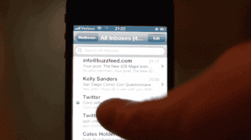
Pioneered by app developer Loren Brichter, who was first to implement pull-to-refresh — if not first to come up with it — this feature has found its way into dozens of apps: Facebook has it, almost every Twitter app has it, Foursquare, Tumblr and GroupMe have it, Google+ has it. Even Pocket has it. It's a surefire way to give an app an addictive quality, and it's fast becoming an expected feature. It implies an endlessness that a simple "Refresh" button doesn't, and has, I think, become a defining behavior in modern computing.
Twitter acquired the pull-to-refresh patent when it bought Brichter's company (his app, Tweetie, eventually became the official Twitter app), but doesn't seem keen on enforcing it — Sparrow, an alternative mail app for Mac OS and iOS released last year, was catapulted to success largely by force of its pull-to-refresh feature.
Apple apparently took notice: when you update your iPhone to iOS 6 in a few months, you'll be able to pull down on your message list to fetch new emails. It's this small UI change — not the new maps app or the new phone app, not Facebook integration, not the new Siri or Do Not Disturb — that people seem to want to talk about:

gotta love the new animation when u pull a menu to refresh it on #ios6
 gotta love the new animation when u pull a menu to refresh it on #ios6--

That pull to refresh animation in mail on iOS 6…
![]() That pull to refresh animation in mail on iOS 6…--
That pull to refresh animation in mail on iOS 6…--

Absolutely love the animation when you ‘Pull to refresh’ mail in iOS6

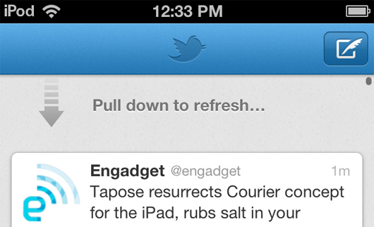
Seriously: when the feature was announced at WWDC, the crowd broke into a sustained applause. Now that the beta is available to developers (and, let's be real, basically anyone who really wants it) it's getting attention for its odd execution. Virtually all other pull-to-refresh implementations use an arrow of some sort, sticking to a loose printer metaphor.
Apple, for reasons unknown, went with something unusual. Something... almost lewd?

Apple's Pull-to-Refresh animation reminds me of World of Goo.
 Apple's Pull-to-Refresh animation reminds me of World of Goo.--

The pull to refresh animation in iOS 6’s Mail app is like a little booger.

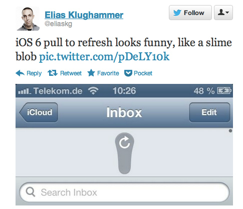

@jwherrman @mattbuchanan I think of it as plucking a delicious drop of nectar from a majestic flower's stamen.
 @jwherrman @mattbuchanan I think of it as plucking a delicious drop of nectar from a majestic flower's stamen.--
My only feeling, other that faint embarrassment for caring so much about this gross little slimeball, is that it's missing a sound. Twitter uses a nice SSCCHH, POP sound with its PTR animation; clearly this should make a SSLLLLLLLRRRRPPP. Or something.