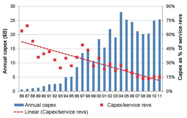
One Chart Explains Why Your Cell Service Sucks

And why it’s so expensive, and why we don’t all have 4G yet, and why we still get that roaming icon so much, etc. The red line represents carriers’ spending on network infrastructure over the years, relative to revenues. It’s still declining despite, like, everybody getting network-straining smartphones.

I know, right? Now tell your friends!
One Chart Explains Why Your Cell Service S...
John Herrman

Check out more articles on BuzzFeed.com!

Facebook Conversations


    Responses So Far

    • likewhoaa thinks One Chart Explains Why Your Cell Serv... is OMG  about 10 months ago
    • jakema thinks One Chart Explains Why Your Cell Serv... is WTF  about 10 months ago
    • Chris Johanesen thinks One Chart Explains Why Your Cell Serv... is Irresistible  about 10 months ago
    Now Buzzing