
For the last four years, iPhone and Android developers haven't spent much time thinking about fonts. Each OS comes stocked with about a dozen serviceable typefaces with names you might recognize: Helvetica, Times New Roman, Arial, Verdana. Devs used these fonts because they were there, they were free, and because they looked fine.
This is changing. Super-sharp screens are making some fonts look bad, or at least boring. Screens are becoming more like paper, so app developers need to start thinking more like traditional designers.
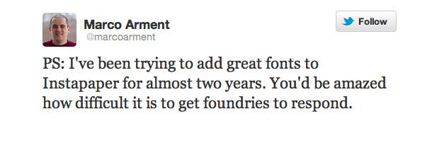
Readability broke ground by licensing a bunch of fonts for its iOS app from Hoefler & Frere-Jones, one of the most prestigious font houses in the world. According to Instapaper developer Marco Arment, this was no small feat:
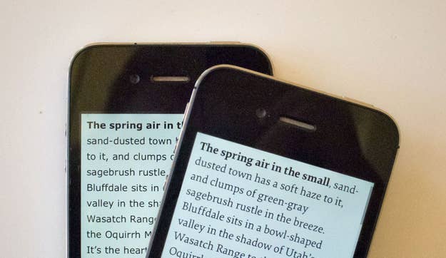
Shortly thereafter, as the Retina-display iPad was on its way to stores, Marco released an update to Instapaper containing new licensed fonts from a variety of font houses. It looked great — the default font, Elena, is a beautiful, light serif typeface that's worlds ahead of Verdana or Georgia for reading on an iPhone or iPad screen. It makes articles feel better. More importantly, it makes other fonts feel worse. So it's time for app developers to step it up. It's time to think about fonts again.
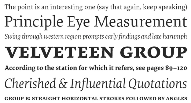
Nicole Dotin, who designed Elena, is happy to see app developers taking an interest in type. "The print industry and books in particular have always been very conservative. What's exciting about [custom fonts in apps] is that that they're actually picking new typefaces." Elena, for example, was released in 2011. The font it most directly replaces in Instapaper, Baskerville, was designed in 1757.
Her company, Process Type Foundry, has worked with apps before; the company's Seravek font is even included with Apple's iBooks. "Working with apps is a part of our business now," she says, and there's no reason to believe it won't become a bigger one. "It only makes sense."
Let's hope it does: Since living with Instapaper on a Retina iPad for a few hours over the weekend, other apps seem deficient. Reeder, my favorite RSS reader app, uses Helvetica Neue for its body font, which feels relatively clunky and hard on the eyes, especially for longer articles. It's like switching from a nice old book to a default-font printed Word document.
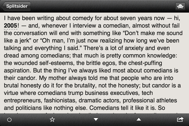
It seems as out of place on my new iPad as it would as a body font in a magazine. Ditto for Simplenote, and for Kindle, which has only one font, and not a particularly good one.
To be sure, this will cost developers more, and the cost will find its way to us. But I'll be happy to pay a little more for a great reading experience — or, at the very least, one that's not obviously worse than books.