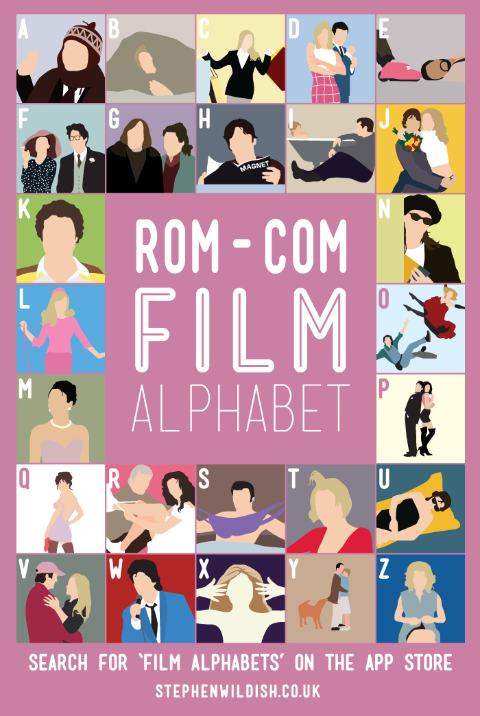
Movie alphabets have emerged as something of a go-to design trope for illustrators on the Internet, and some of the very best examples of the form have been developed by Stephen Wildish, a graphic designer based in the UK. Wildish's work is striking, colorful, and decidedly minimalistic, each block based on an iconic film still and stripped back to its most basic elements. Some of his alphabets are clustered around periods (decades, typically), others arranged by genre (Rom-Com being the latest) or franchise (James Bond), but all are clearly the work of the same creative vision. As with any list-building project of this nature, one might quibble with the inclusion or the exclusion of a particular title, but each alphabet comes as a fully formed challenge. Some of the answers are gimmes, but some of them are not.
In an interview last year with with It Goes To 11, Stephen revealed the origins of the project:
IG211: So, the obvious question: how did you develop the concept for the movie alphabets?
SW: The movie alphabets came about because I had a strange desire to draw Michael J. Fox as Marty FcFly (I could see how his bodywarmer would look in my head) so I drew it… then I kept drawing until the '80s was finished. I then got addicted and can't stop making them!
Think you can crack the code? Chime in with your answers in the comments below or play along on your mobile device!
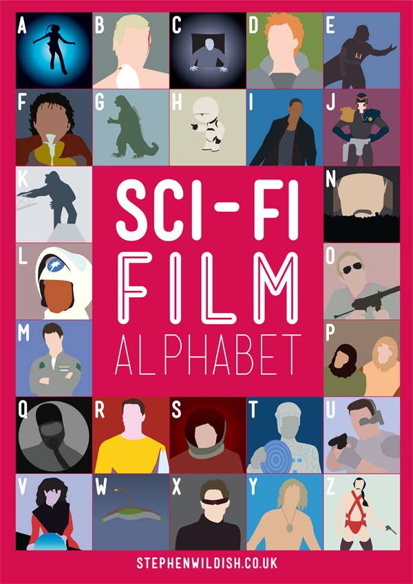
1. Sci-Fi Film Alphabet
2. Horror Film Alphabet

3. Comedy Film Alphabet

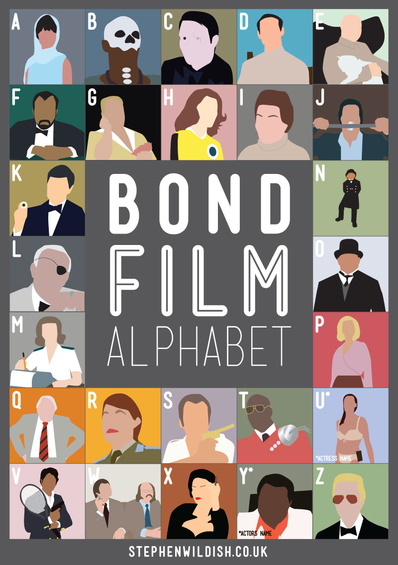
4. James Bond Film Alphabet
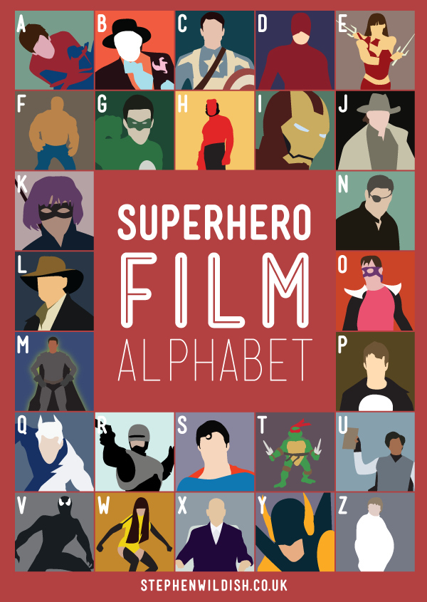
5. Superhero Film Alphabet
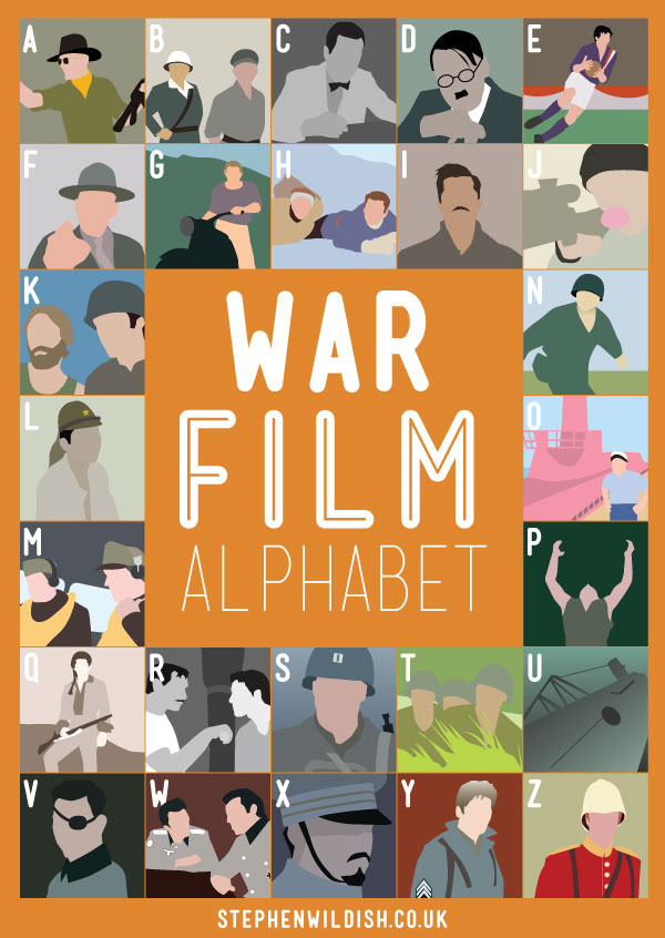
6. War Film Alphabet
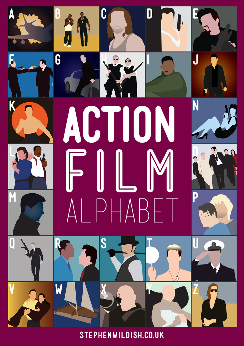
7. Action Film Alphabet
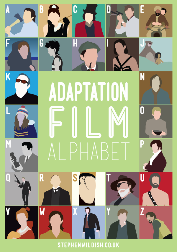
8. Adaptation Film Alphabet
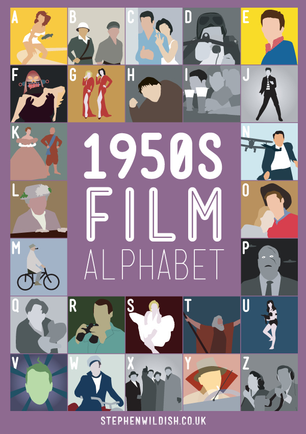
9. 1950's Film Alphabet
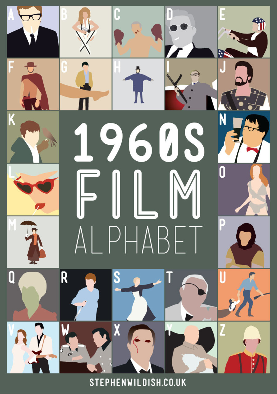
10. 1960's Film Alphabet
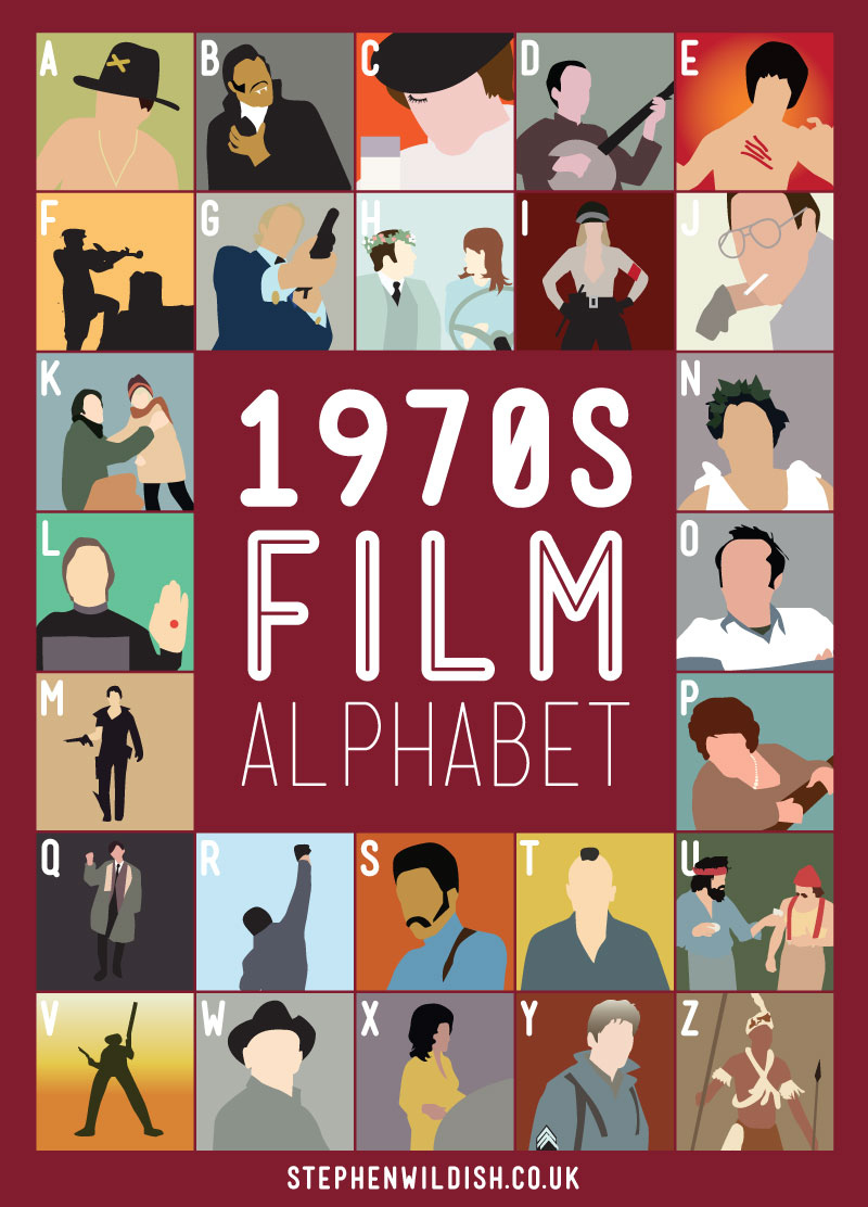
11. 1970's Film Alphabet
12. 1980's Film Alphabet

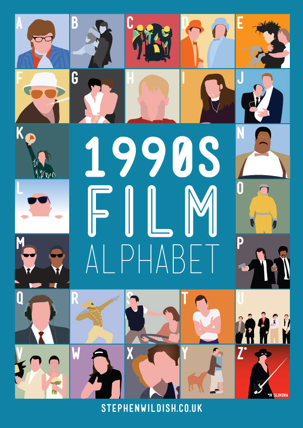
13. 1990's Film Alphabet
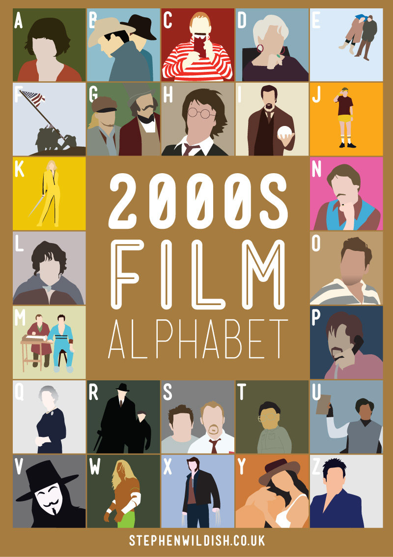
14. 2000's Film Alphabet
15. Ron-Com Film Alphabet
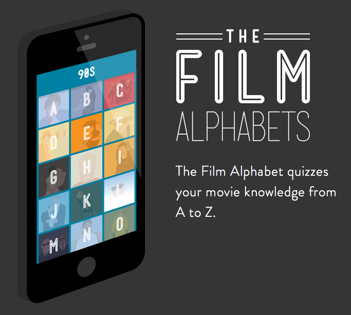
WHOA!: Now available in App form!
Share This Article