A couple of weeks ago we had a look at the long-running election tradition of publishing wildly dodgy graphs on political leaflets. You'll be pleased to know the parties are still at it.
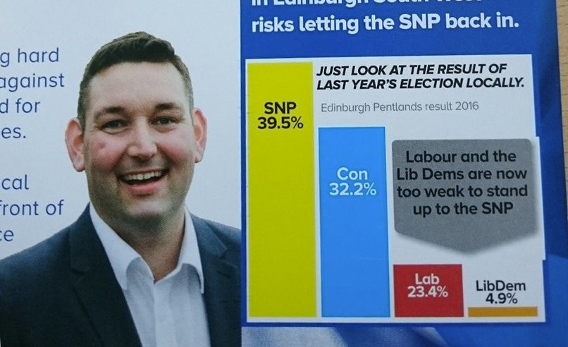
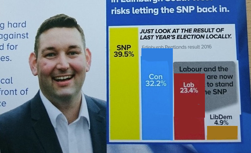
1. In which the Scottish Tories seem to think that 33 is four times as big as 13 (and about 20 times as big as 5).
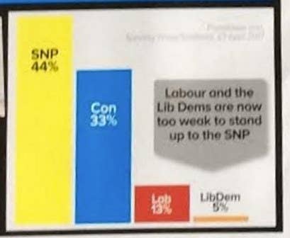
Fixed that for you!
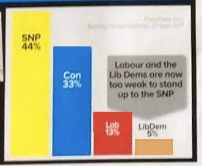
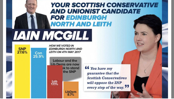
2. Sticking with the Scottish Tories, in whose universe 6 x 8.7 ≈ 27.6.
Fixed that one too, guys!
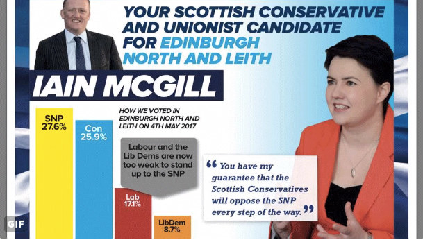
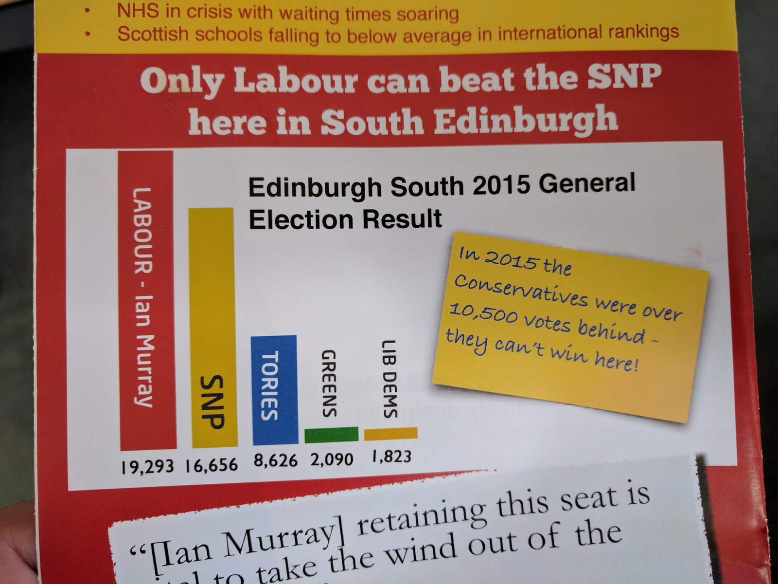
3. No but seriously, the Scottish Tories appear to actually have a problem and we shouldn't laugh at them.
Here you go, fixed this one as well.
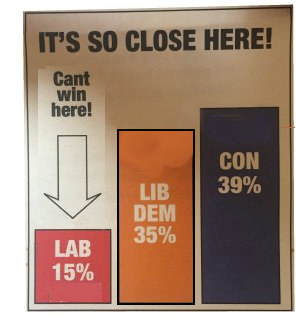
4. According to ancient prophecy, the election is not truly upon us until at least one Lib Dem candidate has churned out a truly heinous graph.
Fixed.
5. Look at this shitshow.
Ffffffffiiiiiiixed!
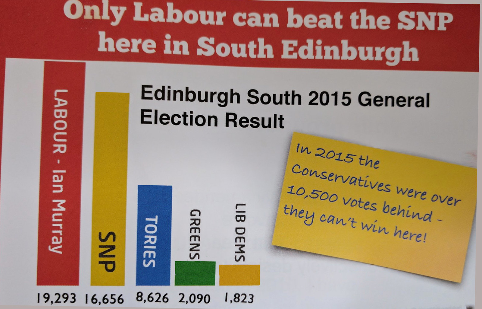
6. Everyone's at it, of course. Here's Labour's contribution.
F. I. X. E. D.
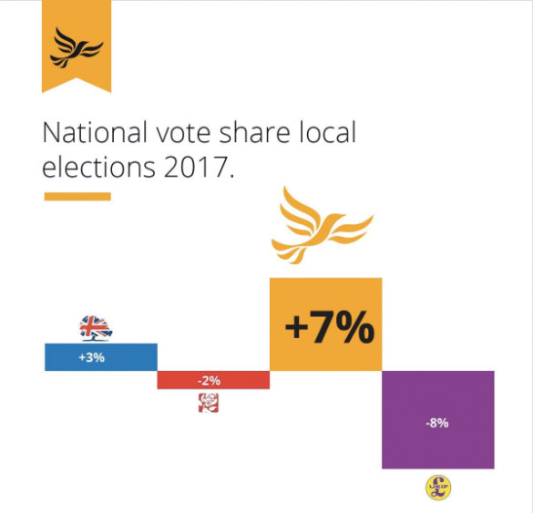
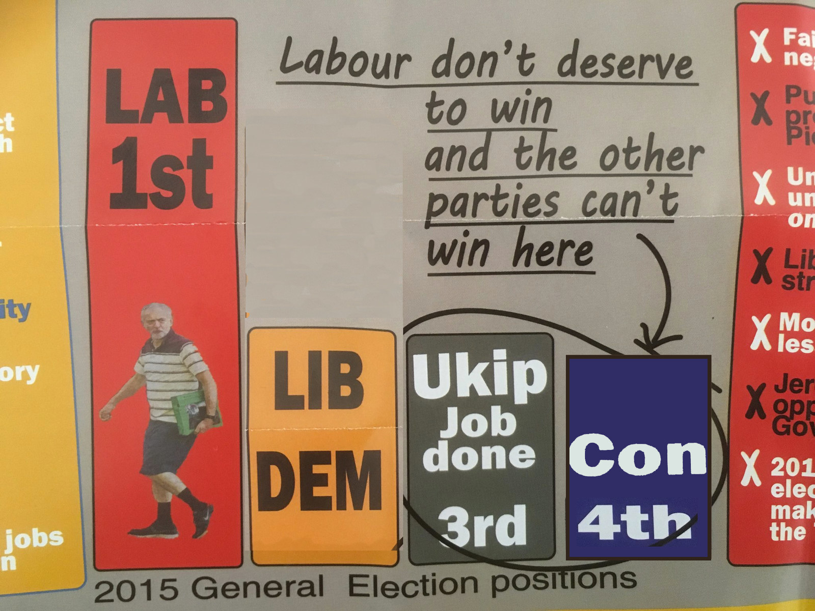
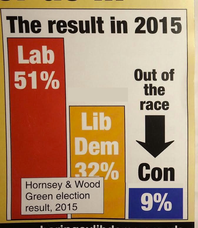
7. Back to the Lib Dems, and this one is a DOOZY.
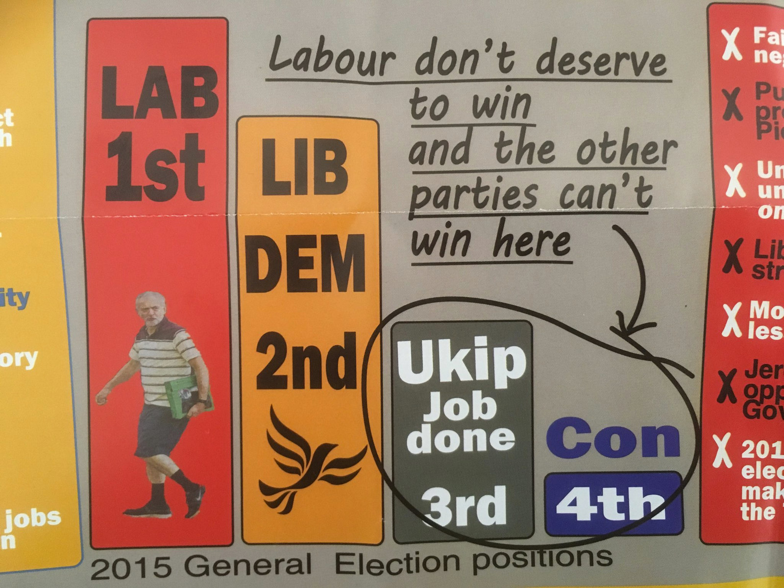
Here's how that should have looked!
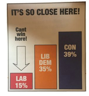
8. More Lib Dems, who really are the masters of this stuff.
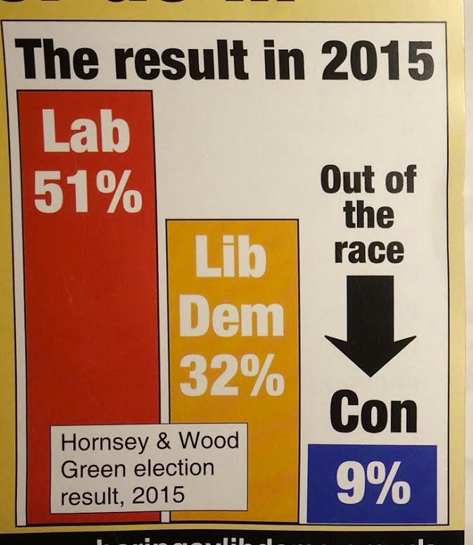
*extremely Coldplay voice* "And I…will try…to fix you…"
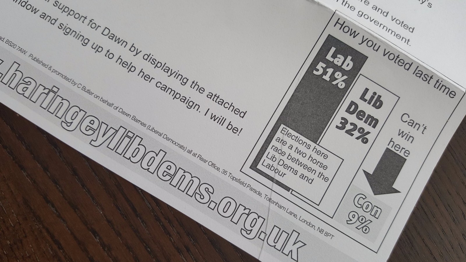
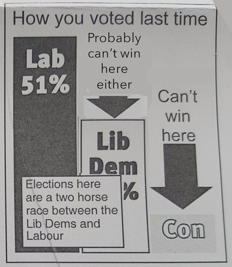
9. And finally, the strange tale of the time the Lib Dems made themselves look weaker than they actually are. And forgot an apostrophe.
Fixé.