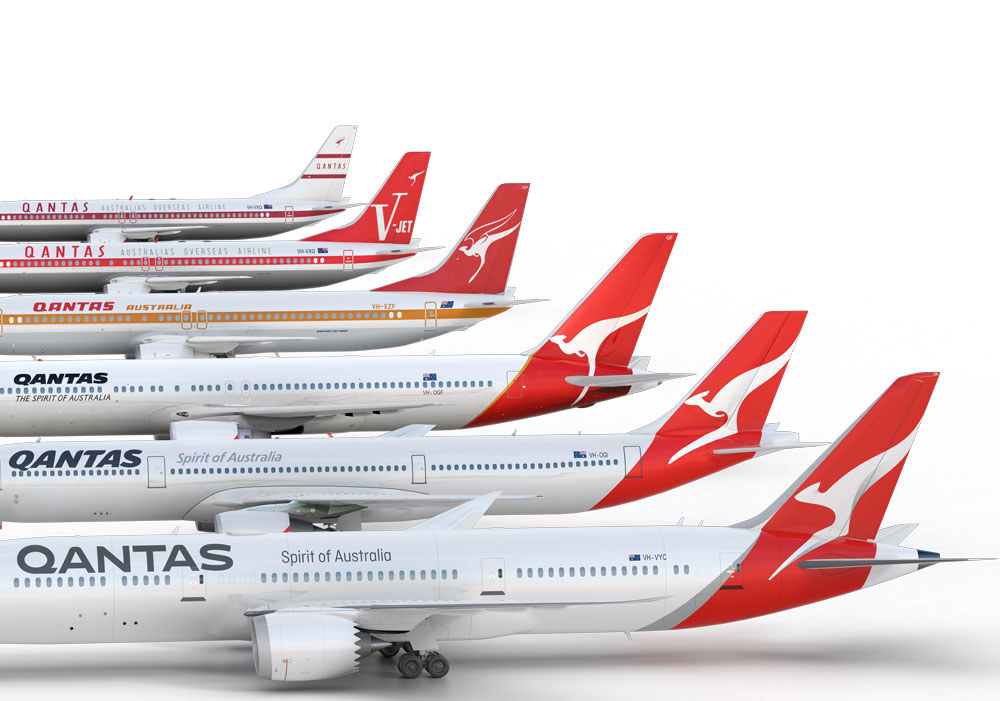
And here it is next to the old one.
#Qantas unveils updated logo - only fifth change since 1944. Spot the subtle difference
As you can see, the triangle is gone and in its place is a thing that kinda looks like a plane's rear spoiler thingo, and the kangaroo has lost its paws. There's also a new font.
“We wanted to make sure our brand remained familiar but we also wanted it to be more modern and dynamic, like the 787 [Qantas' new plane] and like Qantas," CEO Alan Joyce said on Thursday.
“When we looked at the history, we found that the logo has been updated around the time of a game-changing new aircraft joining the fleet. It’s a tradition that goes back to the Lockheed Constellation in 1947, the B747-300 in 1984 and the A380 in 2007."
Here are some other Qantas logos.

Here's how the logo designer, Marc Newson, explained the changes:
"This new brand is more streamlined and the shading behind the kangaroo gives a better sense of movement and depth. A silver band now extends from the tail to the rear of the fuselage, to give a more premium feel."
“The typography for the word Qantas, which measures almost two metres high on the 787, has been carefully streamlined. And Qantas will appear on the aircraft’s belly, so you can tell when it’s the national carrier flying overhead,” Newson added.

