We asked the BuzzFeed Community to share the smartest decorating tip they'd ever heard — and here are some of their best answers!
Note: Some responses have been lightly edited for length or clarity.
1. Base your ~design~ or concept for a room around a single piece you love.
2. Or instead of completely planning out what a room will look like, take your time collecting things you love.
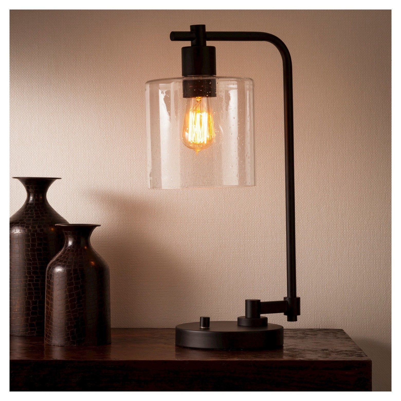
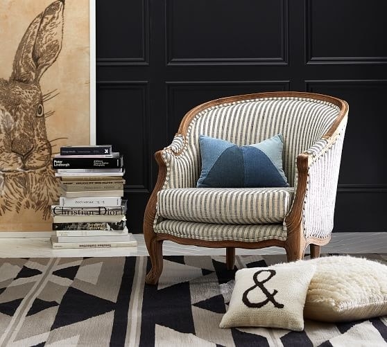
3. Add something black to every room to help it feel more anchored.
4. When you're placing your accessories, follow the "1-3-5 Rule."
5. Same goes for your fabric prints and patterns — keep the number of patterns in the same room to an odd number.
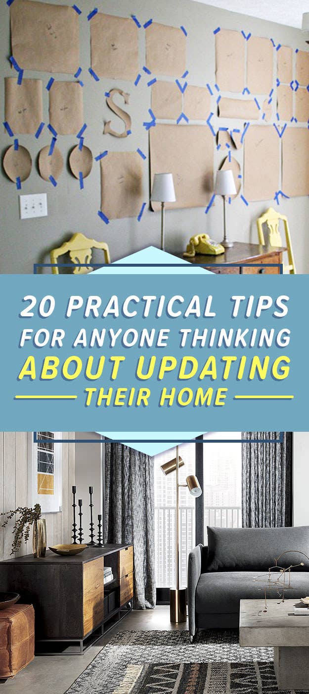
6. Print out your favorite photos and hang 'em on the wall as true art pieces.
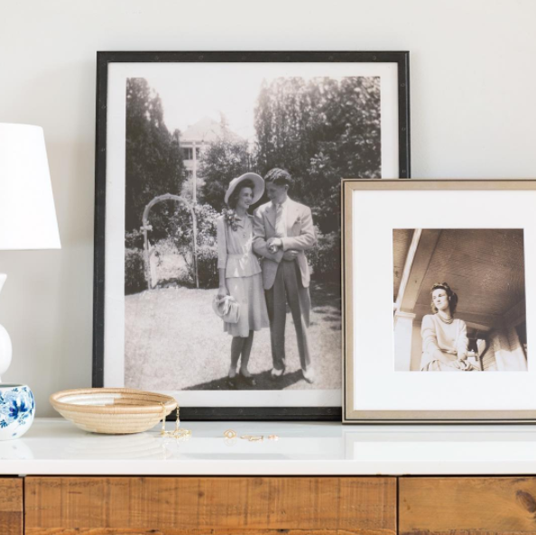
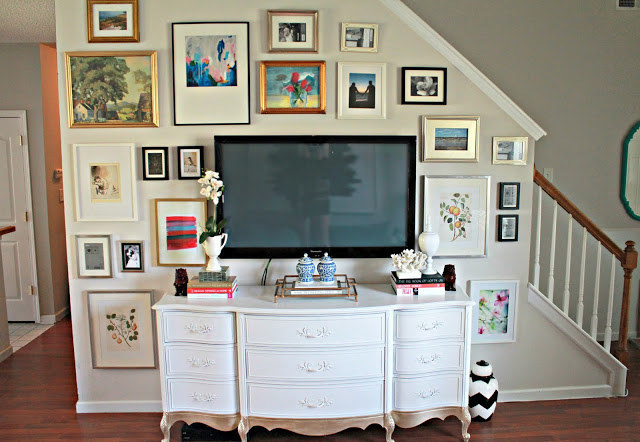
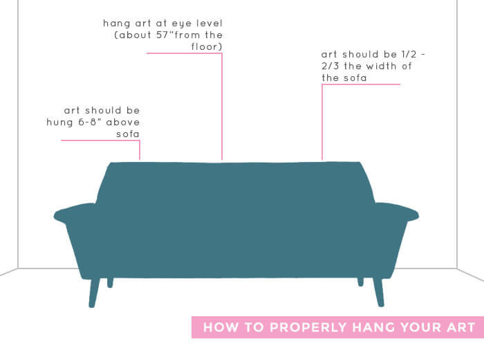
7. Make sure the center of any art you hang is about 57'' from the floor.
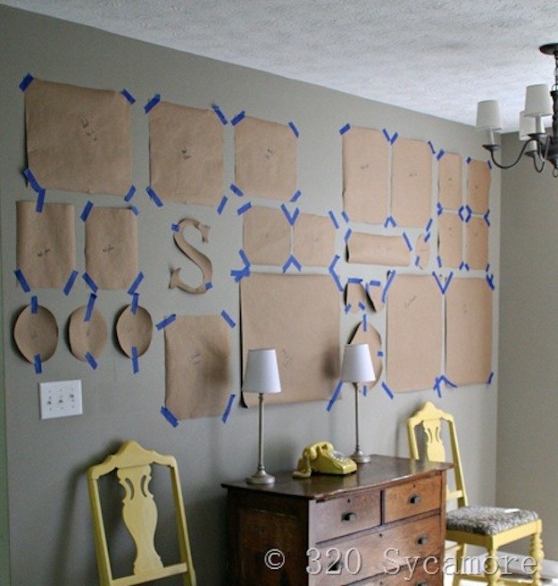
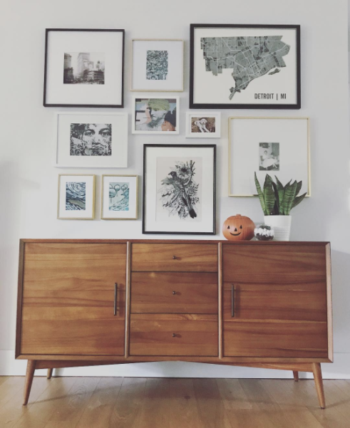
8. Plan out your gallery walls in advance with the help of templates.
9. If you're in an older house and all your wall art looks crooked, it's probably not — but in order to ~look straight~, it will need to be a little off-kilter.
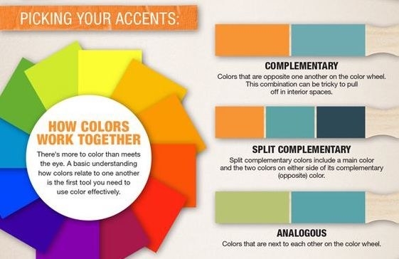
10. Use complimentary and contrasting colors to choose a good color scheme for a single room.
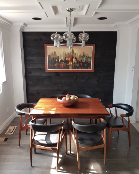
11. To add to color or texture to the walls in a small space, stick to an accent wall so the room doesn't feel closed in.
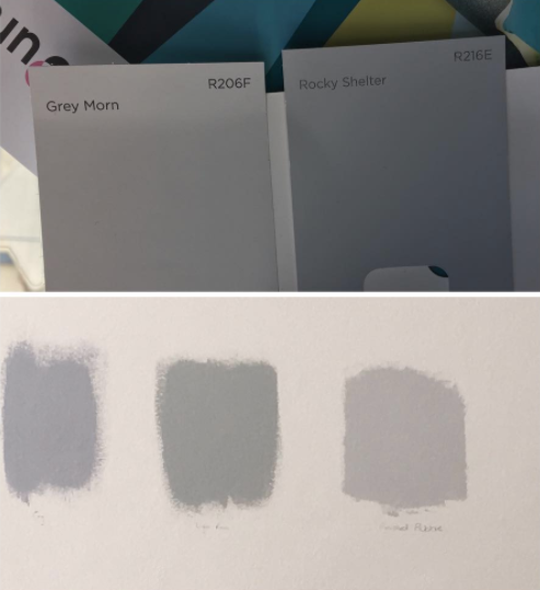
12. When you're paint shopping, compare the paint color you're about to buy to white.
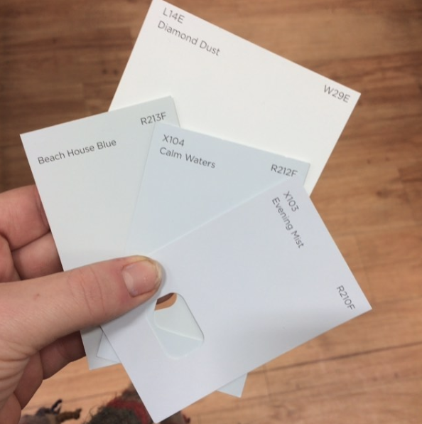
13. Make sure to test any colors on more than just one area of your wall...and to look at the swatches at various times of day.
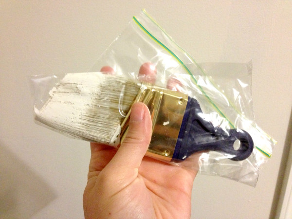
14. When you actually get to painting a room, skip washing your brushes and rollers each night.
15. When you first move in to a new space, give it time before replacing any furniture or doing much decorating.
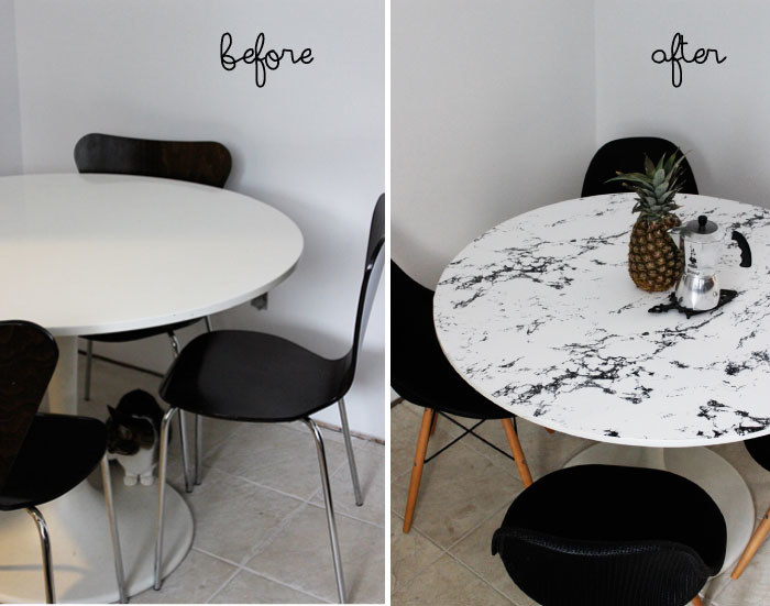
16. Hate your current furniture? Try refreshing it so it fits with your current style.
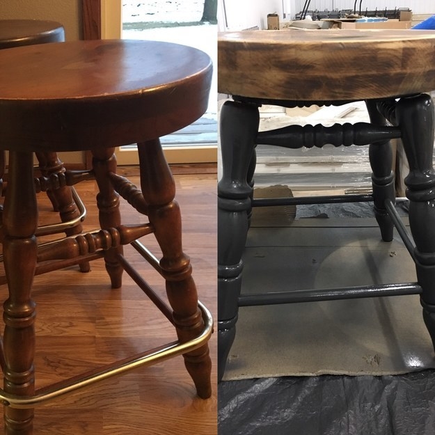
17. Those changes can be simple, like changing out the knobs on a dresser or adding contact paper to literally any flat surface.
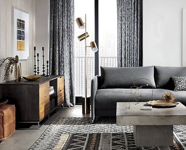
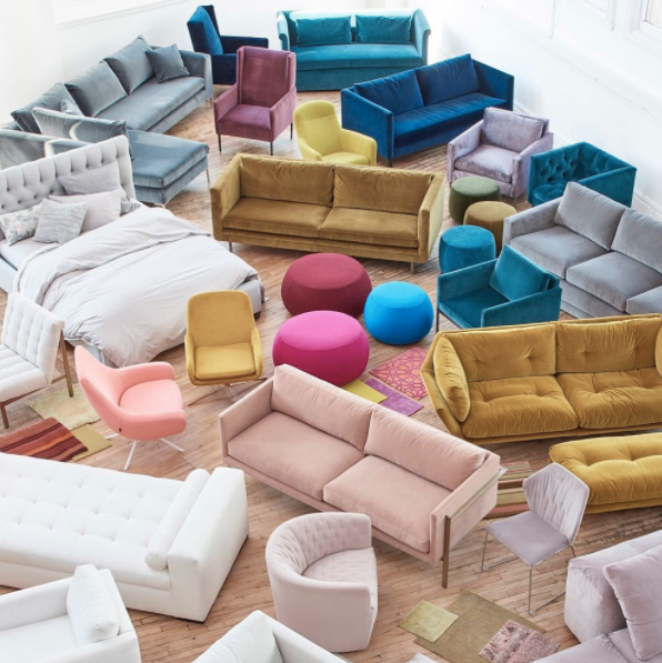
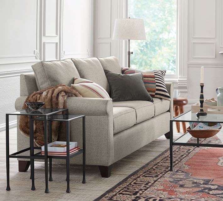
18. Choose neutral tones for your biggest furniture items, and use accessories to add (and switch out) color.
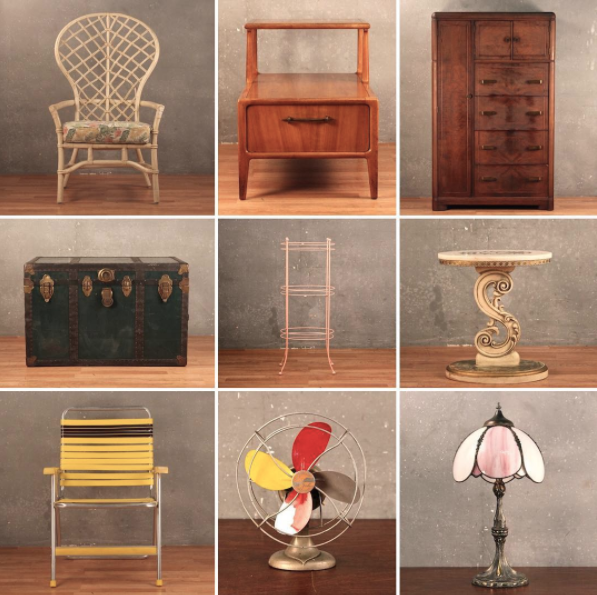
19. If you can afford it, shop for antique or vintage furniture to get something high quality.
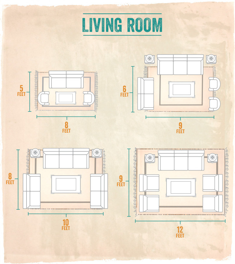
20. Choose a rug that's actually big enough for your room and furniture to help anchor any space.