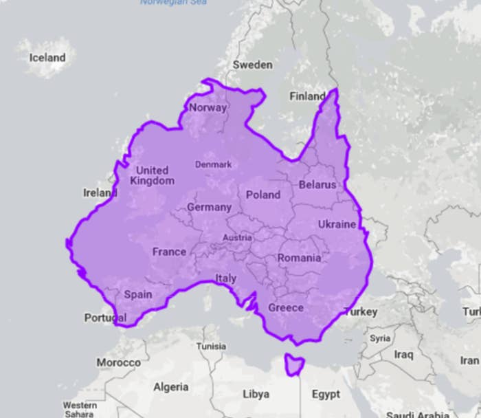
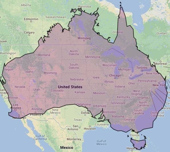
1.
You probably know Australia is huge, but look at how much of Europe it covers.
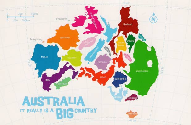
2.
Look at all the countries that fit inside!
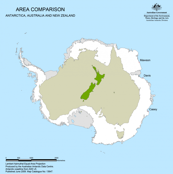
4.
It's almost as big as Antartica!
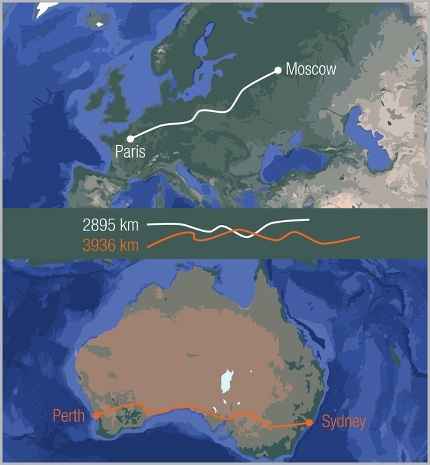
5.
No wonder it takes so goddamn long to get from one side of Australia to the other.
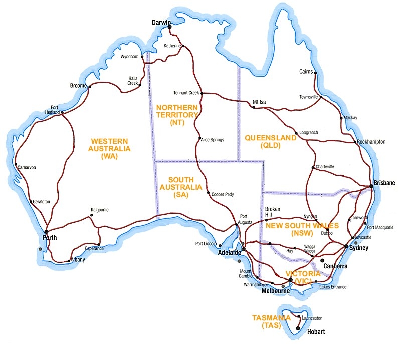
6.
This map shows where the main highways go.
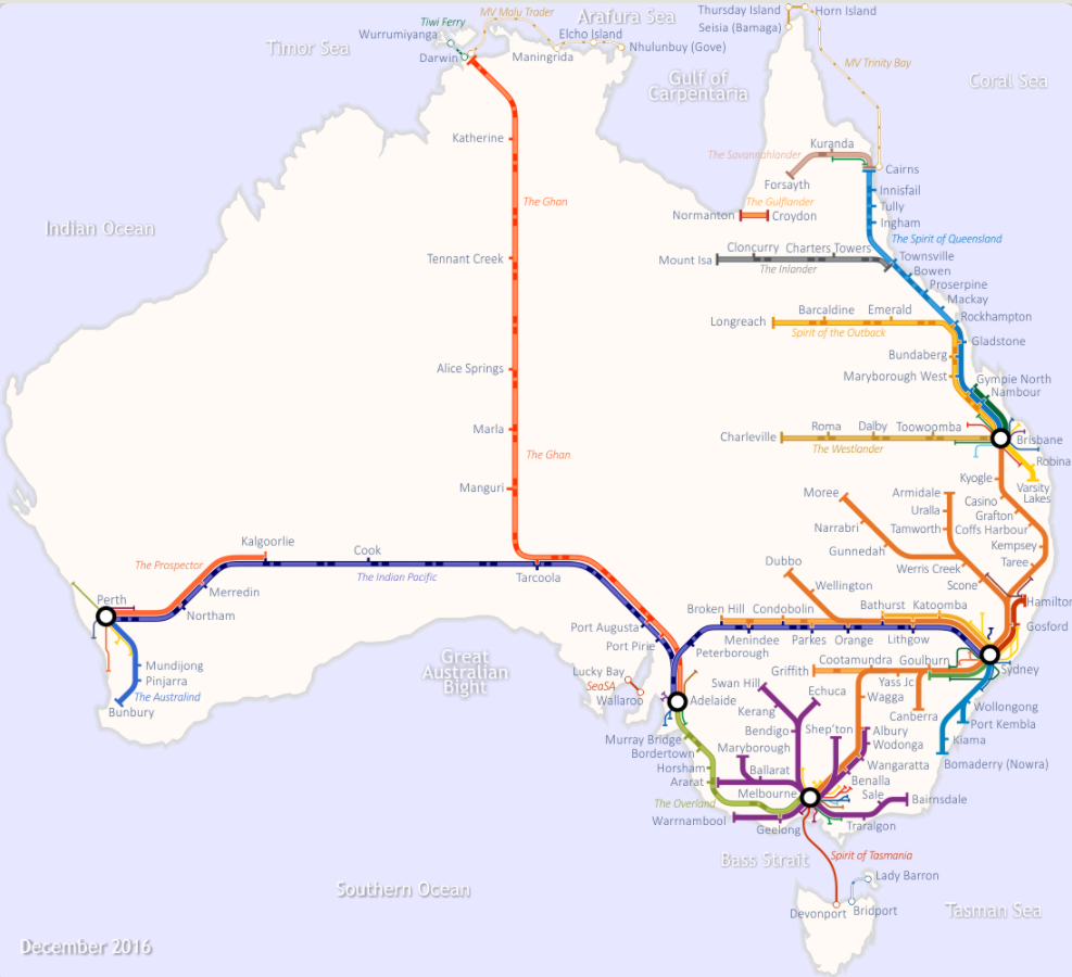
7.
And here's the rail network.
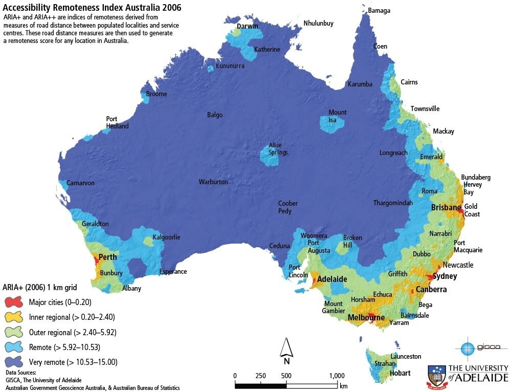
8.
Basically, most of Australia is pretty damn remote.
9.
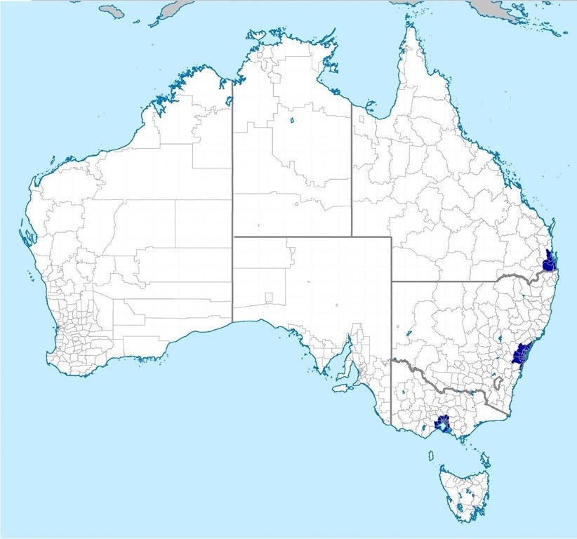
Half of the population lives in the dark blue bits on this map.
10.
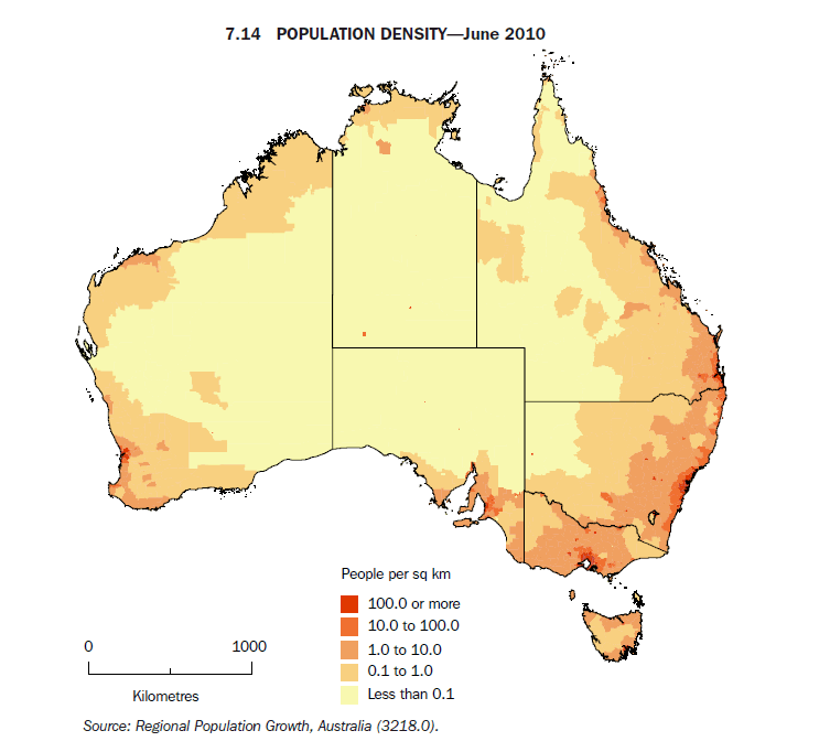
The population density goes from one extreme to the other.
11.
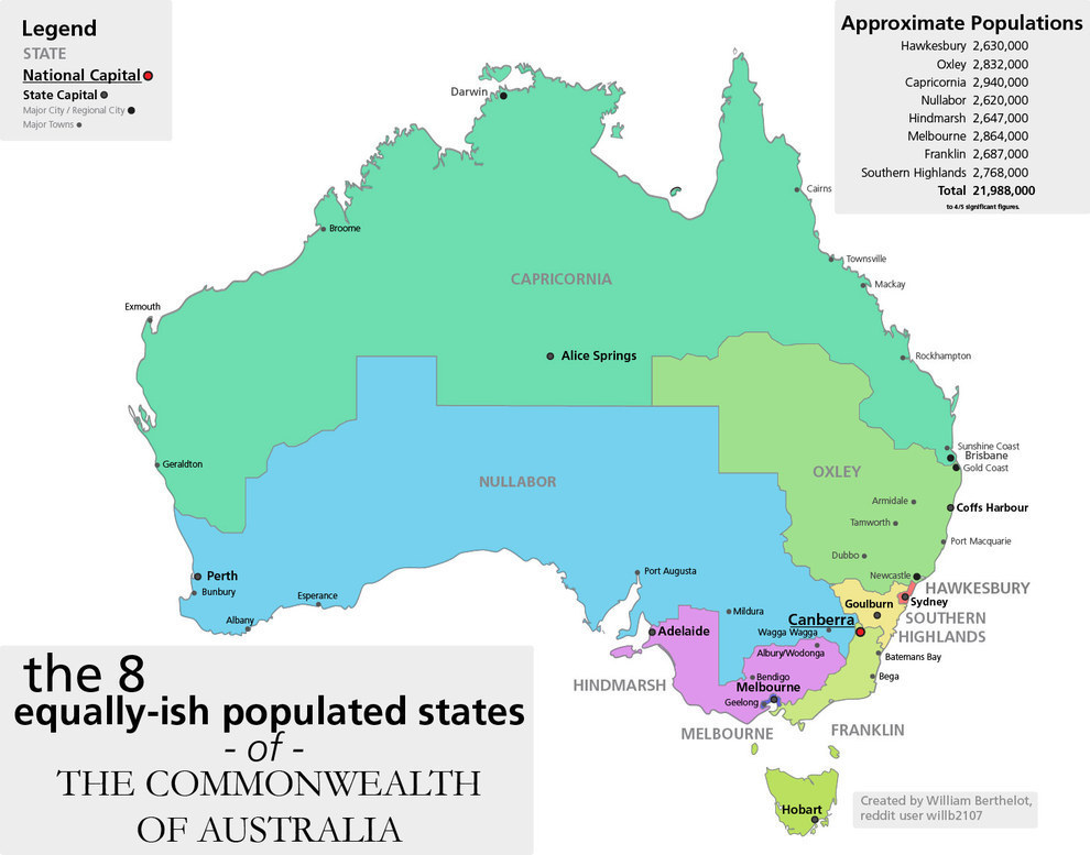
This is what the country would look like if it was divided into states of equal population.
12.
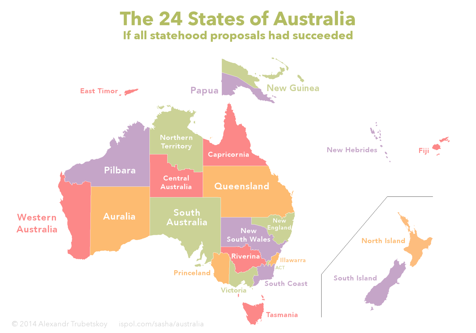
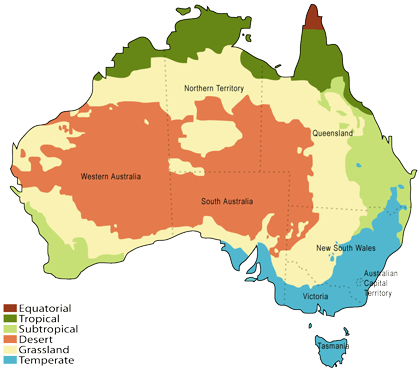
And this is how the country would have looked if all the proposed states actually existed.
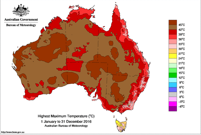
13.
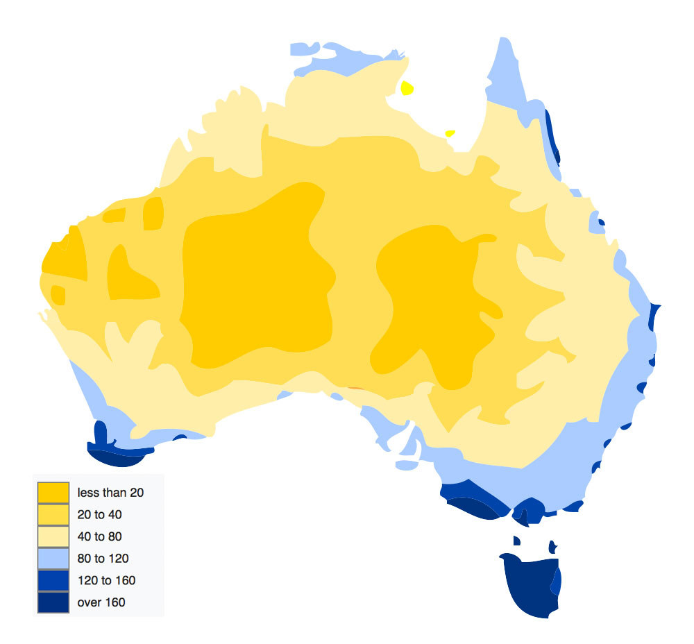
In this GIF, you can watch the history of the way Europeans mapped and divided Australia.
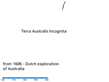
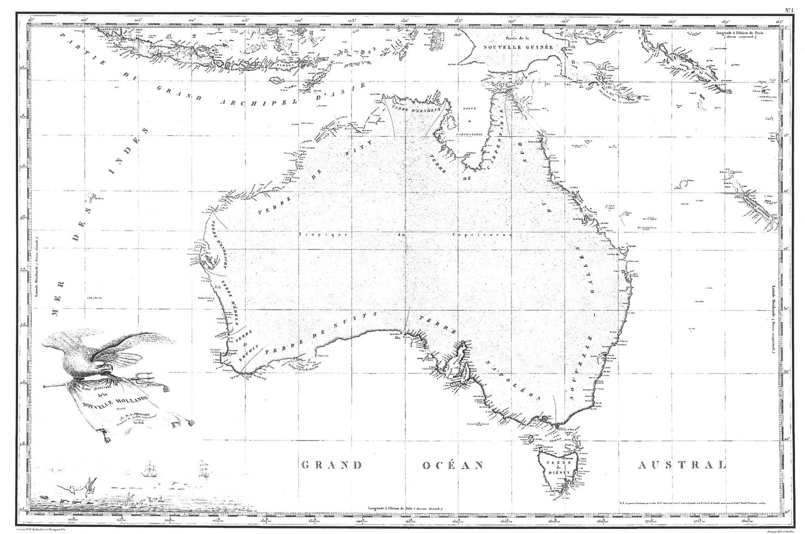
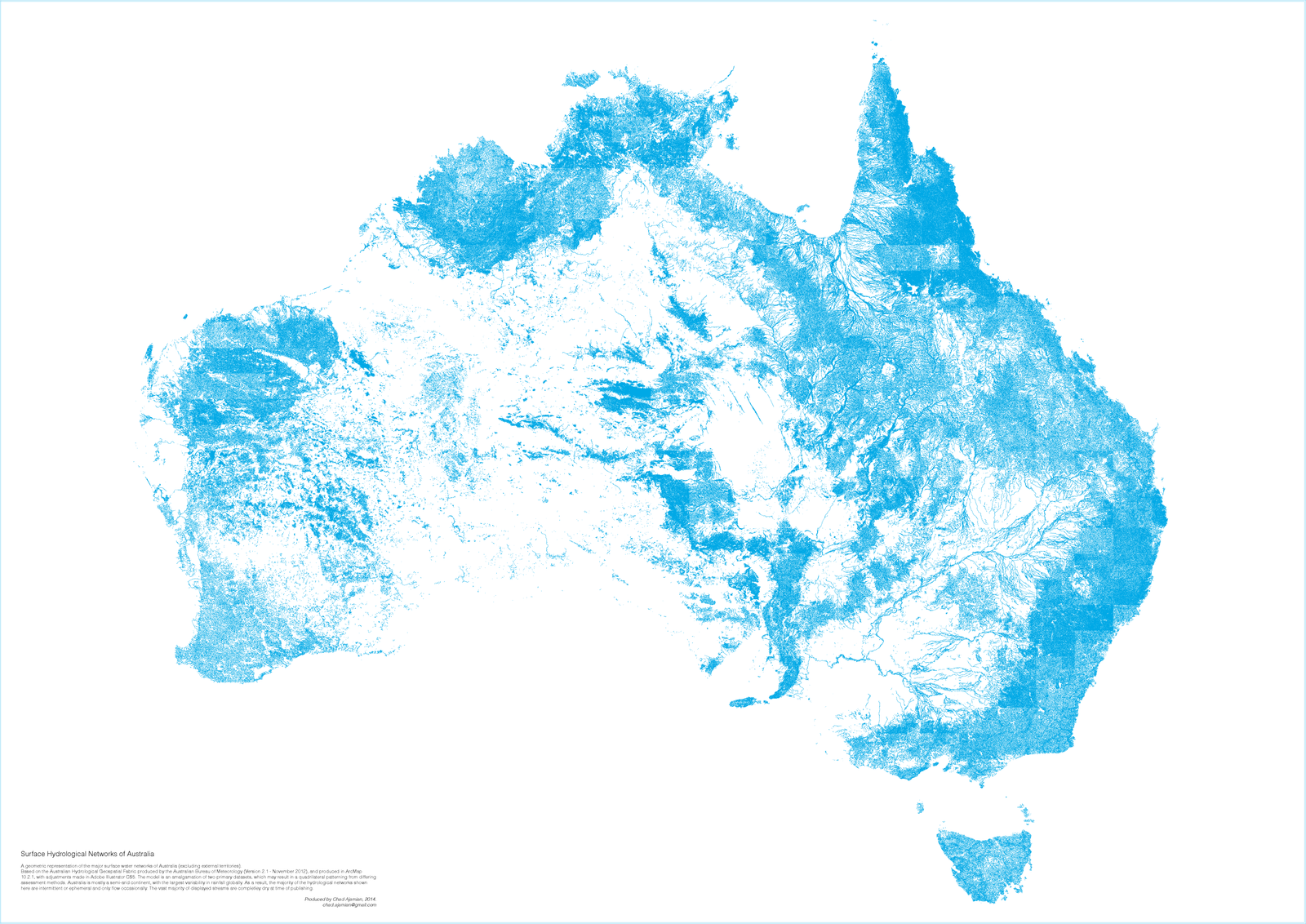
14.
The country was first mapped in full in 1811, by Louis de Freycinet.
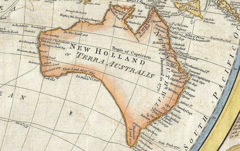
15.
Before that, the maps were a little... off. Like this one from 1794.
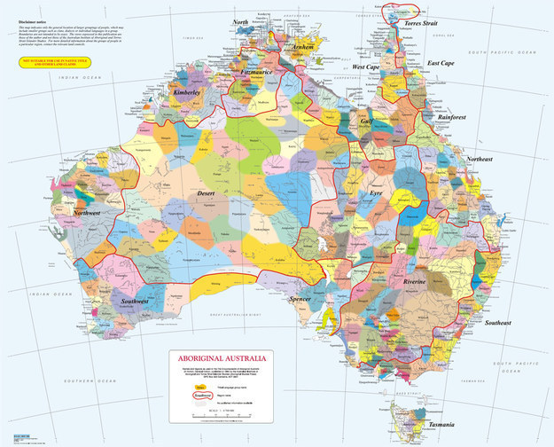
16.
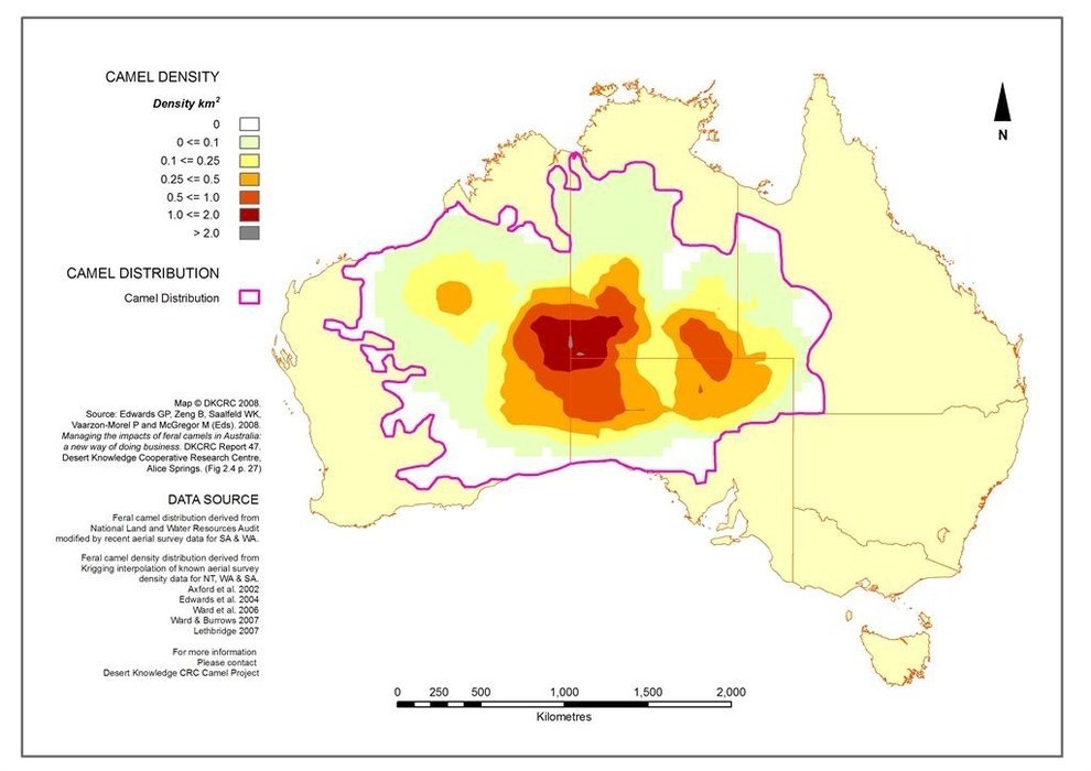
But before there were any maps of Australia, there was a long and rich history of Indigenous culture - including hundreds of language groups.
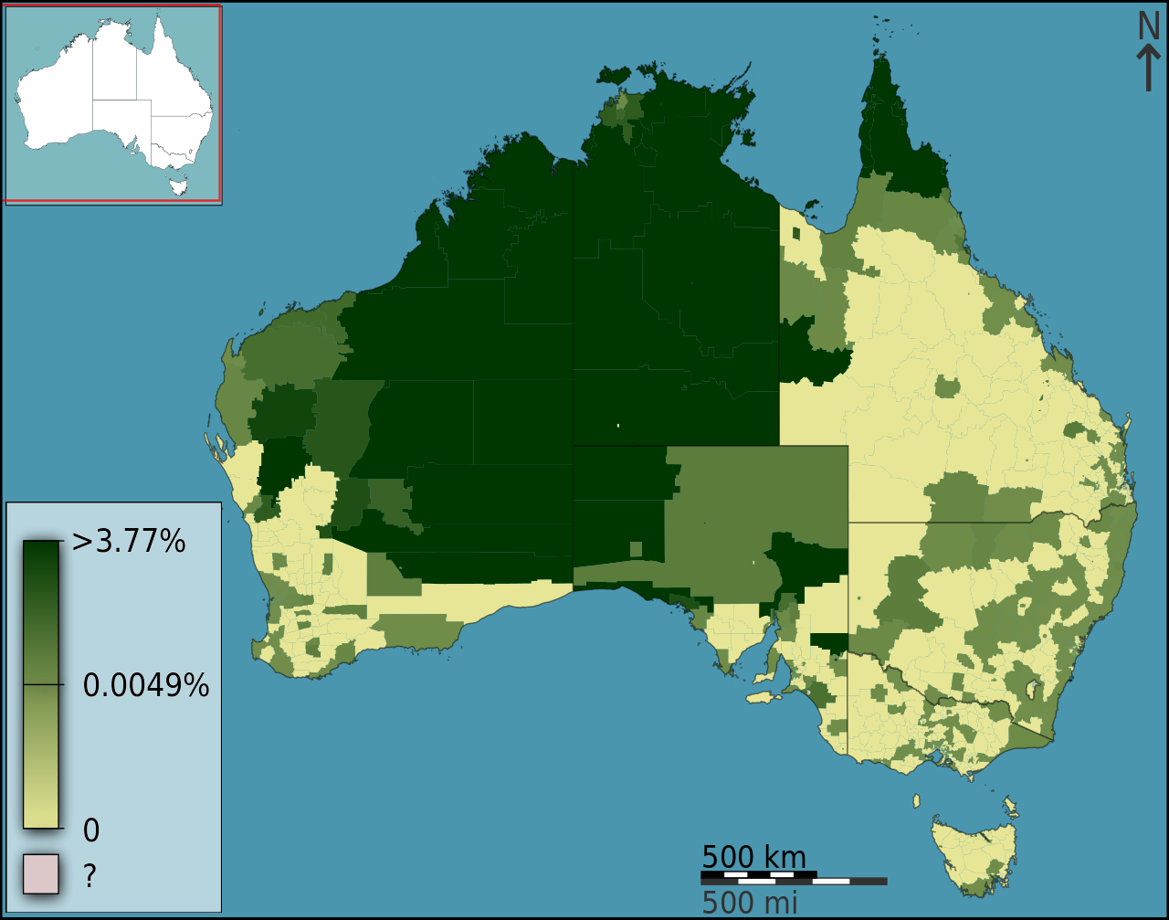
17.
This map shows the percentage of people who speak an Indigenous language at home in each area of Australia today.
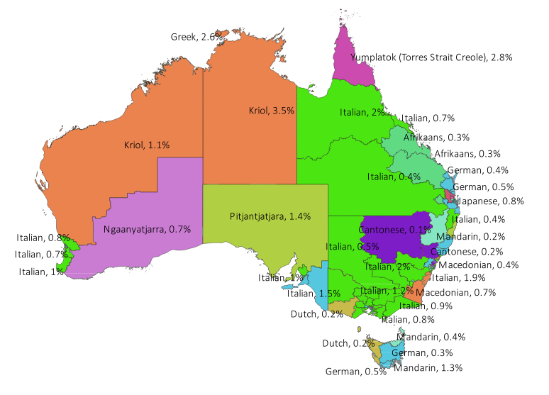
18.
And here's a breakdown of the top languages other than English that are spoken in each electorate.
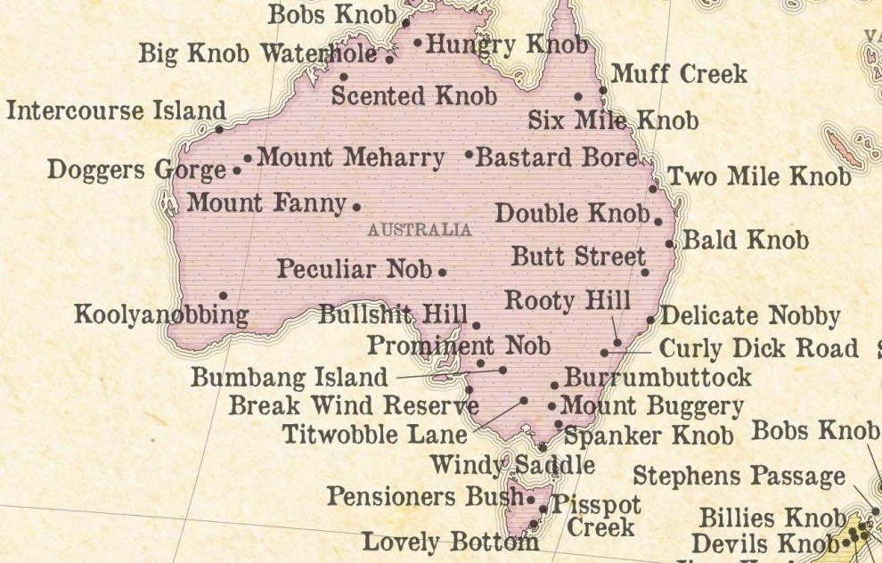
19.
This delightful map shows some of the most ~rude~ place names in Australia.
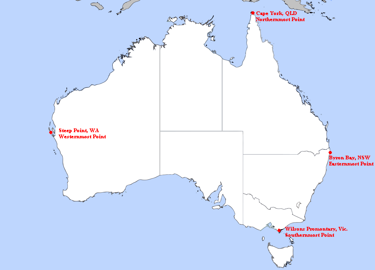
20.
This one marks the most extreme points on the mainland.
21.
Here's a map of the climate in Australia.
22.
This terrifying one shows the highest temperatures reached in 2016.
23.
While this one shows how many days of rain each area averages.
24.
This is what Australia looks like with just the streams highlighted.
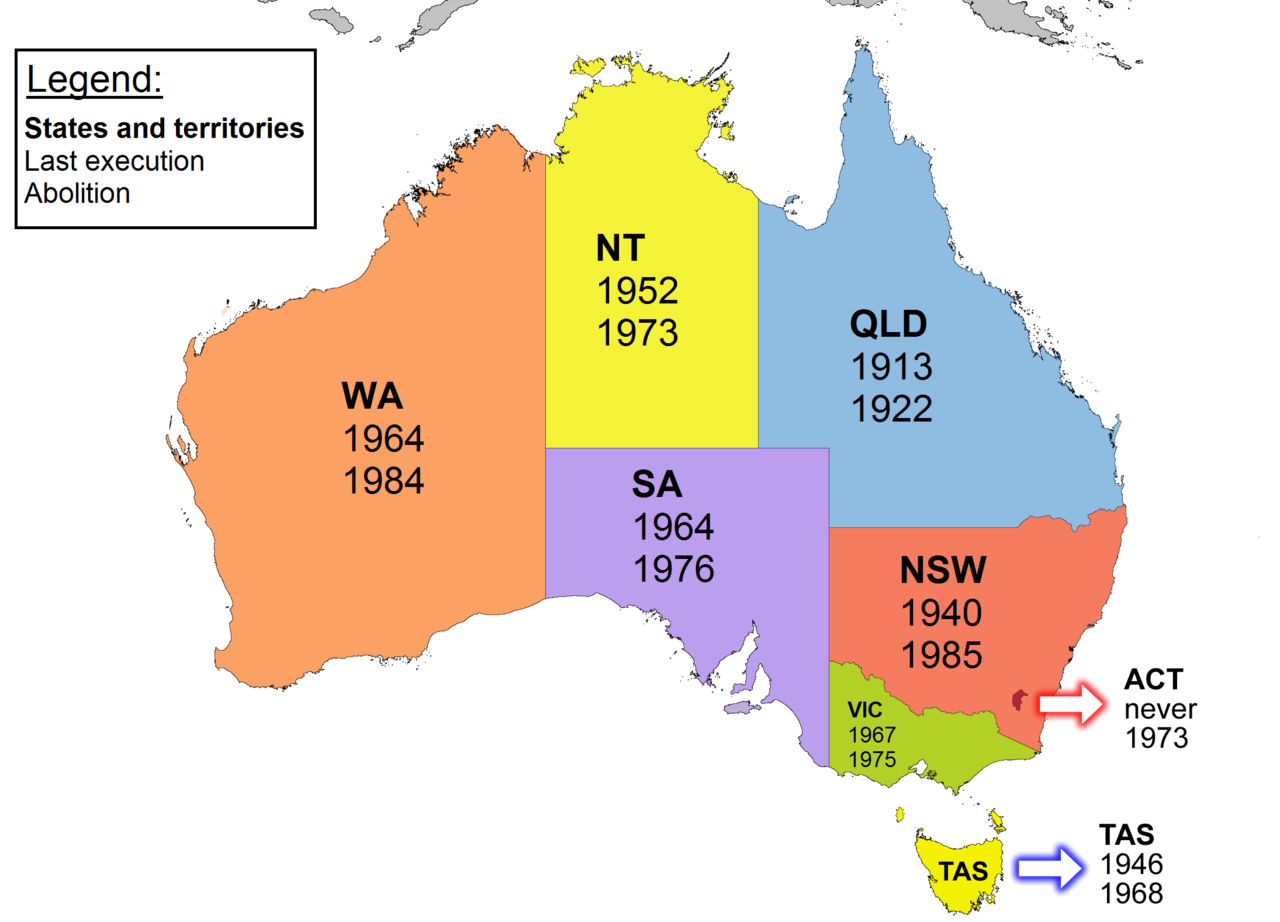
25.
Here's some history for you: this map shows the year the last execution happened in each state, and the year capital punishment was abolished.
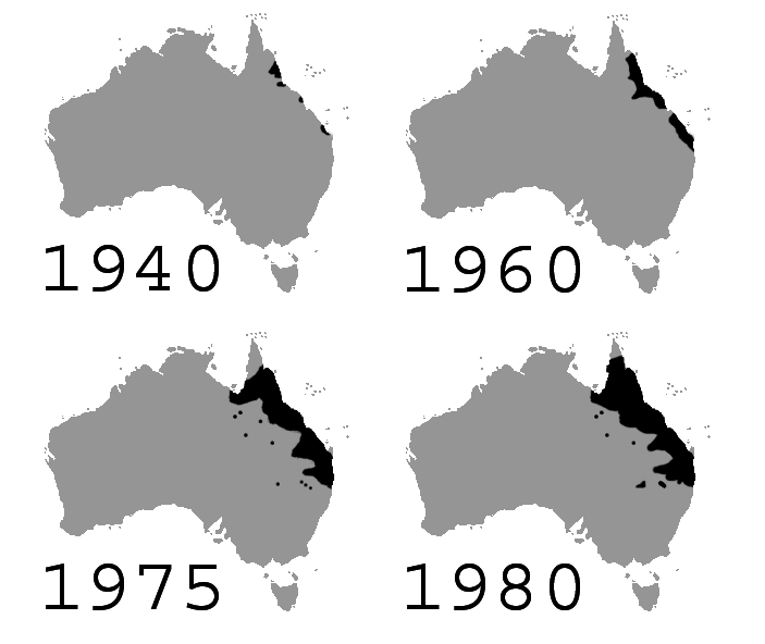
26.
This map shows the progression of the cane toad population over 40 years.
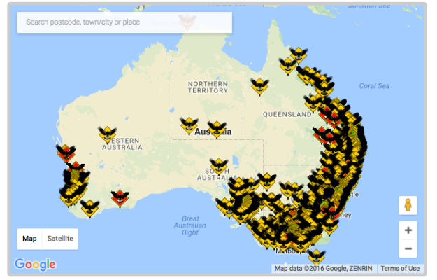
27.
And here are all the reported magpie attacks in 2016. Eek!
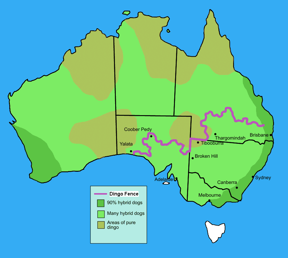
28.
This is what the dingo population looks like.
29.
And did you know Australia has so many goddamn camels?
