
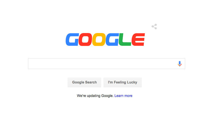
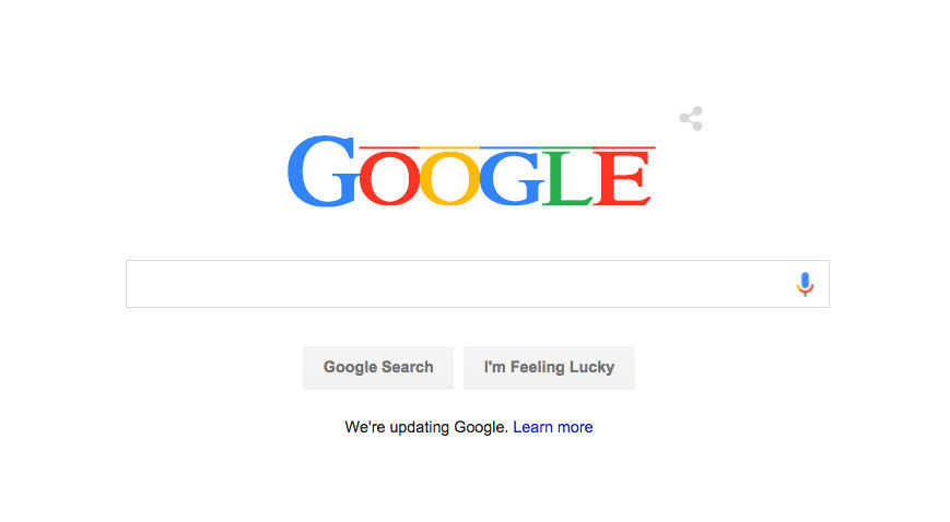
On Tuesday, Google shook civilisation to its core by unveiling a new logo.
Shockingly, not everyone welcomed the change.

the new google logo looks like a fake search engine from a tv show

The new Google logo is hurting my eyes. I can't breathe.

the new google logo looks like shit and i hate it
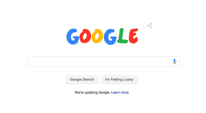
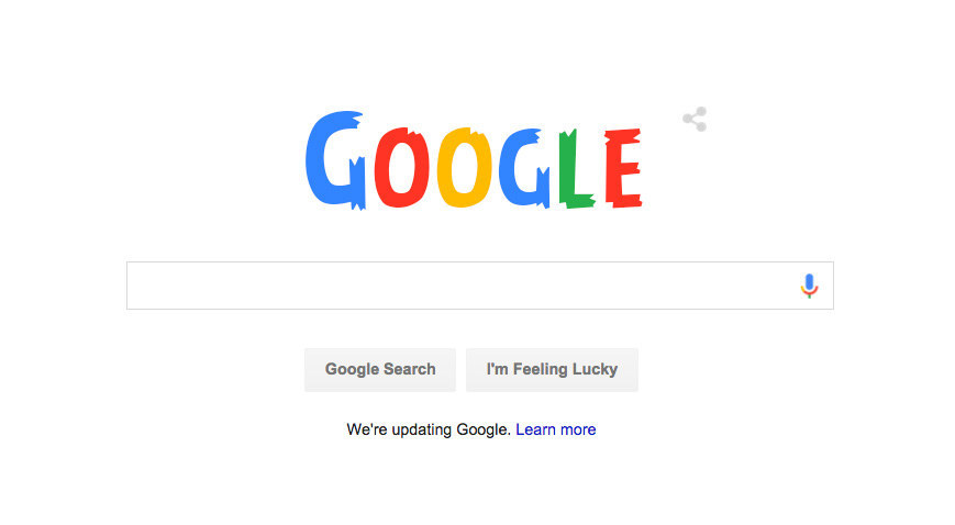
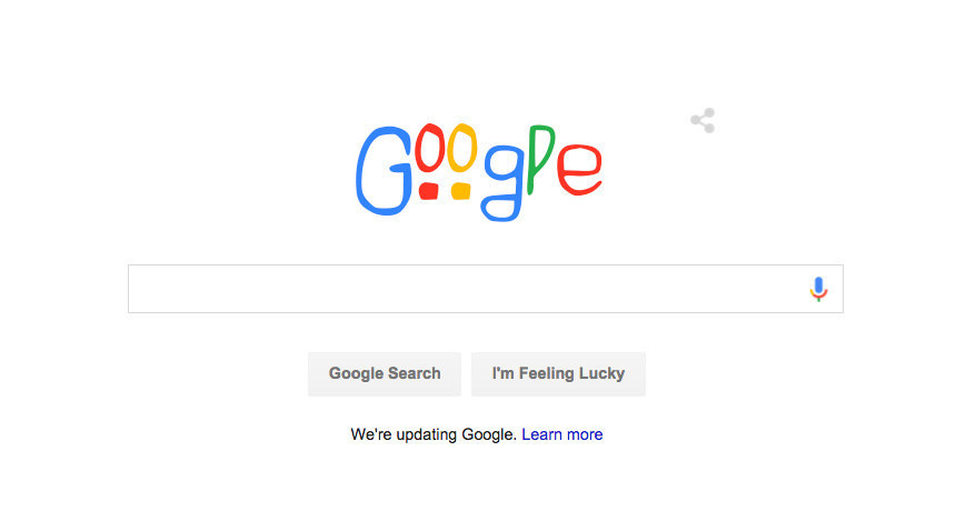
So here are some alternative designs:
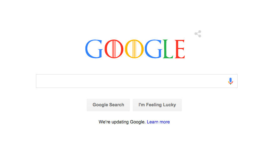
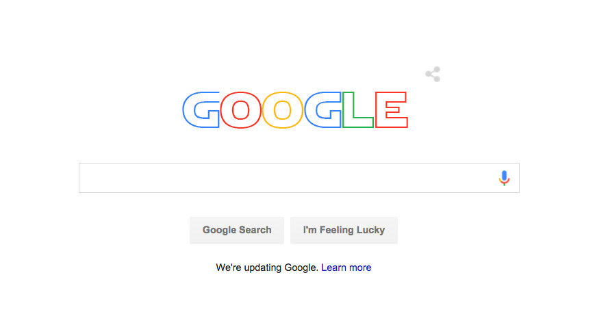
1. The Game of Thrones font
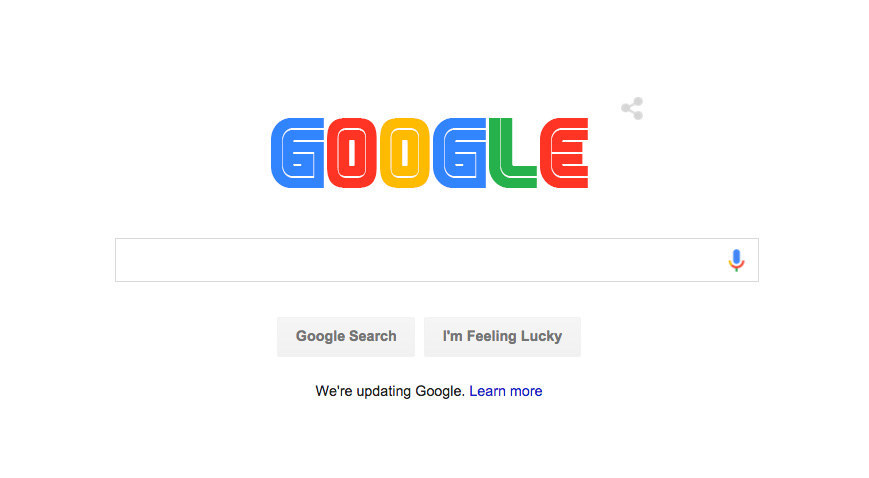
2. The Sega font
3. The Willy Wonka and the Chocolate Factory font
4. The Pokémon font
5. The Chronicles of Narnia font

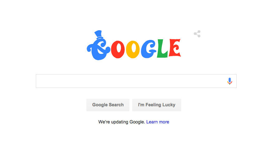
6. The Disney font
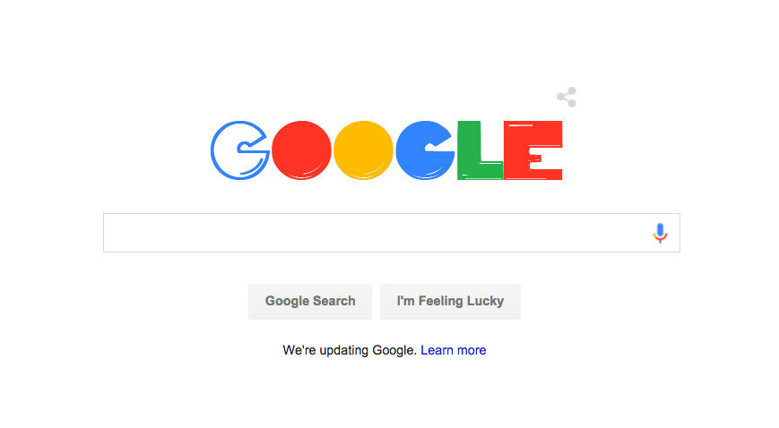
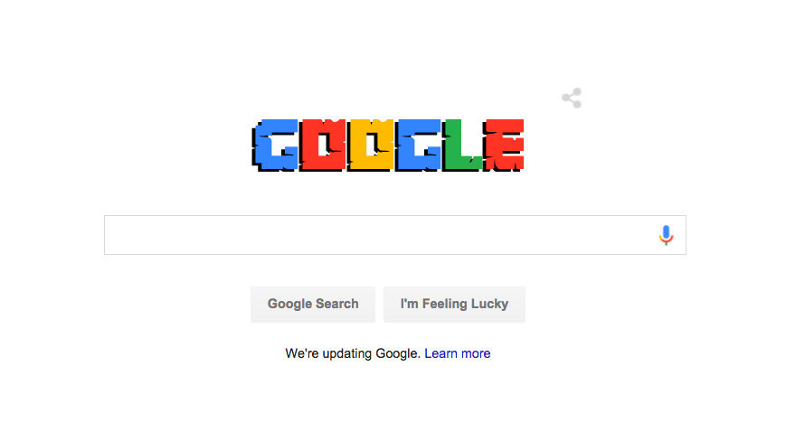
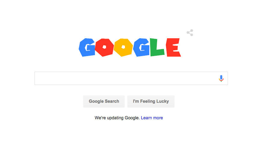
7. The Pac-Man font
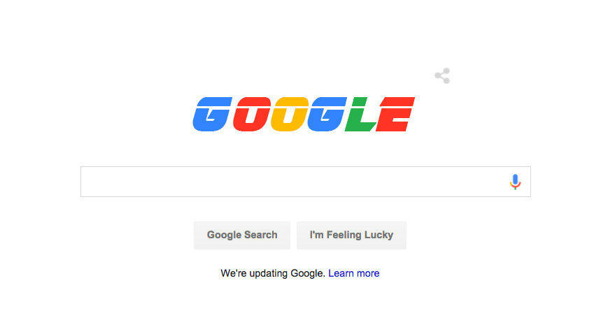
8. The Star Wars font
9. The Conan the Barbarian font

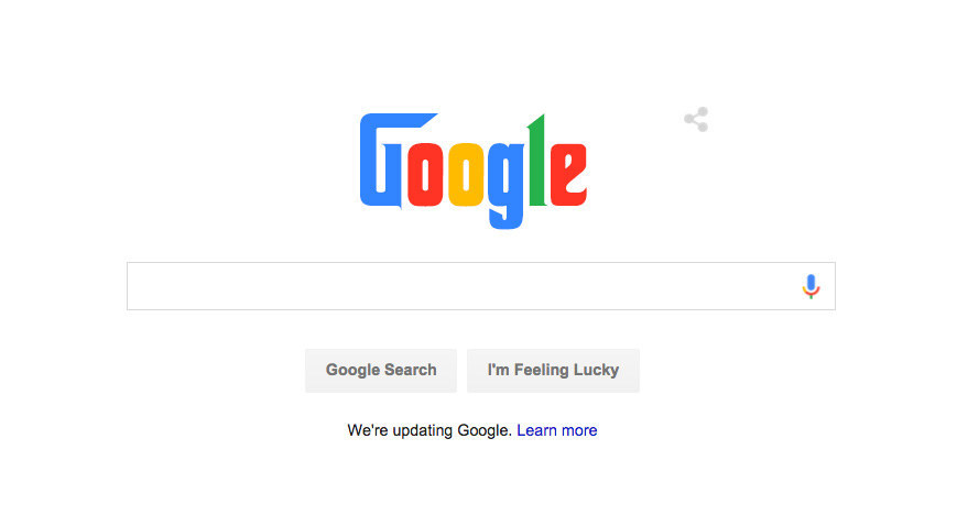
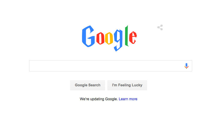
10. The Godfather font
11. The Batman Forever font
12. The Jurassic Park font

13. The Friends font
14. The Lord of the Rings font

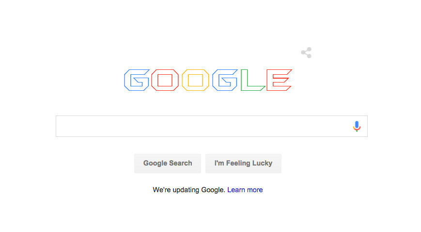
15. The Minecraft font
16. The Avengers font

17. The Harry Potter font
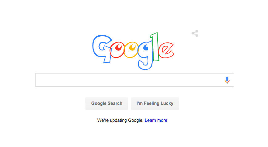
18. The Coca-Cola font
19. The Pepsi font
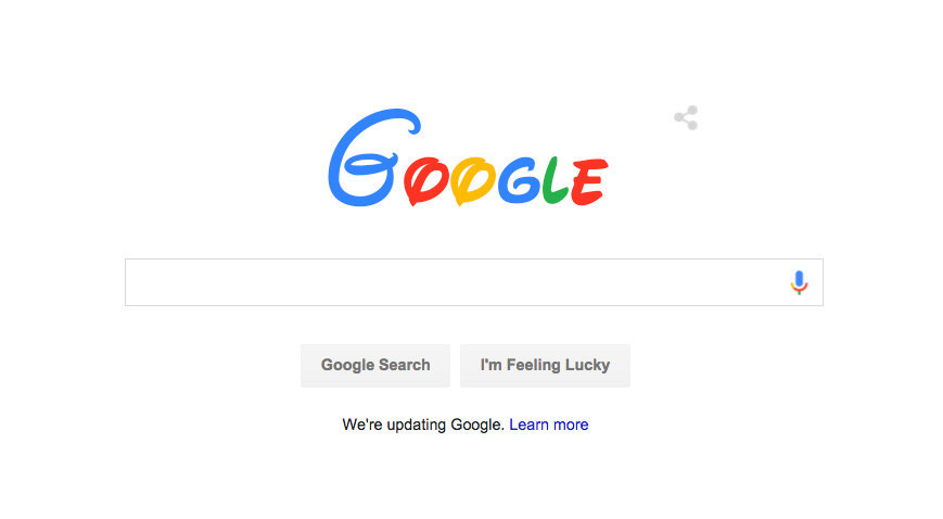
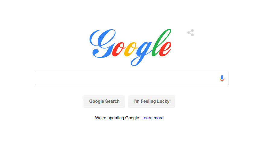
20. The Lion King font
21. The One Direction font
22. The Angry Birds font
23. The Alice in Wonderland font

24. The American Horror Story font
25. The Super Mario font
26. The Blade Runner font
27. Comic Sans
