
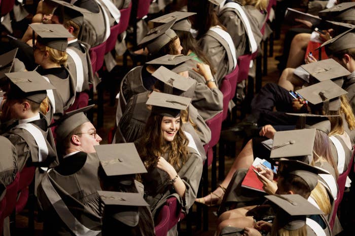
Some of the UK's elite universities are getting 10 times as many applications from the country's best-off areas than the worst, official data suggests, shedding light on the continuing access gap to universities for students from rich families versus their poorer counterparts.
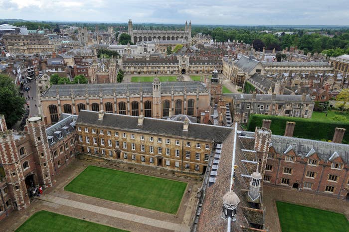
The University of Exeter and the University of Bristol – both part of the prestigious "Russell Group" of universities – each saw approximately 10 times as many applicants from the most privileged areas last year versus the least.
The University of Edinburgh, the University of Glasgow, and University College London also had particularly high ratios of applicants from wealthy areas compared to those from less privileged ones.
Universities are mandated to work to improve access for people from "nontraditional" backgrounds – families with lower rates of attending university – but campaigners and the Labour party have suggested the introduction of tuition fees of up to £9,250 a year has hampered these efforts.
BuzzFeed News has conducted a new analysis on UCAS figures and spoken to experts to shed light on what is really going on with admission to universities in the UK. The results suggest that the reasons for the access gap are more about pre-university education and opportunities, than they are about fees or university offer rates.
There is not much evidence that tuition fees are deterring poorer students
The BuzzFeed News analysis focused on the key UK-wide metric used by UCAS and others to measure applications to university. It is called POLAR3 and works by looking at historical admissions data to classify small areas around the UK into five groups (known as quintiles) based on what proportion of young people from those areas apply to university.
Although POLAR3 is a specific measure for university applications, researchers agree that it closely (although not exactly) tracks with wealthy and less wealthy areas. Put simply, people from wealthier areas are far more likely to apply to university.
The national figures show a big gap in applications around the country: 52.1% of young people from areas in the top quintile applied to a UK university, versus just 22.1% of people in the lowest.
However, the application rate in all five quintiles has increased versus five years ago (for the lowest quintile, from 17.7% in 2012 to 22.1% now), suggesting that fees so far have not deterred students from richer or poorer areas from applying to university – though there's no way to know whether things would have changed faster if tuition fees had not been increased.
The application gap is much bigger for the more prestigious universities
The graph below shows the number of applications to different universities from 18-year-olds living in the lowest-attendance areas versus the highest.
Each circle represents one university. If the circle is sitting on the black 45º line, that means the university gets equal numbers of applications from the top- and bottom-attendance groups.
In the below chart, you can identify individual universities on mobile by tapping any circle you're interested on. On desktop, this works by mousing over the circle in question.
The farther below the line the circle is, the more applications that university gets from the group from areas where people are more likely to apply to university overall.
Unsurprisingly, most universities are below the 45º line, meaning they get more applications from the wealthier, higher-attending areas. But the graph also reveals a bigger gap: This disparity is biggest for the most elite universities in the Russell Group, meaning the application gap is even bigger for top universities.
Ant Bagshaw, the deputy director of the higher education policy site Wonkhe, told BuzzFeed News the application gap was in large part explained by a grades gap between the highest- and lowest-attendance areas that is already in place by the time students apply to university – suggesting that boosting help in schools would help fix the application gap.
"Academic success is socially stratified, with privilege entrenched throughout the education system, so, on average, the richer kids will get higher grades at pre-degree levels," he said.
"Typically more prestigious universities have a better financial package for poorer students, so finance should not be an issue," Bagshaw said. "Not only do they tend to have more money to spend, they do so across a smaller number of students, so the individual take is higher."
Bagshaw added that universities are required by the Office for Fair Access (OFFA) to show they are working to improve access if they want to charge fees – but that this has had unequal effects.
"Widening participation been a priority (not least because OFFA signoff is required to charge fees up to the higher level cap) across the country, but this has meant poorer students attending lower-ranked universities more than it has improved access to the highest-ranking universities," he explained.
The number of offers given to each group reflects the trends in applications
The significance of this chart, which shows the number of offers made by universities, is how similar it looks to the applications chart, for universities right across the distribution – almost universally, around 90% of applicants from either group get an offer.
This suggests that people from areas where few apply to university – and therefore, where fewer people end up actually going to university – are getting offers as often as those from the more privileged areas when they do actually apply.
This suggests the biggest hurdles against equalising participation from the richest and poorest families to university are in school, before applications. Though the next chart shows that's not the whole picture.
Students from areas with most applications are slightly more likely to get an offer from elite universities than those from the areas with fewer applications
This final chart shows the offer rate for applicants from the groups for each university in the sample.
This chart largely bears out the story of the chart above – you can tell by the circles now clustering much closer to the all-important 45º line that the gap in the rate of offers is much smaller than the gap in the actual number of applications from each group.
However, it is worth looking at the blue and purple lines in this chart, too – these mark the average trend of the offer rates of the Russell Group universities (purple line) and the non-Russell Group unis (blue line).
If these universities had exactly the same offer rates to the different groups, they'd sit exactly along the 45º line, but the blue line shifts down slightly – meaning applicants from the group from areas where fewer people attend university get slightly lower offer chances. Meanwhile, the purple line for the Russell Groups unis sits a little lower still, suggesting that for a university where someone from a more privileged area had a 90% chance of being admitted, someone from the low-access group would have roughly a 75% chance.