
By now, you've probably heard the phrase "social distancing," which refers to the act of cancelling plans and isolating yourself socially as a means of preventing the spread of a highly contagious disease, especially to those at higher risk than you are. But why is it so important? These infographics lay it all out.
1. This matchstick visualization that shows just how quickly the virus can spread like fire.

2. And this graphic that demonstrates how the virus spread in clusters in South Korea.

Incredibly important read for anyone who isn’t yet fully practicing #SocialDistancing or doesn’t believe they need to yet. Do not be #Patient31. #COVID19 https://t.co/U28dsZeDBA
3. And this one which shows the effect of just one person keeping their social distance from friends and loved ones.

This makes it easy to understand. #SocialDistancing
4. This photo that serves as a reminder to think about others and their needs during difficult times.

When stocking up for #SocialDistancing, if an item has a WIC symbol beside the price, get something else. People who use WIC to feed their kids can't switch to another brand or kind of food. If a store runs out of WIC-approved options, they will go home empty-handed. #mepolitics
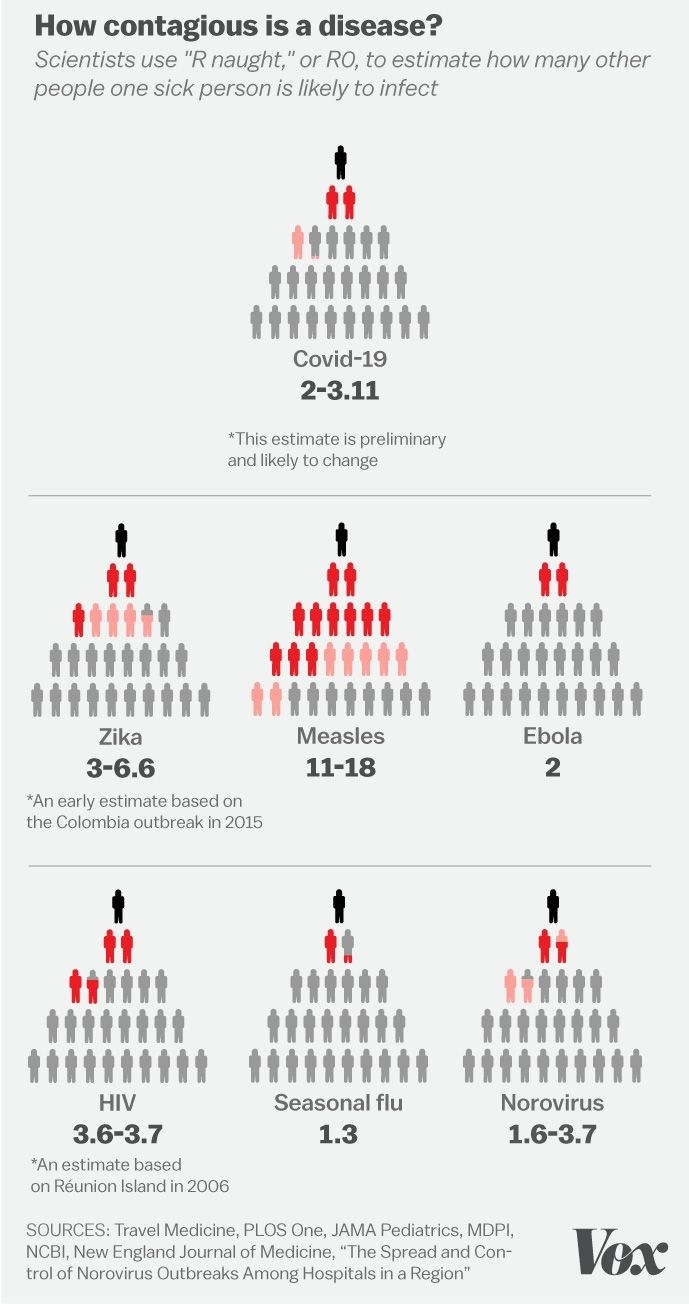
5. And this chart that shows the R naught of COVID-19, which is basically the reproductive number of the virus.
6. And this quote, illustrating how each single case of COVID-19 can have much deeper effects if people are not careful to avoid others.

Early in outbreak, each COVID-19 case infects ~2.5 others on average. There's ~5 days between one infection and next, so we'd expect one case to lead to 2.5^6 = 244 more cases in a month. If we can halve transmission, so each infects 1.25 others instead, we'd expect 4 more cases.
7. This chart that shows exactly how effective social distancing can actually flatten the curve of infection.

How do we make this REQUIRED reading material for Americans? It’s Simply fascinating and the best visual I’ve seen representing the dangers of untapped #COVID19 & the benefits of #SelfQuarantine/#SocialDistancing https://t.co/FpHNOJGtRG
8. And this one, which shows historically how flattening the curve can really work in society.

Is it actually possible to #FlattenTheCurve? Yes, St Louis did it before. In the terrible pandemic of 1918. The chart shows their success: * Philadelphia downplayed it and held a parade in 1918 * St. Louis canceled gatherings and flattened the curve https://t.co/JzwF6JhEWU
9. And this particularly eye-opening chart, which shows just how contagious young and seemingly healthy people might be, even those who aren't showing symptoms.

(1) Follow-up: Why are there so many more deaths in #Italy compared to #SouthKorea and other countries due to #COVID19? One potential reason: Many more old people got infected and then died in Italy than in South Korea. Evidence: See the attached age distribution of the cases.
10. This chart, which shows how every single person is responsible for the well-being of others.

Don’t be #Patient31 who did not follow #socialdistancing Caused 2 clusters responsble for 80% of South Koreas infections Do you want🩸on your 🤚? #CancelEverything #SocialDistancingNow #Covid19 https://t.co/khWTveb6ta
11. And this uplifting quote, which reminds us that even during difficult times when social gatherings should be called off, there are still plenty of ways to find joy.

It is the perfect time for this beautiful reminder ❤️ #embracewhatwehave