
Maybe you've heard there's a measles outbreak currently happening in the United States.
The highly contagious virus was initially reported in at least 40 people who were at Disneyland in mid-December, reports the California Department of Public Health.
Since then, the virus has been spreading across the country, bringing the total number of cases to over 120. Here, we've rounded up nine charts that will help you better understand the current outbreak — including why it's happening, where it's happening, and more.
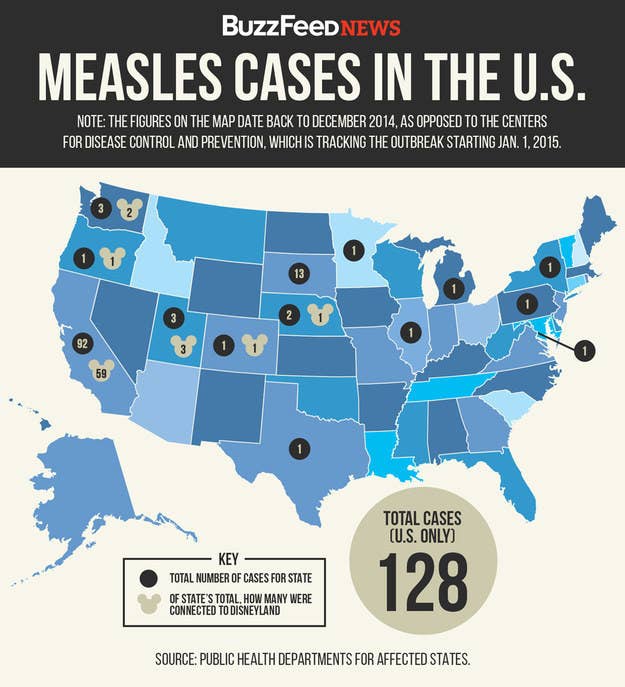
1. This map shows the states currently affected by the measles outbreak.
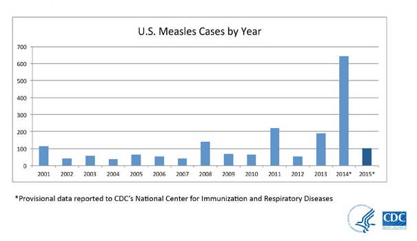
2. Here, we can see the number of measles cases reported each year since 2001.
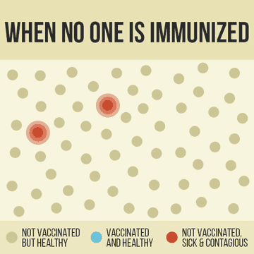
3. This GIF shows how the growing number of unvaccinated individuals can affect how easily measles can be spread throughout a community.
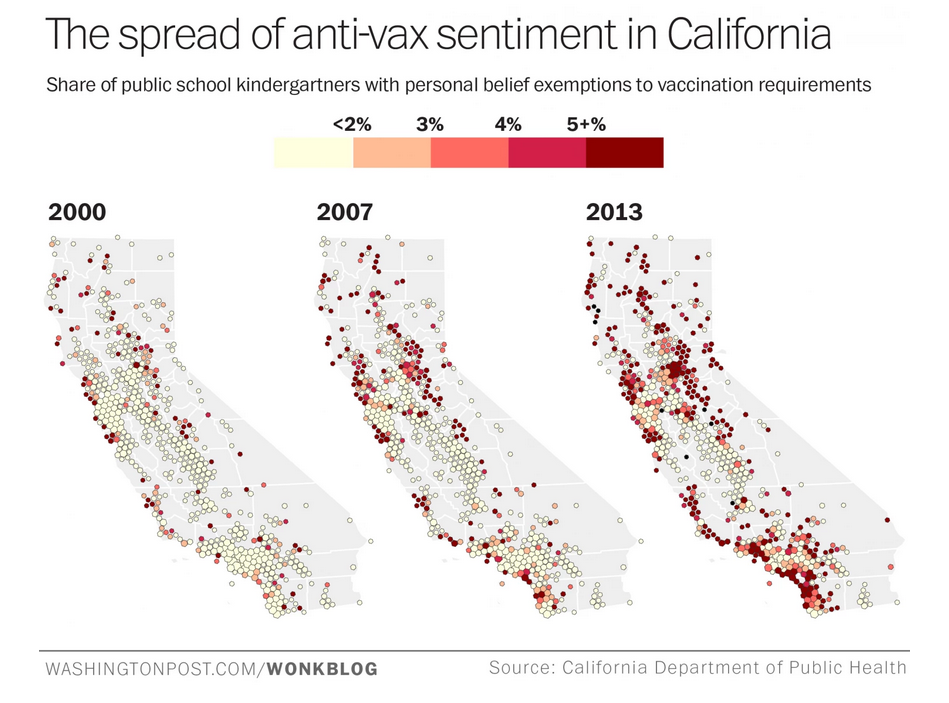
4. These maps from WashingtonPost.com show the amount of public school kindergarteners who entered school with non-medical exemptions to the vaccination requirements in California.
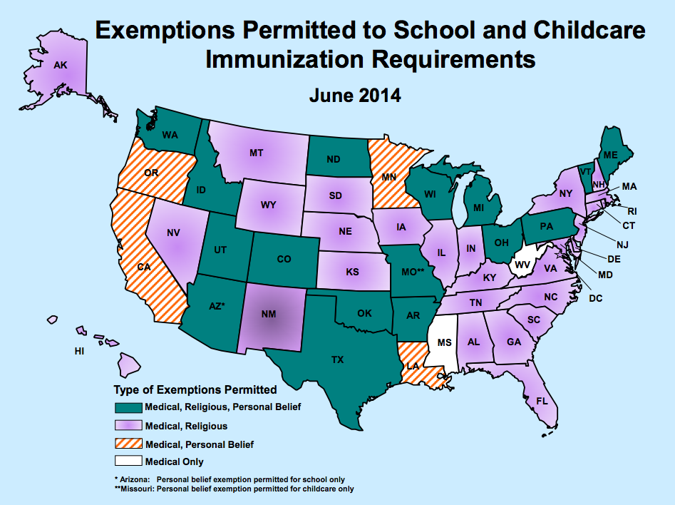
5. This map from the Immunization Action Coalition shows the types of exemptions allowed across the country.
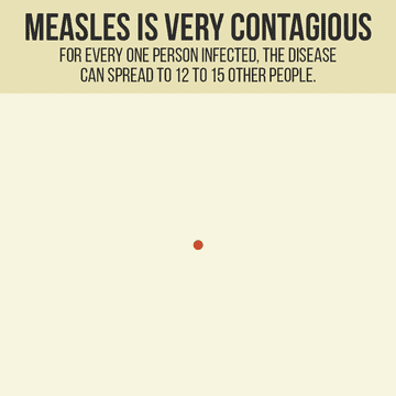
6. This GIF shows just how contagious the virus really is.
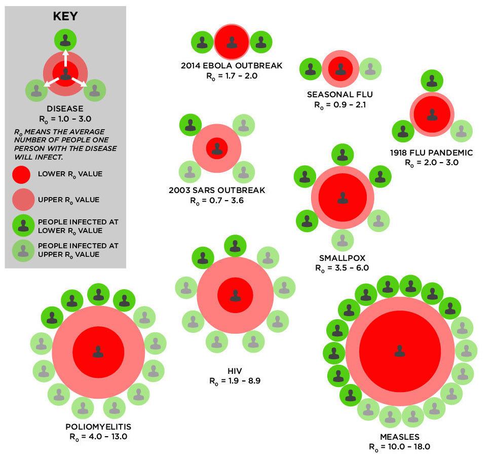
7. And this chart compares the spread of measles to that of other contagious diseases.
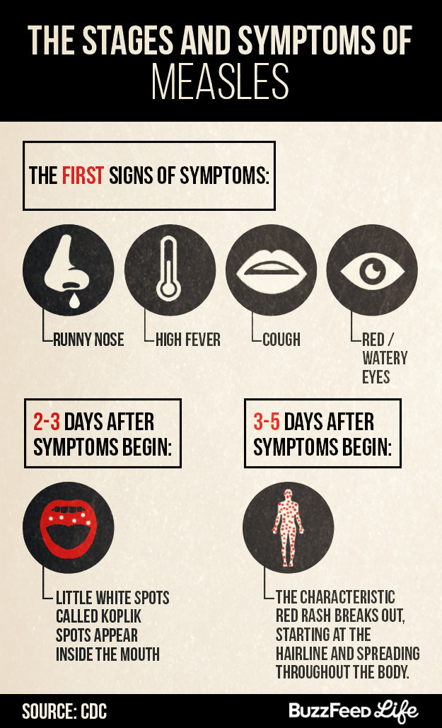
8. Here's a look at how the symptoms of measles progress after a person is infected.
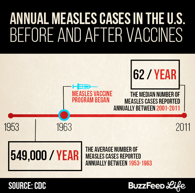
9. And here's a look at just how impressive that measles vaccine is, when enough people get it:
So please, vaccinate your children.
And if you're an adult who is unsure of your vaccination status, check with your doctor to find out if you're up to date on your immunizations.