
If you've been on social media in the past few weeks, you've probably seen a map (or five) of Australia's devastating bushfires.
Maps displaying alarming red flames dotted around Australia keep going viral. But while such images are certainly raising awareness, they can also be a source of confusion, and even misinformation.
Here are a few examples of the maps being shared, and things to watch out for.
Before we get into it: The maps in this post should NOT be taken as current bushfire information. Visit your state or territory fire service site for the latest information and emergency warnings.
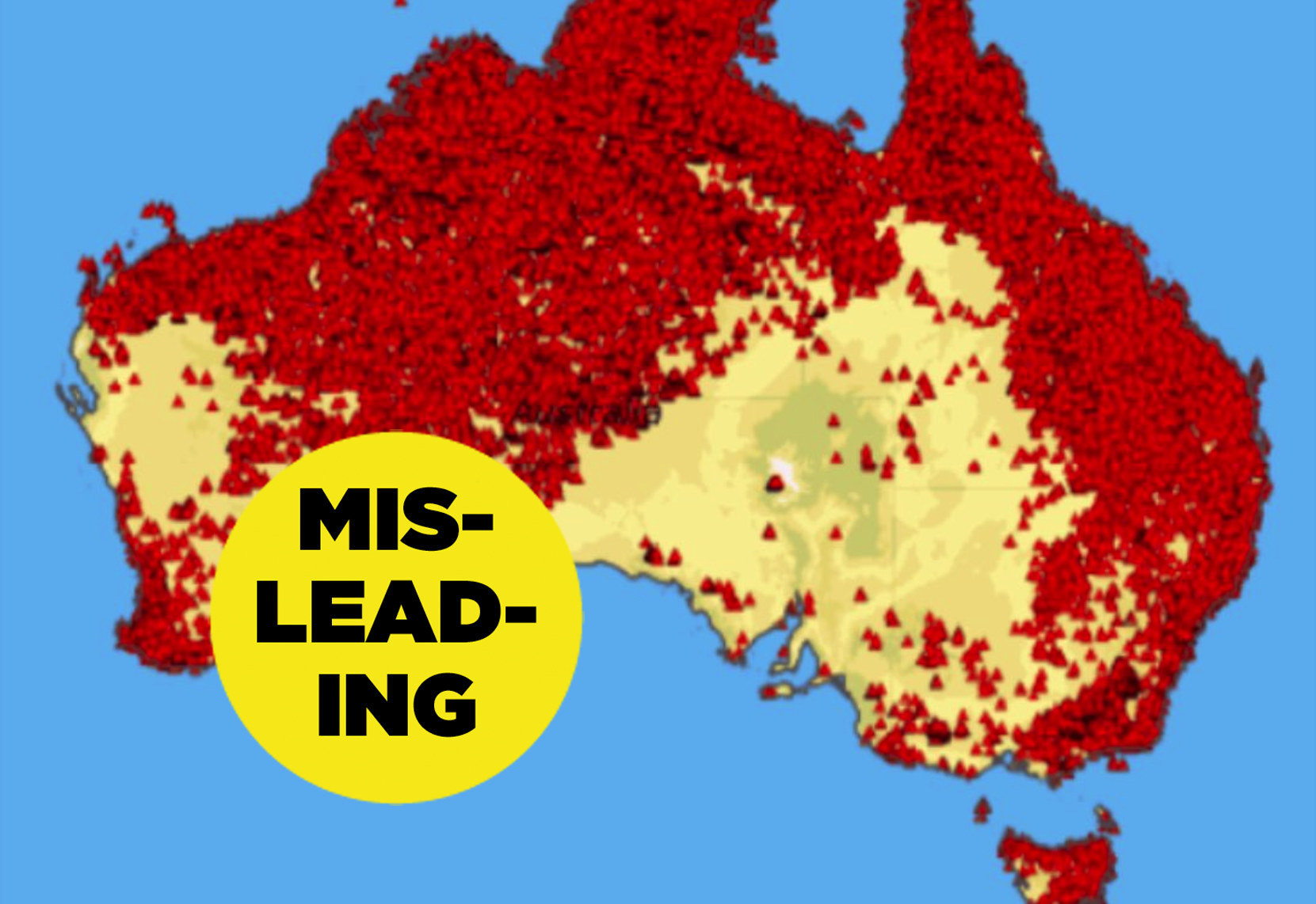
One of the maps that most reliably goes viral is this one with coloured flame icons.
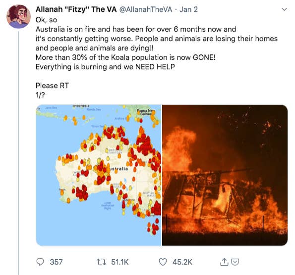
This map is from a site called MyFireWatch, which is run by West Australian statutory authority Landgate and based on data collected by various satellites through the Australian National Ground Segment Technical Team (ANGSTT).
The map uses little fire icons coloured in shades of red, orange and yellow, which make for a very dramatic picture — one that tens of thousands of people have shared in recent weeks.
But reading this particular map is more complex than it seems.
First, MyFireWatch is based on satellite data that shows sources of heat. These are usually — but not exclusively — fires, including bushfires and grass fires. Second, the colour system of red, orange and yellow is about time, not severity or danger.
So on MyFireWatch a red flame icon means a heat source was detected in the past 12 hours.
That is very different to, for instance, the New South Wales Rural Fire Service (RFS) map, where a red flame icon means there is a fire emergency warning, and requires a person to take immediate action in order to survive.
Here is a comparison of the MyFireWatch map on the left, and the RFS map on the right, taken at the same day and time in New South Wales.
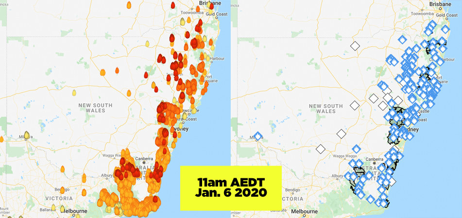
All of the fires burning on this day were at "Advice" level — the blue icon on the RFS map — which means a fire is present but it does not pose an immediate danger. But that isn't clear from MyFireWatch, which remains an alarming-looking mix of red, orange and yellow (indicating heat sources ranging from 0-72 hours old).
Mitchell Whitelaw, an associate professor at the Australian National University School of Art and Design, said the fire icons and colouring on the map is a "real problem".
"Colour and heat, we have a really strong relationship between those and we recognise warm and cool colours very effectively," he said. "Here what they’re doing is using a colour system that talks about heat to talk about time."
Asked why MyFireWatch uses fire icons when a fire is not necessarily present, a Landgate spokesperson told BuzzFeed News: "The aim of the service is to map fires and the overwhelming majority of the icons represent actual fires."
The map is updated automatically and quality checked by a team to remove errors, the spokesperson said.
The MyFireWatch map includes 34 "persistent hotspots" that are not fires, for example the Moomba gas flare in South Australia.
The satellites also may miss fires if the ground is obscured due to smoke or cloud, or if they aren't hot enough (for instance campfires won't be detected, and low-intensity controlled burns under tree canopies may not be).
The MyFireWatch website includes much of this information, showing a map legend and information about its limitations, as well as a warning that the map should not be used "for the preservation of life or property".
But the viral tweets don't have that context.
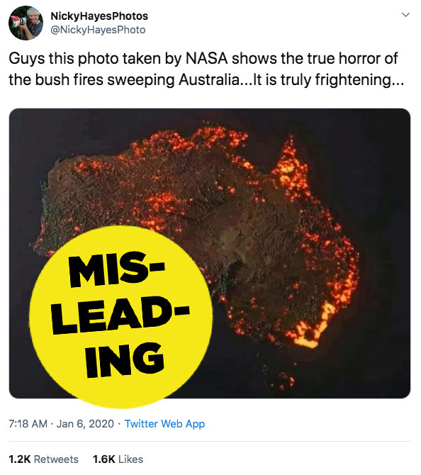
This tweet, which has been retweeted more than 2,000 times, includes an inaccurate map that wrongly suggests bushfires are covering central and western Australia.
The current blazes are in fact most extreme on the East Coast and in South Australia.
The picture's origins, and what exactly it purports to show, are unclear. It is labelled on some non-government websites as a composite image indicating bushfires from 1997 to 2008.
The poster later followed up with a tweet saying the map was not accurate, but hasn't deleted the original tweet.
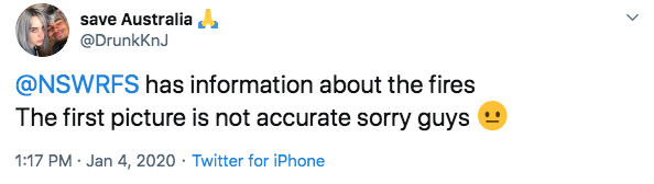
You might have seen this image going viral on Twitter, or perhaps on Rihanna's Instagram. But it has been consistently mislabelled, and caused a great deal of confusion.
Reader, it is not a photo taken by NASA, or a photo at all. It's an image created using data from NASA's Fire Information for Resource Management Systems (FIRMS) spanning over a month (Dec. 5, 2019 to Jan. 5, 2020).
Per Brisbane-based creator Anthony Hearsey, the image is "generally true" to data on the NASA website, but the scale of the affected areas is "a little exaggerated due to the render's glow".
Hearsey told BuzzFeed News in an email that he made the image while experimenting with 3D data visualisation.
"The image is an artistic rendition of data. It’s not meant to show what Australia looks like currently," he wrote. "I never expected the image to reach anyone past my own friends. I have a fairly small social media following, so it was just another image really."
In a nutshell: this image does not represent a single moment in time, and while it is a visual representation of fire activity in Australia over a month-long period, it is not entirely accurate.
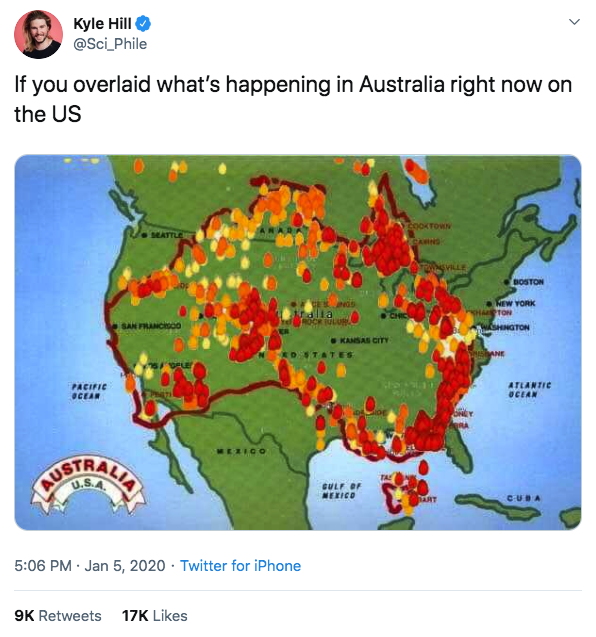
This map posted by ABC News in the United States is neither an accurate representation of current active fires nor of burned areas.
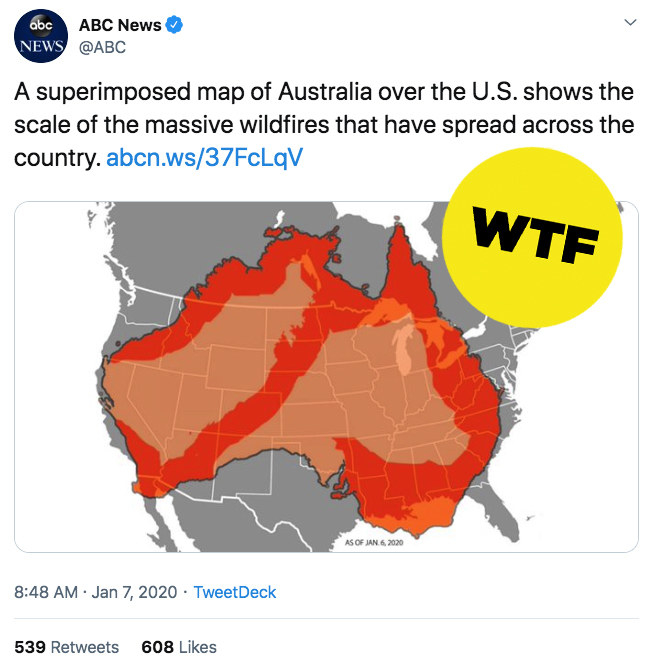
In fact it's pretty unclear what it is meant to be conveying at all. Also, where is Tasmania?!
Maps are an extremely important part of the information that people need to stay safe in emergency situations.
But remember that not all maps are equal, that different maps serve different purposes, and that context — the meaning of the icons, etc — is essential.
Whitelaw said that the speed and image-based nature of social media is "almost the worst possible thing" when you want people to slowly and carefully interpret data.
"It emphasises just the one hit, the image, which is supposed to communicate instantly and intuitively — and you’ve almost always got to look a bit closer," he said.
For Australians trying to keep safe and up to date, it's the state and territory fire service maps, and additional warning information, that you need.
Here are links to those official incident maps.