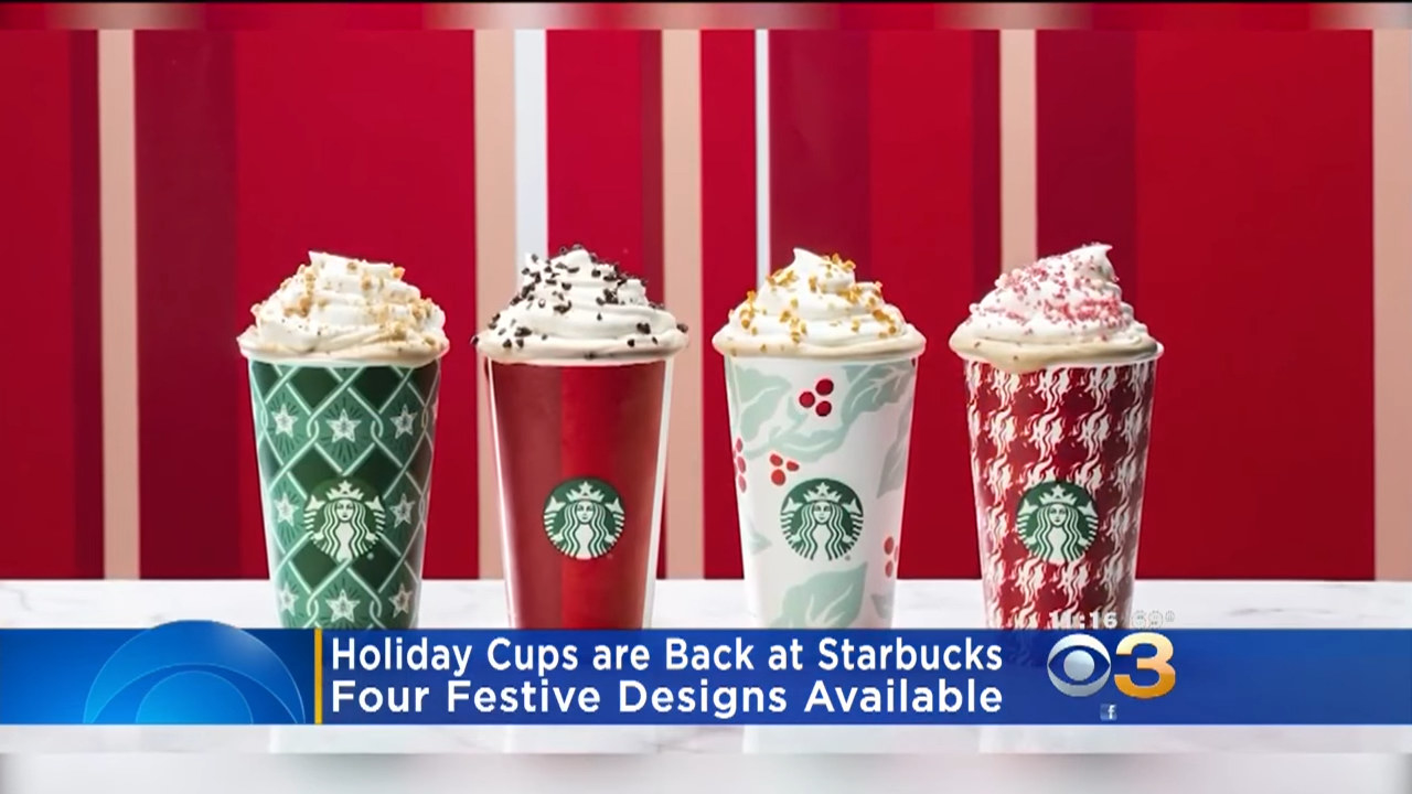
Over the years, Starbucks cups have become synonymous with the holidays, with each December marking a special design. TBH, the cups have changed a bit over the years.
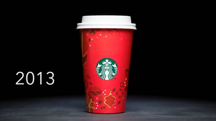
1.Starting off strong, the 2013 holiday cup holds a special place in my heart. It's simple. It's sweet. It embodies everything the holidays represent in my mind.
2.OK, so the pup totally gets me! I'm definitely biased, but I love the 2011 cup. It's cheerful! It's the signature holiday red! It celebrates BFFs. I'm in.
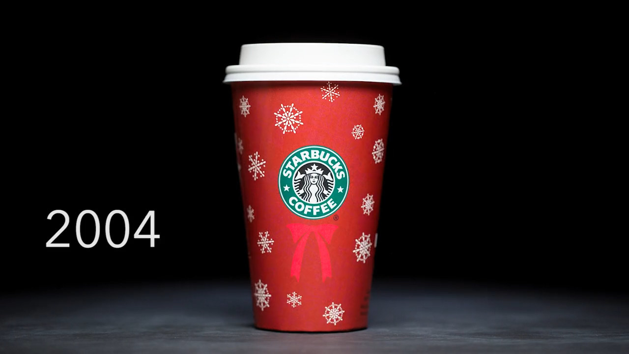
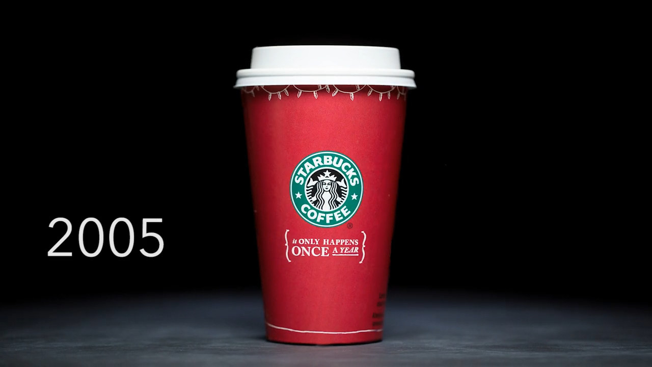
3.Simple and sweet, the 2004 holiday cup looks like a wintery present you can't wait to unwrap!
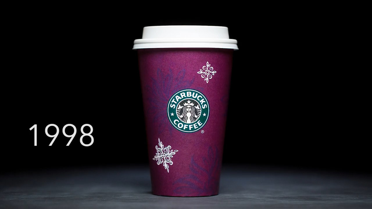
4.So, the 1998 cup is definitely different from the later-instated classic red, but I'm digging the deep purple design and fun white detailing. 10/10.
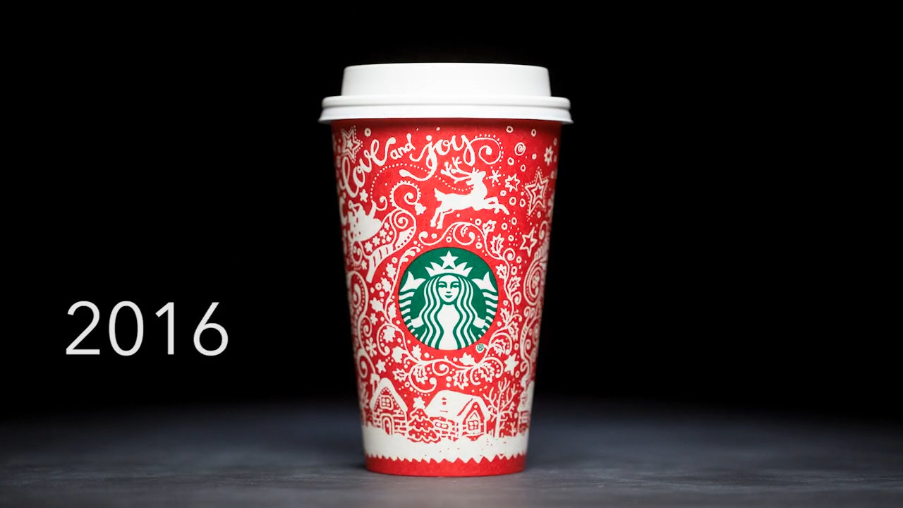
5.Why yes, I love the over-the-top design of the 2016 cup. Coziness personified.
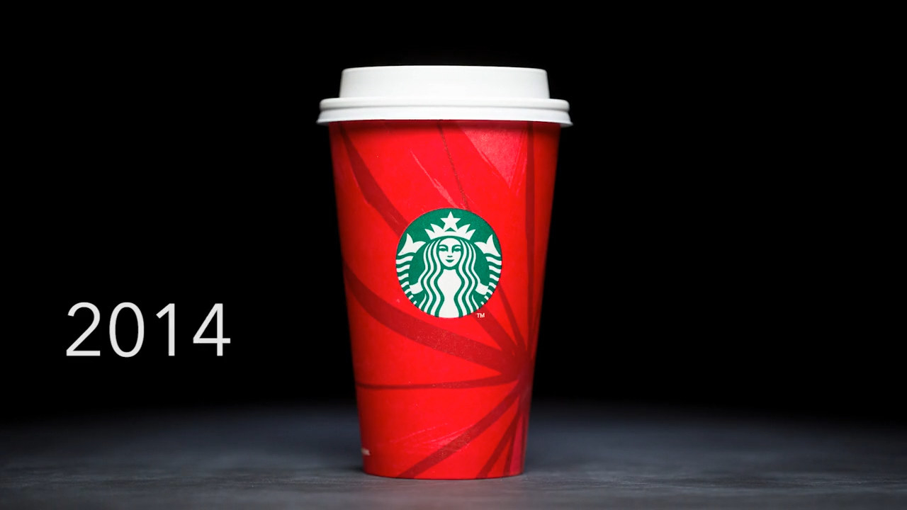
6.The same goes for the 2014 cup. It looks like a lil' Christmas ornament, am I right?
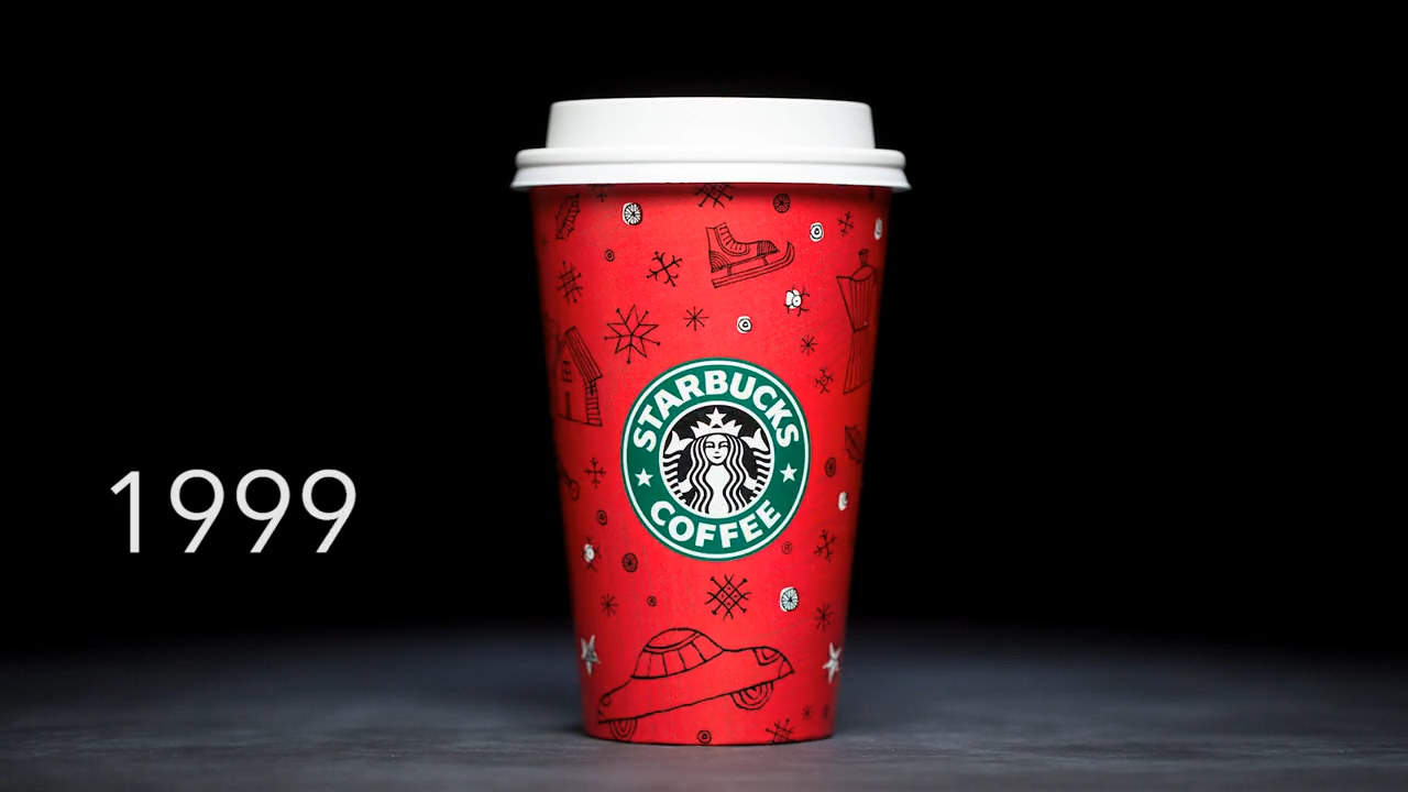
7.1999 is so cute! Playing on nostalgic cheer and winter fun, this cup shows off the most adorable collection of retro cars, ice skates, and snowflakes!
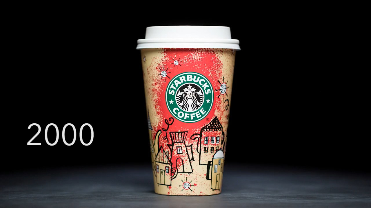
8.Ah, the turn of the century saw a lot of changes, didn't it? This cozy holiday cup reminds me of warm fires and plaid pajamas, and I love it.
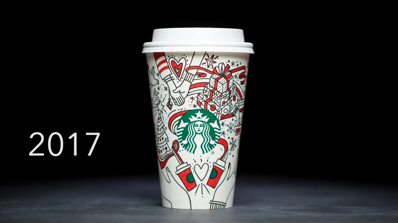
9.2018 introduced a range of cheerful holiday cup options, and the variety is oh so welcome. My fave is on the far right.
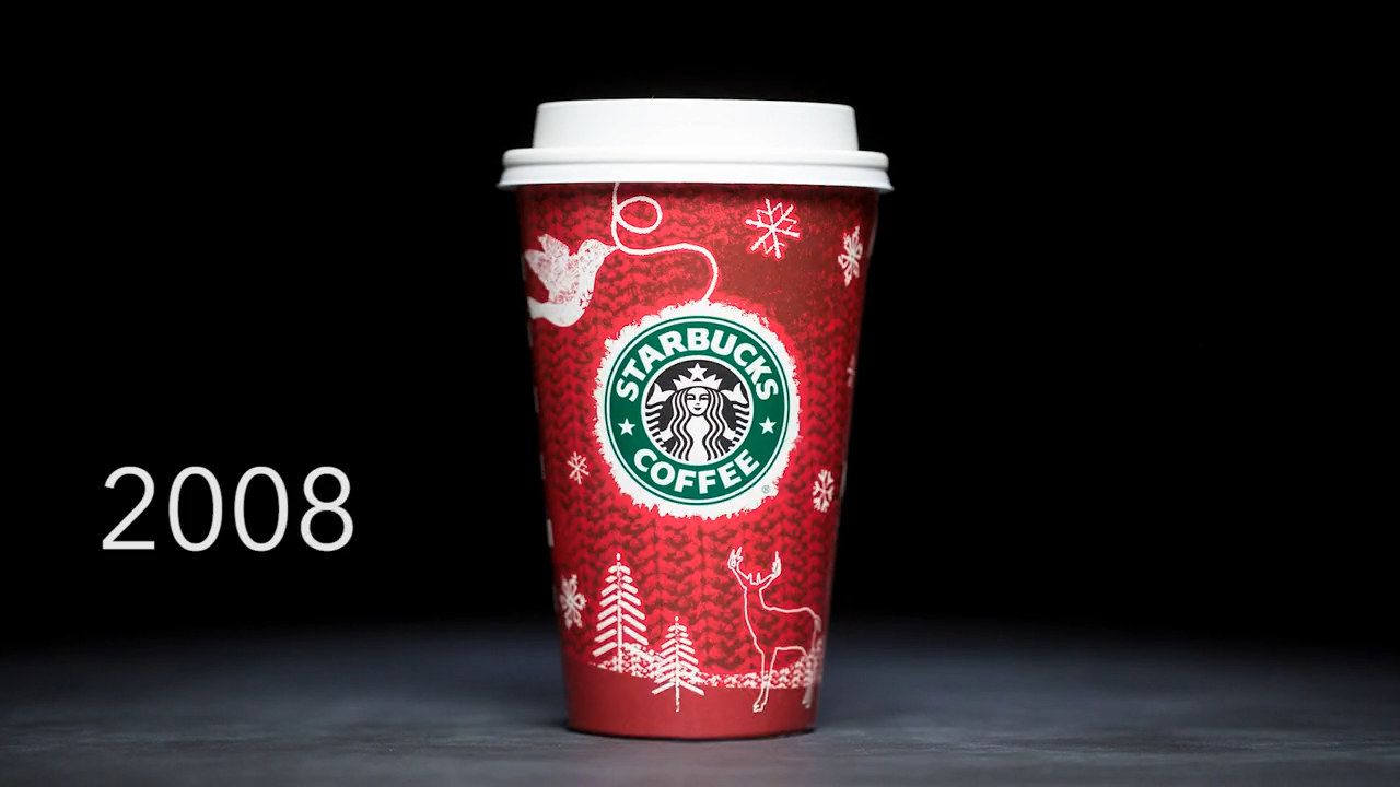
10.2008 took us into a cute winter scene with snowflakes, snow-covered pine trees, and helpful birds. This year, somebody somewhere decided that the Starbucks logo should be turned into a Christmas ornament, and it's a fantastic choice!
11.Now this one is good because it capitalizes on the special limited edition-ness of the holiday cups and also keeps things minimal with a string of white Christmas lights at the top.
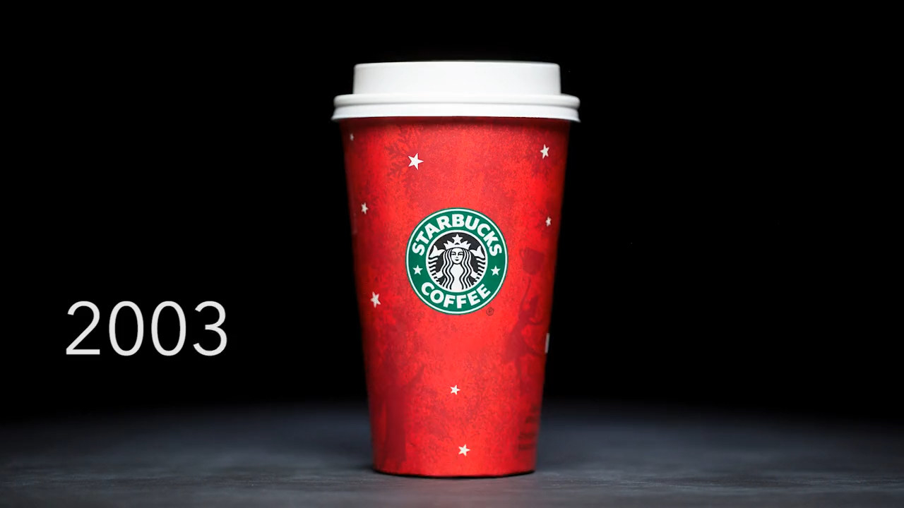
12.Simplicity is the name of the game when it comes to 2003. The design is extra sweet this year, showing off whimsical stars and snowflakes. Lorelai Gilmore would approve.
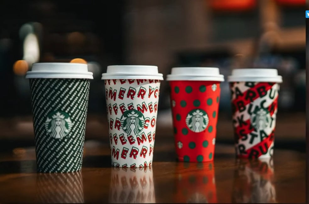
13.2019 also kept things interesting with an expanded range of holiday cup options. I'm a fan of the MERRY MERRY MERRY logo one.
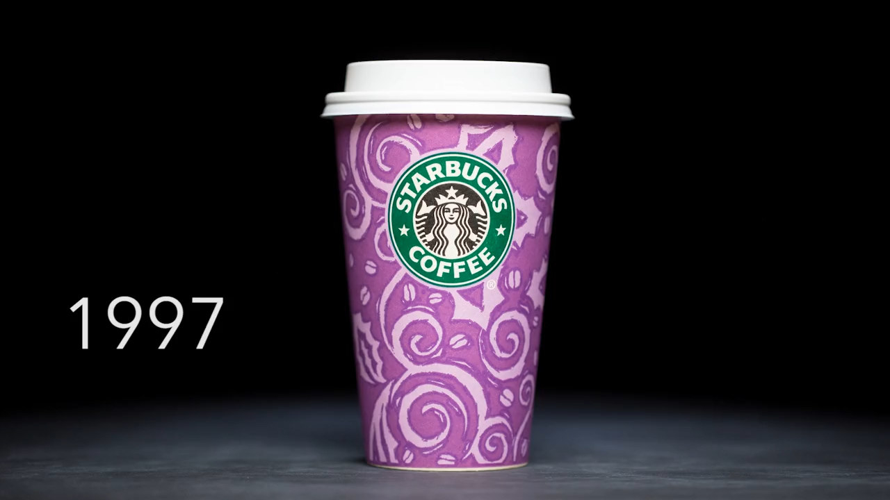
14.Here we've got the 1997 holiday cup. Somebody somewhere decided it should be bright purple, and IMO it looks good but not super festive.
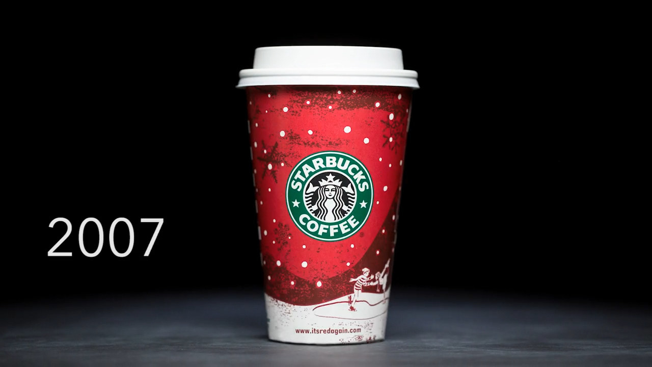
15.The 2007 cup has classic potential, showing off a heartwarming winter scene and a red-painted background. It says: Rest your weary head, all your troubles will be gone with just one sip.
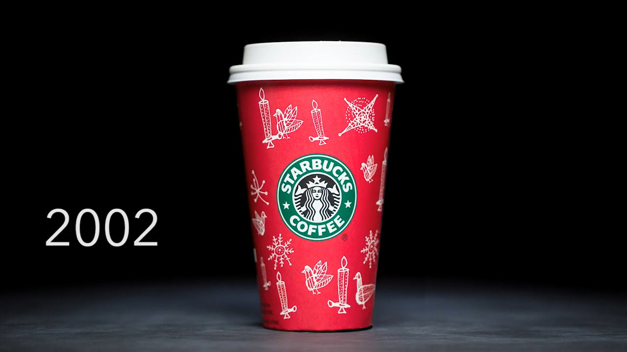
16.2002 was all about embracing the Christmas spirit with delicate designs that include warm, lit candles and snowflakes galore.
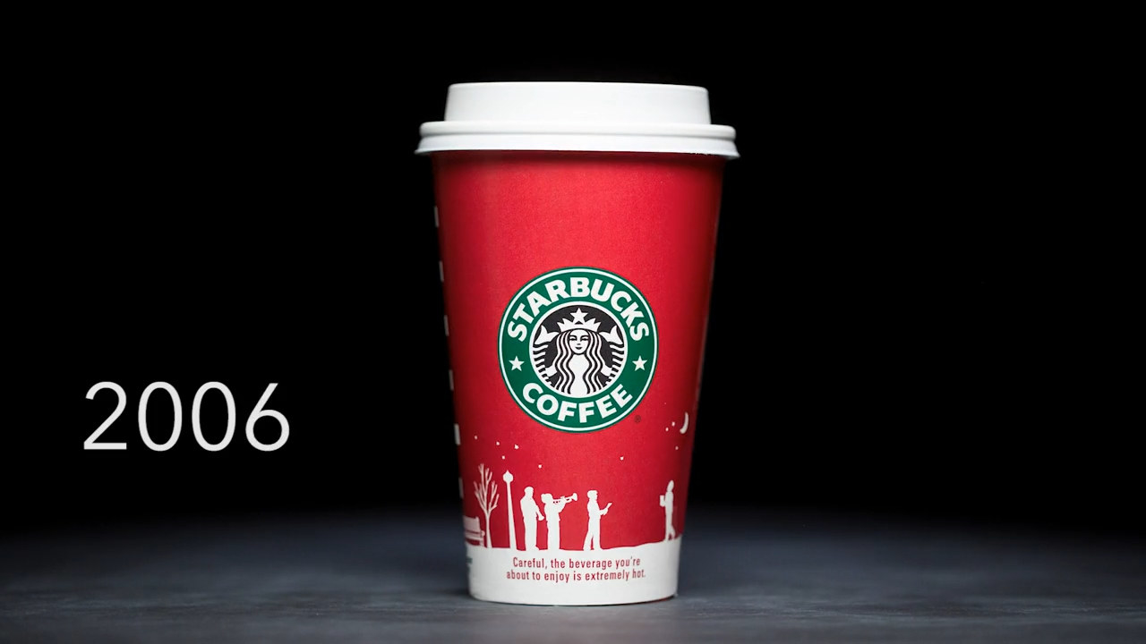
17.They went for a simple look in 2006, showing the classic red design with a snow-laden scene at the bottom. I like it!
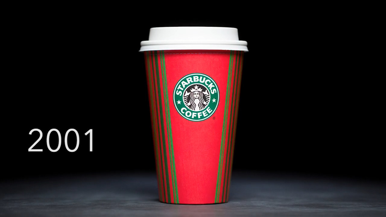
18.Doesn't the 2001 holiday cup remind you of Elf with the classic red and green striped look?
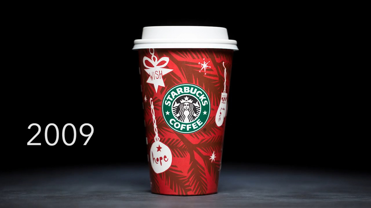
19.I like how the 2009 cup is extra positive, offering up a sweet message of hope and wishing for the best, but the design isn't everything I'd want in a special edition cup, you know?
20.Eh. It's fun but a bit over the top. Don't get me wrong, I like it, I do, but there's just...a lot going on.
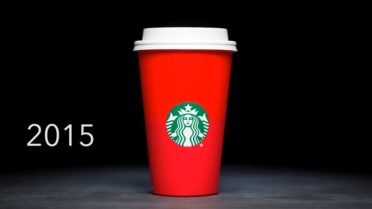
21.It's simple; it's sleek; it's giving holiday on a minimalist budget. The 2015 cup is just...lacking IMO.
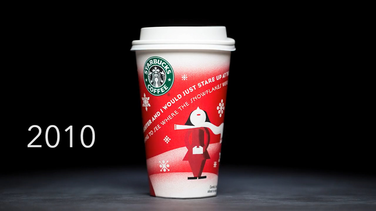
22.I see what they were trying to do here (and sure, 2010 was a weird year), but I'm just not a fan of the style.
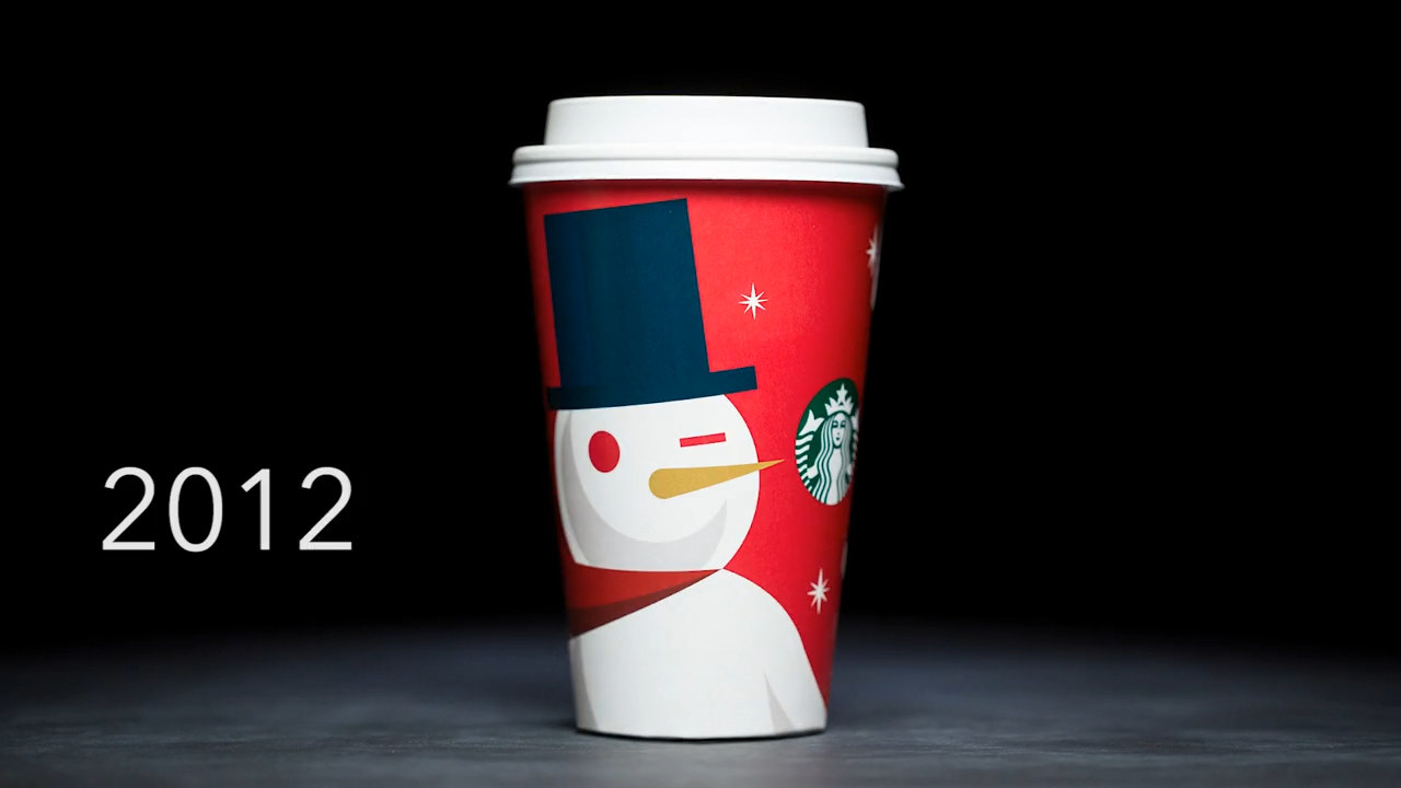
23.I think I can see what they were going for with the 2012 holiday cup as well... It's cute and all, but why is the snowman winking??
