This post has not been vetted or endorsed by BuzzFeed's editorial staff. BuzzFeed Community is a place where anyone can create a post or quiz. Try making your own!

1. How wide is the Global Gender Gap? The darker the blue, the greater the equality between men and women.

2. As a region, North America is closest to equality

3. The economic participation and opportunity gap: 82% closed in North America, 42% in Middle East and North Africa

4. 25 countries have closed the education gap between women and men

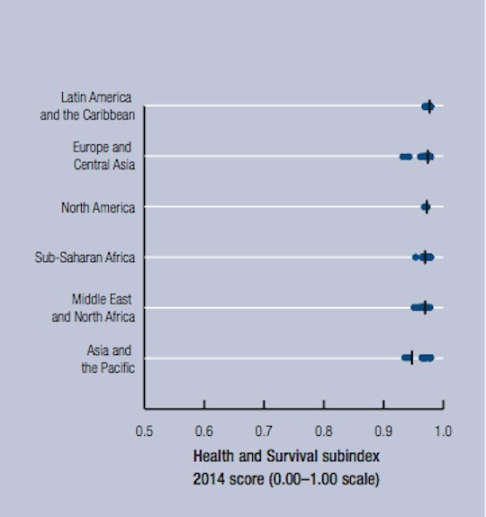
5. The health and survival gap is closing worldwide
6. The gender gap in political empowerment remains wide open, across the world

7. The gender gap is closing, but don't hold your breath

The Global Gender Gap Report 2014


View this video on YouTube
The Global Gender Gap Report, published by the World Economic Forum, provides a framework for capturing the magnitude and scope of gender-based disparities around the world.
Share This Article