
Spec redesigns are the frenemies of the web. They happen when a hungry outsider decides to rework someone else's site, without worrying about boring stuff like ad space or click rates. It's awkward, but the result is a look into a world ruled by graphic designers. It's a terrifying place, with lots of muted colors and Helvetica. Behold!
Wikipedia
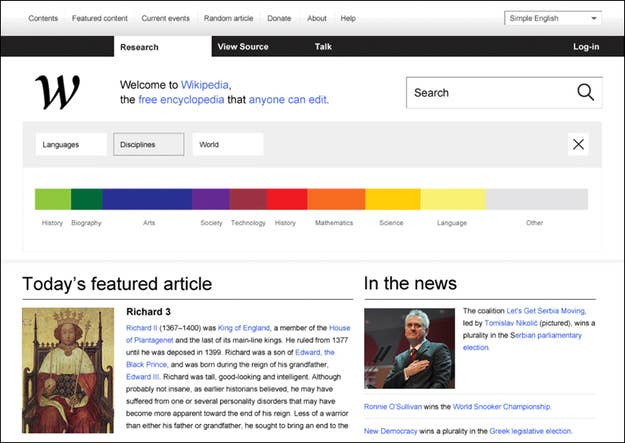
Sure, Wikipedia's cool and all, but it's got a few too many lines and columns for our taste. Shame you didn't think of that, Jimmy — but I guess that's why we're here.
American Airlines
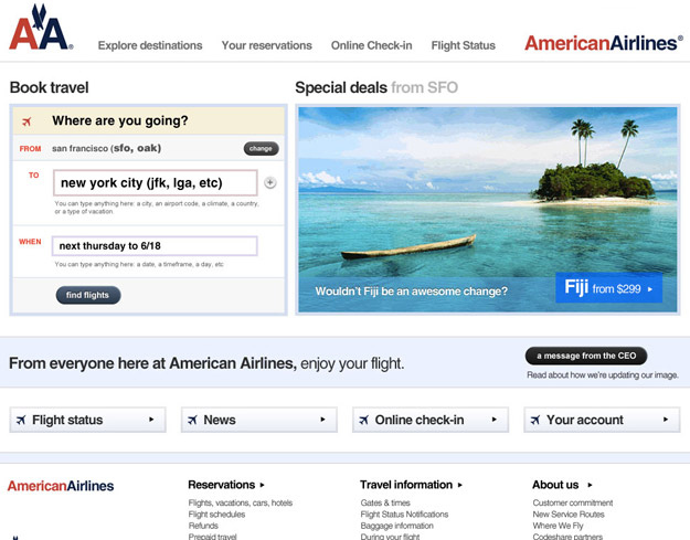
This is the gold standard of passive-aggressive redesigns, offering calm measured advice like, "fire your entire design team, if you have one," and calling out the CEO by name.
The New York Times
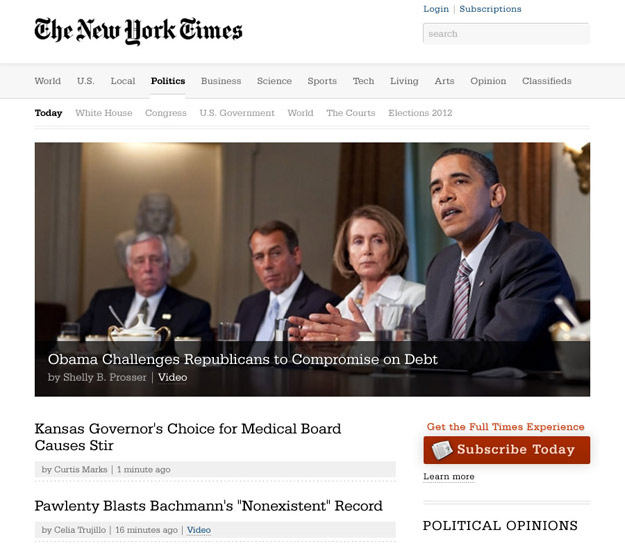
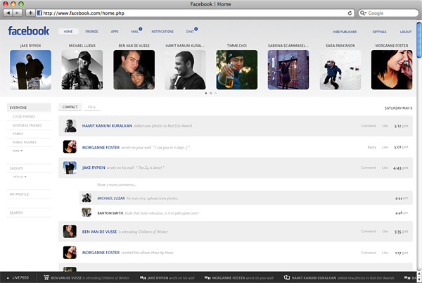
Your group, "Make Facebook Look Like Gmail," has 37 members.
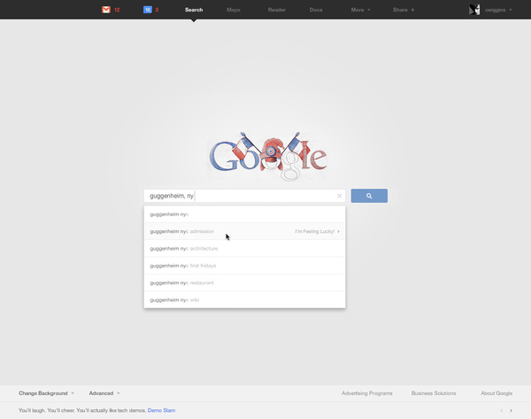
Google's homepage is one of the cleanest major sites out there, but it would still look better if the search bar were lost in a gray ocean of negative space.
Cash
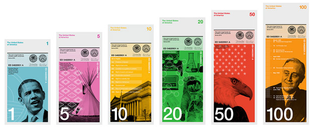
Like green money? Too bad, because now all your bills look like issues of Businessweek.
Amazon
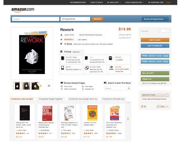
They didn't even change anything here. They just made everything softer and added Helvetica. Take that, Bezos.
The Boarding Pass
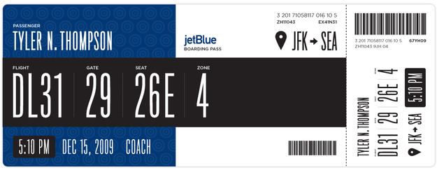
This one is banking on a serious upgrade in airport gate printers.
IMDB
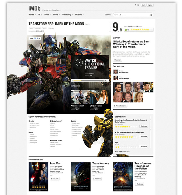
When in doubt, add Transformers.