
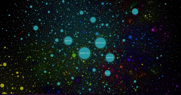
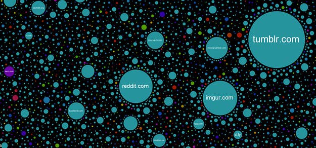
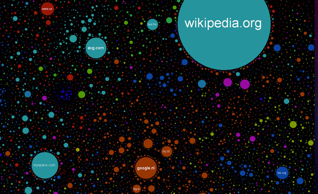
This is a map of the 350,000 largest sites on the web, a project of Russian coder Ruslan Enikeev, with help from the Google Maps API and Russian creative agency Positive Communications. The bigger the traffic, the larger the bubble. (The data comes from the web-tracking firm Alexa, circa the end of 2011). The color corresponds to the country of origin: light blue for America, dark blue for Germany, red for Russia, yellow for China, and so on. Enikeev even used a dynamic physics model to determine the position of each site, plotting traffic between sites as attractive forces and letting the bubbles sort themselves into groups.
The takeaway is that this is a pretty good guess at what the internet looks like. You can see the different neighborhoods — the Russian neighborhood, the social hubs, the isolated, seedy porny region on the bottom right.
This is the "screwing around on the internet" section.
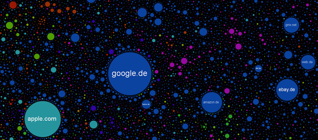
Apple is surprisingly international, closer to google.de than google.com.
Enikeev posted a more thorough description of the map's creation on a site called Habrahabr (think GitHub, but in Russian), in case you want to code one for yourself.