The Bloomberg terminal is an expensive Wall Street trading machine with endless financial data.

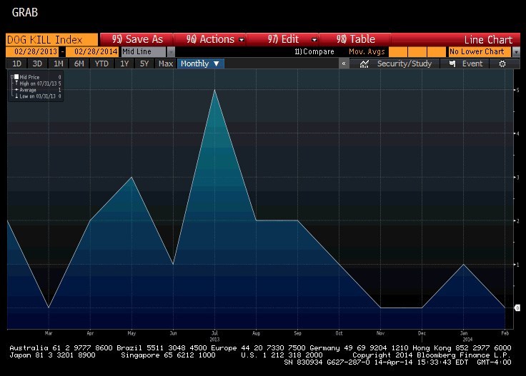
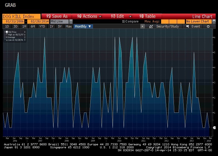
It also has one very sad chart called the "Dog Kill" index.

It's an index like the S&P 500 or Dow Jones Industrial Average. Except it tracks the number of pets injured, lost, or killed while traveling with U.S. airlines each month. It's mostly dogs, the description notes.

There are two victims each month on average, though a high of six was reached in August 2007. Last year, 21 animals were affected, including cats, bunnies, a parakeet, and a ferret.
The data comes from extremely depressing reports filed with the U.S. Department of Transportation. Here's one about Booboo, a 1-and-a-half-year-old dog who died in June 2013 after a 16.5-hour United Airlines flight from Guam.
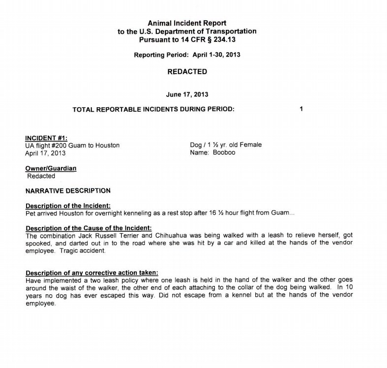
"Description of the cause of the incident: The combination Jack Russell Terrier and Chihuahua was being walked with a leash to relieve herself, got spooked and darted out in to the road where she was hit by a car and killed at the hands of the vendor employee. Tragic accident."
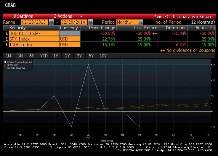
Oddly enough, you can map the Dog Kill index, which starts in January 2006, against the S&P 500 and the Dow. Thankfully, there doesn't appear to be any correlation.
Dog Kill index, you are the saddest graph.