
A question we're thinking a lot about as we prepare to launch the BuzzFeed News app: How much should we present natively in the app, and how much should we link out?
One of the hypotheses we'll be testing is that our target audience of non-news junkies is more interested in browsing and reading than scanning through a collection of headlines and links.
That hunch echoes a trend on Facebook and Twitter: In-stream experiences like native video reduce friction on mobile devices because audiences don't have to rely on tapping links — and waiting for slow web-views to load — to get what they want.
The Economist's Tom Standage recently told Nieman Lab that their Espresso app sells a "finite, finishable, very tightly curated bundle of content." Users trust Economist editors to filter and distill news for them, so the app doesn't even include links. We believe in that distilling process, too, especially on mobile.
But we also agree with Mathew Ingram that links serve a vital purpose. What feels sufficient for one reader might not be enough for another. So we want to serve readers who just want to get the latest news in one easy-to-browse stream while facilitating the process of diving into stories more deeply for those who want to.
We’ll definitely include links to read in an in-app browser, but we don’t expect that to be the primary way the BuzzFeed News app informs readers.
This meshes with the thinking behind the BuzzFeed News newsletter — it includes a lot of links, but you shouldn't have to tap any of them to quickly catch up on the news of the day. As our newsletter editor Millie Tran wrote, we include links because we think they're "a service to our readers who might want to know more, not because our lack of context is a point of frustration and they need to go elsewhere to understand."
We're doing the same thing with our push notifications. Most of them link to a breaking news story, but the alert should be clear enough that readers don't have to tap to understand.
Here are some examples of how we’re including context within our main app feed itself, so users don’t even have to tap to get up to speed.
For our alpha testing, we've been displaying links in the BuzzFeed News app similar to what you might see in your Facebook News Feed. But our awesome designers and developers have given us other components to play with, too. So we can add items like tweets and bulleted lists beneath links to stories inside our main stream:

You can tap the headline if you want the full BuzzFeed News story. But even if you don't — because you're pressed for time, or on a less-than-speedy connection — we aim to provide a "complete" experience by giving you a useful summary and context.
Another example: during the debate over Indiana's religious freedom law, we linked to a story. A tweet from a local reporter and a quote from an NCAA statement provide some background in-stream:
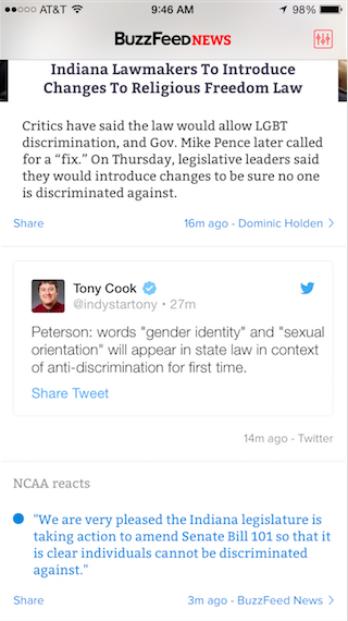
We hope our approach will give our audiences a good overview of what's going on without requiring them to wait for a mobile web-view to load — when every millisecond counts. And they'll still have plenty of ways to explore a topic in more detail: by reading the full BuzzFeed News story, following a local reporter whose tweets we highlighted, or checking out any related links we've selected.
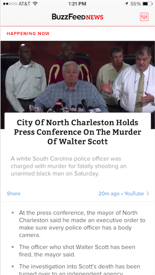
A final example: when the city of North Charleston, South Carolina, held a press conference about the police killing of an unarmed black man, we linked to a YouTube livestream — and also included a running list of what officials were saying for those who didn't want to watch it:
We think this strategy of offering more than just links to stories gives readers a good overview of what's happening in the news without requiring them to do a lot of navigation or leave the app. At the same time, If we get the pacing of our app stream right, we hope each story doesn't take up so much vertical space that it feels like a burden to scroll to the next one.
Of course, we'll pay close attention to data and user feedback to decide what serves readers best in the stream.