

The feed. The stream. The river. Those have become the dominant metaphors of the content apps we use every day — Facebook, Twitter, Google+, and Tumblr, which have slowly become more and more like one another. In parallel, pull-to-refresh has become one of the defining interface paradigms of touch computing — like double-clicking or right-clicking with a mouse before it.
Originating with Loren Brichter's Tweetie a few years ago, it's become virtually ubiquitous as the way to refresh a stream of information, no doubt because it seems so natural — a little tug when you reach the end of the line lets a server on the other end know to send more bits down your way.
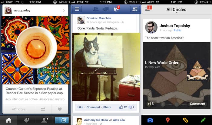
It took a few years to become as widespread as it is today, largely because no one wants to be the guy known for stealing somebody else's invention. But we're long past that point now, largely, I think, because of how "the feed" as a construct homogenizes design. Just look:
Even the way these apps bleed photos outside of the stream is the same. With the expansion of the feed, pull-to-refresh has gone from being a piece of exciting, innovative interaction design to simply part of the feed construct — a standard, although Twitter does own it, technically. It has become boring, in other words.
So designers are finally comfortable messing with it, and it's one of the few places in the totality of the feed that designers can in fact get a little crazy. Welcome to the baroque period of pull-to-refresh.
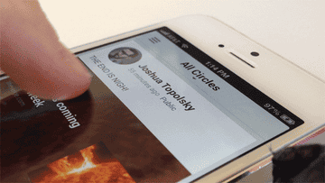
Google+ for iOS had a major design overhaul back in May — now, a few months later, it's been redesigned again. (It is interesting that Google+ designers have the time and resources to continually redesign the iOS app. Hmm!) There are new fonts and new colors, but most importantly, look at that pull-to-refresh animation. It's a whole light show crammed in a square inch of space. This, I believe, is what Google+ — all of it — has been building toward.
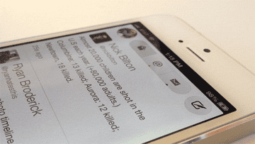
Twitterific is a Twitter app you might not have heard of — but it's perhaps the most important Twitter application outside of Tweetie, which eventually became Twitter for iPhone. Twitterific was the first to use the word "tweet," the bird icon, a character counter, and the first native app for both the Mac and iPhone. And now it gives us this, perhaps the most elaborate pull-to-refresh animation of all time. An egg appears, and just when you think it's going to disappear, replaced by new tweets, it explodes, and a bird, Twitter incarnate, emerges from the scattered bits of the shell, its wings spread and flapping, gloriously. This is no mere pull-to-refresh. It's pull-to-live.